
Diagrams are a powerful way to communicate. Even the most complex ideas that are hard to understand when written as text can be quickly understood with the simplest of diagrams.
However, not all diagrams are made equal. There’s a subtle art to create beautiful diagrams, and we at Creately are super committed to helping everyone draw diagrams that get the job done surprisingly fast.
This post covers some hard-earned tips on how to make diagrams that communicate well and look great.
Pick the Right Diagram Type
There are many diagrams out there and each has a different purpose and in some cases even multiple purposes. For example, a flowchart can be used in decision-making as well as process mapping.
When you pick a certain type of chart or diagram, you need to make sure that it matches your goal.
- Flowcharts – to map out the flow of a process
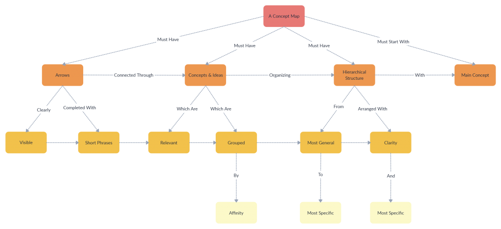
- Mind maps – to organize and structure ideas, thoughts etc.
- Fishbone diagram – to analyze the root cause of a problem
- Org charts – to visualize the hierarchy of an organization’s structure
- Bar charts – to compare categories of data
- Pie charts – to compare parts of a whole
- Pyramid charts – to highlight the hierarchy of data
- Line Graphs – to show a correlation or pattern among data
Identify more diagram types and their different purposes with the following resources
The Ultimate List of Visual Teaching Strategies
The Ultimate List of Essential Visual Brainstorming Techniques
The Ultimate List of Marketing Strategy Planning Tools
4 Diagram Types for Better Project Management
Follow the Standards
Following the standards pertaining to each diagram type makes them more universal; meaning a sequence diagram drawn by a US tech lead can easily be understood by a Japanese developer if UML diagram standards were followed when drawing the diagram.
When it comes to technical diagrams like UML diagrams, ER diagram, BPMN diagrams etc. stick to the standard to avoid making errors and avoid confusion.
Even when drawing common diagram types like flowcharts, mind maps or Venn diagrams, following the standards will ensure it’ll be easily understood anywhere.
Stick to a Color Theme
Adding color would make any diagram look attention-grabbing, but too many colors that don’t have a pattern will make it look cluttered and unprofessional. Here are some tips you can follow when adding colors to your diagrams.
- Use Creately’s color palette to effortlessly select a professional color scheme. Each row in the palette represents a theme, so it will make it easier for you to stick to a good looking color theme for your diagrams.
- Limit the number of colors you use in your diagram as it may make it look chaotic. Instead, stick to 3-4 colors to preserve the readability of the diagram.
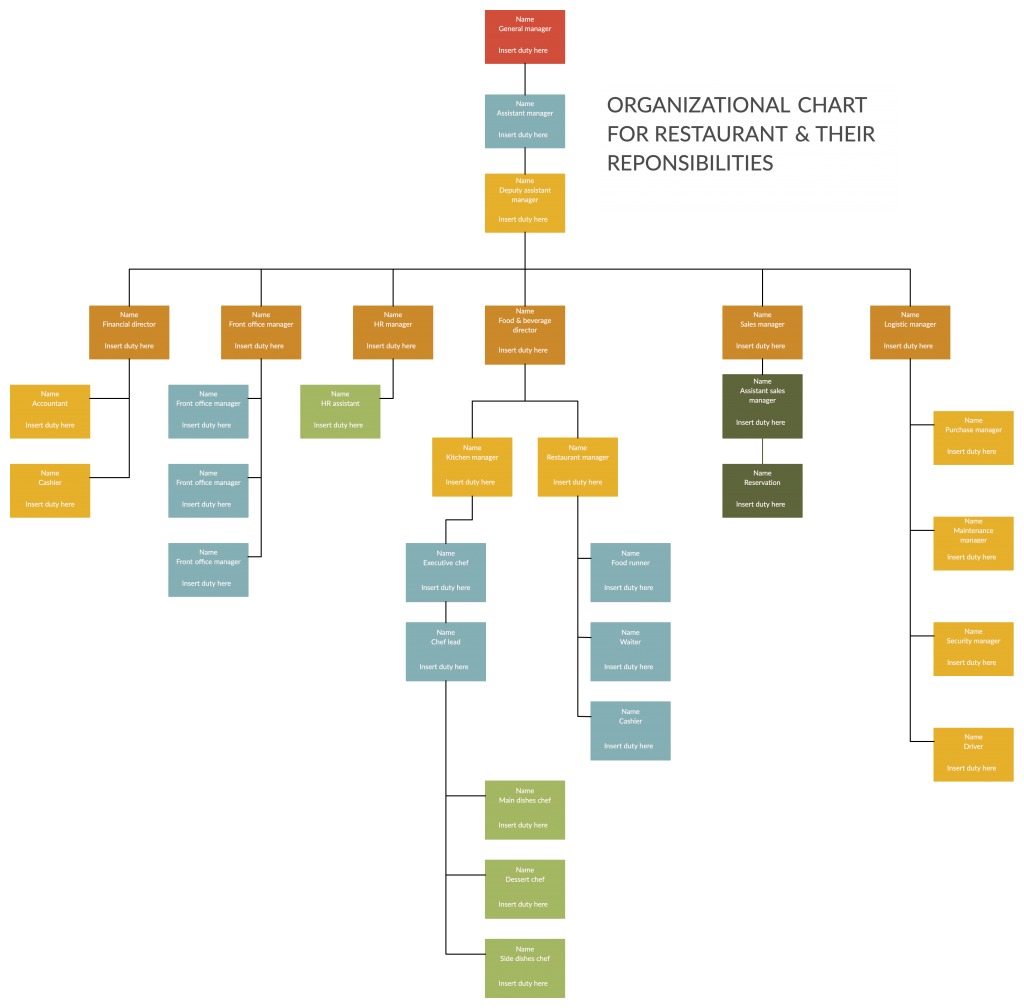
- And you can use different shades of the same color to indicate the relationships among various shapes.

- Use different colors to provide contrast to different objects. If you use the same color for all shapes it will make it difficult to understand your diagram. Here’s an example diagram of a decision tree. Click on the diagram to use it and make changes online.


Pay Attention to Typography
Many only pay attention to the visual aspect of charts, graphs, and diagrams and completely neglect the typography. The end result is a good looking diagram that is still hard to read and understand.
- Choose the right font; serif gives a formal vibe while sans-serif gives a cleaner and more modern look. While you can use any of the two, it is better to avoid overly complicated or artistic fonts
- Use only one font type in a diagram, for more than one font won’t look good on it. To emphasize information, you can use different font weights.
- When using colors, use them in relation to the shape the text appear on
- Keep enough whitespace between words/ sentences to make text readable
In this Typography Tutorial for Diagramming, we’ve covered everything you need to take care of when adding text to your diagrams.
Be Mindful of the Size of the Diagram
In many cases, diagram span multiple pages. The more complex the diagram is, the harder it gets to read and understand it. In a situation like that, you can,
- Reduce the number of shapes you add to the diagram. Not all data you have at hand need to be represented in your diagram. Leave out the information that you can do without to keep your diagram more focused and relevant.
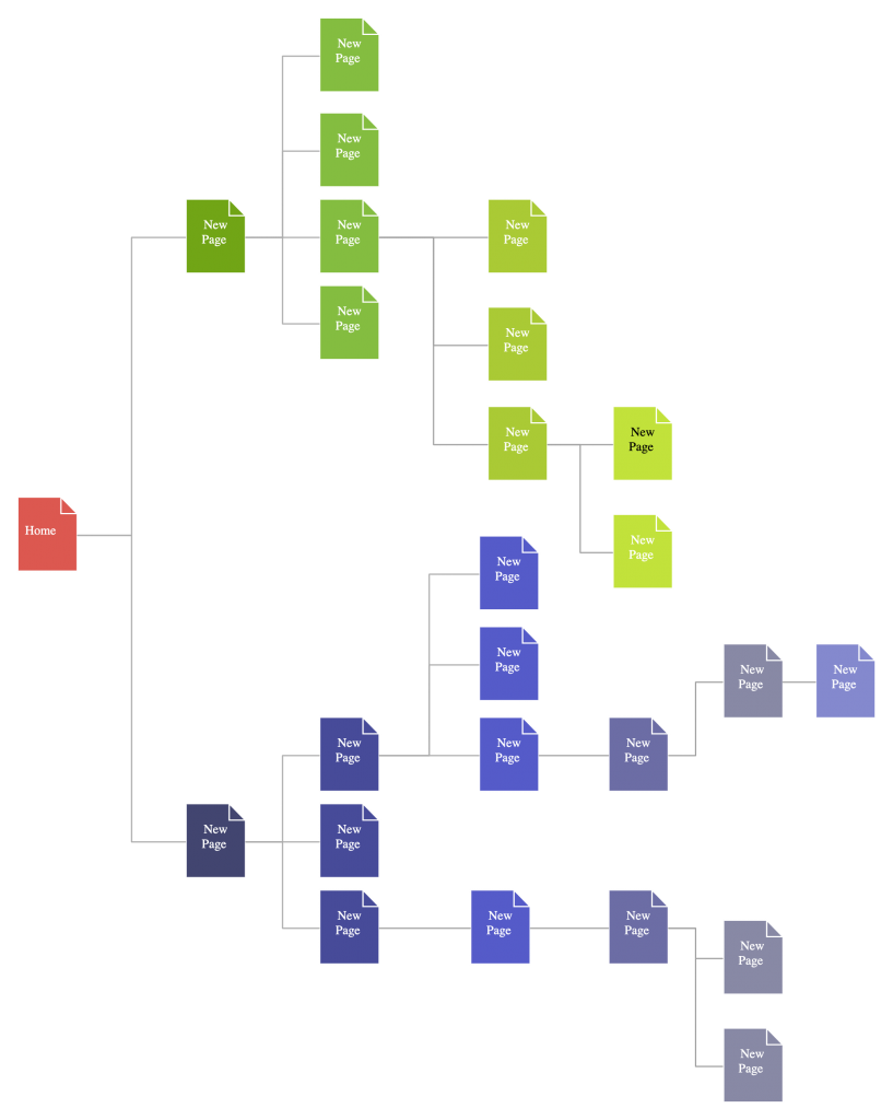
- Break complex diagrams into several smaller ones. If the diagram span multiple pages, you can represent it in readable smaller diagrams that are linked together. Use the Creately viewer to easily navigate from one diagram to the other.
- The Viewer also allows to embed larger diagrams in smaller spaces like web pages and blogs; it provides the readers the option to zoom in on the diagram and move around the diagram as they read it.
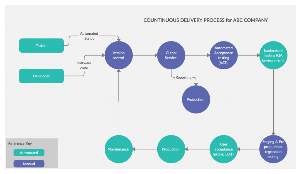
Add Legends/ Guidance
You may know what the different shapes, colors, arrows etc. in your diagram stand for, but your reader might not. That’s where you can add a legend to clarify what a specific element in the diagram denotes
Similarly, you can add swimlanes in flowcharts to highlight different departments, actors etc. And different colors in organizational charts to represent different departments or teams.
Be Consistent with the Lines in Diagrams
Lines in your diagram play an important role in making your diagram look good. When selecting the lines to use or determining the line weight, consider the font and the font weight you’ll be using as well.
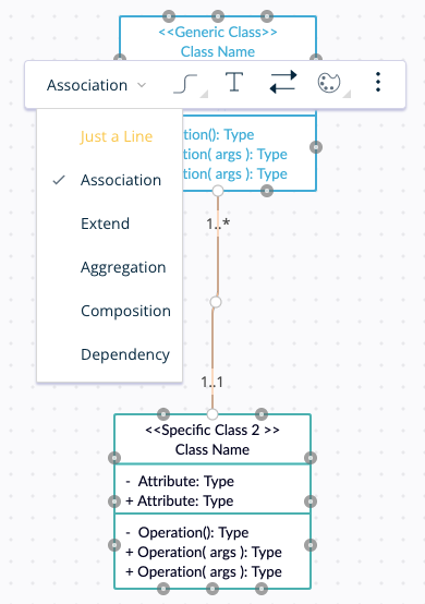
And in technical diagrams like UML diagrams, you’ll have to be extra careful when selecting the right connector types. For example, there are several types of class diagram relationships. However, with Creately it’s easier, as its smart connectors automatically figure out the connector head according to the context.
Keep Plenty of Whitespaces
Minimal whitespace will clutter your diagram, and too much whitespace will blot out the connection between two objects. This is why you need to tune in just the right balance of white space into your diagrams. It helps put emphasis on elements as well as balance out the spread of objects in the diagram.
Use Creately’s ‘Hide Grid’ option to easily scan your diagram for how effectively you’ve used whitespace.
Align All Objects in a Logical Manner
Aligning objects in your diagrams in a logical manner – whether from left to right or from top to bottom – makes it easier to go over the information and understand it.
Got More Tips to Create Beautiful Diagrams?
In this guide, we’ve covered most of the steps you need to follow to create beautiful diagrams that you can add in your thesis, presentations, or business documents.
Have you got more tips to create professional diagrams to share with our readers? Let us know in the comment section below.
And don’t forget to check out our latest post – The Visual Guide to Launching a Product. It’s the one guide you need to develop a successful product launch strategy.