Donut Chart Maker
Create Stunning Donut Charts Online with Ease
Effortlessly transform your data into visually engaging donut charts. Visualize sales data, project progress, or survey insights with clarity.
Intuitive donut chart shape to quickly visualize data
In-built presentation tools to present data or survey findings
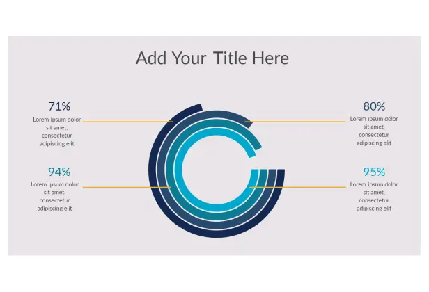
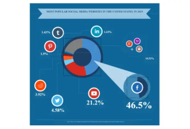
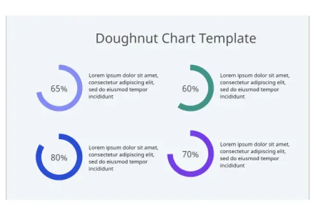
Access ready-made donut chart templates for sales, surveys, or reports


 Diagramming Visual Collaboration Org Chart


Turn Complex Data Into Clear Doughnut Charts

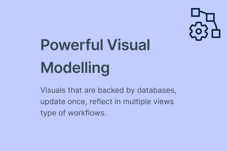
Exclusive donut chart shape designed for accurate data visualization and easy customization.
Customize every detail with color themes, labels, and text formatting to highlight key insights.
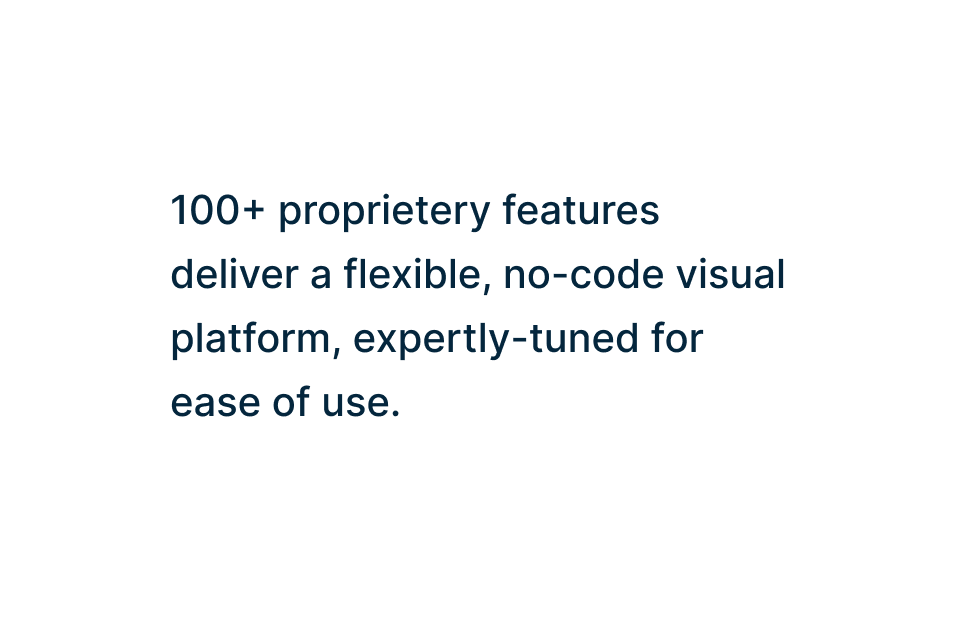
Access 50+ diagram types with specialized shapes and icon libraries.
Jumpstart your work with ready-to-use donut chart templates for surveys, sales, and reports.

Make Your Donut Charts Interactive and Insightful
Add multimedia, links, and embeds to create engaging, interactive donut charts.
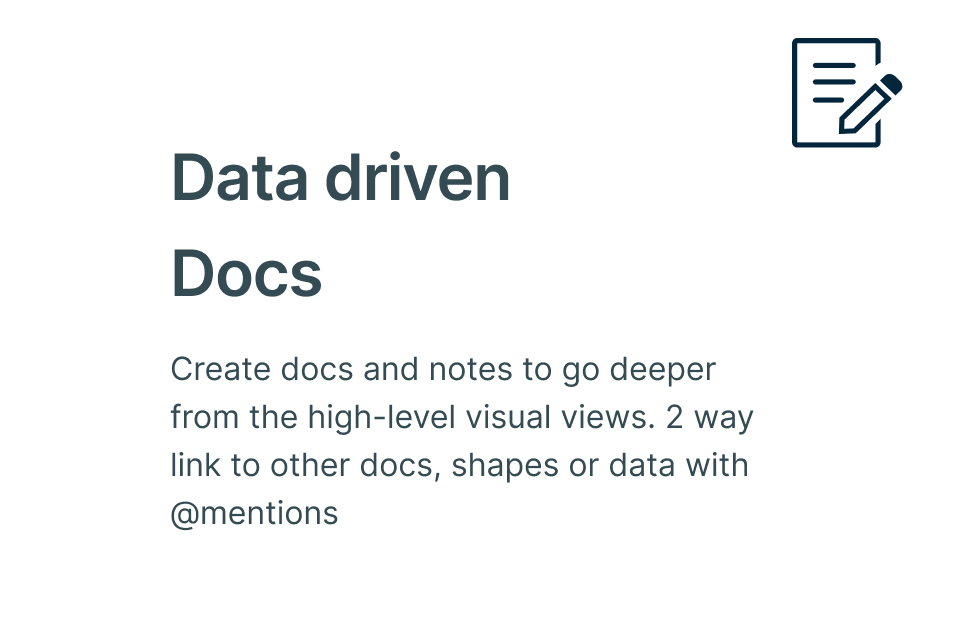
Attach notes, docs, and links to each slice of your donut chart for deeper context.
Turn your visuals into interactive presentations, dashboards, and reports with built-in tools.
Work Together on Donut Charts in Real Time

Co-create donut and doughnut charts with real-time cursors for unlimited participants.
Share instant feedback, comment, and discuss directly on the canvas — with full version history to track changes.
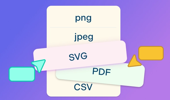
Export and share donut charts as PNG, JPEG, SVG, or PDF, or embed securely on a site or intranet.
Keep everyone aligned by centralizing conversations and insights around a single donut chart source of truth.
What Is a Donut Chart?

A donut chart ( or doughnut chart) is a circular data visualization that looks similar to a pie chart but with a hollow center, giving it a distinctive ring-like appearance. Each segment of the donut represents a part of the whole, with the size of the slice proportional to its value. This design not only adds visual appeal but also improves readability, as the empty space in the center reduces clutter and makes it easier to compare different data segments.
The central hole is often used creatively to display totals, percentages, or key performance metrics, turning the chart into an effective percentage circle or quick-glance indicator. Widely used across business, finance, and marketing, donut charts and doughnut graphs are excellent tools for illustrating market share, budget allocations, survey results, and audience breakdowns.
How to Make a Donut Chart in Creately?
Launch Creately
Sign in to Creately and open a new or existing workspace. This is where your team can collaborate in real time, so ensure all participants have access.
Add a Template or Start from Scratch
Choose a donut chart template from Creately’s library for a quick start, or use the special donut chart shape to create a custom chart. Templates save time while maintaining professional design.
Import and Prepare Your Data
Organize your data in a spreadsheet or CSV file, then import it into Creately. You can also use Creately’s table and data panel to input values, calculate percentages, and create labels for each segment.
Customize Your Donut Chart
Style your donut chart using Creately’s customization tools: adjust colors, fonts, and segment sizes, add legends, and use the notes panel or sticky notes to annotate slices with context, insights, or links.
Collaborate, Review, and Share
Share the chart with your team to gather feedback. Collaborate in real time using multi-cursors, comment directly on the canvas, and track changes via version history. Once finalized, export your donut chart in formats like PNG, SVG, PDF, or JPEG, or embed it in websites, emails, or presentations. Use Creately’s integrations with Microsoft Teams or Google Workspace to share charts seamlessly with stakeholders.
Create a Donut ChartCreate Donut Charts Online with Editable Templates

FAQs About Creately’s Donut Creator
What are Creately’s donut chart maker pricing plans?
- Free Plan — $0/month for basic donut chart creation and collaboration
- Starter & Team Plans — $8/month or $5/month billed annually
- Business Plan — $149/month or $89/month billed annually
Annual billing helps you save more while unlocking advanced collaboration, workspace management, and enhanced donut chart features. You can compare all available plans and features on the Creately Pricing Page.
How can you create donut charts faster?
Are there templates for different donut chart use cases?
Can teams collaborate on donut charts?
Can I add notes, data, and files?
Can I share, present, or export donut charts?