A large org chart should help people understand the organization, not force them to scan hundreds of boxes at once. The most effective approach is to maintain one complete, data-backed org chart while showing each viewer only the level of detail they need. By using collapsed branches, compact cards, departmental views, filters, search, and drill-down controls, you can keep even a complex hierarchy clear, navigable, and easier to update.
How to Organize and Navigate a Large Org Chart
1. Keep One Master Org Chart
Start with one complete source of organizational data. Include the fields needed to build and maintain the hierarchy, such as employee ID, manager ID, name, title, department, location, and employment status.
Avoid creating separate, disconnected charts for every department. These quickly become inconsistent when someone changes manager, moves teams, or leaves the organization.
Instead, import the hierarchy into Creately’s org chart software from a CSV, map the employee and manager fields, and generate smaller departmental or leadership views from the same underlying chart. Creately can validate missing IDs, unknown manager references, and reporting loops before building the hierarchy.
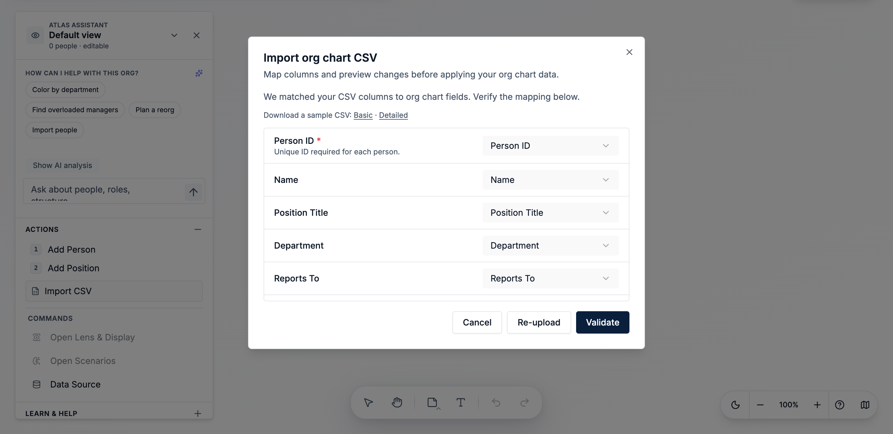
Tip: Confirm that the reporting structure is correct before adding secondary fields or visual formatting.
2. Show Only the Top Levels First
Do not open the chart with every employee visible.
For the default view, show the senior leadership team, major department heads, and one or two levels below them. Collapse deeper branches and let viewers expand the team or manager they want to explore.
In Creately, collapsed cards can still show direct-report and total-report counts, so viewers can understand the size of a hidden branch without displaying everyone. Large charts can also open with only the first few levels visible to reduce clutter.
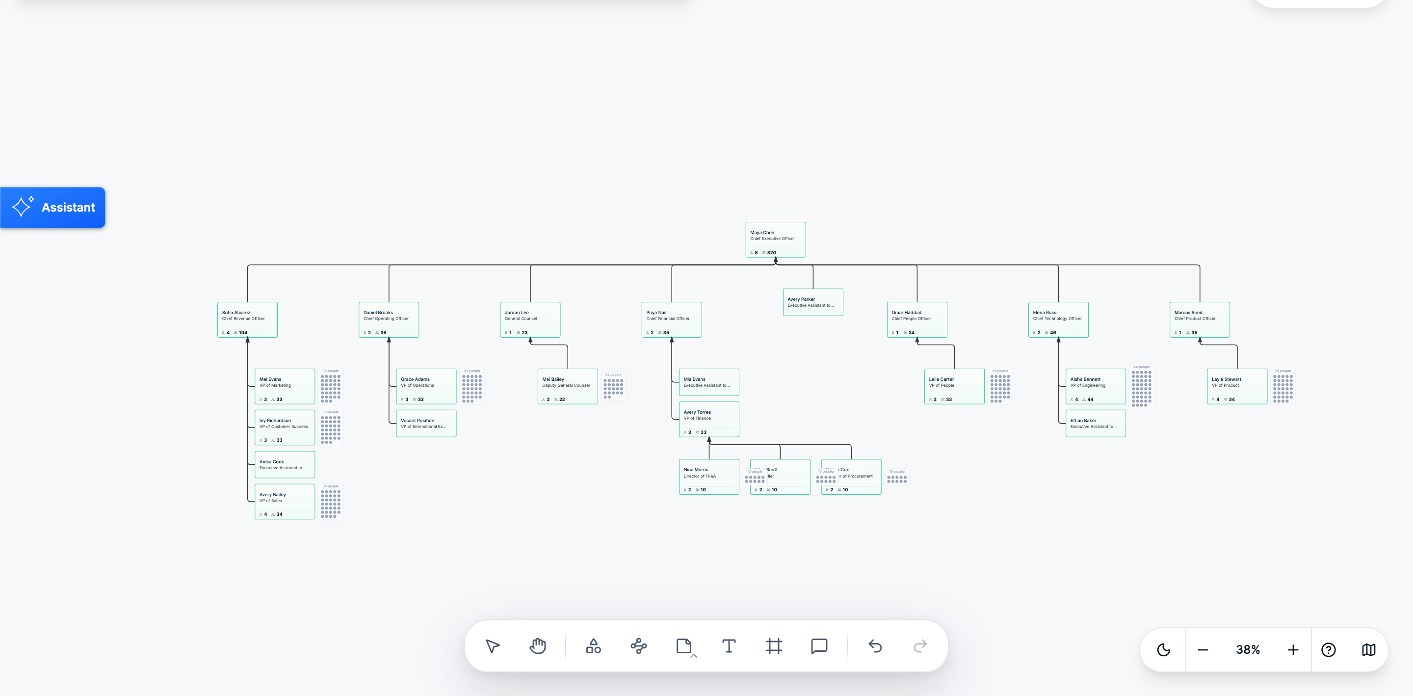
Tip: Begin meetings with the company overview and expand only the branch being discussed.
3. Keep Employee Cards Simple
Large charts become difficult to scan when every card contains a complete employee record.
For most company-wide views, show only:
- Name
- Job title
- Department, when useful
- Photo or initials, when useful
Keep details such as email, employee ID, location, manager, cost center, and tenure in the properties panel.
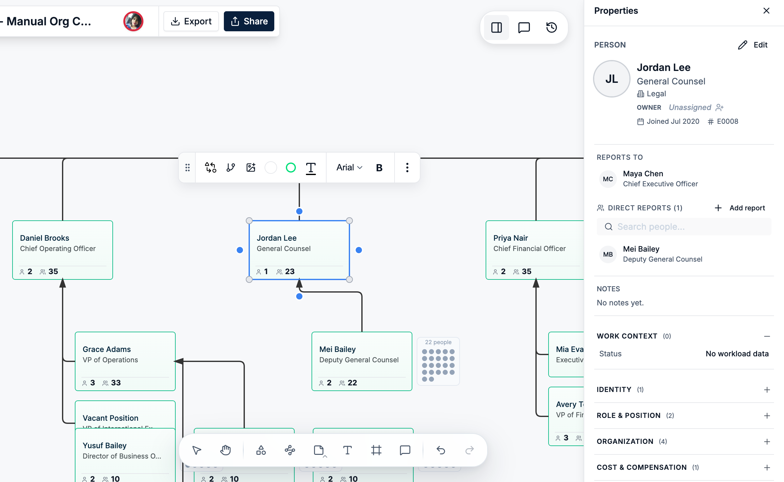
Use Creately’s Text Only or Photo Card styles with Minimal detail for the full organization. More detailed cards can be used when reviewing a smaller department or individual employee.
Tip: Use minimal text cards for the company overview and detailed cards only when the additional information supports the task.
4. Separate Departments Visually
Viewers should be able to recognize the main organizational groups without reading every title.
Use one consistent visual cue to distinguish departments, divisions, regions, locations, or cost centers. Color is often the simplest option, but it should have one clear meaning.
In Creately, you can color the chart by department, location, cost center, band, or management level. Because the color is based on stored data, the styling remains consistent as the chart changes.
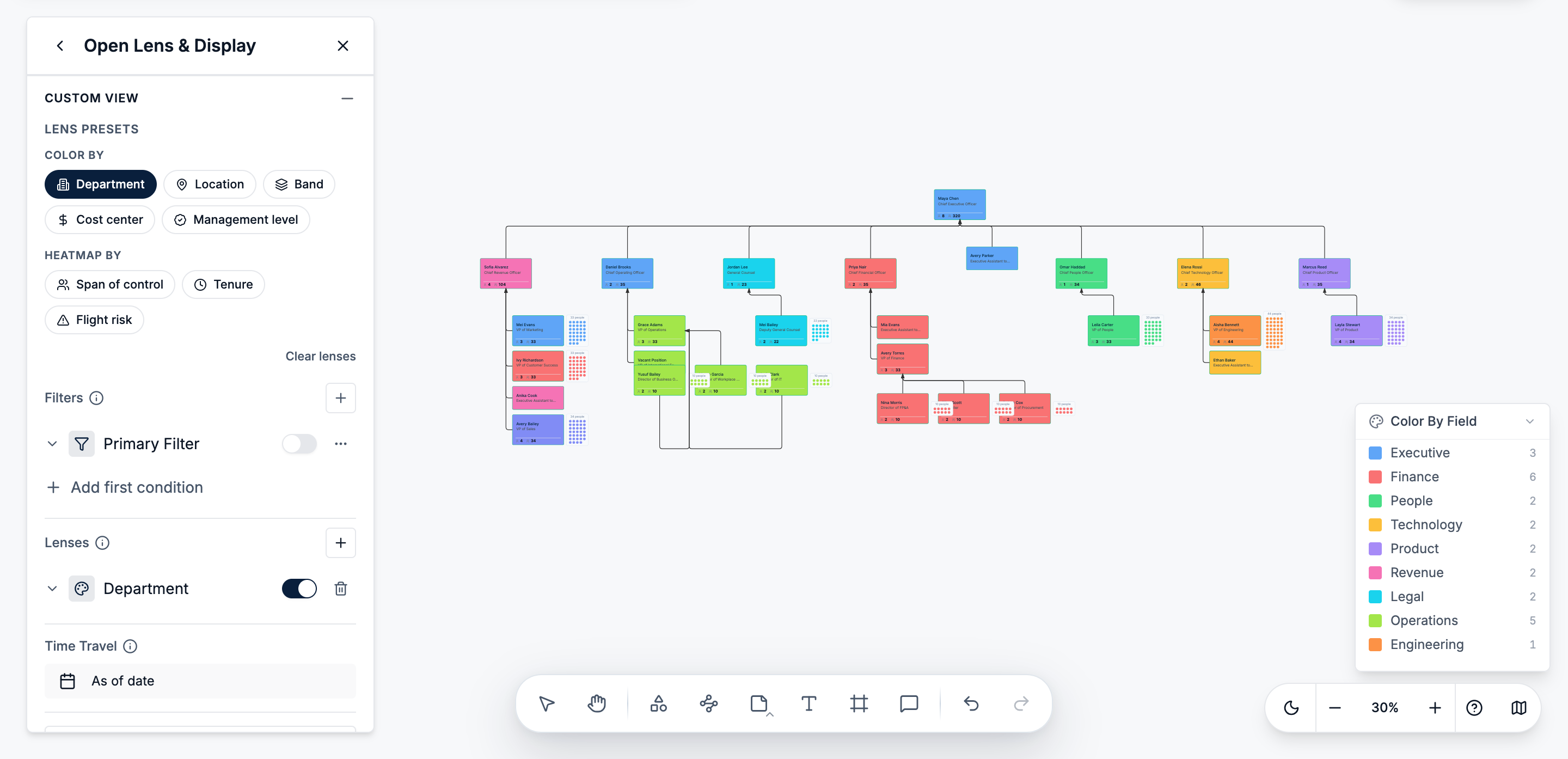
Tip: Avoid combining several color systems in the default view. Use a different lens when you need to analyze another field.
5. Apply a Consistent Layout and Spacing
A readable org chart should make reporting levels and team branches easy to follow.
Keep cards at the same management level aligned, leave enough horizontal space between departments, and use consistent vertical spacing between levels. Avoid positioning hundreds of cards manually.
Creately’s Auto Layout and Tree Mode can arrange the hierarchy after an import or structural change. You can then adjust horizontal and vertical spacing to suit the selected card size.
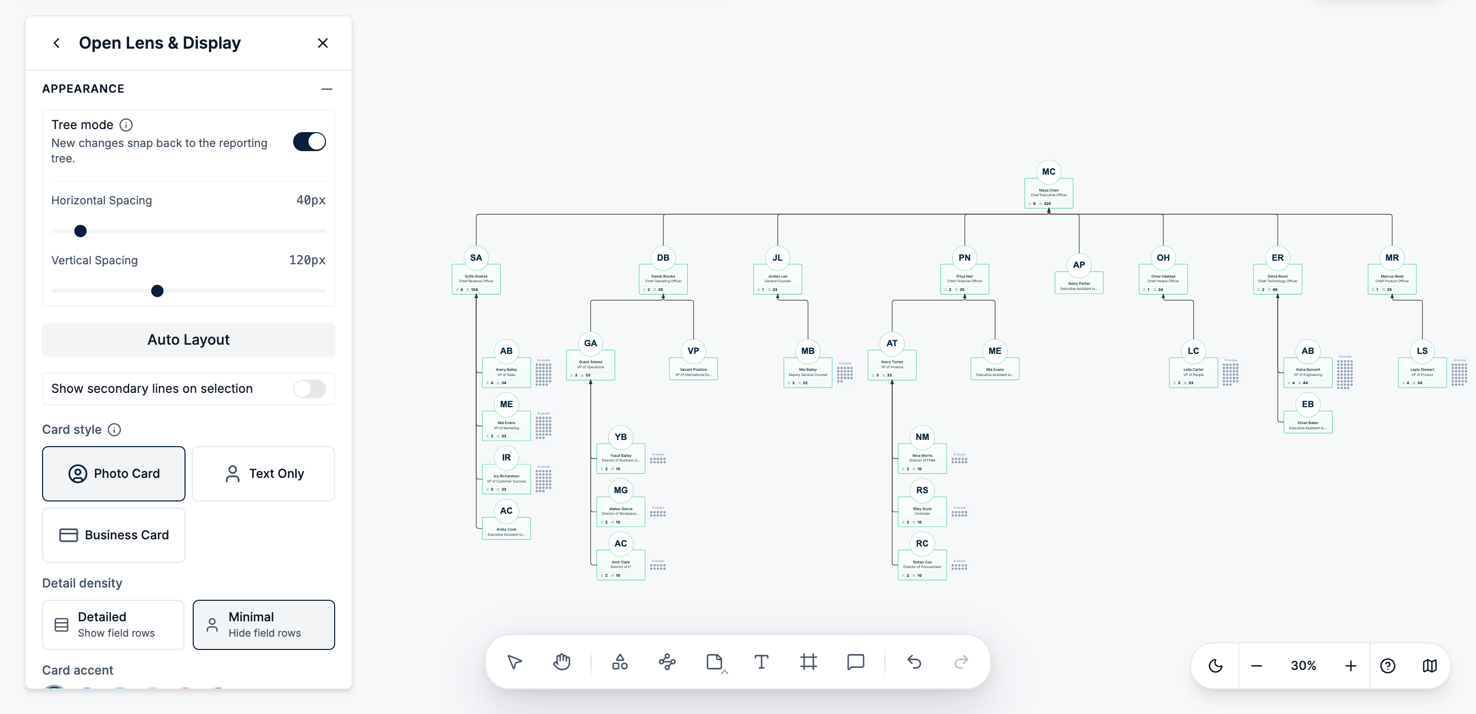
Tip: Choose the card style and detail level first, then adjust the spacing.
6. Let Users Focus and Drill Down
A large org chart should work as an interactive navigation tool rather than a static wall of boxes.
Viewers should be able to expand a manager’s branch, collapse unrelated departments, focus on one team, open employee details, and return to the company overview.
In Creately, users can collapse branches or focus on a department or manager’s subtree. They can also ask the assistant to “Focus on Engineering” or “Show Maya Chen’s team.” These actions change the current view without changing the underlying hierarchy.
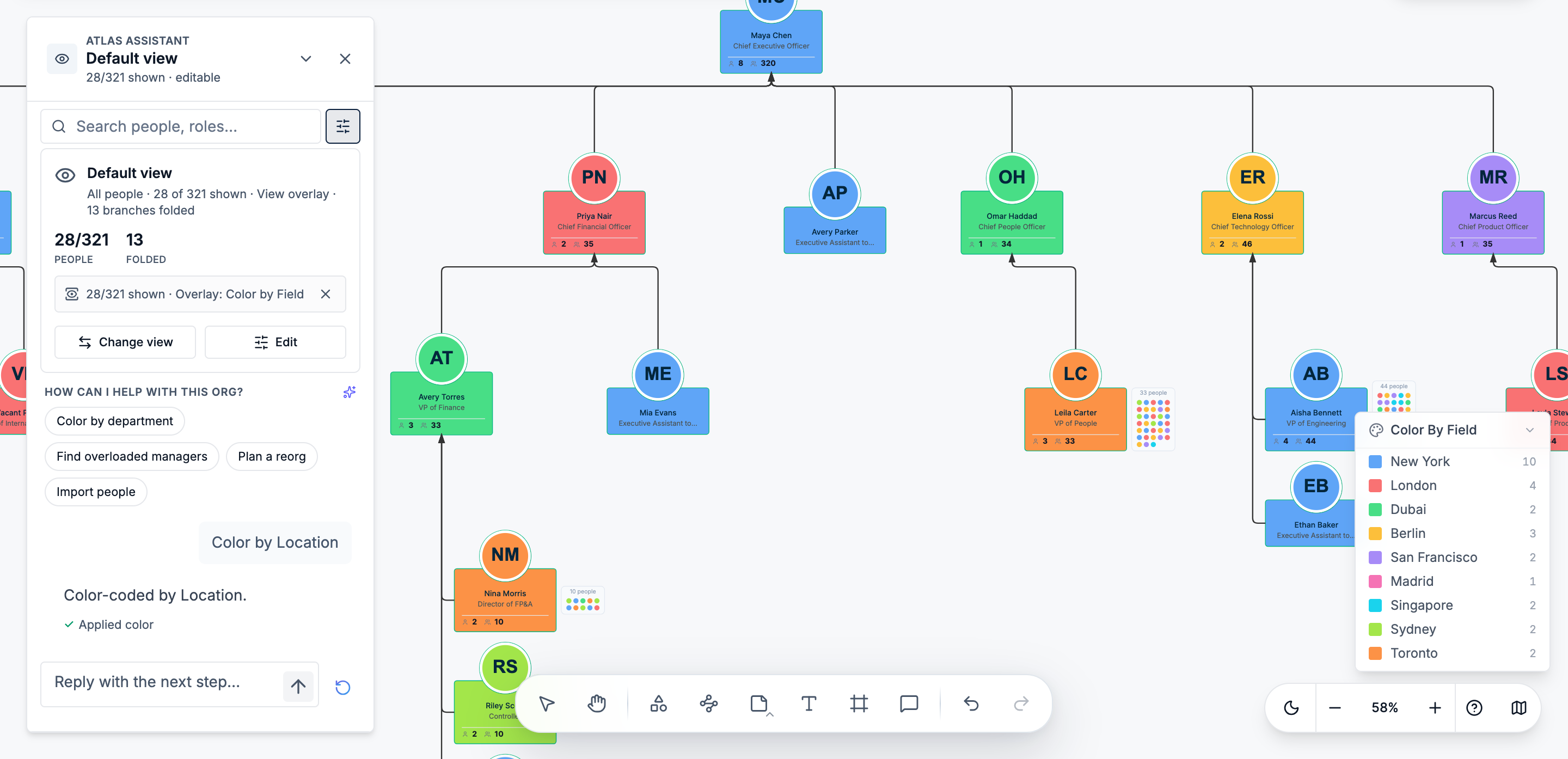
Tip: Use one focused branch at a time instead of opening several disconnected departmental charts.
7. Use Search and Filters Instead of Browsing the Whole Chart
People should not have to scan the entire organization to find one employee or group.
Use search when locating a specific person, title, or department. Use filters when you need to find people who share a characteristic across different parts of the organization.
For example, you may need to find:
- Everyone in a particular location
- Managers at a specific level
- Employees in a cost center
- Vacant positions
- People with less than one year of tenure
Creately supports search, multi-condition filters, custom views, and natural-language questions about the hierarchy. Frequently used filters can also be saved for repeated use.
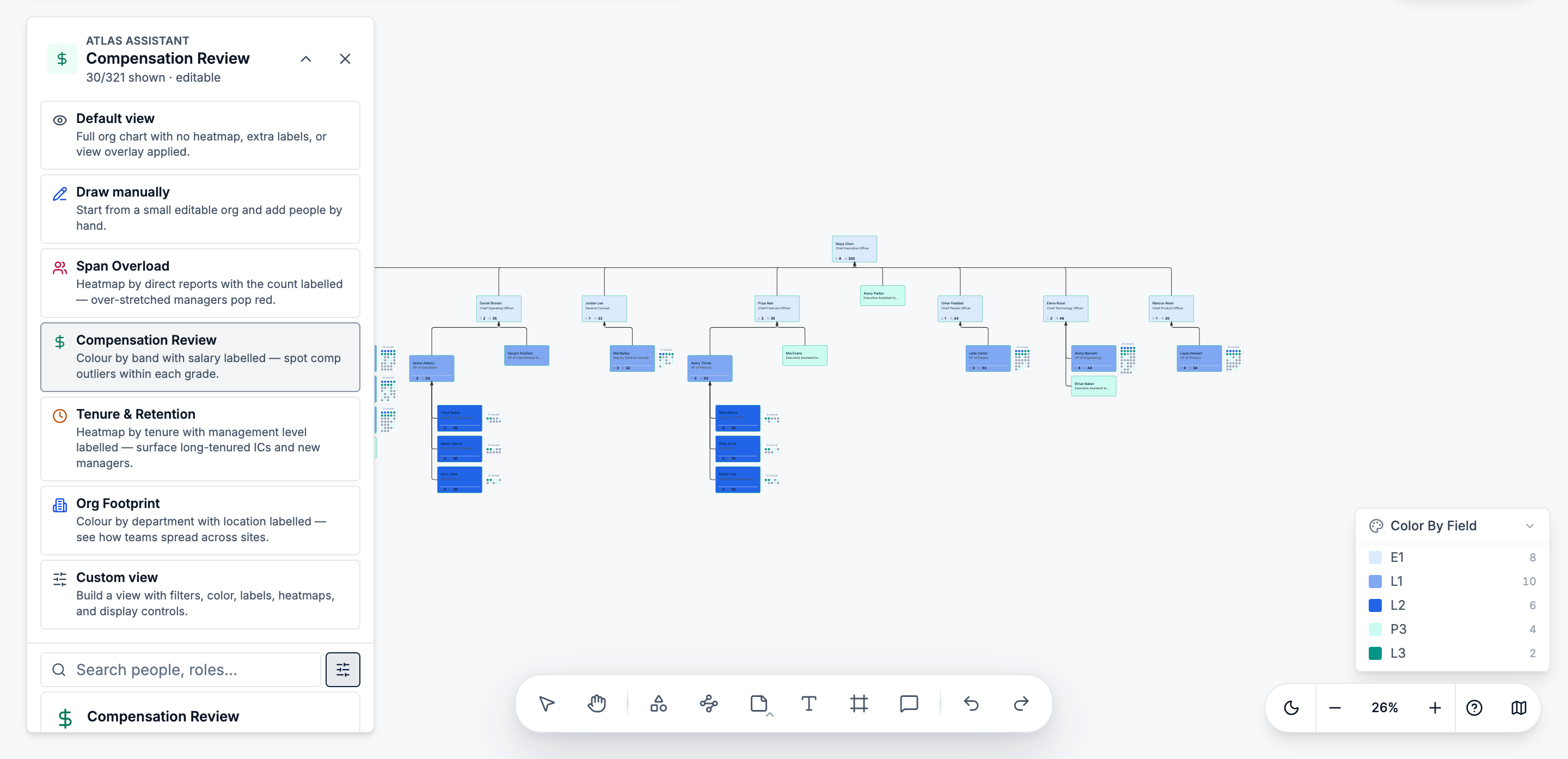
Tip: Use department views for structural exploration, filters for temporary questions, and search for a specific person or role.
8. Show Secondary Reporting Lines Only When Needed
Matrix and dotted-line relationships can make the chart difficult to follow when every connection is visible at once.
Use the primary reporting line to define the main hierarchy. Give dotted-line, matrix, assistant, project, or team relationships distinct visual styles, and reveal them only when relevant.
Creately supports separate relationship types for primary, dotted-line, and matrix reporting. The option to show secondary lines on selection helps preserve a clean default view while keeping complex relationships available.
Tip: Treat secondary reporting lines as supporting detail, not as part of the permanent overview.
9. Create Different Views From the Same Data
Executives, HR teams, managers, and employees do not need to see the organization in the same way.
For example:
- Employees may need a simple people directory.
- Executives may need a leadership overview.
- HR may need detailed workforce information.
- Managers may need a focused team structure.
- Finance may need a cost center or location view.
Use different lenses, filters, colors, card settings, and field visibility rules while keeping the same underlying data. Creately’s viewpoints are non-destructive, so different users can examine the same chart in different ways.
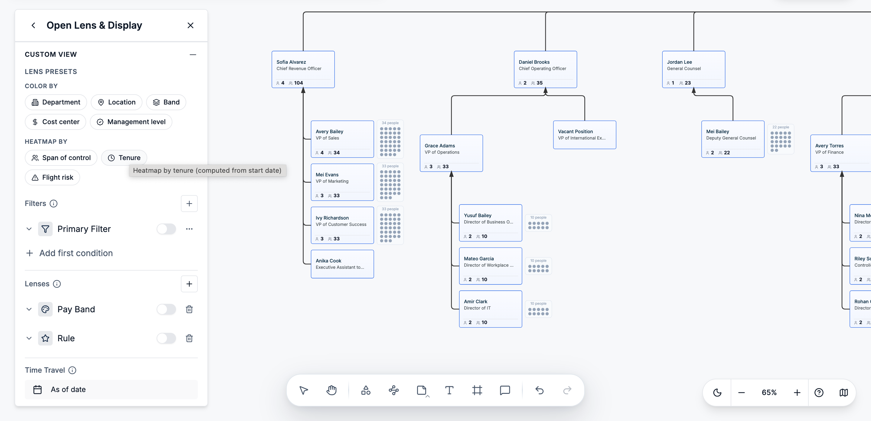
Tip: Name frequently used views clearly, such as “Executive Overview,” “Engineering Structure,” or “Regional Headcount.”
10. Keep the Org Chart Current
Even a well-designed org chart becomes unreliable when it is not updated.
Create a clear process for recording new hires, departures, manager changes, transfers, promotions, title changes, vacancies, and temporary assignments.
Assign ownership to HR, People Operations, or another team with access to the official employee records. Update the master chart directly or refresh it through a new data import.
Creately supports real-time collaboration, auto-save, comments, role-based permissions, and scenarios for proposed structural changes. This allows teams to maintain the live chart while testing reorganizations separately.
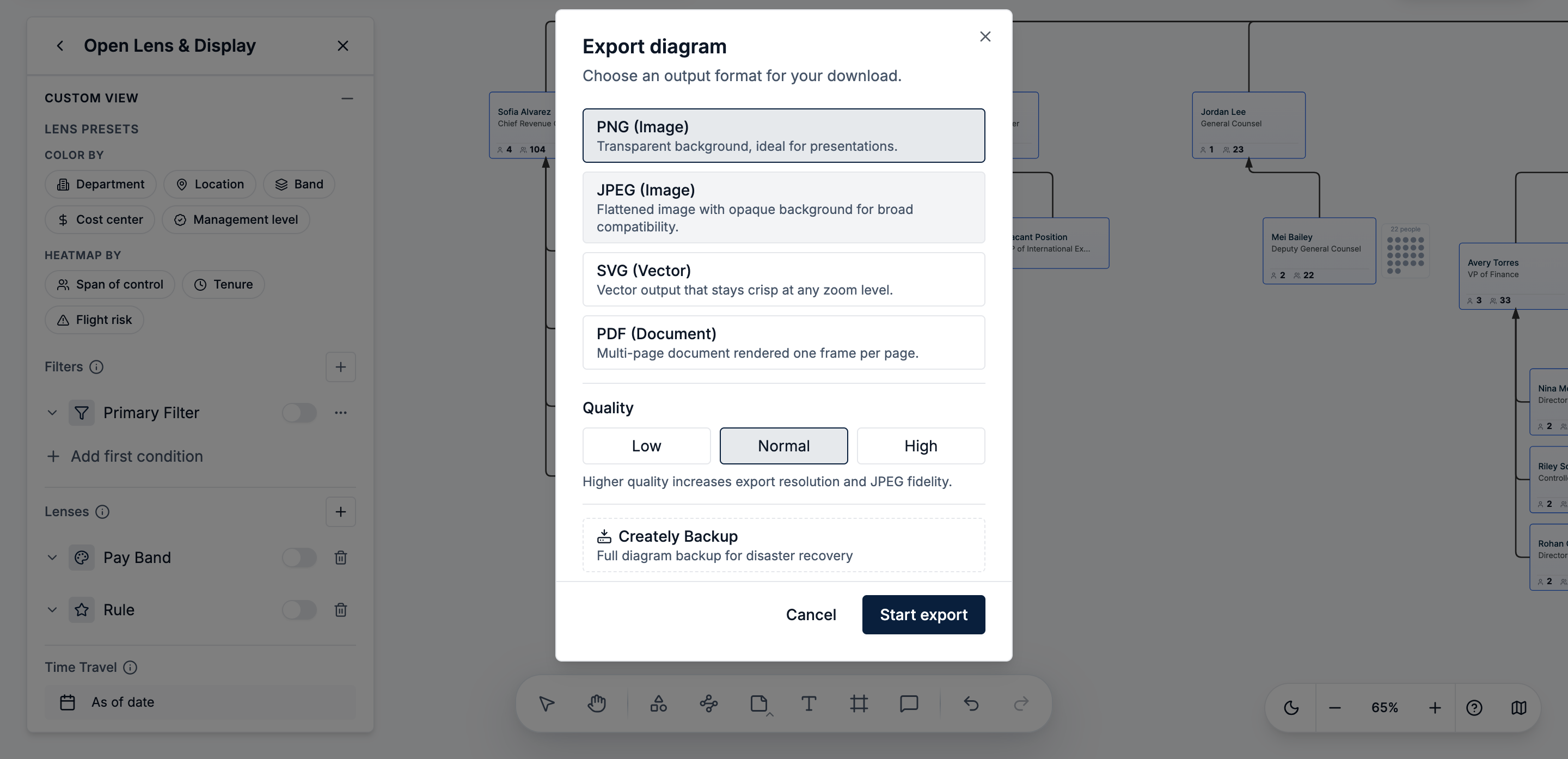
Tip: Share the live chart whenever possible. Export a PDF, PNG, or SVG only when a fixed snapshot is needed.
FAQs About Large or Complex Org Charts
How many people can you include in one org chart?
There is no universal number at which a chart becomes unusable. The important factor is whether the tool can load the hierarchy efficiently and let viewers collapse, search, filter, and focus instead of displaying everyone at once.
Should a large company use one org chart or separate charts?
Use one maintained organizational dataset, then create company, department, regional, or leadership views from it. This gives users smaller views without creating conflicting sources.
Can a large org chart show a matrix structure?
Yes, but primary and secondary relationships should use distinct line styles. Show secondary lines selectively so the default chart does not become overcrowded.
Is an interactive org chart better than a PDF?
An interactive chart is better for search, navigation, updates, and drill-down. A PDF or SVG is useful when a fixed snapshot is needed for a report, presentation, or printout.
Who should be responsible for maintaining the org chart?
Responsibility usually sits with People Operations, HR, or another team that has access to authoritative employee data. Department heads can review their branches, but one process should govern final updates.