Carrying on from our last post, i.e. Choosing Color to Improve your Diagrams, we thought we’d delve into another aspect of Diagramming, which is on how Lines should be used for better readability, aesthetic appeal and clarity. This post is inspired by an excellent presentation done by Enrique Garcia Cota, which forms the basic foundation for what you are about to read. While some of these tips may be common knowledge, the sad fact is that we’ve seen how even “professional” diagrams have suffered when it comes to readability and clarity. Thus, do pay heed to what we have laid out here as best practices, since this would only help you churn out diagrams that are both professional and effective.
1. A zero-point Line Width is not good. . .
…simply because you are asking whoever is “reading” your diagram to strain their eyes. Rather, it would make sense to have at least a 1.50-point line width as depicted below.
2. Consistency is Something that is. . .
…key when it comes to line width. Generally, one other factor that does affect aesthetic appeal is having a diagram with different line widths. Fine, we are aware that you cannot be too drastic when it comes to enforcing this particular rule. So using your better judgement, it is better to stick to changing the line width of one element instead of all three. See what we mean below.
3. The Utilization of the Line Head. . .
…needs to be consistent, too. For instance, if you are drawing an UML diagram, the line head needs to be relevant since a different line heading would mean that your diagram is wrong. In a general diagram, like the one below, using different line heads would mean it’s inconsistent and also aesthetically unappealing.
4. If a Dashed Line is going to be Used. . .
…then make sure you pay attention to which dashed line you are using. Once again, while you may be forgiven for using inconsistent dashed lines in some diagrams, doing so in a UML diagram would be unforgivable.
5. Opt for Connectors, not. . .
…straight lines. Diagramming has evolved in such a way where you really do need to pay attention to the smaller details, which make the whole diagram more neat and tidy. The example below, makes this argument quite clear.
6. To choose Lines or. . .
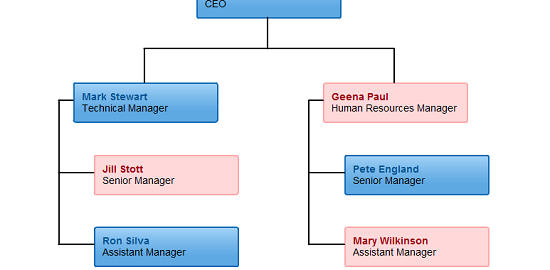
…to choose shapes? If that is your current question, the answer is it depends on the diagram. If you consider this infographic, having shapes is perfectly fine. However, when it comes to flowcharts, org charts and sitemaps, the best choice is to stick to lines along with the appropriate heading.
7. Lines with a Coloured border or just Lines? Well,. . .
…you be the judge. This point is more to do with aesthetics than anything else. There really is no problem with having a border around your diagrams, some would think that such a practice lends a sense of substance aesthetically, while others would prefer a more minimalist approach. One work of caution though. If you choose one style for your diagram, make sure you stick to it.
All things considered, remember that diagramming is certainly an endeavor that revolves around both the artistic and scientific. The proper portrayal of information should be conclusively right, it should also be aesthetically appealing as well. For more interesting tips and trends on diagramming, stay tuned to this space. In the meanwhile, do get in touch with us here, if you do have any queries.


