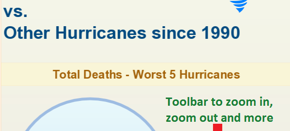
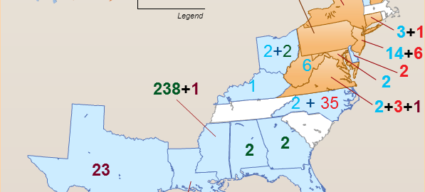
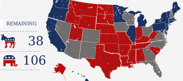
If you’ve been on Facebook, Twitter, or any number of blogs in the last year or so, you may have come across a trend of visual articles called infographics. Popular because they make a bigger, visual impact on readers, infographics are everywhere. Readers tend to pay more attention and hold information longer when you pair it with these eye catching graphics.
But not all infographics are created equal. Effective infographics have many common characteristics. Here are four components that will increase the effectiveness of your future infographics.
A Visual Story
An infographic is a visual version of a blog post or article. Just as you’re telling a complete story with a article, your infographic has to have a start, middle, and finish. There also has to be a “so-what”–an overreaching point to the whole thing. Why should the reader care about what they just read?
One way to make sure your infographic accomplishes this is to start with a written outline before you even consider the graphics. Give it the same test you’d give a blog post or an article. Does it make a point? Does it include supporting facts? Does it follow a logical sequence of information? Remember that the graphics should enhance the story, not substitute for missing pieces of it.
Example: 10 Most Mysterious Airplane Crashes From the History
Maximum Shareability
If you release an infographic into the world and no one shares it, does it make a sound? Of course not. The entire point of creating these visual articles is to have them shared via social media networks and blogs. You’re looking for your information to be shared with a link back to your website.
Provide readers with the tools they need to easily share your infographic. Give them the embed code for your image so they can post it on their blogs. Add social media sharing buttons to your page to make sharing to Facebook, Twitter, and Google Plus a one click action. Finally, ask and you shall receive. Add a line to the end of the article asking your readers to share the image with anyone they feel would be interested. You can even email complementary websites and blogs with your infographic and ask them to share if they feel their audience would enjoy it.
Verifiable Facts
Early 2013 saw a rash of infographics with facts that later turned out to be not true. In their rush to create something that would go viral, some internet marketers put out infographics without fact checking the statements they were making. Minor backlash ensued, making media outlets a little more critical of the infographics coming their way.
No matter how visually beautiful your infographic is, it must be supported by verifiable facts. In fact, it’s always a good idea to cite your sources. You can do so by putting an asterisk next to anything you have a citation for and adding the source at the bottom of the infographic. It will show your readers and publications that want to share your creation just how serious you are about presenting a truthful infographic.
Solving a Problem
Infographics for fun are nice. There are plenty of organizations that want to create an infographic because they are trendy. But if your infographic doesn’t solve a problem for the reader, its chances of being effective are low. Ask yourself what the reader gets out of the deal. Are you answering a question she might have? Did you bring to light an issue she might have overlooked? Are you helping her make a decision or showing her how to complete an action? If you can’t come up with anything, go back to the infographic drawing board.
Bio: Brian Lakeman is blogger and Brand Manager for Activ8me fibre broadband. He enjoys writing about technical topics that relate to internet users.


I think the most important thing in every infographic is to make it super easy to read for every one (and show the data with comparative graphics) we have some inspiration of amazing infographics here:
Some great points about infographics. I particularly resonate with the notion that good infographics always tell a story – so true. Oftentimes, when we’re trying to convey information or data, we want to just info-dump on people. Info-dumping is difficult to absorb and digest, even when the info is conveyed in pictures.
We might be living in the information age, but we’re narrative creatures. Expressing and conveying information THROUGH stories is how we can really connect to an audience, and convey those precious info-nuggets 🙂
An infographics make the article more colorful. infographics helps to understand anything clearly & the visual picture attracts the readers more than text
Hopefully with the importance of effective infographics growing and growing so will the quality of the infographics. With the rush to publish, not only have facts been wrong, but shoddy workmanship has brought some results that don’t look attractive and do more harm than good.
Making sure that the graphics are all a high resolution makes a big difference too. Thanks for the details on how to be more effective.
I agree with you completely that a really great infographic, if it isn’t shared with the world, is a complete waste. Which is why, as you suggested, it is important that one makes it easy for their inforgraphic to be shared via networking instruments like Facebook, Twitter, and Google Plus etc.
This is completely amazing! I love your ideas. Keep up the good work.
This post is getting bookmarked for me. I’ve been brainstorming about how to convey some teachings I’d like to share, and my wife told me about infographics, because of course, she is a Pinterest addict! So this is going to give me a little shape and form to them, so we have some good luck out of the chute with them hopefully. Thanks much.
-Doc Jec
Hi Nishada
Thanks for publishing Brian’s article explaining what Infographics are and how they work. My wife and I were just this morning wondering what the term meant. Obvious I suppose…
However, I still prefer the written word. Pictures confuse me unless they are by Titian or Cezanne my favorite painters:)
But that’s just me I guess.
Prosperity
davethescribe