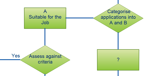
We just finished with Part 1, Part 2 and Part 3 on the basics of UML diagrams. We now have a two-part series on Flowcharts. This is a very straightforward post, which you will find useful when it comes to getting your diagrams picture perfect. When it comes to flowcharts, one of the most significant things to consider is the element of clarity and attention to detail. Flowcharts, as we all know, can range from solving simple to complex problems. However, there is a list of common mistakes and flowchart guidelines to avoid them, which you should be cautious of.
 Every symbol has a meaning. While it may seem convenient to use a process symbol for everything, this could end up confusing the reader. To get a better understanding of what symbols are relevant when reading up on what each object is all about.
The two most widely accepted flow directions are top to bottom or left to right. Having said that these two types of directions should not be mixed into the same flowchart. Consistency really does matter.
3. Excessive color schemes
Your flowchart is designed to give a solution to a problem. With this in mind, the last thing you want to do is to have your message lost in visual noise.
4. Symbol sizes should be consistent
Maintaining a flowchart that is well proportioned is vital when it comes to avoiding a visual mess. As a rule of thumb, ensure that the height and width are in proportion to each other and the rest of the symbols in the flowchart. This is not, however, applicable to objects that are meant to be intentionally small, like connectors.
5. The need for consistent branch direction
In a perfect world, a flowchart should be logical in all aspects. One of the areas that we do not pay much heed to is branch direction. The best example to illustrate this point is with Decision symbols. Ideally, TRUE conditions should flow out from the bottom while FALSE conditions should flow out from the right side.
6. Flowchart symbols and spacing
More often than not we choose to ignore this crucial point. To make your flowchart more professional you should maintain even spacing around symbols. The one exception to this rule would be Decision symbols, which require extra space to accommodate branch labels.
7. Remember to scale
One of the most basic facts that are overlooked is scaling. Too often a detailed flowchart is re-sized to fit just one page. This is never a good thing. It is better to have a flowchart span multiple pages than to be crammed into a small space, where all the details are unreadable. If you really aren’t happy to span your flowchart over several pages you might like to create a high-level flowchart which incorporates several process steps in to one. Alternatively you can also group processes together and then collapse them to reduce the visual clutter of your flowchart.
8. Extended flowcharts
If your flowchart is connected to another flowchart, then instead of putting it in just one page, it is best that you connect it via a circular node to the flowchart on a different page.
Well, that’s the first 8 flowchart guidelines done and tidied away. Keep this list of flowchart guidelines to avoid flowchart mistakes handy and next time run through it at the end of your next flowcharting exercise. We’ll go through the remaining 7 flowchart guidelines and flowchart mistakes in the next post. In the meantime, if you have a common flowchart mistake you think others should avoid let us know in the comments and we’ll make sure it’s covered.


i have never been very good at creating flow charts. in fact,, i’ve never been very good at understanding flow charts. Your article and the good instruction makes me feel like maybe, just maybe even i can produce a decent, easy to follow chart for an upcoming management meeting. thanks much
Hi,
Can group two process into one process?
example
___________________________________________________
| Total_Earnings = Basic_Salary + Overtime + Allowance |
| Total_Deduction = EPF + Scheduled_Tax |
| Net_Pay = Total_Earnings – Total_Deduction |
————————————————————–
Very usefull FC guide!!
[…] 15 mistakes you would unintentionally make with flowcharts ( Part 1 ) […]
[…] flowcharts to UML diagrams, we’ve offered quite a bit of important reading material for you out there. […]
[…] is the final post of our two-part series on Flowcharts. Part 1 can be found here. Remember what really matters is having clarity and attention to detail when […]