Conversion rate optimization. The science of optimizing your website to convert more site visitors into customers. There are countless guides and checklists written around the post. But we are about to go about it in a different way – a more visual-friendly way, as that’s what we specialize in.
Conversion optimization has a lot of elements to keep track of, and getting them on to one place to analyze makes it easier for everyone who’s involved. The best way to do this is through visualization techniques like flowcharts.
There are multiple ways prospects may convert into your customers.
- Users who convert on a website; there might be multiple objectives (i.e. buy a product, buy more, download eBook, register, sign up for newsletter etc.) as to why they convert. The paths they might take before they convert may also vary.
- Users who convert through a drip campaign; drip campaigns allow businesses to generate leads through email. These emails are automated and are triggered by actions that user you’ve segmented take. For example, a welcome email you send once a user get registered to use your app.
- Leads generated through other online/ offline sales processes; this might include conversions that your sales team generates through manual emails, phone calls, interviews etc.
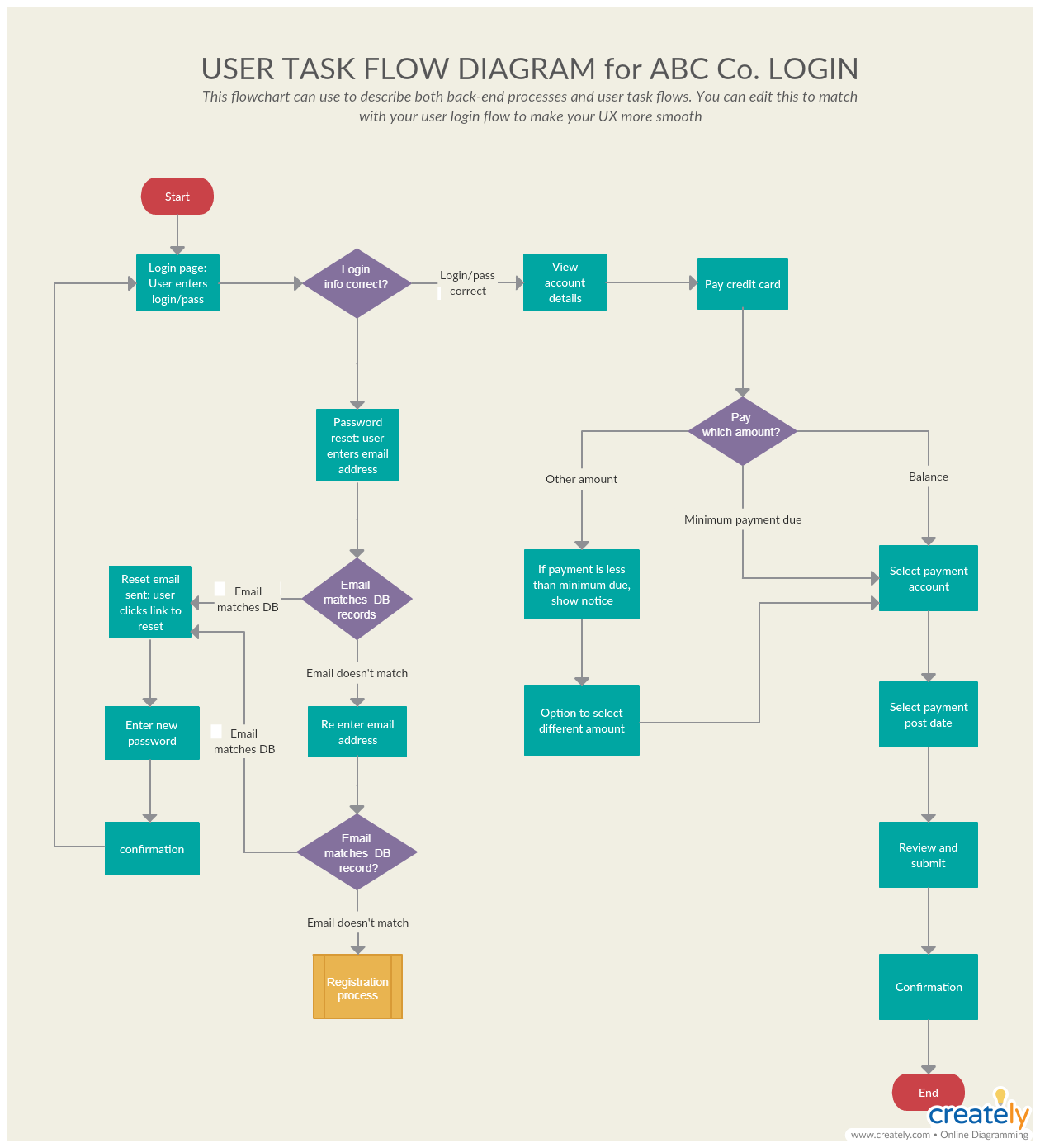
Start with Analyzing Your Sales Funnel
Not all prospects that enter your sales funnel engage in the same way or convert into a customer. It’s important to learn who do and what contact points trigger them to do it.
This is a lot of information to analyze; you need to look into how the customers first come across your site (flows into the funnel), how they browse through it, and engage and retain after they’ve made their purchase.
The easiest way to get a clear picture of this is to map the sales funnel flow with a flowchart. It helps to identify the gaps and blockers in your process and improve it for future use.

Sales Funnel Flowchart Template (Click on image to edit online)
Get to Work on User Flows
Users on a website or app might take different paths to get to what they want. Visualizing these flows will help understand your user behavior as well as any blockers or bottlenecks that may cause them to bounce off your website.
Ultimately these maps will help you improve the user experience on your site.
User Flow Diagram Template (Click on image to edit online)
Tip: Instead of a flowchart, you can use wireframes – user interfaces the visitors will be engaging with – to map the user journey as well.
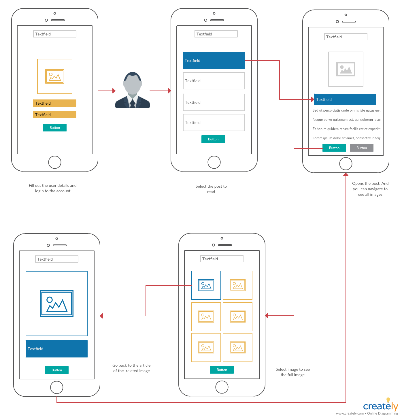
User Flow Wireframe Template (Click on image to edit online)
Document Each Step in the User Flow and Its Conversion Percentage
As you map your user journeys you can track the number of people that actually advance through the flow using data analysis tools. You can mention the percentage on the user flow diagram to get a quick conversion rate analysis at the end. Similarly, you can highlight any other percentages such as bounce rates on your user flows.
Bonus Tip: You can also link the shape for the step to the Analytics tools URL to get the source data.
Plan and Optimize Your Email Drip Campaigns
Setting up an email drip campaign might seem difficult, but only if you don’t have a plan. If you follow these few simple steps, it’ll be over before you know it.
Segment your email list
Planning a drip campaign starts with segmenting the email list or dividing it into subsections based on demographic factors or an action a user takes on your site or app (i.e. subscribe to your newsletter).
Create your message
Your message should be clear and actionable. Your language and tone should be personalized to match your target audience, but it should still adhere to your brand voice guidelines.
Plan the workflow of the campaign
Next is to outline the steps of your email drip campaign. Using a flowchart you can illustrate what the workflow looks like from the start of the drip campaign to the end.
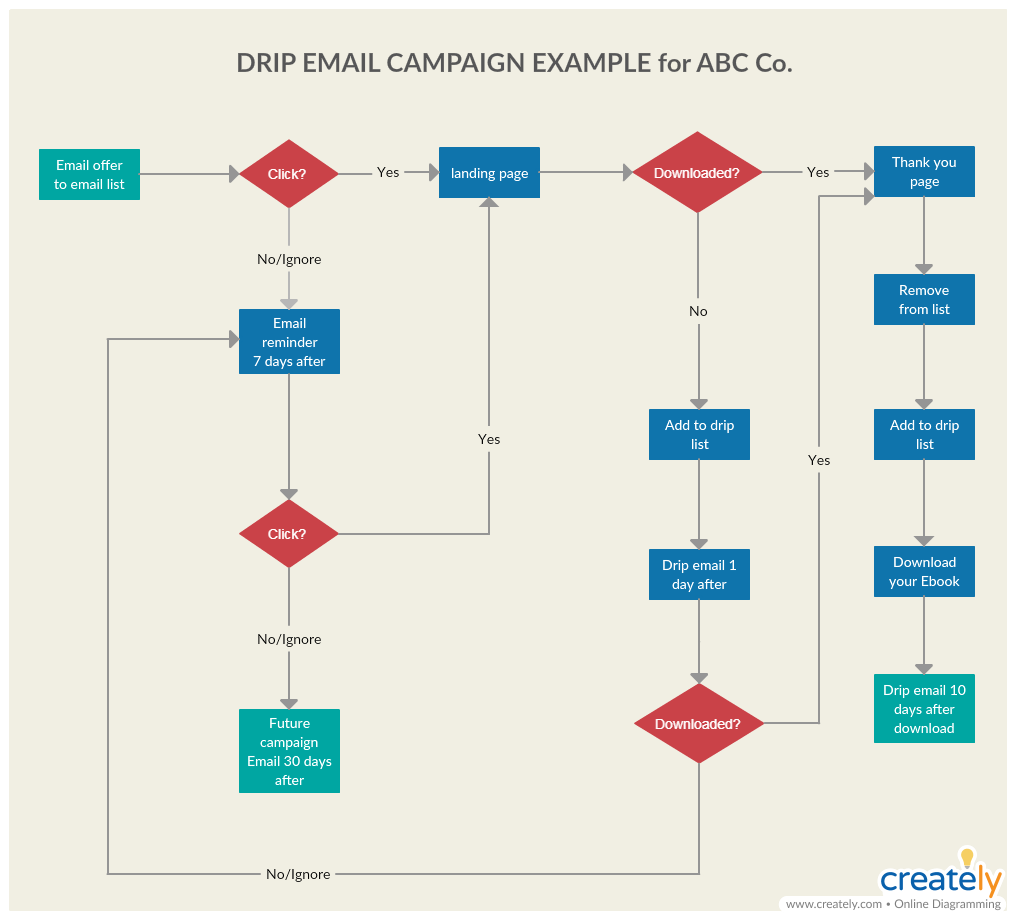
Email Drip Campaign Flowchart Template (Click on image to edit online)
Start, evaluate and improve
Once your campaign has started, you need to track results, even though it’s automated. If something is not working, you can re-adjust it. Adding Open and Click-through rates to your chart will help you visually understand patterns and opportunities to improve your campaign plan.
What are Your Thoughts on this Conversion Rate Optimization Plan?
We’ve listed here how you can easily create a conversion rate optimization plan to improve your website to attract and convert more visitors into customers. Any other handy conversion optimization techniques that you use to simplify the complex CRO marketing processes? Do let us know in the comment section below.
Also, don’t forget to check out our Ultimate List of Marketing Strategy Tools. It’s the list you need to make sure your marketing plans are high-impact and well-defined.