We’ve all felt it. The kickoff goes well, the intro emails go out, the playbook is in motion… and then things quietly stall. You follow up, get no response, and eventually realize the customer’s still stuck in a step you thought was done.
This kind of thing happens all the time in Customer Success. Not because anyone’s dropping the ball, but because the process isn’t visible enough.
Most onboarding journeys live in a mix of emails, slide decks, Slack threads, and mental notes. And when everyone is working from their own version of what’s happening, it’s no wonder things fall through the cracks.
Effective onboarding visuals help users grasp what matters quickly and confidently. It’s what helped me reduce churn, work better with other teams, and make the whole experience less frustrating for my customers and myself.
In this article, I’ll walk through how I’ve used simple diagrams to make onboarding more collaborative and less confusing. If you’ve ever had a project stall and thought, “This should’ve been smoother,” this is for you.
Why Visibility Matters in Onboarding
Back when I started in CS, I spent a lot of time following up on things I thought were done. I’d check the CRM, scroll through old email chains, create a customer health dashboard, ping Sales or Product for context… and still walk into customer calls unprepared.
What I eventually realized was that we weren’t lacking process,we were lacking clarity.
Each team had their own assumptions. Sales thought onboarding began the moment the contract was signed. Product thought it started after kickoff. Support waited until something broke. Meanwhile, the customer was unsure what was supposed to happen next.
It was messy, and everyone meant well. But without a shared visual, we were always a step behind.
It’s not just anecdotal. McKinsey found that teams using visual process mapping are more efficient and make fewer mistakes. That checks out with what I’ve seen. Once I could visualize our onboarding flow, I could finally improve it.
How Visualization Reduces Friction
When I started drawing out the onboarding process, even just sketching it on a whiteboard changed the way we worked.
- It became easier to spot where customers were getting stuck
- Handoffs between teams improved almost overnight
- Customers stopped asking, “So, what happens next?”
- And I stopped feeling like I was constantly playing catch-up
What surprised me was how quickly things improved. Just having one diagram that everyone could reference made a huge difference. I could see where we were slowing down, and more importantly, I could explain it to someone else.
Visuals gave me something to point to, so instead of vague conversations like “onboarding feels slow,” we could talk about specific steps and why they were taking longer than expected.
The Diagrams that Made the Biggest Impact
I’ve tried a few different visual formats over the years. These are the ones I keep coming back to because they actually help me do the work better.
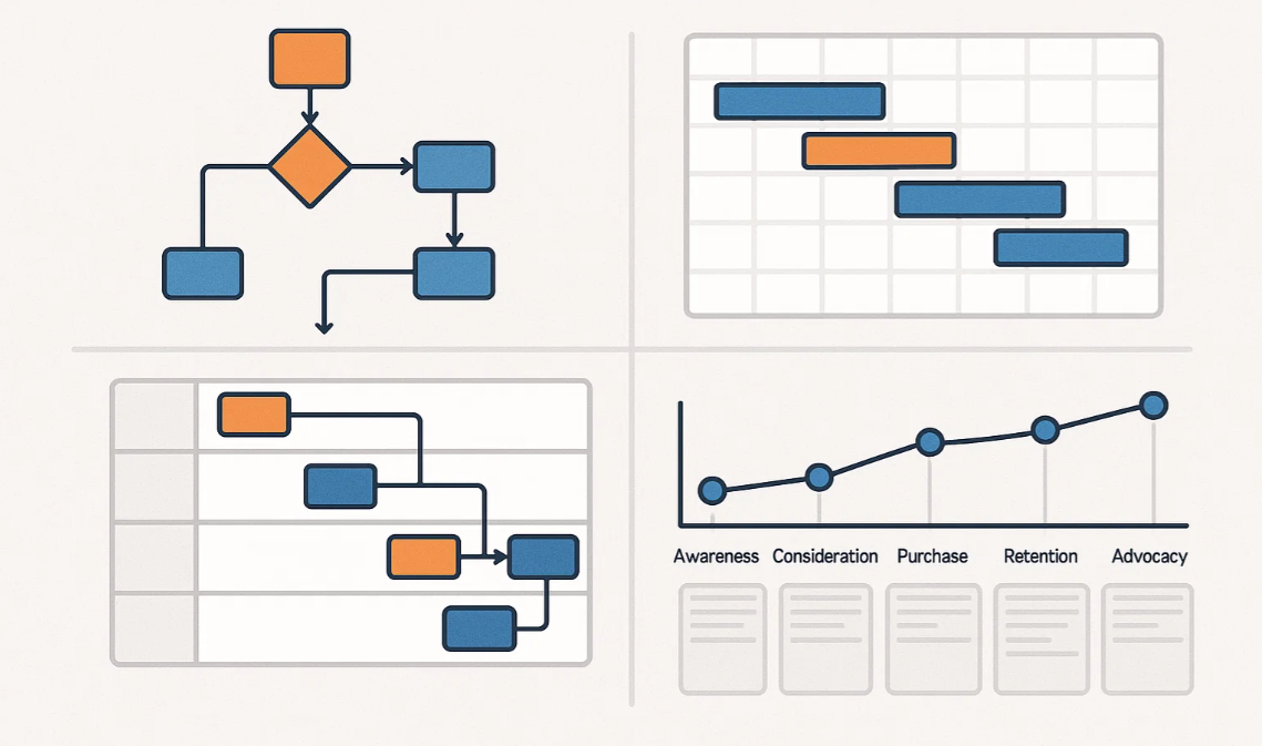
1. Onboarding flowchart
This helped me map out the key steps from contract to first value. Seeing the whole journey laid out helped highlight delays and unnecessary steps that weren’t obvious before.

Each company or organizations process will differ slightly to mine and you can create your own quickly using any number of flowchart templates available on Creately.
2. Swimlane diagram
I used this to show who was responsible for each part of onboarding. It’s a great tool when you’re working with Sales, Product, and Support, because it clears up ownership without needing to chase people down.
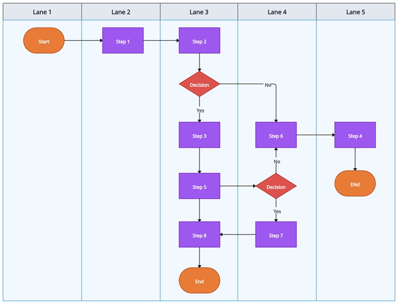
Above is a vertical swimlane flowchart available on Creately. You can quickly edit that and create your own swimlane.
3. Customer journey map
This one’s more about how the customer feels at each stage. I found it helpful to understand where things get confusing or frustrating from their perspective, not just mine. Below is customer journey mapping template you can use to do that. Make sure to change the lanes to match your user journey.

4. Gantt chart
When I needed to manage expectations, especially with larger accounts, this helped show what we were doing behind the scenes and what we needed from the customer. It kept everyone aligned on timelines without too many check-ins. Similar to above Creately has plenty of Gantt chart templates you can quickly edit and come up with a Gantt chart.
I didn’t build all of these at once. I picked the one that solved the problem I was facing, built it out, and refined it as I went. They’ve all helped at different points, depending on what needed fixing.
Common Friction Points Visuals Helped Solve
What undermines onboarding most is repetition, patterns that frustrate users without drawing attention. And once I started using visuals, I could deal with them before they turned into bigger problems.
- Missed handoffs between Sales and CS
I used a swimlane diagram to map out responsibilities. That helped reduce the awkward back-and-forth when it wasn’t clear who was doing what. - Customers unsure about what’s next
A Gantt chart helped make expectations clearer. It showed both internal work and what the customer needed to do, so no one was left waiting without context. - Internal teams duplicating tasks
I’ve seen Support, CS, and even Marketing send the same onboarding resources to customers without knowing it. A shared flowchart helped avoid that. - Long onboarding timelines with no clear reason
Mapping out time spent at each stage showed where we were slowing down. Sometimes it was a process issue. Sometimes it was a resource gap. Either way, at least I knew where to look.
None of these solutions were complicated. That’s kind of the point. Simple visuals worked because they were easy to create, easy to share, and easy to act on.
Final thoughts and how to get started
If onboarding has ever felt messier than it should, you’re not alone. In my experience, most of the friction comes from people not having a shared view of what’s happening.
You don’t need a new platform or a fancy dashboard to fix that. Just start with one clear visual that reflects your process.
Here’s how to begin:
- Sketch out your current onboarding flow on paper or a whiteboard
- Choose one visual format that fits your biggest challenge
- Use a tool like Creately to digitize and share it
- Get feedback from someone outside your team—fresh eyes help
- Revisit it regularly, because onboarding evolves as your product does
You don’t need to perfect it. You just need to make it visible.
If you’ve got your own visuals, use cases, or even just a question, feel free to leave a comment. I’d love to learn how others are thinking about onboarding and what’s worked for you too.
I’m James Leggett, a Customer Success Manager with over 4 years of experience across EdTech, FinTech, and CSTech. Leveraging my IT and SaaS background, I collaborate with CS teams to scale their programs, enhance efficiency, and drive revenue growth through expansion and renewals using AI driven customer success tools like Velaris. I’m dedicated to fostering success and enjoy sharing my expertise on Customer Success through my company’s blog.