A few posts back, we illustrated a few tips on how text can be used visually for better clarity and readability. In this post, which uses a presentation done by Enrique Garcia Cota as a foundation, we turn our attention to… Read More


A few posts back, we illustrated a few tips on how text can be used visually for better clarity and readability. In this post, which uses a presentation done by Enrique Garcia Cota as a foundation, we turn our attention to… Read More

A few posts back, we spoke of how Lines should be used for better readability, aesthetic appeal and clarity. In this post, which borrows a few ideas from the excellent presentation done by Enrique Garcia Cota, we focus on on of the most understated… Read More

We last spoke about UML Diagrams a few weeks back in this post – Understanding the relationships Between Classes. While this particular post focused on Class Diagrams per se, we thought it would be apt to move onto Sequence Diagrams… Read More

Carrying on from our last post, i.e. Choosing Color to Improve your Diagrams, we thought we’d delve into another aspect of Diagramming, which is on how Lines should be used for better readability, aesthetic appeal and clarity. This post is… Read More
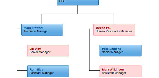
It is a well known axiom that color is one of the most important components of diagramming. Whatever diagram type you do use, the utilization of a color scheme can make it either excellent or mediocre. This post will offer… Read More

When it comes to generating more traffic for your site there is no formula as such. If you design a site that is competent and consistent, your visitors will atleast stick around and may be tell others about your site…. Read More