Infographics are everywhere. In fact, they are so ubiquitous, we hardly realize how useful they can be. Calorie charts and cooking instructions on food packaging? Yes, those are infographics.
How about the metro map you pull up on your phone to get around the city? That’s one of the most classic examples of an infographic! That chart sitting in your Pinterest feed showing you twenty different ways to pair scarves with your outfits is an infographic too.
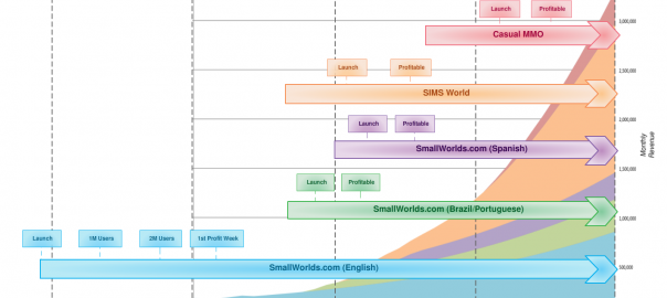
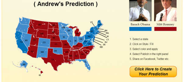
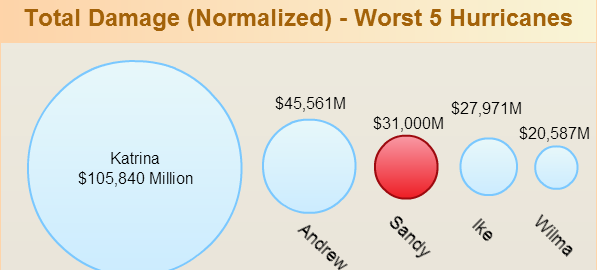
To clearly define what it is: an infographic is a catchy visual representation of data that uses drawings, color, lettering and graphic symbols to pack data equivalent to several pages of text into a single image. It is information delivered in graphic form. Info + Graphic. Simple, really.
We all love infographics and with good reason. Yet, not every infographic actually succeeds in achieving what it sets out to do. There are good ones and then there are great ones. What makes an infographic really effective? To understand this, we need to first appreciate what they are meant to do.
What Do Infographics Do?
Remember how you were always told that an image speaks a thousand words? That’s what an infographic must do, but even better.
The function of an infographic is to quickly and succinctly communicate information through visual representation. This approach not only saves space but actually helps viewers retain the information better.
And sometimes visual representation offers the most efficient way to organize and store information in an easily accessible and manageable way. Think family trees going back several generations. Now try imagining them in the form of descriptive text. Which would you prefer? The tree captures complex relationships between people in ways that no prose can.
Let’s take another example. When you see a simple line drawing of a cake of ramen noodles (represented by a few squiggly lines densely clustered together) cooking in water (more squiggles) with a few thin vertical squiggles above it (indicating steam), this instantly tells you that the water should be boiling. It gives you a sense of the ratio of water to noodles and tells you how big the utensil should be. All this information is packed into one square centimeter of
All this information is packed into one square centimeter of area on the package and even takes up lesser ink to print than a few lines of text would. It is elegant, simple and, most importantly, effective. Also, who wants to spend time squinting at minuscule text when an image works even better? Even somebody who is not literate or who does not know that language can instantly understand how to cook their ramen. Text simply cannot compete!
But wait, we are not talking about a battle between text and image. In fact, a good infographic must contain the ideal balance of both elements. Then there are dont’s of infographic design; for example, it shouldn’t be all color, pattern and caricature with no actual content. Of course, we are always drawn to those that catch our eye, but which ones really remain with us? The ones that prove themselves useful and meaningful, of course!
Simple Infographic Tips for Effective Results
It takes creativity and experience to learn how to create a good infographic. If you are looking for infographics for your website or blog, you could always hire a professional graphic design company to create them for you. Alternatively, if you are attempting to create some of your own, here are some infographic tips to bear in mind for a stellar result:
Accuracy
When designers set out to create infographics, they are faced with one big challenge. How do I summarise this data without oversimplifying it, or worse, making the graphic completely inaccurate?
Granted, one will have to do away with a good bit of detail, but the best infographics are those that deliver accuracy in a form that is easy to digest. This demands a sensitive understanding of who your viewers are going to be and what they are looking for. Get your data from trustworthy sources. You will need to study the source material carefully to be able to sift out the essential bits from the fluff.
How will your infographic reach its audience?
Does it form part of a talk or presentation where it will be explained out aloud by a speaker? In that case, it may need some text but not much.
On the other hand, if it’s going into an instruction manual accompanying a children’s game set, images will have to be large, bold, attractive and as expressive and self-explanatory as possible without text. This is why context and an understanding of the audience matters above all.
Think of yourself as a curator leading viewers around an exhibit.
Where would you like them to begin and what path should they take? The best infographics always have a clear overarching concept that draws all the content together tightly and dictates how the design should look.
For instance, if you are telling a story, you may opt for a linear format or a comic-book panel format. A recipe for ramen is really a story about how to cook. You begin at the top or the left.
On the other hand, if you are representing the results of a sociological study about how different age groups spend their money, you may have multiple stories radiating from a central point because there is no clear beginning or end. Each story stands for itself but also makes sense when it comes together as a whole in whatever random order.
New media, new directions.
Digital infographics are all the rage nowadays. But why limit yourself to 2D images that give up all their content upon first glance?
You could offer an interactive multi-level infographic that allows the viewer to decide what depth of information they are looking for. Incorporate 3D renders, gifs, hyperlinks, mouseovers or even scrolling designs into your infographic to make it playful, detailed and intense. A fantastic example is the zoomable Tree of Life created by Imperial College London to represent the incredibly complex timeline of species evolution.
At the end of the day, a successful infographic is one that stays with the viewer and sparks off conversations and discussions. It should be able to make information relatable and easy to understand without losing out on precision. At the same time, it must have heart. This is where your understanding of the audience comes in. The ability to make that connection is what sets the great ones apart from the rest.
About the author;
Meenakshi is the co-founder of Hashtag17, a company that provides solutions for designing, developing, SEO, branding, and managing websites for optimum conversions and high user satisfaction levels.


