4 Simple Infographic Tips to Get Your Audience Hooked in Seconds
4 Simple Infographic tips

4 Simple Infographic tips

Infographics are everywhere. In fact, they are so ubiquitous, we hardly realize how useful they can be.  Calorie charts and cooking instructions on food packaging? Yes, those are infographics.

How about the metro map you pull up on your phone to get around the city? That’s one of the most classic examples of an infographic! That chart sitting in your Pinterest feed showing you twenty different ways to pair scarves with your outfits is an infographic too.

To clearly define what it is: an infographic is a catchy visual representation of data that uses drawings, color, lettering and graphic symbols to pack data equivalent to several pages of text into a single image. It is information delivered in graphic form. Info + Graphic. Simple, really.

We all love infographics and with good reason. Yet, not every infographic actually succeeds in achieving what it sets out to do. There are good ones and then there are great ones. What makes an infographic really effective? To understand this, we need to first appreciate what they are meant to do.

What Do Infographics Do?

Remember how you were always told that an image speaks a thousand words? That’s what an infographic must do, but even better.

The function of an infographic is to quickly and succinctly communicate information through visual representation. This approach not only saves space but actually helps viewers retain the information better.

And sometimes visual representation offers the most efficient way to organize and store information in an easily accessible and manageable way. Think family trees going back several generations. Now try imagining them in the form of descriptive text. Which would you prefer? The tree captures complex relationships between people in ways that no prose can.

Let’s take another example. When you see a simple line drawing of a cake of ramen noodles (represented by a few squiggly lines densely clustered together) cooking in water (more squiggles) with a few thin vertical squiggles above it (indicating steam), this instantly tells you that the water should be boiling. It gives you a sense of the ratio of water to noodles and tells you how big the utensil should be. All this information is packed into one square centimeter of

All this information is packed into one square centimeter of area on the package and even takes up lesser ink to print than a few lines of text would. It is elegant, simple and, most importantly, effective. Also, who wants to spend time squinting at minuscule text when an image works even better? Even somebody who is not literate or who does not know that language can instantly understand how to cook their ramen. Text simply cannot compete!

But wait, we are not talking about a battle between text and image. In fact, a good infographic must contain the ideal balance of both elements. Then there are dont’s of infographic design; for example, it shouldn’t be all color, pattern and caricature with no actual content. Of course, we are always drawn to those that catch our eye, but which ones really remain with us? The ones that prove themselves useful and meaningful, of course!

Simple Infographic Tips for Effective Results

It takes creativity and experience to learn how to create a good infographic. If you are looking for infographics for your website or blog, you could always hire a professional graphic design company to create them for you. Alternatively, if you are attempting to create some of your own, here are some infographic tips to bear in mind for a stellar result:

Accuracy
When designers set out to create infographics, they are faced with one big challenge. How do I summarise this data without oversimplifying it, or worse, making the graphic completely inaccurate?

Granted, one will have to do away with a good bit of detail, but the best infographics are those that deliver accuracy in a form that is easy to digest. This demands a sensitive understanding of who your viewers are going to be and what they are looking for. Get your data from trustworthy sources. You will need to study the source material carefully to be able to sift out the essential bits from the fluff.

How will your infographic reach its audience?
Does it form part of a talk or presentation where it will be explained out aloud by a speaker? In that case, it may need some text but not much.

On the other hand, if it’s going into an instruction manual accompanying a children’s game set, images will have to be large, bold, attractive and as expressive and self-explanatory as possible without text. This is why context and an understanding of the audience matters above all.

Think of yourself as a curator leading viewers around an exhibit.
Where would you like them to begin and what path should they take? The best infographics always have a clear overarching concept that draws all the content together tightly and dictates how the design should look.

For instance, if you are telling a story, you may opt for a linear format or a comic-book panel format. A recipe for ramen is really a story about how to cook. You begin at the top or the left.

On the other hand, if you are representing the results of a sociological study about how different age groups spend their money, you may have multiple stories radiating from a central point because there is no clear beginning or end. Each story stands for itself but also makes sense when it comes together as a whole in whatever random order.

New media, new directions.
Digital infographics are all the rage nowadays. But why limit yourself to 2D images that give up all their content upon first glance?

You could offer an interactive multi-level infographic that allows the viewer to decide what depth of information they are looking for. Incorporate 3D renders, gifs, hyperlinks, mouseovers or even scrolling designs into your infographic to make it playful, detailed and intense. A fantastic example is the zoomable Tree of Life created by Imperial College London to represent the incredibly complex timeline of species evolution.

At the end of the day, a successful infographic is one that stays with the viewer and sparks off conversations and discussions. It should be able to make information relatable and easy to understand without losing out on precision. At the same time, it must have heart. This is where your understanding of the audience comes in. The ability to make that connection is what sets the great ones apart from the rest.

About the author;

Meenakshi is the co-founder of Hashtag17, a company that provides solutions for designing, developing, SEO, branding, and managing websites for optimum conversions and high user satisfaction levels.  

The Dont’s of Infographic Design
The Don'ts of Infographic Design

The don'ts of infographic design

We are always in a hurry; that’s maybe why they call us human race. We are in need of instant, to-the-point information, which is easily comprehensible.

Taking into consideration the fact that our brain processes images 60,000 times faster than words, it is evident why infographics have experienced such rapid growth in popularity.

In recent years, more and more marketers have taken advantage of the power of visual communication in their endeavor – to build awareness, generate leads and drive traffic to a website. In order to make such great impact with infographics, the entire package of this fairly-innovative piece of content has to be well-executed.

To learn how to create an infographic design that is impactful, you must familiarize yourself with some of the most common mistakes others have made, and learn how to correct them on your future projects.

Less is More

A mantra to live by; unfortunately, many are those who don’t really understand that the primary role of an infographic is to briefly illustrate, or better say, summarize, a lengthy research or an article.

Remember that whoever stumbles upon your infographic will be looking for a quick fix, a short answer to their question, and will not bother reading bulky paragraphs.

Solution: Highlight only the most important pieces of information you wish to present, and make short, but strong sentences.

More is Easier to Understand

Before completely disregarding us and labeling as just another contradictory piece, let us explain: if you put too much focus on creating a short infographic, you might end up creating one unorganized image with too many confusing pieces of information.

Solution: For an effective infographic design, focus on defining categories and presenting them all into different charts, which would make them easy to grasp.

Choose the Font Wisely

Use of font in infographic design

In cases when content marketers who don’t have a lot of experience in web design wish to include themselves in the process of infographic design, it occasionally results in the use of the ‘taboo’ fonts (the infamous Comic Sans, for example). Although calligraphy might seem more visually appealing at first, it doesn’t really yield any results.

Solution: Go with the fonts which are considered to be easy-to-read, like Arial or Times New Roman; still, whenever possible, opt for visualizations to represent particular pieces of information, rather than typography.

Refrain from Using Unusual Formatting for Data Visualization

This is a warning aimed at designers. Although your creative right side might be telling you to think out of the box and design something visually innovative and unexpected, more often than not, the result will be rather confusing.

Solution: Opt for charts, diagrams and use other visual elements which are familiar to your target audience, such as pie or bar charts.

Never be Predictable

Certainly, when creating content for an infographic, you will focus on the popularity of the particular topic; however, to make yourself stand out from the sea of similar works, you cannot settle for something most people are already well-informed about.

Solution: Come up with a new piece of information that would grasp your reader’s attention and provide them with much-needed value; always add an ‘a-ha!’ moment, a hook, which will be clearly highlighted and effectively attract your readers’ attention.

Tell a Story

Incomprehensible infographics are rather difficult to follow, and if you don’t present users with a logical sequence of information, or even events, they are bound to disregard your work.

Solution: Ensure you follow a certain storyline when creating content for your infographic, the one which your target audience will find relevant.

Be Careful with Color

Infographics are all about positive visual stimulation, and more often than not, designers opt for loud colors which most users find unappealing.

Solution: The 3-color palette rule is your safest bet – it comes down to a lighter shade for the background and two brighter ones which will be used to make clear distinctions between elements. Colors should complement each other, as well as your website.

Moreover, it is advisable to match the overall design of the infographic with the design of your website, and in that way create something unique everyone will recognize as yours without even having to look at credentials.

Final Words on Don’ts of Infographic Design

The beneifts of visual communication methods such as infographics are plenty. The effective use of infographic can radically improve your marketing efforts if utilized properly. They represent a unique opportunity to use visual elements which add much more to your story in a shorter amount of time. Remember: your readers will receive the message better if you show it to them, instead of just tell them about it.

Bio: Blake is a content marketing consultant at https://agseosydney.com.au/. Asides from digital marketing, his passions include science fiction books, 1980’s movies, and exotic foods.

5 Tips to Launch a Successful Startup from Shark Tank Experts
Shark Tank Formula for Startup Success

ABC’s Shark Tank has inspired an entire new generation of entrepreneurs to get out in the world and follow their dreams and launch a successful startup of their own. But just like in the tank, not every startup will experience success. In fact, the reality is that about nine out of ten startups will fail, and 50% of new businesses don’t make it past the four-year mark.  Why do so many startups suffer this fate? Here are some of the most common reasons:

Bad Financial Planning

Money is tight in the early stages of a business, so if you don’t watch your spending, it could be the end for your startup. For example, don’t hire more people until you absolutely need to, instead, take on more roles yourself.

Yes, this means you will be working more hours, but that’s the life of an entrepreneur. If you have to go on business trips, don’t fly first class until you can afford it. In the beginning, you have to be mindful of how you spend every penny, otherwise it could mean the end for your startup.

Lack of Passion

Being an entrepreneur is a 24/7 job, so you have to be passionate about what you do in order to succeed. If you don’t believe in your product, you won’t be able to get others to believe in it either, so you should never get involved with a company unless you want to live and breathe it. If you don’t have this mindset, you won’t be able to turn your startup into a well-established, successful company or launch a successful startup in the first place.

Unable to Secure Investors

Most startups rely on the help of investors in order to make it through the first few months or years, but when they can’t nail down an investor, the business collapses.

If you’re having trouble finding an investor, tap into your network on social media or search for pitching competitions or funding opportunities in your community. Before you go in front of investors, role play with a friend so you can practice your negotiation skills. Remember, you usually only get one shot at this, so make it count.

Problems With the Market

Some companies release products or services without doing research to see if there is a high demand for them in the market. Even if the product is innovative, affordable, and well-made, if there’s not enough demand for it, it won’t succeed on the market. To avoid running into this problem, startups must do market research prior to launching their products or services.

How to Launch a Successful Startup According to the Shark Tank Experts

Now that you know why so many startups fail, take a look at this infographic to learn more about achieving success with startup tips from Shark Tank:

How to launch a successful startup infographic

Why Infographics is a “Must-have” Marketing Tool
Infographics in Marketing

It’s no secret that human beings are visually oriented, so we respond to images more than words most of the time. In this day and age of our consciousness being dominated by the Internet, innovative use of images is very important in capturing an audience and making sure that they get the value we want them to have through that power.

In combining informative content with visuals, the infographic became one of the best ways to convey information as it makes whatever statistics needed more digestible and comprehensible. Even those who may not be that good with figuring out facts and figures can understand them through the use of infographics. It’s the epitome of showing and not just telling.

Chart available in our infographic library

Charts available in our infographic library

The Advantages of Infographics

Infographics are also quite shareable and linkable, making them perfect for social media. When people see infographics on Facebook and Twitter, they can get it right there instead of having to read through paragraphs on a long article. If you’re a startup or a small business who is trying to make a mark with content, then infographic software are a great tool for doing just that.

Due to them being great for social media and linking, they can do wonders for your SEO. People who are doing research and stumble upon your infographics can link credit to your website, making you more of an authority and boosting your visibility online. Also, just by having tons of people share your infographics, you already get so much exposure. If the facts and figures presented by your infographics are that compelling, they will indeed be shared.

Having said that you need to encourage sharing and linking by adding embed codes etc. Since you have already created the info-graphic you can go that extra mile and start marketing your info-graphic as well. Check out this great article about how to make your infographic go viral.

Creating infographics also lets you figure out your brand’s go-to graphic design. You definitely need to have your branding go with your design, so the colors and visual style you incorporate must be consistent with your brand. By doing so, you make your brand a lot more recognizable.

Do’s and Don’ts in Infographics

First of all, you must determine the original source of data by looking at its sources and tracking it back to the original page where it’s cited. That’s then what you put on your infographic as one of your sources. Never under any circumstances neglect citing your sources because plagiarism is a serious breach of conduct and trust.

Also make sure that your data is the most recent available. Using outdated data is poor form, so you have to go the extra mile in determining from what year that data is from. With that in mind, you’d also want to limit the number of sources you’re using since it’s easy to have too many, and they might conflict each other. Pick the most recent ones with high online rankings for best results since you’d want to have sources with considerable authority online.

Don’t put down a user-generated website as your source since that information may not be entirely true. Since pretty much anybody willing enough can change and add to whatever is on that page, it may not be entirely reliable. You may check out the sources and references cited there though and see if they’re indeed authoritative and trusted, and then you may be able to use those sources as your own.

Tell a story with the information and make sure that there are no gaps and hanging questions in it. The worst thing you can do is to have lots of gaps and leave the audience with more questions than answers. Telling a story with it means having a progression from fact to fact that makes sure audiences don’t get lost along the way.

Finally, take the initiative and share your infographic on social media. Don’t wait for your audience to take notice, take it to them as soon as you can. The more visibility you can have, the better chances your infographic can gain an audience. If you can turn it into a press release, then definitely do so. Also, don’t promote only once; do what you can to promote it as long as it’s still relevant to the times.

Websites for Getting Infographics Data and Content From

Sources are not that hard to come by, but it can be confusing as to which ones are the most trustworthy ones. Here are some you can make use of.

The Guardian Data Blog is all about data journalism and visualization that lets you take a look at what goes on behind The Guardian’s journalistic efforts. There’s also a Presenting Data Master Class offered by The Guardian that can help you do better infographics and other data presentations.

The United States Census Bureau is a great source for seemingly obvious reasons. It gives you quick and easy access to facts on people, business, and geography. It also has a Data Visualization Library, which should give you ideas on how to present in your infographic.

The World Health Organization website provides data and analyses for monitoring the global health situation of past and present. You can review the Publications section if you don’t know where to begin.

Data.gov is the US Government’s home for open data. Whatever data you need that involves the US, it should be here.

CIA World Facts is great if you want more in-depth data that you can’t find anywhere else. It also has the added benefit of making you feel like a secret agent, if that’s your kind of jam.

Google Public Data Explorer is powered by the most powerful Internet company in the world, so it’s bound to be full of data that’s mostly up to date.

Google Scholar and Google Consumer are some of the Google-based tools for gathering data from various sources on the Internet. Ask Your Target Market and Mechanical Turk are similar in this regard as well.

Infographic Online Tools

If you’re not a graphic designer, don’t have tools like Photoshop, and/or don’t have the time to carefully craft a design for your infographic, then you may want to get into online tools that can help you make one yourself in no time.

Creately’s online infographic tool comes packed with many features to quickly come up with info-graphics. This include separate libraries for business shapes, people shapes, charts, country maps, world maps, US state maps etc. Check out the blog post about creating infographics online with Creately.

Visualize is an infographic resume generator that can help you chart out your professional qualifications and accomplishments in a simple yet compelling personal visualization.

Google Developers has chart tools that are simple yet powerful, as well as free to use. Not only can you choose from a variety of charts, but you can also configure an extensive set of options to make it suit the look and feel of your website.

Easel.ly is a free online infographic tool with a dozen free templates for you to choose from, with each being easily customizable. You can also access a whole library of elements like arrows, shapes, connector lines, fonts, colors, text styles, sizes, and so on to let you fully customize your infographic.

Piktochart is a lot like Easel.ly that offers three basic themes for free and a subscription plan for those who want to use it more extensively for a longer period of time.

There are many others like Easel.ly and Piktogram such as Infogr.am, Visual.ly, InFoto Free, Venngage, Dipity, Get About, and more. Explore each one and find out which one is best for you.

About the author: Jay Manangan is a web content writer and a designer of Your Company Formations UK and Co-Founder of Shift Stream Media. His main interest are online marketing, business management, web design and tech. Follow him on Google+ and Twitter.

10 Futuristic Movies That Got It Right [Infographic]

These Top 10 Futuristic movies shown on the “big screen” tried to give us a foretaste of what it will be like living in the future will be like. Films can be a paradise for the imagination.  But have they always got it right? They were not always correct but still there have been many occasions that these movies surprised us by successfully predicting the advancement of technological changes in everything from automobiles, artificial intelligence, security, space travel, future life and even more. The creators of these movies in this infographic foresaw the technological advancement of the future even before anyone could think about it.

10 Futuristic Movie That Got it Right-Inforgraphic

Movies that foresaw the advancement of technology

1. The Star Trek television series has always showcased mind-boggling technology that stretches the imagination. Apart from hyper-drives and tele-porters, however, the series has also surprisingly foreseen and portrayed many technologies and devices that have become common appliances. One such invention was tablet device. Picard holds iPad in this clip from Star Trek: TNG Season 6 episode 4, titled Relics.

2. The Back to the Future franchise got some things right and many things wrong, but one that falls into the former category is wearable computing.  A device similar to Google glass appeared in the Back to the Future movie franchise. That’s right, Marty’ children are using devices that resemble Google Glass. So in the world of Back to the Future, Google Glass is invented ostensibly before the Internet.

3. In the underappreciated 1982 (Airplane II: The Sequel), there’s a scene where security agents monitor a body scanner in a futuristic airport. The joke is that the scanner shows the agents images of the passengers’ naked bodies as they pass through. Transportation Security Administration implemented the same scenario in airports (1992) and it wasn’t funny anymore. The government of USA asked the developers to replace the human body with a cartoon like dummy. Later it was removed from airports.

4. Adaptive braking and autonomous cruise control are already a reality for luxury cars. So in nearly 50 years, will cars reach full autonomy? The head of Stanford’s DARPA Urban Challenge team, which placed second in the driverless race, predicts self-driven cars by 2030. That deadline might feel a little tight, but 2054 is much more forgiving. Ford and Google have also jumped on the driver-less bandwagon by developing a car that takes over the steering wheel when you are about to crash, which is great news for drink drivers.

5. When we first saw Microsoft’s innovative multi-touch interface, Surface, The first thing that came in to our mind is “minority report”. And 3D displays, which were a key trend at this year’s Consumer Electronics Show, are also on the verge of commercial viability. I’m not predicting a holographic, gesture-controlled computer in the near future. But if Surface is already available in 2007, it’s hard to imagine that we’ll be using mice and 2D monitors in 2030.

6. In the most famous trilogy Iron Man, Tony Stark controls the super intelligent computer named Jarvis with motion commands. This was a very exiting piece of concept how he managed to develop prototypes by using only motion controls. Since the first movie in 2008 it was a massive hit then in 2010, leap motion controller was introduced as product to the market.

7. The company iRobot who invented Roomba the vacuum robot was inspired by the movie star wars. When iRobot founders Helen Greiner and Colin Angle were kids, they each saw Star Wars, a film that would motivate them to change the world. The sexology influenced them so much that they created similar robots that were appeared in death star in star wars IV: New hope (1977).

8. HAL 9000 may be too smart for his own good. In the 60’s many AI researchers were extremely optimistic, predicting full machine sentience by the end of the millennium. But in the 40 years since the movie’s a space oddsy release, artificial intelligence has been a major disappointment. Yet recently when Apple introduced a clever and accurate voice recognition system called SIRI that recognizes your voice to respond with actions.

9. How many of you know/remember the 1985 movie Weird Science? For those of you that do not, it is a movie about 2 teenage boys creating a beautiful woman from a Barbie doll with the aid of some computer magic and some lightning. This was long back then when the 3D printing was not around. Now only production companies like SoftEther from Japan makes even 3D mannequins.

10. Man didn’t land on the moon until 1969, but 40 years prior (1929), the silent film Woman in the Moon showed what it might be like. There was a multi-stage rocket, media frenzy at the launch event, and a countdown leading up to the anticipated event.

Movie References : Star Trek, Back to the Future, Airplane II, Total Recall, Minority Report, Iron Man, Star Wars, A Space Odyssey, Weird Science, Women on the Moon

If you enjoyed this article make sure to share it 🙂 .

Hurricane Sandy: How it Compares with Recent Hurricanes
Hurricane Sandy and how it compares with other devastating hurricanes

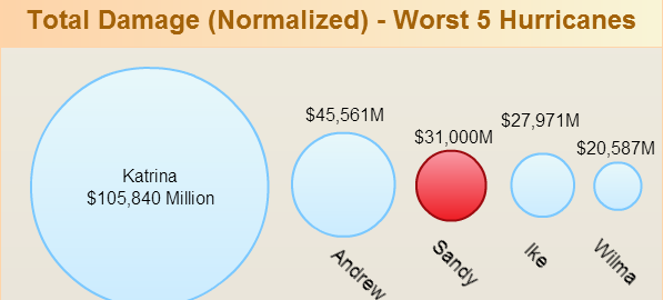
Hurricane Sandy showed how devastating mother nature can be and how helpless we are when faced with such power. We are really sad about this and millions who were affected are in our thoughts and prayers. Although there were obviously few things that could have been done better to save lives most will agree that lot was done to prepare people for the Sandy hurricane. So how does hurricane Sandy compares with the latest devastating hurricanes to hit United States? Below info-graphic gives a good idea.

Hurricane Sandy and how it compares with other devastating hurricanes

As the infographic shows the damage and the loss of lives because of hurricane Sandy is low compared to hurricane Katrina. Lessons learnt from Katrina helped, but the different agencies and the aid workers can be really proud of their efforts as well.

This is copyrighted work by Creately team. However you can use this as a template and create your own hurricane Sandy infographic by clicking here >> .