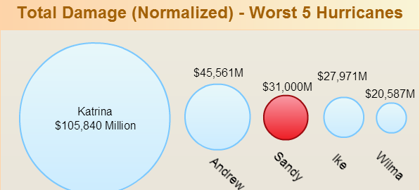
Hurricane Sandy showed how devastating mother nature can be and how helpless we are when faced with such power. We are really sad about this and millions who were affected are in our thoughts and prayers. Although there were obviously… Read More
Collection of article on drawing diagrams using Creately. Informative articles on application of diagrams in business, education, project management and more.

Hurricane Sandy showed how devastating mother nature can be and how helpless we are when faced with such power. We are really sad about this and millions who were affected are in our thoughts and prayers. Although there were obviously… Read More
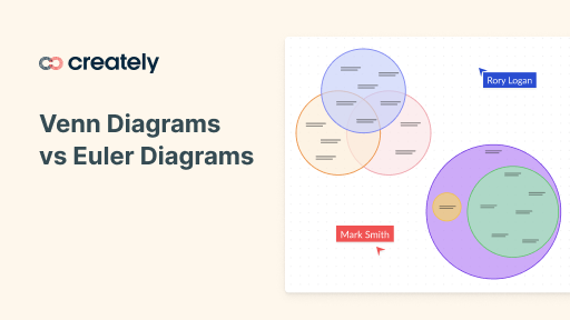
Venn diagrams and Euler diagrams look very similar so it is understandable that many people find it confusing to identify the difference. Although both the diagram types rely on the set theory there are some subtle differences that make them… Read More
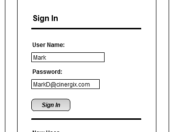
Wire-frames function as a bridge between raw creative thoughts and the final product. Think of wire-frames as architectural blueprints for a building and you’ll understand why it is a critical tool in just about any development project. The fact is,… Read More

UML stands for Unified Modeling Language. It’s a rich language to model software solutions, application structures, system behavior and business processes. There are 14 UML diagram types to help you model these behaviors. You can draw UML diagrams online using our… Read More
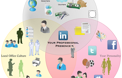
The diagramming community is gaining steam and we are fine tuning the features to make it more awesome. If you’re creating public diagrams make sure to rate them as well as diagrams submitted by other users. The objective is to… Read More
I hope you had fun using our simple Gantt chart drawing tools and your Creately experience is going to get even better with the launch of Creately Diagramming Community this week. While we are working on those things Creately users… Read More