When most small businesses think of metrics, things like website traffic, conversions, and page views immediately come to mind. But while these metrics can deliver important insight as to how well your marketing is working, they do little to illustrate how you score on user experience (UX).
Color, images, and a catchy copy can attract your audience, but it’s your UX design that keeps them coming back (or not). A recent study by Experience Dynamics revealed that a massive 79% of users who don’t like their website experience will go straight to another site who can better serve their needs.
Adding the ever-expanding mobile usage into the mix, and UX becomes more crucial than ever.
If you aren’t well-versed in UX optimization, you could outsource to a tech company who specializes in exactly that.
Or, you can use these five UX hacks that don’t take an expert to implement.
Hack #1 – Understand What Your Users Want, Not Just Who They Are
Traditional personas focus on customer demographics, but don’t do much in communicating what exactly those personas need. Someone who falls in the 25-34 age range is married with two children, and works full-time may have very different needs and expectations than someone else who falls within those same parameters.
Instead of lumping people into age and location categories, try developing a new set of standards that focus on actions: do they like to comparison shop? Are they looking for specific information? Are they just browsing? Are they in the decision-making stage or the curiosity phase? Have they done business with you before or are they first-time visitors?
Listen for cues during conversations with your customers. Talk about their goals, what’s preventing them from reaching those goals, and what their ideal solutions look like. Find out how they discovered you and what made them choose you in the first place. Train your team to make these same discoveries and develop a way to capture and organize them.
By determining their needs, you are better positioned to fulfill their expectations regardless of the age, name, and geographic location of your user.
Hack #2 – Focus on More than Just Your Homepage
Users don’t always enter your site through your home page. It’s important each secondary page clearly communicates what you do and what value you provide.
This is especially important if you are using landing pages in your marketing mix. These pages (and all other pages) should contain a consistent brand and structure throughout so your users don’t feel like they are visiting a whole new website while they are clicking around.
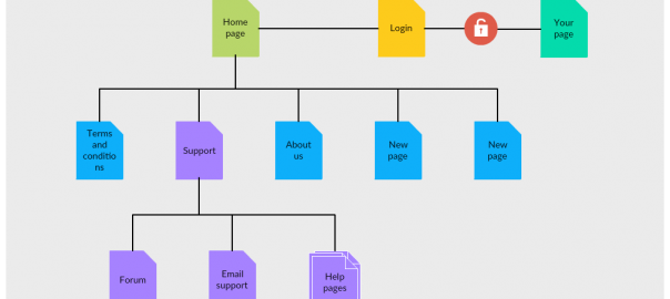
In addition, you should make it easy for users to navigate to other areas regardless of their website entry point. Users don’t want to click the back button several times to get back to a certain point. If you can help them get anywhere on your site in 3 clicks or fewer, you’re all set. Prior to designing your website landing pages, create a blueprint and a prototype of them with wireframes and UI mockups to ensure that, each one of them meets the standards of a quality UX experience.
Hack #3 – Enhance Readability to Improve Brand-ability
How your content looks, is just as important as what your content says. But your audience will never know what your content has to say if it doesn’t look presentable first.
From web page copy to blog articles to signup forms, your reader should be able to skim the content easily to find what they’re looking for. No one wants to dive into a whole page worth of text with nothing to prevent reader fatigue. Instead, you can use a blend of the following elements to make your content more reader-friendly:
- Bullet points
- Numbered lists
- Headings
- Images
- Infographics
- Different font sizes
- Contrasting colors
- Columns
- Buttons
- Tables
- Charts
- Videos
Using easy-to-read formatting and layouts, such as small text chunks, can boost the viewer’s ability to find the information they need, which can reflect positively on your branding strategy.
Hack #4 – Rely on User Feedback to Find Hidden UX Failures
You can’t assume you know what your customers need based on your own logic and expertise. What you think your customers want may differ than what they actually expect from you.
Go straight to the source and seek out the answers. Start by mining your Google reviews, social media comments and ratings, and other outlets to see what advice your customers have already offered.
If that’s not enough, you can add feedback polls directly to your website or send out emailed surveys using free tools like SurveyMonkey. However you choose to solicit their feedback, don’t ask about their UX in general terms. It helps to think of specific things you want to know about their experience, such as why they visited your site and if they found what they were looking for.
Just keep in mind that how you go about asking for their feedback also impacts their user experience – choose wisely!
Hack #5 – Find Fault in Your Competition, then Vow Not to Make those Same Mistakes
You should already know what your competition is doing better than you are (and what you’re doing better than they are) and how you can benefit from them, but UX usually isn’t one of those factors most SMBs consider.
Take a desktop and mobile tour of the competition for yourself to see how users are experiencing other brands’ websites.
Some elements to consider:
- Ease of navigation
- Amount of scrolling
- How many clicks to find information
- Layout of text and images
- Quality of information and resources
- Absence of information you think should be present
You don’t have to copycat what others are doing – just pick out the things they could improve and make sure you aren’t making the same errors.
Conclusion
Companies experience an unceasing struggle to stand out from their competitors, and it’s only becoming harder as marketers are becoming smarter and information becomes more widespread. User experience is gaining its edge as a noticeable competitive advantage and looks to be a high priority for marketers in the coming months and years.
In fact, Experience Dynamics predict that UX will become a key competitive advantage for companies by 2020, ranking even higher than product and price.
The sooner you can craft a better UX, the longer you can enjoy the benefits.
Author: Ben Shepardson has been creating and managing websites and web content since the early aughts. From the early wild days of SEO to today’s demand for fully-researched content that users crave, he’s dealt with it all. His latest project is NoStop Content Writing, a provider of original, top-notch written content for business owners and media agencies.


Wow! This article is truly worth reading! The content is so rich and useful. Thank you so much for this!
Wow! I must say this is definitely a good trick! I totally agree with this article. Worked for me too! Loved reading this. So useful! Thanks!