How to Use Concept Maps for Studying and Organizing Information
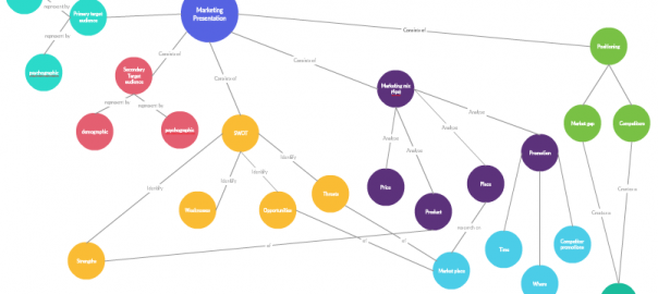
A sample concept map

Of all the various learning styles visual learning is the most popular one. Various studies put it somewhere between 45% and 65%. This is understandable because humans process visuals faster than text or audio. They are also more likely to recall something they saw rather than something they heard. However, studying is more than processing things and recalling them. You need to understand the concepts and how to apply those concepts to solve real-world problems. This is why concept maps are so powerful and frequently used for studying as well as teaching. Below are some benefits of using concept maps for studying.

Improve your understanding of the topic

As I mentioned before you study to get a deeper understanding of a topic or a concept. Your understanding of subject increase when you connect the new things you learn with what you already know about that subject.

When you draw a concept map you’re actively looking for relationships between different concepts. You add the new ideas and see how they relate to what you already know about a subject. Because you are naming those relationships you need to dig deeper to understand the actual relationship between those concepts. These actions inevitably force you to get a deeper understanding of the subject.

Helps you to validate your knowledge

Most of us overestimate our understanding of things. It’s natural to feel this way for various reasons including familiarity. For example, you might clearly understand some parts of a subject leading you to believe you understand the subject as a whole.

When you draw a concept map you’re actually creating a visual image of that subject. A visual that you can analyze to check your understanding of a subject. If some relationships seem odd or you can’t figure out why you named it that way then you probably don’t understand the subject as well as you think you do.

Plus it makes it easier to get feedback from your teachers and peers. You can’t ask for help when you don’t know whether you understood a topic or not. By showing a concept map other can easily see what you understood and whether you understood them properly. This will enable them to give valuable feedback to improve your knowledge.

Helps you remember/recall things faster

Exams are the moment when you need to use all you’ve learned and understood. And if you’ve gone through your study material and created concept maps then exams shouldn’t be a problem for you. However, in pressure situations, it isn’t as simple as that.

Almost all of us have gone through exams where we have a fleeting memory of something but can’t really recall the whole thing. Well, it’s much easier to recall a graphic than a whole paragraph or a chapter from a textbook.

Recalling and processing images is infinitely easier than paragraphs. But, it’s important to remember that although images are easier to process they don’t necessarily improve the understanding of knowledge. Concept maps are superior in that sense because not only they improve processing of facts but also understanding of facts.

How to draw a concept map

Now that you understand the benefit of using concept maps for studying it’s time to create one. The easiest choice is to use a pen and paper. However, it will get ugly when you start to edit and expand it. You can’t easily access it every time unless you carry it wherever you go. And you can’t share it unless you actually give the paper to someone. It’s much more productive to use a web-based concept mapping tool.

Creately’s concept map maker is easy to use and has many templates to get you started. You can share your concept map with peers and get feedback in real-time. Plus the mobile app gives you access to your concept maps anywhere you go. On top of that, you can use it to draw various other diagrams like flowcharts, UML diagrams, SWOT diagrams, Venn diagrams and drawing mind maps.

A sample concept map

How a concept map will look like

How do you use concept maps for studying?

I hope I’ve convinced you to use concept maps for studying. It has proven to bring great results, especially for visual learners. What other techniques do you use for studying? I’m especially interested in visual methods.

Author Bio: My name is Mark Clain. I support the effective adoption of new technologies or ways of working within writing by communicating complex information in an informative and inspiring way. My texts are varied – some of them are technical, requiring in-depth instruction, others are educational on Studymoose.com. I’m fond of writing articles for students, helping with essays.

Typography Tutorial for Diagramming
Typography tutorial

Typography tutorial

Yes, the main point of diagrams is to visually guide readers to better understand the inner workings of a particular subject or thing, but ultimately diagramming is about visually communicating a message – and it is in effectively communicating your message where the importance of text in diagrams lies.

Typography, being both a science and art, entails that it is something you must have a deep learning of. From the history of typography and the main types of fonts to the basic rules of typography and the intricacies of concepts like kerning, leading and tracking – and even further into the psychology of typography, it’s a vast body of knowledge that can take a lifetime to fully master.

That’s what makes it the exciting challenge that it is. But once you have a grasp of the intermediate concepts, that’s when the fun begins as you are able to break perceived rules and let your creativity roam free.

Here is the typography tutorial for diagramming you should always refer to when drawing a diagram.

Learn the Basics

As with most things, learning the basics of typography is the first step towards its effective use. But even this could be a challenge with typography being such a complex art and science.

As mentioned, there are basic principles of typography to take into consideration; like kerning (or the adjustment of character spacing), leading and tracking, which go far beyond choosing the right font and color schemes.

There are also basic psychologies behind different fonts and typefaces – the understanding of which will enable optimal message communication.

As noted by Creative Market – a platform for handcrafted digital content – a common mistake for beginners is jumping right into their artistic whims without understanding the basics. This practice leads to making the same elementary mistakes over and over again. You don’t want that.

Choose the Right Font

Beyond readability, choosing the right font for your diagram is integral in communicating your message. As noted by Frank Denneman – a leading resource person on storage technology and computer resource management – diagram objects and fonts go hand in hand when it comes to conveying your subject – the objects visualize the idea, while the font determines the tone of voice.

It is important to note the two major categories of fonts—serif and sans serif. The former evokes an older, albeit formal vibe, while the latter provides a cleaner, modern look.

Choose the Right Font

While there is no specific rule of which of the two should you use in making diagrams, since you aim for readability, avoid curls or over complicated fonts.

Once you decide on the typography, use only one font in a diagram, and use different font weights (light, medium or bold) when emphasis is needed.

Apply a Proper Color Scheme

Picking a suitable color scheme is equally important to the overall message of a diagram, as it is used to indicate a relation between the different objects.

Color scheme tips:

  • Light colors should be the go-to for filling out shapes, and as much as possible, avoid mixing strong and light colors on the same diagram.
  • As a general rule, light colors should have black text, while strong colors should have white text
  • Avoid using too many colors
  • You should always take into consideration the readability of the text when applying a color scheme, the message is always of prime importance

Space is NOT Waste

Whitespace is an integral part of typography as it is a tool used to highlight certain points of your diagram.

Not giving value to space makes your diagram look cluttered, making it more confusing for the readers.

Whitespace lets the design breathe and stabilizes design components, while adding a layer of sophistication, when done right.

Lines

Another crucial part of communicating your message through diagrams, such as mind maps or fowcharts, apart from typography is the proper use of lines.

Make sure that you are consistent with how you use the different kinds of lines to avoid confusion. It is also key to have the right mix of line and font weights – there should be a perfect balance across the diagram.

Minimalism

This should be a prevalent concept across the board when it comes to typography and diagrams.

From the number of fonts and colors used, to the text length and number of objects included, you should always strive for minimalism, as it allows the message to be conveyed concisely and directly.

Takeaway on the  Typography Tutorial

The world of typography is a complex world filled with guiding principles, different concepts and a plethora of choices.

And while it may appear that objects in diagrams simplify the task of trying to relay a message, finding the right mix of the above-mentioned elements is a tricky endeavor that requires tons of learning and practice.

The Dont’s of Infographic Design
The Don'ts of Infographic Design

The don'ts of infographic design

We are always in a hurry; that’s maybe why they call us human race. We are in need of instant, to-the-point information, which is easily comprehensible.

Taking into consideration the fact that our brain processes images 60,000 times faster than words, it is evident why infographics have experienced such rapid growth in popularity.

In recent years, more and more marketers have taken advantage of the power of visual communication in their endeavor – to build awareness, generate leads and drive traffic to a website. In order to make such great impact with infographics, the entire package of this fairly-innovative piece of content has to be well-executed.

To learn how to create an infographic design that is impactful, you must familiarize yourself with some of the most common mistakes others have made, and learn how to correct them on your future projects.

Less is More

A mantra to live by; unfortunately, many are those who don’t really understand that the primary role of an infographic is to briefly illustrate, or better say, summarize, a lengthy research or an article.

Remember that whoever stumbles upon your infographic will be looking for a quick fix, a short answer to their question, and will not bother reading bulky paragraphs.

Solution: Highlight only the most important pieces of information you wish to present, and make short, but strong sentences.

More is Easier to Understand

Before completely disregarding us and labeling as just another contradictory piece, let us explain: if you put too much focus on creating a short infographic, you might end up creating one unorganized image with too many confusing pieces of information.

Solution: For an effective infographic design, focus on defining categories and presenting them all into different charts, which would make them easy to grasp.

Choose the Font Wisely

Use of font in infographic design

In cases when content marketers who don’t have a lot of experience in web design wish to include themselves in the process of infographic design, it occasionally results in the use of the ‘taboo’ fonts (the infamous Comic Sans, for example). Although calligraphy might seem more visually appealing at first, it doesn’t really yield any results.

Solution: Go with the fonts which are considered to be easy-to-read, like Arial or Times New Roman; still, whenever possible, opt for visualizations to represent particular pieces of information, rather than typography.

Refrain from Using Unusual Formatting for Data Visualization

This is a warning aimed at designers. Although your creative right side might be telling you to think out of the box and design something visually innovative and unexpected, more often than not, the result will be rather confusing.

Solution: Opt for charts, diagrams and use other visual elements which are familiar to your target audience, such as pie or bar charts.

Never be Predictable

Certainly, when creating content for an infographic, you will focus on the popularity of the particular topic; however, to make yourself stand out from the sea of similar works, you cannot settle for something most people are already well-informed about.

Solution: Come up with a new piece of information that would grasp your reader’s attention and provide them with much-needed value; always add an ‘a-ha!’ moment, a hook, which will be clearly highlighted and effectively attract your readers’ attention.

Tell a Story

Incomprehensible infographics are rather difficult to follow, and if you don’t present users with a logical sequence of information, or even events, they are bound to disregard your work.

Solution: Ensure you follow a certain storyline when creating content for your infographic, the one which your target audience will find relevant.

Be Careful with Color

Infographics are all about positive visual stimulation, and more often than not, designers opt for loud colors which most users find unappealing.

Solution: The 3-color palette rule is your safest bet – it comes down to a lighter shade for the background and two brighter ones which will be used to make clear distinctions between elements. Colors should complement each other, as well as your website.

Moreover, it is advisable to match the overall design of the infographic with the design of your website, and in that way create something unique everyone will recognize as yours without even having to look at credentials.

Final Words on Don’ts of Infographic Design

The beneifts of visual communication methods such as infographics are plenty. The effective use of infographic can radically improve your marketing efforts if utilized properly. They represent a unique opportunity to use visual elements which add much more to your story in a shorter amount of time. Remember: your readers will receive the message better if you show it to them, instead of just tell them about it.

Bio: Blake is a content marketing consultant at https://agseosydney.com.au/. Asides from digital marketing, his passions include science fiction books, 1980’s movies, and exotic foods.

How To Do a Case Study Analysis Using Mind Maps
How To Deal With Case Study Analysis Using Mind Maps

How To Deal With Case Study Analysis Using Mind Maps

Mind mapping helps in many situations. It can be used for work, for organizing a personal or family schedule, for setting your life goals and of course, you can also do a case study analysis using mind maps.

A lot has been said about using this technique in educational processes, both for teachers and for students. However, there are always more ways to make these maps work for you. In this post, we will talk about using mind mapping when working on a case study analysis. So, let’s begin.

Why should students use mind maps?

In one way or another, probably all the students have used mind mapping technique while studying.  It is natural for our brain to multitask and to perceive the information simultaneously. When we look at a picture, we see it all at once as a composite image that consists of different details and features.

We naturally think in pictures, or rather collections of images and associations. You see Ronald McDonald, you think of a big mac, then of fries and cola which you ordered from your car when you saw a lamp indicating the necessity of oil change. You think that you need to hit a gas station, maybe tomorrow morning. Oh, no, you cannot do it tomorrow morning as you have an important meeting at work that you have to attend. This is how Ronald McDonald brings you to the thought of a work meeting.

On the whole, mind maps are very natural for our brain as they have similar connection structure. That is why using these maps can improve all the processes connected to our brain activity, including studying processes.

Even before you start your case study

Case studies are usually based on the material students go through in class. So, a lot of information can be taken from the notes you make during lessons. When you make notes in class, mind mapping can help a lot.

All students make notes. Most of them write these notes as a simple text, sometimes highlighting the key points. Such notes have several disadvantages, though:

  • They have a difficult structure or no structure at all;
  • They take a lot of time to make;
  • It ‘s hard to remember something from such notes;
  • Creative parts of the brain are not stimulated, as when you only write down what your professor says word by word, you can barely get any associations in your head.

The main flaw of these notes is the lack of structure and key categories. Such papers look like walls of words. Sure, you can highlight some things, but it doesn’t help much. The primary definitions are always hidden by the big amount of text.

If you use mind maps for taking notes, you will remember the information more vividly, especially if you have a photographic memory. Here are the pros of making notes with mind maps:

  • You get a clear structure;
  • You comprehend the information better;
  • You memorize the main categories and key points;
  • You get a logical summary;
  • You get a minimum text, etc.

So, start preparing for writing case studies beforehand by writing clear notes. Here is the example of using a mind map on pricing models.

Example of using a mind map on pricing models

The process itself – organizing the material

Mind maps can really help you if you have a lot of different material taken from books, websites, magazines, encyclopedias, etc. If you are overwhelmed with loads of information and don’t know where to start, you can begin with making a mind map adding the information that you have and the sources.

You can start your work with pointing out the main thought, fundamental idea or the message of your case study analysis. If you clearly know what you write this paper for and what conclusion you want to come to, the rest is all about the technique.

The next step is formulating the central thesis of your case study. They can be the subheadings of your work. Then, you can just add any key ideas and thoughts to every subheading. At this point, your mind map will grow, and you will see the whole picture clearly. Thus, it will be much easier for you to write the entire text of your case study analysis.

Here is an example of the mind map of the case study of Antarctica (Case Study  Glaciated region: Antarctica/Southern ocean). As you see, there is a lot of information here, but it is easy to comprehend it, if it is in such a visual form instead of different pieces of text.

Example of the mind map of the case study of Antarctica

Using mind maps in case studies

Apart from using mind maps for preparing the material for writing a case study analysis, you can use a map in the work itself.

You can either provide some information through a mind map, duplicate some part of the text to make it clear and visual or to summarize the whole work in a clever way. For example, this very post can be summed up by this easy mind map (How To Deal With Case Study Analysis Using Mind Maps).

How To Deal With Case Study Analysis Using Mind Maps

Your professors would most likely appreciate such a creative approach to writing a case study analysis, so you should definitely try it once.

Creating a mind map, try not to make it too complicated; it may only confuse you and draw you away from the main points. Sometimes it is easier to make several mind maps instead of trying to fit too much information into just one. Or you might consider creating a concept map.

Using mind maps is not only a great thing for working on a case study analysis but also an excellent technique to use in other educational processes. You should work on your personal style, as mind mapping is a creative activity that can be performed differently by different people.

You can come up with your own ways of processing information and adding it to your maps. It doesn’t matter if your maps are distinct from the ones of other students; every one of us thinks in a different way. Let mind mapping show everyone the way you think.

Alyce Fabel is an inspired blogger and writer working as a private tutor. She writes about educational issues and shares her writing experience. She enjoys writing and loves helping students to become creative and proficient writers. Alyce is a former journalist dreaming of publishing great American novel. Stay in touch via Twitter!

4 Easy Ways to Make Your Diagrams Look Awesome

Our users add thousands of diagrams to the community everyday and we frequently come across good diagrams that can become great diagrams with some simple tweaks. Do you want to create beautiful diagrams that stands out from the rest? Then keep reading.

Stick to a color theme

Adding colors can make almost any diagram look good. But the really awesome diagrams stick to a color theme. If you’ve used flat colors for few objects and rainbow colors for some more objects chances are it will make your diagram look cluttered and distracting.

Don’t know the difference between flat colors and rainbow colors? Don’t worry we’ve made it easy for you. Our preset color palette is designed based on themes so you can stick to one theme even if you don’t know much about colors. If you check below you’ll notice that each row represent a specific theme. Stick to one them and your diagram will look that much better.

Preset color palette

The all new Creately color palette

You can take this a step further by giving some thought to the different emotions enticed by colors. This is especially important if you’re using Creately for mock-ups, web site designs etc.

Check out this info-graphic at Huffington Post to see how various brands use color to evoke different emotions. For a more in depth reading about colors and emotions check out this guide.

Keep in mind where its displayed

Creately and many other diagram software usually provide you with a large canvas to draw your diagrams. And most users take advantage of this and create large diagrams but they tend to forget where they’re going to display that diagram.

For example if you’re hoping to include that diagram in a blog post you might have to convert that diagram into a much smaller 600px wide image. If you use the full canvas for even a simple diagram it might look ungainly when embedded into your blog post. So keep in mind where you’re going to display the diagram so you don’t have to unnecessarily minimize even simple diagrams.

Another thing you can do when you know dimensions beforehand is to control the flow of your diagrams. In the above blog post example your width is restricted but the height not so much. In such a case you can plan your diagram in a downward flow instead of horizontal flow.

In some cases it is impossible to create small diagrams and you need to utilize the full canvas. If that is the case you can make use of the Creately viewer to zoom in and out of your diagrams.

Follow the standards

What makes different diagrams useful and universally accepted is the various standards associated with those diagrams. A class diagram drawn by US tech lead is easily understood by a software developer in UK because they follow a certain standard.

For technical diagram like UML diagrams, ER diagrams people generally follow standards. But when it comes to common diagrams like flowcharts and Venn diagram they tend to ignore them often.

Even a simple thing like not naming arrows in your flowchart can confuse users. So keep the standards in mind if you want to create awesome diagrams.

Add legends / guidance

Excellent diagrams makes it super easy for anyone to quickly understand the diagrams. In a complex diagram adding a legend can make life a whole lot easier for viewers. But adding legends is not the only way to guide users.

For example in a business process model it could be adding swim lanes to differentiate between departments. In a Venn diagram it could increase the font size when naming sets. In an org chart it could be using different colors for different departments. There are plenty of simple things like this in most diagram types which can be used to guide users.

Got More Tips ?

Listed above are some steps you can take to make your diagram look awesome. Have a great idea of your own? make sure to share it in the comments section.

15 Creative Venn Diagrams to Get You Thinking
creative venn diagrams - guess the movie

Although mostly used in mathematics there are many other usages for Venn diagrams. Everyday hundreds of Venn diagrams are created by our Venn diagram maker and below are some creative Venn diagrams from our diagramming community.

One creative way to use Venn diagrams is question and answer type. You ask the questions and hide the answer in the Venn diagram. You can leave clues to get to the answer in different intersections.

Some of the Venn diagrams shown below can have multiple answers. That’s okay as long as you can justify your answer. So lets get started with the first one.

American Dessert Venn Diagram

creative venn diagram - guess the food

Can you figure our this delicious dessert by looking at the ingredients?

You need all these elements to create one of the most delicious American deserts. Can you figure out the answer ? Give it your best shot before looking at the answer.

Answer : Pan cakes

 Creative Venn Diagram Depicting a Movie

creative venn diagrams - guess the movie

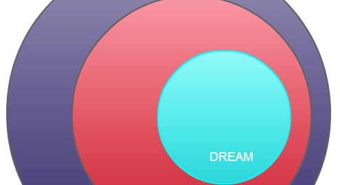
Multiple dream levels are well represented in this Venn.

This Venn is a bit tricky but if you’re a movie fan this should be somewhat easy to guess. The answer is in white text, highlight it to view it.

Answer : Inception

Who are We Talking About ?

creative venn diagrams - who is this guy

Here’s a little hint: He visits only during Christmas.

Fairly obvious, I guess you don’t need hints for this one.

Communism vs. Fascism Venn Diagram

Communism vs Fascism Venn Diagram

Click on Venn Diagram to Edit Online and Download

Geniuses Venn Diagram

creative venn diagram who got to be this character

If you are a good sitcom and movie fan. You can figure this one quickly.

Finding the most arrogant, annoying genius wouldn’t be so hard when you look at all these characters in here. Who could possibly be annoying than Sheldon Cooper?

Operating Systems Venn Diagram

creative venn diagrams

What is the best operating system you prefer?

All three operating systems have their pros and cons. What would you prefer to be the best operating system to work on. Hint: Its Stable, User-friendly and customisable!

Cartoon Character  Venn Diagram

creative venn diagram

Most of the cartoon characters are from 80’s . Expect the private from penguins of Madagascar

These characters are from the cartoons you used love and this is your chance to figure out whether your favourite character is adorable, intelligent and super fast.

Funny Cartoon Venn Diagram

creative venn diagram

Cartoon fans, who is the character you least interested in?

Homer Simpsons, Minions and Patrick Star feature this Venn diagram. Who could be annoying than the annoying orange? Guess you’ll find out solving these venn diagram.

Superheroes Venn Diagram

creative venn diagrams super heros

Super heroes , villains  you could figure this one out if you know them all!

3/5 Avengers are here in this venn diagram. Think of a genius character that has super power and got lot of money.

Entrepreneur Venn Diagram

entrepreneur creative venn

What entrepreneur could possibly have in common with skydivers?

Stave Jobs is a entrepreneur and a visionary in our time. But Skydivers and stunt bikers? Find  what do they have in common.

Aliens & Robots Venn Diagram

creative venn diagrams transformers

What do these movies characters all have in common?

Solving this venn diagram puzzle would be easy as finding the robotic human and the character who is an alien robot-human.

Country Quiz Venn Diagram

creative venn diagram quiz

Test your geographical knowledge with this Venn.

There are 196 countries in the world and there aren’t much country name starts wit the letter “S”. Sort and find the answer to this diagram without Googling.

Movie Quiz Venn Diagram

creative movie character venn

What a combination. Who matches this description?

Green has strong emotional correspondence with safety and harmony. The answer is not a super-villan. Hint: He speaks back wards


Genius Venn Diagram

creative venn diagrams bill gates

Who owns a desktop operating system and a search engine at the same time?

Apples owns a Mobile OS and a Desktop OS. Google Owns a Mobile OS and a Search Engine. Microsoft owns them all. Now Is it too difficult to solve this puzzle?

Guess the Movie Venn

This creative Venn diagrams is about a movie

This diagram is all about a movie. Can you guess the movie ?

If you can figure this out without the hint. You have more common senses than many people. Hint: The movie was released in 1999 staring Bruce Wills as the main character.

Entrepreneur vs Investor Venn Diagram

creative venn diagrams of entrepreneur

The answer to this Venn is pretty obvious, you just have to think what they have in common.

If you are a startup evangelist you may find the answer your eyes closed.

Listed above are some creative Venn diagrams found in our diagramming community. You can create your own creative Venn diagram by using our Venn diagram templates.