Hot on the heels of our Confluence and JIRA plugins, we got some sweet news today. Unlike our usual slew of releases, we got some incredible updates for both Creately Online and Creately Desktop, which you should grab hold of… Read More


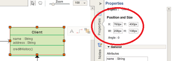
Hot on the heels of our Confluence and JIRA plugins, we got some sweet news today. Unlike our usual slew of releases, we got some incredible updates for both Creately Online and Creately Desktop, which you should grab hold of… Read More

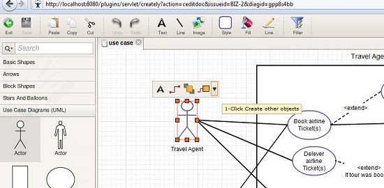
Well, this has been quite an exciting month for us! We had our Creately for Confluence go live last week, and today, we’re happy to announce the beta release of Creately for JIRA, a diagramming plugin for everyone’s favourite issue… Read More

I was the 2nd presenter in line to have a go on the Tech Talk session series at Cinergix. I decided to make the focus of the presentation to center on a QA Quality Factor which is known as “Reliability”…. Read More

We did speak quite a bit about org charts a few posts back, but in this post we thought of letting you all in on 3 simple points that can help you create organizational charts that are more clear, focused and… Read More

While we did say that Part 2 of this article would have been posted on Monday, we really had to make way for some exciting news. While more details on Creately for Confluence is to be expected soon, let’s carry… Read More

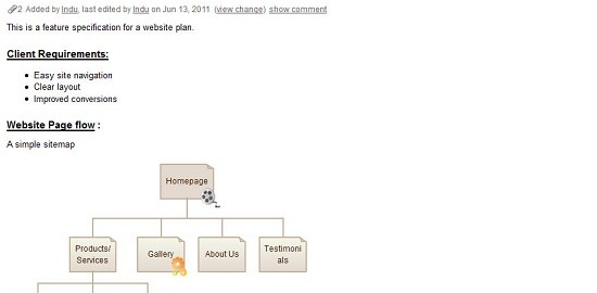
Here at Cinergix we feel like we’re on Cloud 9 right now! Yes, after weeks of arduous hardwork, we’re extremely delighted to announce the Beta release of Creately for Confluence, a plugin for everyone’s favourite collaboration platform, Atlassian Confluence. This… Read More