A few posts back, we spoke of how Lines should be used for better readability, aesthetic appeal and clarity. In this post, which borrows a few ideas from the excellent presentation done by Enrique Garcia Cota, we focus on on of the most understated elements used in diagramming – Text. When it comes to the use of text in diagrams, we’ve identified 5 general rules that you should stick to when drawing diagrams. To make it more relevant and easier to assimilate, we’ve applied these rules to various diagrams.
1. Only One Font
There is good reason why you should stick to just one font type – unhindered readability that is clear and consistent. We’ve drawn a Stakeholder Map below that has three different font types. While we have deliberately shown fonts that are quite different, it is best that you are aware of the fonts you use since many may look similar but are still quite different e.g. Arial and Arial CE.
2. Same Sized Text
Another aspect that serves to make your diagram imperfect would be varying font sizes. However, unlike different types of fonts (where you really must stick with one type), you may change the size of the font depending on the diagram. Consider part of a SWOT diagram below. While it is acceptable to have the title capitalized with a font size of 20, the bullets points should either be 14 or 16; not a whole spectrum of sizes, which will make the diagram uneven when it comes to visual balance and readability.
3. Forget Italics
When diagramming, assess and see how you are adding value to it instead of diluting the whole experience, for instance having small text in italics (like in the Leadership Grid diagram below) is pointless since it might be a hindrance to readability.
4. Do Not Use Bold
Having consistency in your text is key. If you think going bold with your text is what you fancy, then bold all your text. Having a Mindmap like the one below with some text being bold and some not makes it look half done and incomplete. In short, it really does not look professional. It really is paying attention to these small things that makes a HUGE difference.
5. Use Colors That Contrast
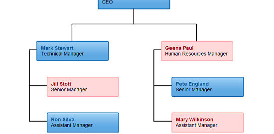
We’re gonna stick our neck out on this one and suggest that you stick to contrasting colors in all your diagrams. Our color palette generator helps choose colors that helps make the fonts stand out. Consider the Org Chart below. Notice how the red font is easily seen against a pink background whereas a dark blue font is not as visible against a blue gradient.
For more interesting tips and trends on diagramming, stay tuned to this space. In the meanwhile, do get in touch with us here, if you do have any queries.


Much thanks to you for that valuable post.Really it’s working and help me a great deal in building quality backlink for my website.I will utilize it for your site. A debt of gratitude is in order for sharing.