I’m a writer; by profession. I love putting words into sentences and stacking them into neat little paragraphs and watch them fill pages and pages for eternity. But I hardly do what I love, for what I love is not compatible with what my readers want.
Now, my readers, well most of them, are a very busy bunch; so busy that they choose to read while commuting and use their mobile devices to do so. They don’t even read the introductory paragraph that I put so much effort into, they skip right to the second headline where I list the things I want to say.
If the paragraph is too long they avert their eyes from it and pay attention to the bullet points under it, with no shame whatsoever. And if there is an image or a graph illustrating the facts, they would abandon all the words, sentences and paragraphs in a heartbeat!
Readers, they love it so much when there is actually nothing much to read!
I would complain as a writer, only I do the very same thing most of the time!
What You Need to Know
If you skipped the introductory paragraphs and came here hoping that I would start talking about the point at hand here (already!), I don’t want to disappoint you!
The point at hand is…
See what I did there, I made you finally look! (At least I hope you did and now you really know that this blog post is about visual communication!!).
What is Visual Communication?
Let’s start by answering this simple question; visual communication is illustrating and conveying the meaning of things using visual elements such as images, graphs, charts, diagrams, infographics, posters, maps, props etc. The hand gestures and facial expression of a communicator can also be considered as visual communication elements.
How to Use Visual Elements Instead of 1000 Words
Use Images at Regular Intervals
An image is worth a thousand words, but make sure that image is relevant to the situation you are referring to. You can add an image of a puppy and a kitten playing in a blog post that talks about the importance of visual communication, but it won’t work. The image will certainly steal the attention of the reader, but it will neither properly convey your message nor retain his attention.
When you are using images in a blog post make sure that they,
- reinforce the idea you are trying to convey
- are clean and uncluttered (you can clean up or resize images using photo editing software)
- give copyrights to the relevant source if they aren’t original ones
Adding a featured image at the very beginning of the article is a guaranteed way of directing the attention of the busy reader to the introductory paragraphs they overlook most of the time. And when adding images make sure to do so at regular intervals; however, unless you are writing a manga, only add one image for every 350-450 words.
Use Graphs and Charts to Show Quantitative Data
Edgar Dale, the American educationist, says that we remember 10% of what we read, 20% of what we hear, 30% of what we see, 50% of what we see and hear, 70% of what we discuss with others, 80% of what we personally experience and 95% of what we teach others.
Or I can put it this way;

Pyramid Chart
As you can see, numerical data make more sense and seem more appealing when they are visualized using graphs or charts. For example, with the above pyramid chart, I’ve been able to show the hierarchy among the data I have mentioned above.
Complicated data can easily be simplified with graphs and charts. However, it is important to make sure that you use the correct type of chart or graph to visualize the relevant statistics at hand.
- Bar charts – for comparisons
- Pie charts – to show how data is composed or how the whole breaks down into parts
- Pyramid charts – to show the hierarchy of data
- Line graphs – for comparisons and to show a correlation or pattern among data
Use Visual Elements to Show Qualitative Data
While quantitative data can be measured and reduced to numbers, qualitative data represent qualities that cannot be measured. For example the number of fingers on your hand is quantitative, and the color of your skin is qualitative. Just because a piece of information cannot be broken down into numbers, it doesn’t mean that it cannot be visualized.
There are some methods that you can use to visualize qualitative data;
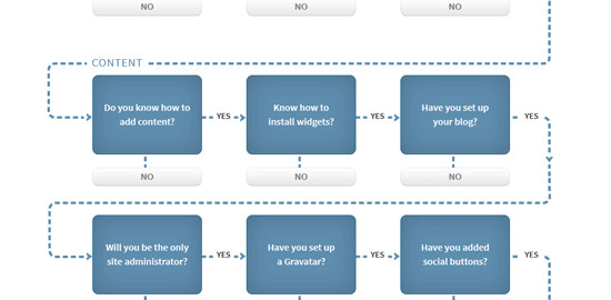
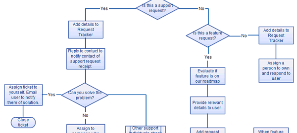
- Diagrams to visualize concepts and processes – There are many diagram types you can use to represent data. For an example the flow of a process (i.e. decision making process) can be depicted through a flowchart, or the structure of a system can be depicted through a block diagram (i.e. a sitemap or a network diagram).
A diagram type you can use to visualize concepts or show relationships between different variables is mind maps. Check the mind map below that illustrates a few benefits of visual communication that we should all (as writers and readers) know about.

Example of a Mind Map
- Word Clouds – A word cloud is an image that consists of several words related to a particular subject. The size of each word varies according to its significance. This is a great way to emphasize characteristics of a certain subject in a visually appealing manner. For example, the word cloud below highlights aspects of online marketing.

Example of a word cloud
- Comics – Comics can be a unique way of communicating a message or a process to a reader. For example, Google interprets its key engineering decisions through a series of comics, proving that this unconventional method of visual communication is a great way to explain complicated technical concepts to not so tech-savvy users.

Google Chrome Comics
- Logos and photographs – these can be helpful visual elements in highlighting facts you are trying to point out in words. For example, when you quote someone famous in a post, you can add his or her image next to it; likewise, you can add logos or icons next to the text to represent the subject under discussion.
Focus on Color and Typography
Visual communication applies to the color palette and typography as well; both play a major role in communicating your message to the readers and provoking a response from them.
Choosing a color for your font should be as important as selecting the words you write down. For example red indicates a sense of urgency, and writing a message in red would not only draw the attention of the reader, but it would also encourage them to respond immediately. On the other hand green would stimulate a sense of calmness, encouraging the reader to peacefully internalize the message without hurrying. Thus, when selecting colors, whether for the design of the page or typography, make sure they agree with what you are trying to say.
Typographical elements, such as the font, font size, the space between sentences etc., also contribute to making an article visually appealing. Using a larger font for the title and the subheadings are techniques commonly emphasized. In addition, you can either italicize the text or make it bold to draw the attention of readers to an important message.
This post consists of more than 1000 words; if I hadn’t added any visual elements, most readers would have skipped reading it altogether. I’m sure some at least went through the images while scanning the content. This is why it is important to use visual elements in a blog post; they draw and retain the attention of the reader while helping you drive your point home!


Hi Amanda,
You have a point here, some reader or most of them will appreciate something with visual element. It is much faster and easier for the brain to process something through visual.. For me, I prefer to read through visual representation, rather than reading actual words!!, Thank you for sharing, Can you share more ideas?
I’m sure you’re right, but I’m old school; I get my information from the words and skip over most graphics. I find most infographics irritating to the eye and less informative than written descriptions and commands, assuming there’s room for the latter.
If we can include traffic signs as infographics — “P” with a slash through it doesn’t save that much space and is a poor substitute for “No Parking,” although I recognize we have to communicate at all levels of language proficiency and internationalism in my town. I’m still wondering what the symbol is for “No Stopping,” though.
Are you familiar with Tufte’s work on visualizing quantitative and qualitative information? Beautiful stuff.
Hi Len, appreciate your feedback. True I do skip graphic sometimes too, but to be honest I like infographics. Sure, they don’t include a lot of information, but that’s exactly the point; the purpose of an infographic is to simplify complex data and convey the message using visual elements. But then again, we have to be really careful in selecting the facts we include in an infographic for we cannot add all relevant details, a luxury we can, of course, afford if we choose to say it in words.
And thank you for referring me to Tufte’s work, I’m definitely going to have a look.