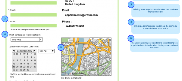
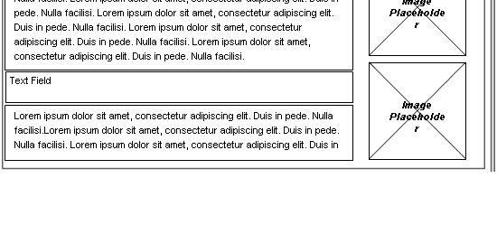
While our last post was all about highlighting some benefits and uses of wireframes, today’s post will focus on some tips that need to be taken into consideration when dealing with the process of wireframing. While some of them may not be focused directly on designing per se, there are certain elements like gathering feedback and adhering to a set objective, which are important to say the least.
As you may already know, a mockup is more inclined to show what a site will LOOK like; whereas a wireframe would be more focused on showing what a site DOES. This is a distinction that we do lose track of at times. The 10 steps shown below is an effective check list of what needs to be taken into account with regard to your wireframing project. These steps, if put into practice from your end, can help your client understand how exactly his site will function once it comes into fruition.
1. Set an achievable objective
A wireframe aims at solving all kind of problems. In addition to this, it will save you money and time since it is easier to change a paper wireframe or a prototype than to discover errors in many lines of code.
2. Functionality counts
Wireframes are about function, not form. That’s why they come before the actual design.
3. Who is in charge?
When doing a wireframe, remember that it’s vital to have someone in charge. This person should keep it current, manage feedback and relevant changes.
4. Is everyone involved?
It is imperative that you involve all staff in the process, from marketers to designers and developers and even users.
5. Put a deadline to the wireframe
If you want to keep a project moving, choose a deadline for your deliverables and make sure you stick to it.
6. Focused on users
As mentioned in our little intro, a wireframe is all about showing what a site DOES, having said that you would also need to take into account the user experience. For instance, it is never a good idea to let a site be too detailed whereby a user is confused when it comes to navigating around. Always have the user in mind and see how you can make the whole website experience easy and convenient.
7. Consistency
Consistency in your wireframe will assist users, developers and designers. When it comes to the repetition of groups of elements; remember that this can be useful to clarify things to users.
8. Does everyone understand your wireframe?
Everyone from business men, to marketers and designers, should find the wireframe easy to follow. As a rule of thumb it is best that you ask someone not involved in the project to see whether it is easy to assimilate. Perhaps your mother?
9. Get feedback
Ideally, an initial wireframe should gather feedback, a second one should show this feedback that was considered and the last one should be refined and polished.
10. The perfect tool
Paper prototyping is an excellent way to get started. However, as the project evolves, it is best that you consider an app or wireframing software to bring your wireframe into fruition and to help you manage the many iterations and screens involved.
Simple Project Planning with Wireframes
With a new product concept, the usual temptation is to dig into development right away. Coding should only be considered after the plugin’s behavior was identified. And this was attempted via detailed diagrams.
While workflows led our team at Creately to understand how the plugin works, wireframes helped us with the look and feel of the app, essentially defining the plugin’s graphical user interface. This diagramming process not only avoided re-work but helped our team understand how Creately would behave when integrated into FogBugz (visually, of course).
And, then we used wireframes…
Wireframing was the best stage which helped us see the real navigation between pages. By planning the process prior to development, it gave us a clear picture of the functionality and usability of the plugin; and helped us identify any potential problems to prevent insidious scope creep.
The wireframes illustrate the interface and information by separating design from the user experience. This was aimed at solving user experience issues. The whole process was a tad bit hectic, so we set out to design wireframes and workflows for each of the processes involved in development.
We wanted to explain the designs to the team quickly and easily. With the wireframes and workflows in place, everything was more like storytelling. We invited the entire team to collaborate and brainstorm on the diagrams and wireframes. They were asked to iterate over diagrams to reduce project turnaround times. This helped us arrive at concrete ideas even before we actually started with coding. This way, we were more focused on whether the plugin actually works rather than whether it looks flashy.
Any More Wireframing Tips?
So there you have it, 10 easy but significant steps that you should stick to at all times when wireframing. We hope you enjoyed this particular blog post, stay tuned for posts on sitemaps during this week. We do encourage you to send us your thoughts or comments via our site. Till next time – keep those wireframes picture perfect!


[…] some of our recent posts walked you through the art of wireframing and its benefits, have you ever wondered why we’re going on and on about wireframes? Well the […]