Wardley Mapping Tool
Plan Your Organization’s Growth
Understand your organization’s landscape and plan ahead for rapid growth while being prepared to navigate successfully through uncertainty.
- Customizable Wardley mapping templates to visualize organizational operations and landscape
- Online whiteboard with freehand drawing and real-time collaboration
- PDF, PNG, SVG, & JPEG export formats for printing & presentations

Map Your Organization’s Value Chain
Multiple Wardley mapping templates to identify operational gaps and plan activities to overcome them.
Configurable color themes to highlight insights and opportunities for improvement.
Freehand drawing and highlights to add annotations, make notes, and highlight specific points in the Wardley map that requires extra attention.
Link documents and add references to create valuable and information-rich Wardley maps.
Import data with ease from Excel, spreadsheet or CSV to centralize all of your information onto one infinite canvas.
Gear the Entire Organization for Performance

Attach links to external resources with in-app previews to provide further context to justify the thought process behind the operations strategy.
Import images onto the workspace to provide more context to the formulated plans, objectives, operations, and activities.
Embed your Wardley map in any site, or in Google/Microsoft docs, sheets, or slides, and Powerpoint presentations.
Export your strategy map as SVGs, PDFs, and PNGs to publish, present, print, and share.

Get Everyone in the Team to Perform
In-app video conferencing to communicate and evaluate the Wardley map with your entire team in real-time.
Real-time cursors for any number of participants. Collaborate with cross-functional teams on a shared canvas during operations and planning meetings.
Full comment threads to review, discuss and share feedback with organizational teams.
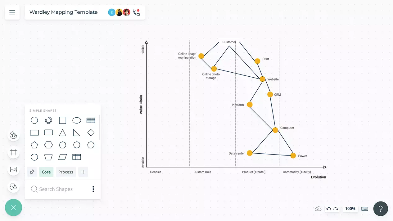
What Is a Wardley Map?
The Wardley map is a tool used to understand the landscape in which a business operates. It helps identify uncertainties and risks associated with delivering value to customers by showing the value chain graphed against evolution. Thus it allows the business to anticipate the future through increasing its situational awareness, and identify the strategic route to follow.
How to Create a Wardley Map?
- Identify the needs of the user or what the user actually wants. You can use a technique like a user journey map to understand the user requirements and pain points.
- Once the high-level needs of the user are clear, map out the components or activities required to fulfill them. According to Simon Wardley, the creator of the map, this set of components is called the chain of needs or the value chain.
- Draw the map. List the components/ activities down the y-axis. As you discover subordinate activities, place them under the superior activities. Connect them with lines to show how they relate to one another and to identify dependencies.
- Identify how evolved each component is in the value chain. Plot the components along the evolution axis which consists of the categories genesis, custom-built, product (+rental) and commodity (+utility).
- Examine the map you have built. Invite others from your team and discuss the trends you have discovered. You can do so with a Creately edit or review link or simply by adding collaborators to your documents.