We all like visual presentations. That’s the impetus behind the popularity of infographics. According to sources quoted by the Visual Teaching Alliance, our eyes can register 36,000 visual messages per hour (Jensen, 1996) and “90 percent of information that comes to the brain is visual” (Hyerle, 2000).
What This Article Covers:
- Visual Appeal for Numbers
- Visualizing Mountains of Data
- Follow The Data-Driven Leaders
- Examples From Online Services
- A Chart for Every Situation
- Resources
QuickSprout’s Neil Patel points out the oh-so-short attention span we are graced with as humans, putting it somewhere in the neighborhood of a mere 8 seconds but points out that infographics are “thirty times more likely to be read than text.”
Using infographic to dress up our numbers is one cool way to share our data, but before we can even think about that, we have to visualize the mountains of data now being collected and determine how to best present it to bosses, clients, customers and those within our organizations who need it for business decisions.
And when it comes to visualizing data, Rachel Delacour reminds us in her Wired.com article: aesthetics are not optional.
Visual Appeal for Numbers
But too often, turning data sets into graphics happens with little or no respect for aesthetics. And aesthetics are not an optional part of visualizing data. They are crucial in helping us understand what we’re looking at. That’s why it is high time to think about how we all go about handling data and presenting it. — Rachel Delacour, Wired.com
The key to dressing up numbers is knowing how to make sense of those numbers, and how to both present and choose the appropriate means for presentation based on the meaning we want to convey. We want to master the mountains of big data, learn how to sift through it for what’s important, and understand how to choose the right chart for the story we want to tell.
Visualizing Mountains of Data
Business today works with numerous online services in order to round out, make up for staff, expediency or extra productivity. Ranging from mobile point of sale to email marketing to retail technology to analytics to accounting to customer relationship management to project management. One thing all these services have in common is collecting data that you need to present to your clients or bosses or board members.
Some of us cut our teeth on crunching numbers and producing charts. Others, not so much. The challenge is in thinking about data, making sense out of new kinds kinds of data, and choosing an appropriate format for layout and presenting the data.
Rapid-Fire Technologies Produce New Data To Analyze
Today, these technologies are not quite new, not exactly emerging, but because they have not been on the scene for decades, learning how to analyze the copious amounts of data produced by them poses challenges, both for understanding and for sharing with others.
What are some of these technologies?
- data from email marketing
- data from in-store retail and mobile point of sale
- data from website or blog analytics
- data from accounting activities
- data from retail technology (like pricing comparisons and analytics)
Let’s take a popular trending topic that produces a mountain of data — like email marketing — as an example. In Understanding Mobile Email Statistics and Benchmarks, the writer asks (and answers) some key questions:
Have you ever looked at your mobile email marketing statistics?
[Do you know] how to benchmark your mobile email statistics and look at them?
Ten years ago, who was benchmarking “email marketing statistics”? Maybe so-called internet marketers, but certainly not the average business manager! Knowing the answer, she goes on to say, “Before you can do that, we must know a bit more about the how and what. Statistics might not be that clear if you look or compare them for the first time.”
So, before you can add visual appeal, dressing up your numbers, in this case, involves a combination of efforts including first understanding what you’re seeing, then using the right types of charts, graphs, or diagrams to display each type of information. Asking yourself the question: Which type of chart conveys your point the best: a scatter chart? a histogram? flat bar chart? a pie chart?
Continuing with our example of turning the new deluge of mobile email statistics into useful representations, Email Monday provides a plethora of charts — the ultimate mobile email statistics overview — displaying different metrics around the subject. Viewing them gives us an eye-candy view of what information movers-and-shakers would want to see.
Follow The Data-Driven Leaders
Services like Creately.com allow you work with your own data, whether you’re an engineer or business analyst or marketing director. But the new types of data, like those mentioned above, can stump even the most seasoned number cruncher.
We can begin to understand how to present our numbers by doing what people have been doing for aeons: studying what leaders in various industries are already doing.
Data-driven businesses with huge budgets are daily fighting to gain control of big data and whipping it into shapes that companies can manipulate and act upon. Below are some examples.
Examples From Online Services
Data is the meaningful trends and stats gained from analysing those numbers. Which is why independent businesses have historically been at a competitive loss. They just didn’t have the resources to employ an army of analysts to hammer away on algorithms. These days the tables are turning. — Tara Benedict, Vend
There is a wide array of numbers, formulas, metrics, benchmarks, comparisons, and aggregations measuring people online and offline, their behaviors, processes, activities, dollars spent and social engagement. The new data is big data, massive but almost manageable if you can harness it and present it to those who need to know in ways they can understand. Study charts around a specific type of data to visualize other ways you can use or present the same or similar or contrasting data. Here are a few fields of data being used by popular online companies.
Retail Technology: Real-time Data
FOLLOW THE LEADERS
Examples From Online Services:
- Retail Technology: Real-time data
- Website and Blog Analytics
- Social Media Metrics and SEO
- White Papers, eBooks and Surveys
In the mobile retail technology space are companies like Vend, who provides POS software for small business and enterprises, and Wiser whose dynamic pricing engine gives retailers a way to measure their pricing structures against similar retailers. Both companies present the massive real-time data streams, which sometimes change hourly, in understandable charts and graphs so business owners can make informed decisions daily.
We’ve already looked at stats coming from mobile email marketing, perfected by companies like GetResponse and Litmus both of whom produce periodic papers and reports useful to retailers, small businesses, consultants and other major industries.
Viewing the graphs and charts from huge companies like these who measure factors that change so rapidly, you can learn new ways to present ever-changing data.
Website and Blog Analytics
Aside from pure website traffic, services like open-source analytics powerhouse Piwik looks at who is looking at you, how they view your website, where they go after they leave. Take a look at the myriad charts they provide to see the footprints left and the revenue impact of blog or website visitors. You’re already familiar with Google Analytics, too.
Coupled with information from services in the retail space or with email marketing, you start to glean an even bigger picture of what’s happening with your web properties and how to present facts and figures to decision-makers.
Social Media Metrics and SEO
On the social metrics scene are companies like Kissmetrics, Sprout Social, and HootSuite who offer you people activity metrics and social engagement touchpoints. Talk about BIG data and NEW data, the social media space touchs upon fields like behavioral analysis, demographics, psychoanalytics, comsumerism and others formerly only in the purview of multi-national conglomerates.
It is no wonder that small business would have difficulty determining what is meaningful or how to share any information about what is happening there. Your task here is to view the data services like these provide to see what kinds of meaningful information they extract from these noisy spaces and how they share it.
White Papers, eBooks and Surveys
Another excellent source of study are the white papers and reports put out by research think tanks — like Forrester Research — and the marketing automation biggies, whose ebooks are always chock full of data analysis and the resulting charts they created to share the data. (Beautiful stuff!)
You’ve studied, you get the idea, you’re ready to grab a shovel-full of your own numbers and metrics. The next section helps you figure out which format is best for sharing your data compilations.
A Chart for Every Situation
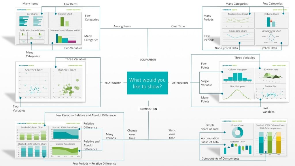
Take note of Daniel Pradilla’s wise words: “There’s a chart for every situation. Each type of information that you have and each analysis that you want to make can be benefited or harmed by the chart you choose. The idea of displaying data graphically is to help the other person understand what you mean to say.” (His site is also where I first saw Abela’s charting guide shown below.)
We asked this question earlier: Which type of chart conveys your point the best: a scatter chart? a histogram? flat bar chart? a pie chart?
The thought-provoking diagram below helps you decide which chart to choose to get your point across.

The Chart Suggestions – A Thought Starter diagram is courtesy of Dr. Andrew Abela of Extreme Presentation
Conclusion
With all this talk of big data and visually appealing charts, did I forget to mention the simple things? Sometimes you just want to capture your data with a simple table. 🙂 If you don’t want to code by hand, there is always the CSS Table Generator (with lots of examples).
Thanks for staying with me during this discussion of visual appeal for your numbers and charts. If you can think of other services or resources that create the kinds of charts we could learn from, please share them, along with your ideas, thoughts and questions in the comments below.
Vernessa Taylor is a micro and small business champion who helps owners choose and use smart technologies in their businesses. She is the editor of CoachNotes Blog at LocalBusinessCoachOnline.com. For a limited time, get your no-cost copy of her eBook: Engage! Communications PowerPack for WordPress Blogs, 2nd Edition.


One of the wonderful article. The critical thing is however the presumption furthermore the objective stick with it, the methodologies are constantly developing to concentrate on calendar of differed group, abilities to focus, and also the evolving slants. What’s more, we as experts around here, just need to continue obliging. The multiplication of infographics is a superb case with this. People used to try to peruse extraordinary written work.
That was a good read, Vernessa. I’m with you on there being mountains of data that can be analyzed now. Lots of companies let all their own data and client data simply flow by without getting any actionable data out of it. That’s a shame considering that a lot of statistics and data that you see out there on the web is just so much rubbish, and the only data you can truly rely on is your own data.
Hi Author,
That would be the great insight for creating visual appeal for numbers in a systematic way but I am the little bit confused on, how to create compelling content from data? If you know about the approach kindly respond me back via email or below my comment.
I am looking forward to reading your positive response. Cheers, Dave
You can use an Infographic creation tool.
Thanks a lot!
Nice Article. Thank you for sharing such type of information.
Great strategies. I found a lot of insight in this article and some of the best wise words iv heard in awhile!
One of the awesome article. The important thing is though the assumption and also the target stay the same, the strategies are continuously evolving to focus on schedule of varied crowds, attention spans, as well as the changing inclinations. And we as professionals in this business, only need to keep accommodating. The proliferation of infographics is an excellent example with this. Folks used to make an effort to read great writing.
Excellent article. Kudos to you. Infographics are now more easily taken up by people. And there are simpler ways to convey informations. Like you said in the conclusion, a simple CSS table generator might do the trick for many.
Great article – really true that the challenge of conveying quantitative information is converting the numbers into visuals that connect and communicate with average people. Also, true as the other poster said that now people expect to be able to quickly read well put together graphics, so in some sense these are now required in order to keep pace with expected presentation of data.
Great Article! The field of information visualization has emerged from research in human-computer interaction, computer science, graphics, visual design, psychology, and business methods. It is increasingly applied as a critical component in scientific research, digital libraries, data mining, financial data analysis, and market studies.
Great post! The bottom line is though the goal and the premise remain the same, the strategies are constantly evolving to cater to the changing preferences, attention spans, and even schedule of various audiences. And we as professionals in this industry, just have to keep adapting. The proliferation of infographics is a great example of this. People used to take the time to read good writing. Now, they just like to look and take in everything in one glance.
Great quote there by Rachel about the aesthetics of visualising data.
One thing I picked up on was mobile data – it’s becoming more and more apparent now to marketers and businesses that mobile data should be taken more seriously.
Great post, thanks.
– Stuart