Easily visualize your processes and workflows with smart automation.
Create visual organizational structures with images and detailed profiles.
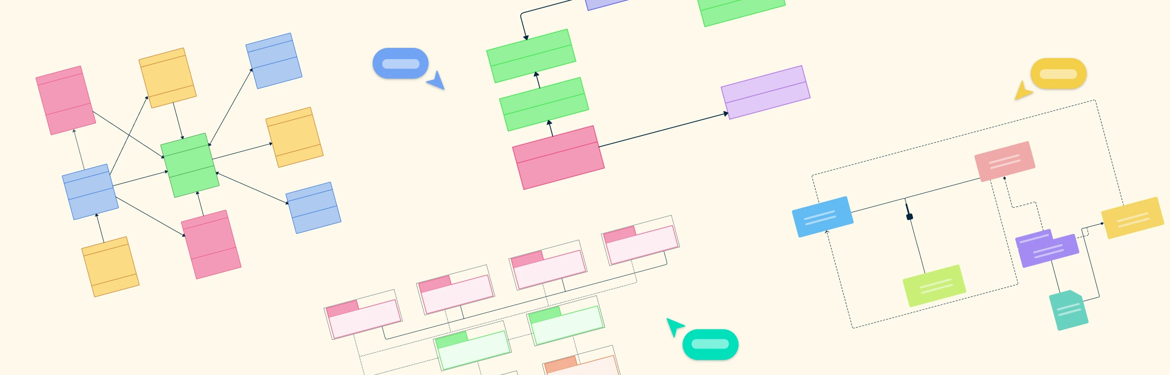
Visualize concepts and their relationships on an infinite visual canvas.
Map family history and understand the relationships with detailed genograms.
Visualize relationships between entities using Crows Foot or Chen notation.
Visualize your network infrastructure. Support AWS, CISCO, Azure and more.
Visualize and expand your ideas using our powerful mind mapping tool.
Easily create family trees with our professionally designed templates.
Infinite canvas to add diagrams, images, sticky notes and more.
Run collaborative meetings, workshops or brainstorming sessions.
Collaborative diagramming for educators and students at discounted rates.
Log In
Sign Up Free
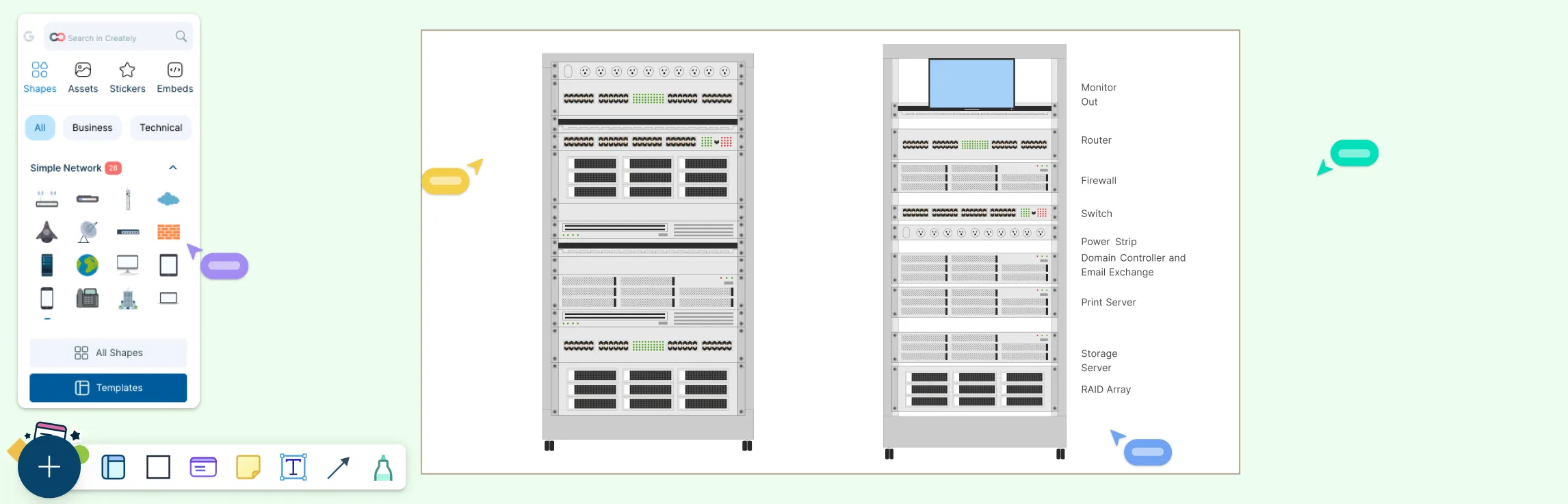
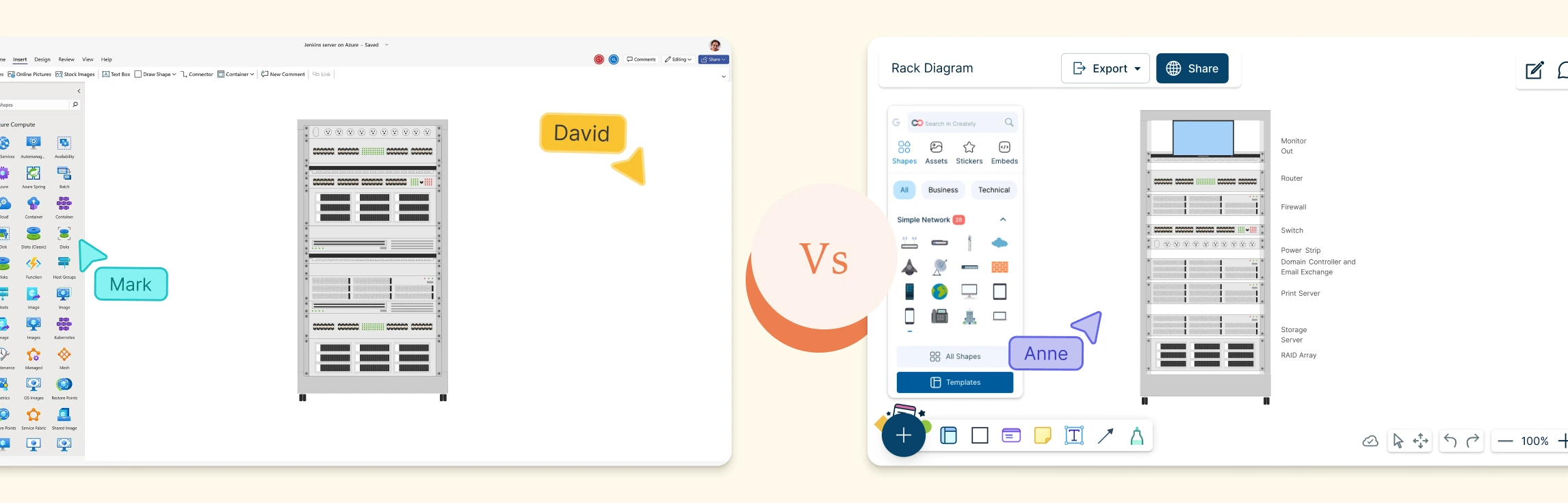
Managing servers, switches, and network gear requires clarity and precision. Whether you’re planning a new deployment, reorganizing a rack, or documenting existing infrastructure, a clear visual layout keeps everyone aligned and prevents costly mistakes. In this guide, you’ll learn how to create rack diagrams that are accurate, scalable, and easy to maintain—so you can plan smarter, troubleshoot faster, and keep your infrastructure organized.
In this guide, you’ll learn what a rack diagram is, how to make a rack diagram in Visio, and the common limitations teams run into when using Visio for rack layouts. We’ll also explore a faster, more collaborative alternative and explore some ready-made rack diagram templates to get started.
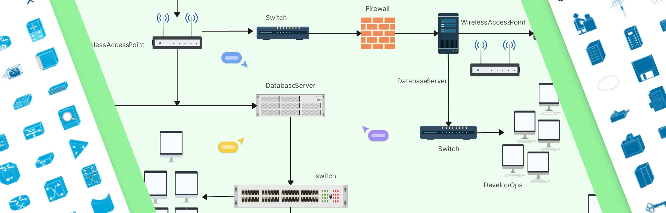
Network diagrams are the backbone of modern IT infrastructure work. They help teams design networks, document what’s actually deployed, troubleshoot issues faster, and explain complex setups without long meetings or guesswork. But not all diagramming tools are built for this kind of work. The right tool makes it easier to be precise, keep diagrams up to date as the network evolves, and ensure network engineers, operations, and security teams are aligned around a single source of truth. The wrong one leads to messy diagrams, outdated documentation, and costly misalignment when it matters most.
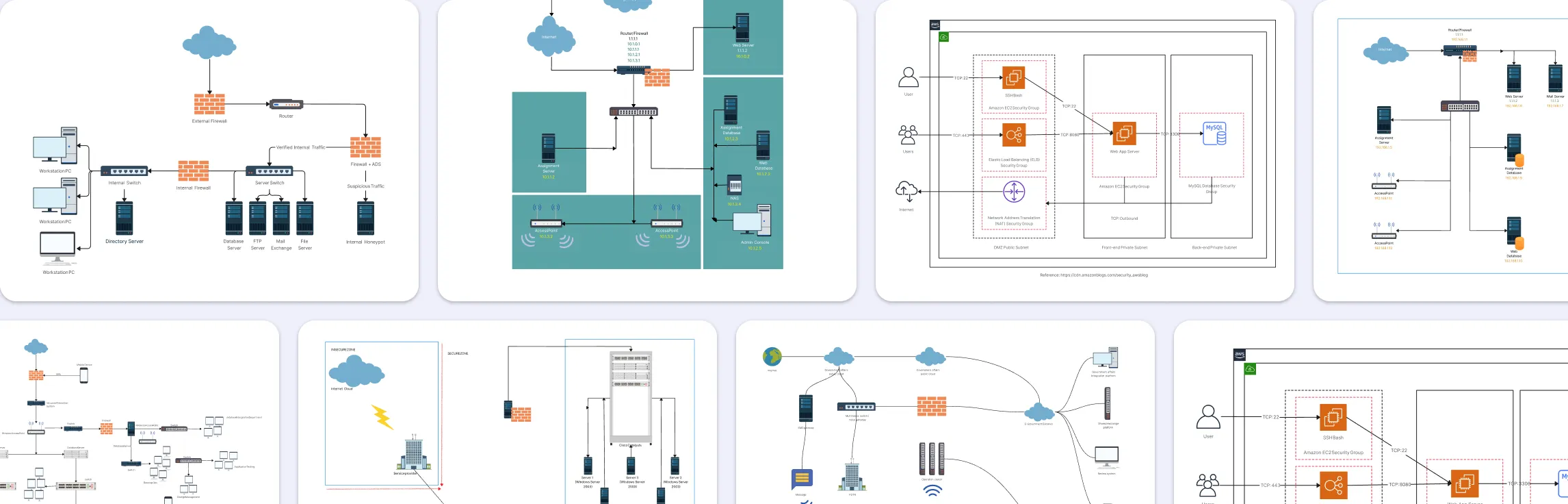
Network security diagrams help teams spot vulnerabilities, plan controls, and communicate network design clearly. Used by admins, architects, and auditors, they turn complex networks into easy-to-understand visuals. This guide showcases practical network security diagram examples and templates you can use to strengthen your network.
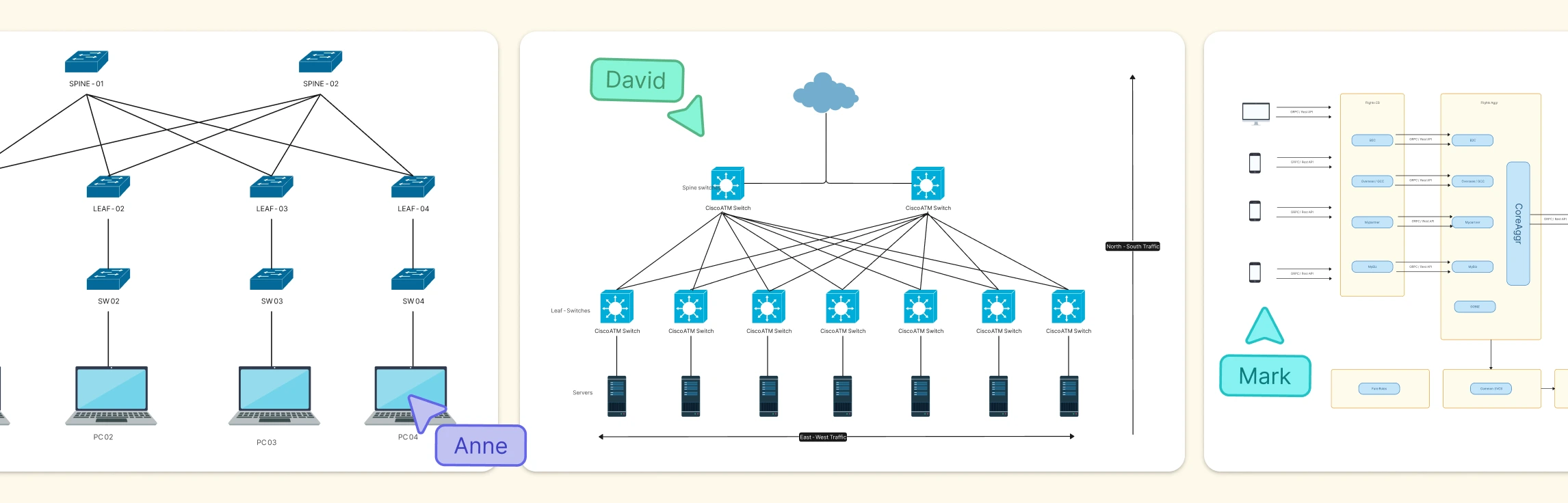
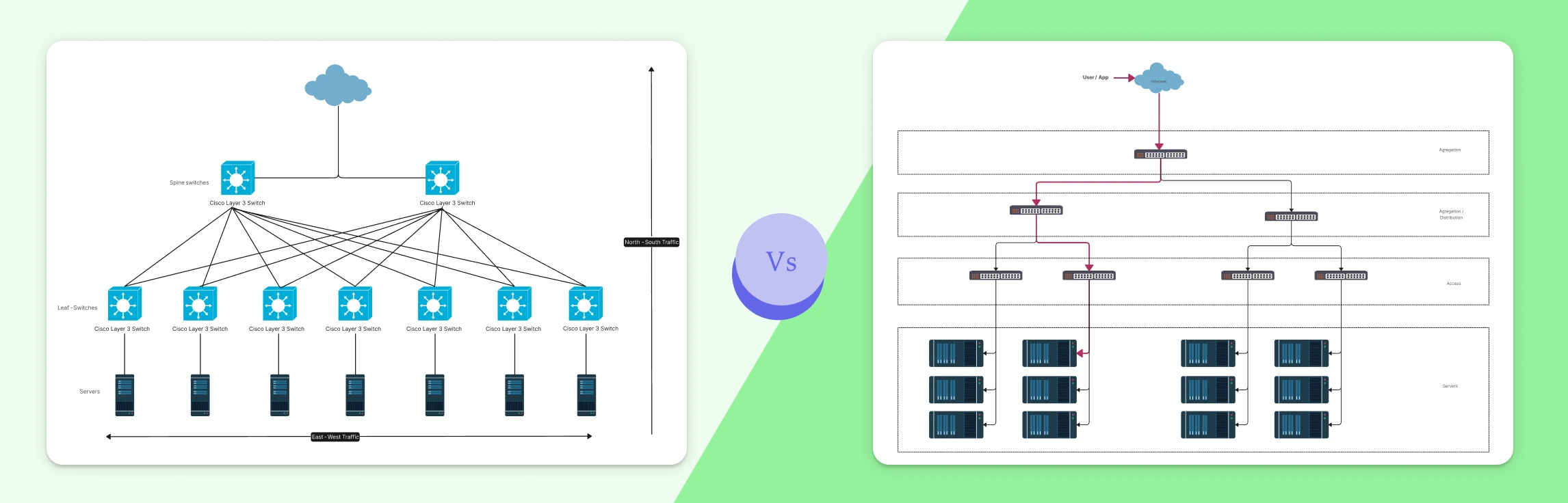
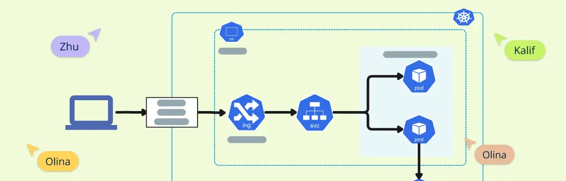
Modern networks generate far more traffic inside their boundaries than at the edges, and that internal flow is where things often go wrong. This guide explains what East–West traffic is, where it shows up in data centers, microservices, Kubernetes, and cloud networks, and why visualizing it is critical for performance, security, and observability. You’ll see real-world examples, common challenges teams face, and how network diagrams can turn hidden internal traffic into something clear, shareable, and easier to manage.
Modern applications don’t just send traffic in one direction. Requests move into systems from users, flow across internal services, and fan out across increasingly complex architectures. Understanding the difference between North–South and East–West traffic is essential for making sense of how modern networks actually behave. This guide breaks down both traffic patterns, shows how they differ in real-world environments like data centers and microservices, and explains why visualizing these flows matters for performance, security, and reliability today.
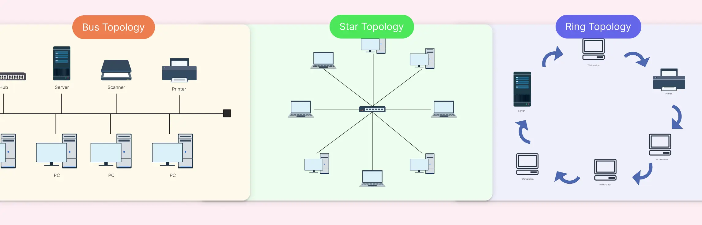
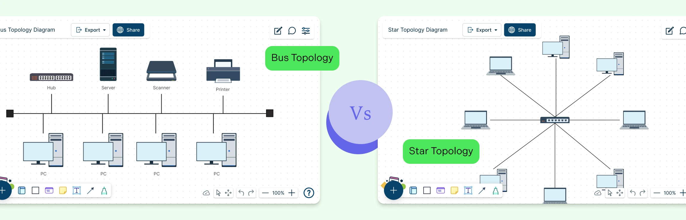
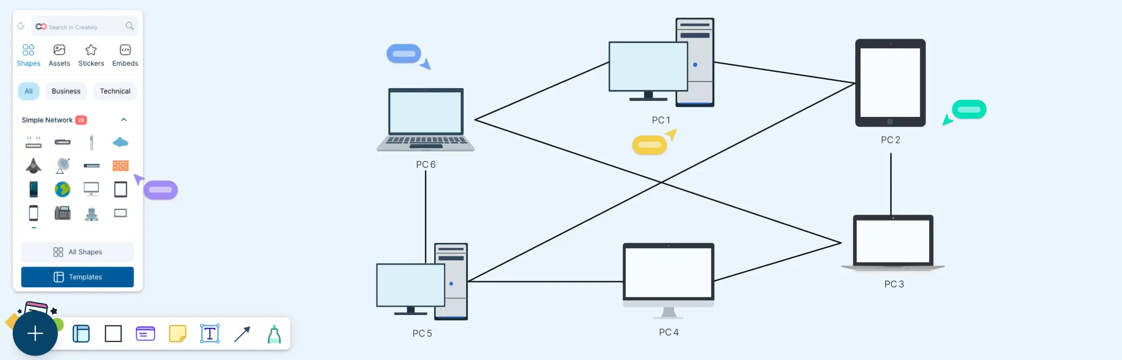
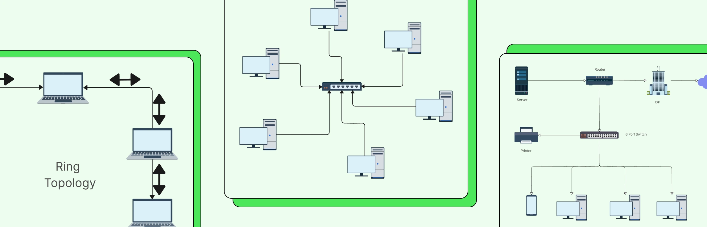
Choosing the right network topology can feel like navigating a maze; one wrong decision, and you’re stuck with slow data flow, troubleshooting headaches, and scattered team workflows. That’s exactly why comparing Bus, Star, and Ring Topology upfront can save hours of frustration and keep your network running smoothly. In this guide, we’ll break down each topology, highlight the differences, and show you practical ways to visualize your network with ready-to-use templates.
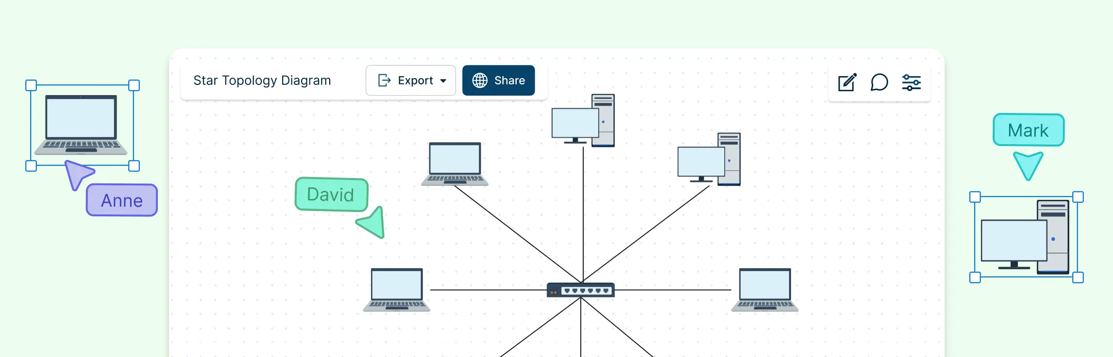
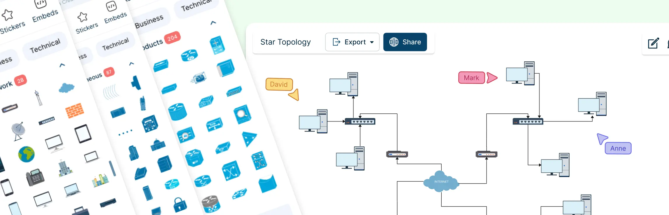
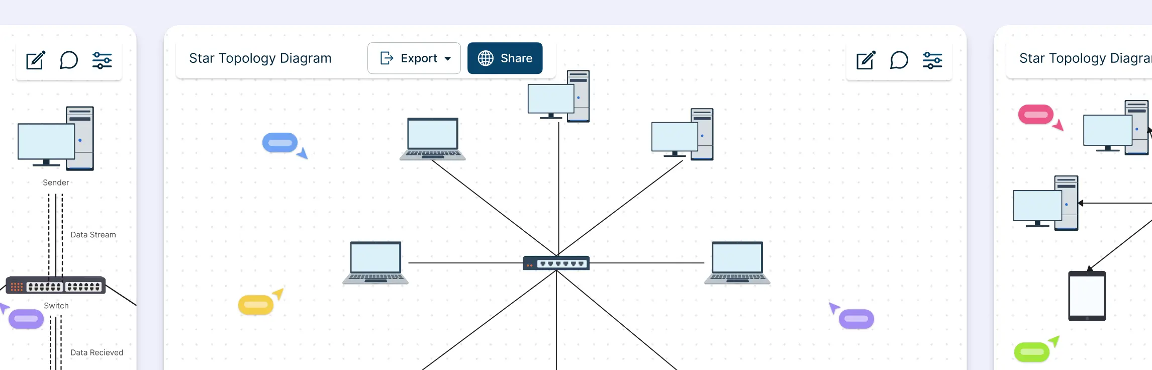
Ever stared at a messy network diagram and felt your head spin? Many teams struggle with scattered connections, confusing layouts, and endless troubleshooting, especially when networks grow beyond a few devices. That’s where a star topology comes in: a simple, organized way to connect devices with a central hub, making your network clear, manageable, and scalable. In this guide, we’ll discuss the different types of star topologies and 10 practical star topology examples that you can explore.
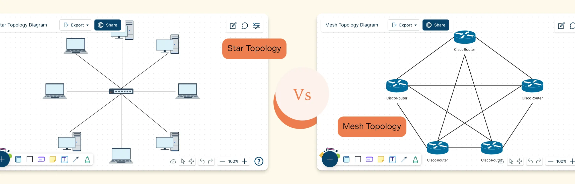
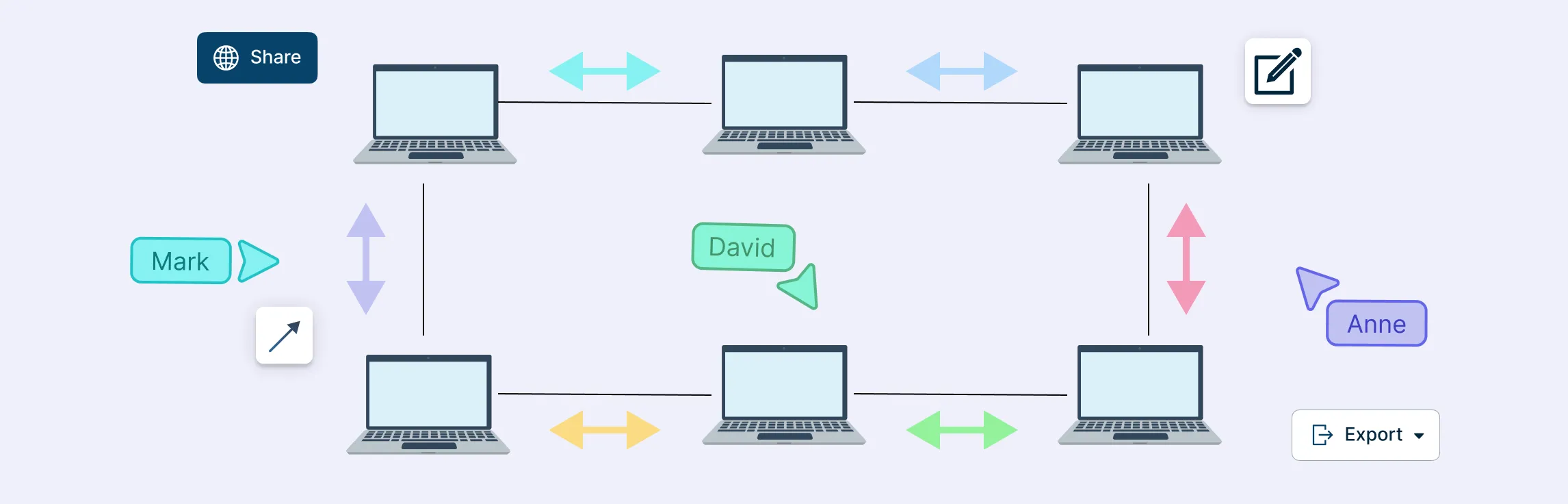
Choosing the right network layout can make all the difference in performance, reliability, and scalability. Star and Mesh Topology are two of the most popular designs, each offering unique ways to connect devices and manage data flow. Whether you’re building a small office network or a large, high‑availability system, understanding Star and Mesh Topology helps you make smarter design decisions, troubleshoot effectively, and ensure your network can grow with your needs.
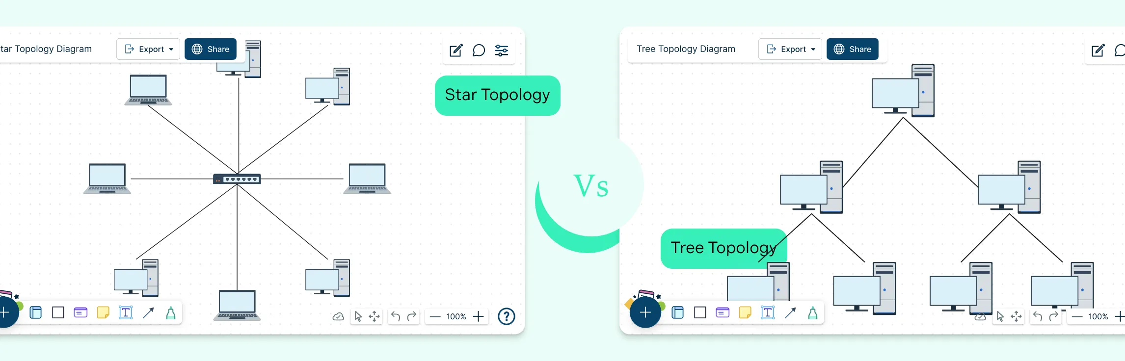
Choosing the right network topology plays a big role in how efficiently a network performs and scales over time. Star and tree topologies are two widely used structures, each offering different strengths when it comes to layout, reliability, and expansion. This guide breaks down the key difference between star and tree topology to help you understand how they compare and when each one makes the most sense.
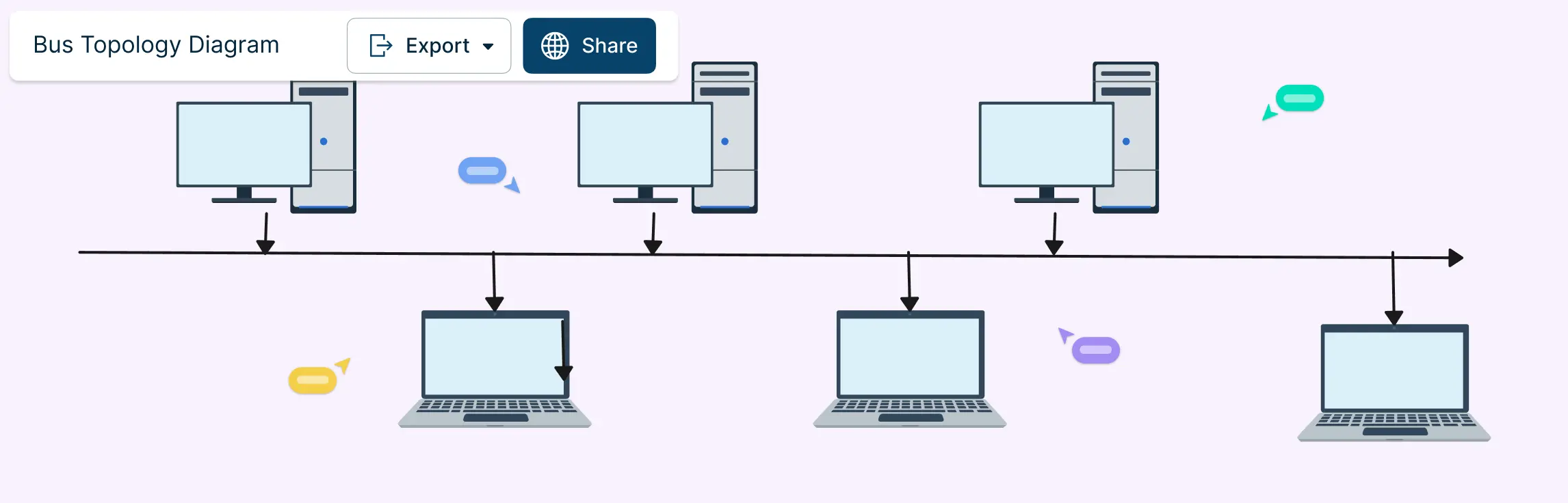
Bus topology remains one of the simplest ways to structure a network, with all devices connected along a single shared communication line. While bus topology is less common in modern enterprise networks, bus topology still appears in legacy systems, industrial environments, and specialized setups. This guide brings together practical bus topology examples to show how this layout is used across different real-world scenarios.
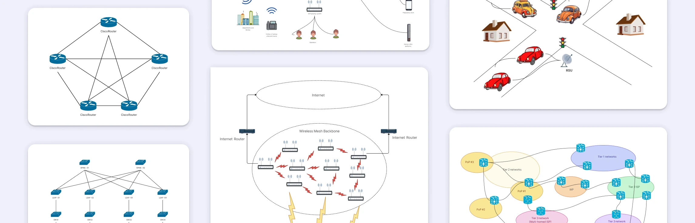
A partial mesh network is a practical approach to building reliable networks without the overhead of fully connecting every device. This guide explores why partial mesh networks are used, where they appear in real-world architectures, and how they compare to full mesh topology designs, helping you understand and choose the right topology with confidence.
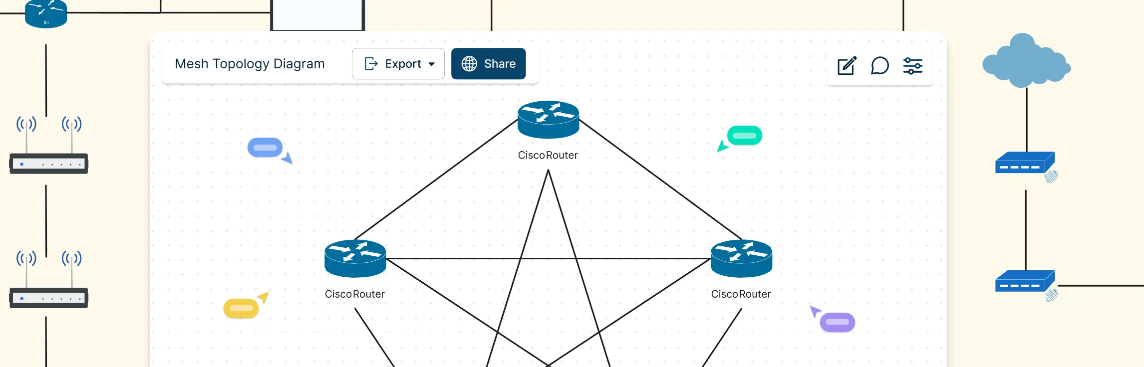
A mesh topology connects devices through multiple redundant paths instead of a single central link, making networks more reliable, fault-tolerant, and scalable. This guide covers real world mesh topology examples, from internet backbone routing and wireless mesh networks to home Wi-Fi systems, data center interconnections, emergency communication networks, and peer-to-peer architectures to help you understand how mesh designs work in practice and draw accurate network diagrams.
Choosing the right network topology can feel confusing, especially when terms like bus and star sound technical but affect how your entire network behaves. This guide breaks down how bus and star topologies work, what makes them different, where they overlap, and when each one makes sense. By the end, you’ll know exactly which topology fits your setup, and how to diagram it clearly using ready-made templates.
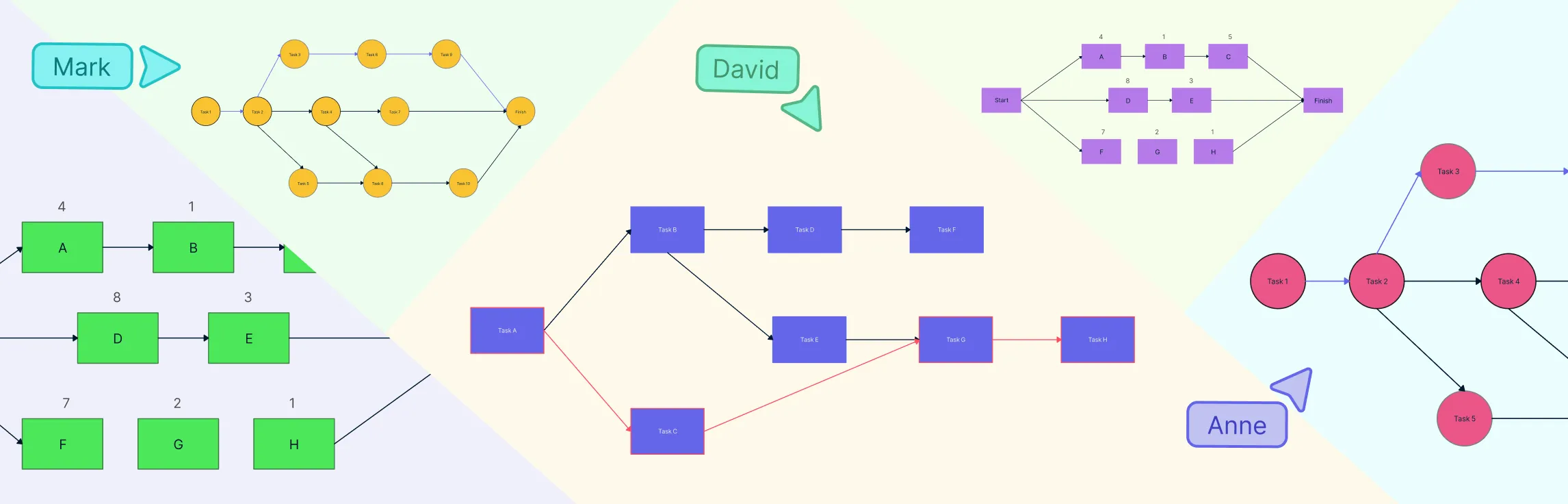
Want clearer project timelines and fewer surprises? Network diagrams and the critical path method (CPM) help you visualize how tasks connect, depend on one another, and ultimately drive your project schedule. A network diagram maps the flow of work, while the critical path — the longest chain of dependent tasks — defines the shortest possible project duration. Since any delay on this path delays the entire project, understanding these tools is essential for realistic planning, early risk detection, and staying on track.
Visualizing your network’s security setup is key to keeping systems safe and organized. Firewall network diagrams help IT teams see how traffic flows, identify weak points, and plan robust defenses. In this guide, we’ll explore practical examples and templates you can use to design clear, effective firewall diagrams for any network.
A ring network topology connects devices in a circular loop so each node links to exactly two neighbors, forming a closed path for data to travel either unidirectionally or bidirectionally. Ring topologies can be simple logical designs or part of hybrid network setups — they’re valuable for planning, documentation and troubleshooting network traffic paths.
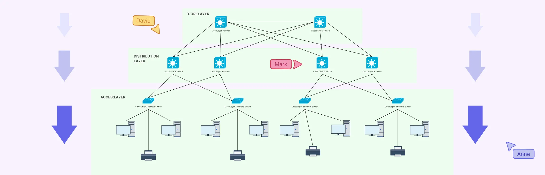
Designing a network can feel like trying to untangle a massive ball of wires, confusing, frustrating, and time-consuming. That’s where a hierarchical network topology comes in. In this guide, we’ll break down what a hierarchical topology is, explore its core layers, show real-world examples, and weigh its advantages and disadvantages.
Ever stared at a tangle of cables or a messy network diagram and thought, “There has to be a better way”? That’s where the extended star topology comes in: a structured, scalable network design that keeps communication smooth, devices organized, and troubleshooting a breeze.
Ever stared at a diagram full of tangled notes trying to make sense of your network setup? The right network diagram software can turn that chaos into clarity. In this guide, we’ll walk you through the best network diagram software, so you can pick the solution that brings structure, speed, and visual clarity to your workflow.
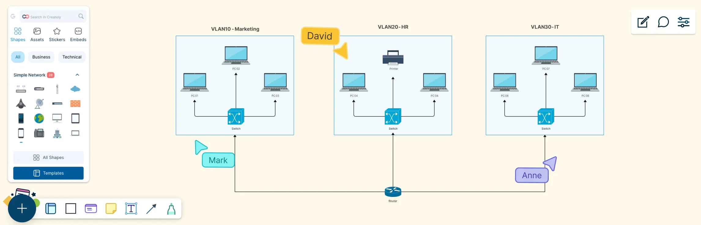
Modern networks can look simple on the surface, but behind the scenes, traffic needs to be carefully separated, secured, and managed. This guide helps you understand VLAN diagrams by breaking them down step by step, from what a VLAN diagram is, the key components you’ll see, why it’s used, real-world examples, and how to draw one yourself.
This guide walks you through everything you need to know about peer-to-peer (P2P) network diagrams, from what they are and how they work, to the key elements that make them effective. You’ll explore the main P2P architectures, see real-world diagram examples like BitTorrent, WebRTC, and Gnutella, learn how to draw your own P2P network diagram step by step, and compare peer-to-peer layouts with traditional client–server networks.
Network topology can feel unnecessarily complex, especially when you’re juggling performance issues, scaling needs, and team alignment at the same time. This guide breaks down star and ring topology in a simple, practical way, without the jargon overload. You’ll learn how each topology works, see real-world examples, understand the difference between star and ring topology, and explore how a star–ring hybrid topology combines the best of both worlds.
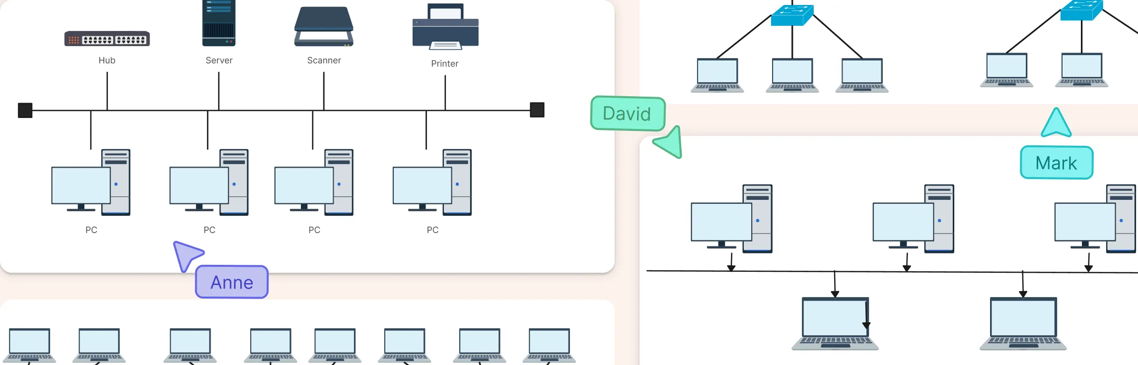
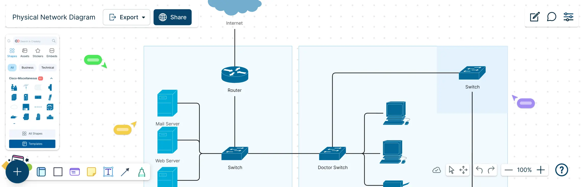
Managing a network without a clear map can feel like navigating a maze blindfolded. Cables tangled, devices misplaced, and troubleshooting taking hours instead of minutes. That’s where a physical network diagram comes in. This guide will show you exactly what a physical network diagram is, why it matters, and how to create one step by step. You’ll also learn about its key components, common topologies, best practices, and ready-to-use templates that make diagramming fast, accurate, and visually intuitive.
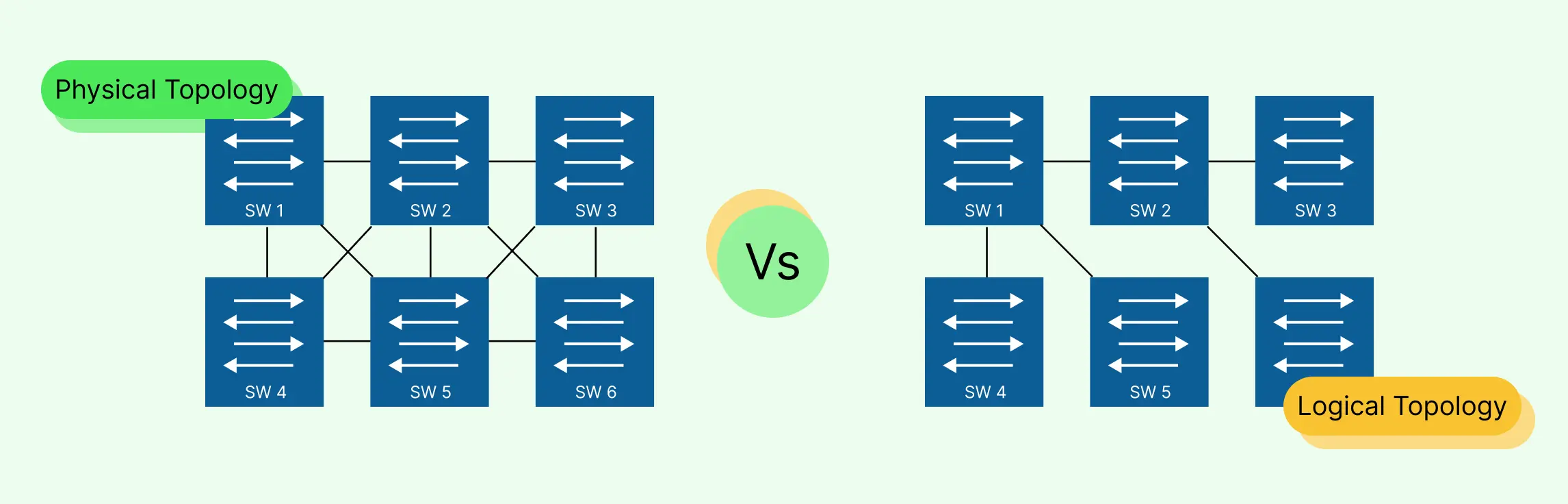
Designing and managing a network can quickly become overwhelming, cables everywhere, unclear data paths, and confusing layouts can leave even experienced IT teams frustrated. That’s why understanding the difference between logical topology vs physical topology is essential. In this guide, we’ll break down physical and logical topologies, explain how they differ, and show you how to create clear, accurate diagrams that save time, reduce errors, and make collaboration effortless. Plus, you’ll discover ready-to-use templates that let you map networks visually without the stress of starting from scratch.
When you’re planning or managing a real-world network, clarity and control matter more than ever—and that’s where tree topology stands out. With their hierarchical layout and clearly defined branches, these diagrams make it easier to scale networks, organize complex infrastructure, and pinpoint issues without disrupting the entire system. This guide will take you through the essentials of tree topology, from how it works and its key characteristics to practical examples and diagramming tips, helping you design, visualize, and troubleshoot networks with confidence.
Network diagrams are the foundation of understanding how data flows in different network designs, and ring topology diagrams have a special place in that world because of their unique circular communication pattern. While ring topology might seem simple at first glance, they pack a lot of interesting behavior—from predictable traffic flow and equal access for all devices to the engineering trade-offs that make them both powerful and challenging in real deployments. This guide walks you through ring topology diagrams, how they work, and their practical applications in real-world networks.
Mesh topology has become increasingly important as modern networks demand higher reliability, flexibility, and uninterrupted connectivity. Designed to keep data flowing even when individual connections fail, this network structure is widely used in environments where uptime and resilience matter most. Industry experts often highlight its ability to support dynamic routing, making it well-suited for wireless networks, IoT systems, and large-scale infrastructure. This guide walks you through mesh topology in computer network from a practical perspective, helping you understand its behavior, strengths, and structure through clear explanations and diagrams.
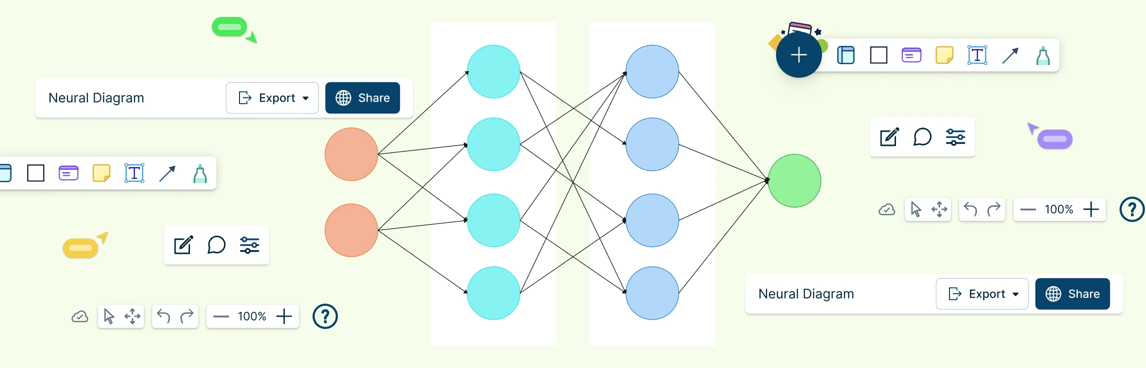
Neural networks power many of the intelligent systems we use every day, but what happens inside these models can feel abstract and hard to visualize. A neural network diagram brings clarity by turning complex learning processes into a simple, visual structure you can actually understand. In this guide, you’ll explore what neural networking diagrams are, how neural networks are used, their key components, common examples, and how to create one yourself.
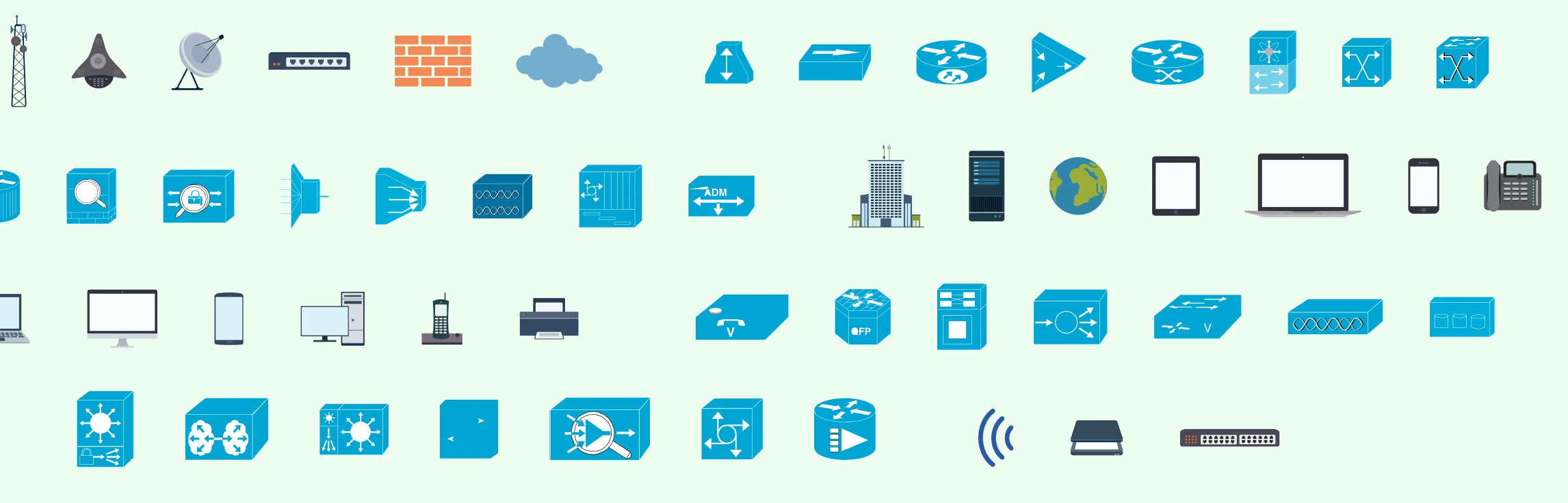
Network diagrams are visual representations of a computer network that show how devices, systems, and connections are structured and how data flows between them. These diagrams are only as clear as the symbols used to draw them. This guide simplifies networking symbols by explaining what they are, why they matter, and how to use standard symbols correctly. You’ll learn about common network diagram symbols, best practices for labeling and annotation, and how these visual elements help create diagrams that are easy to read, share, and maintain over time.
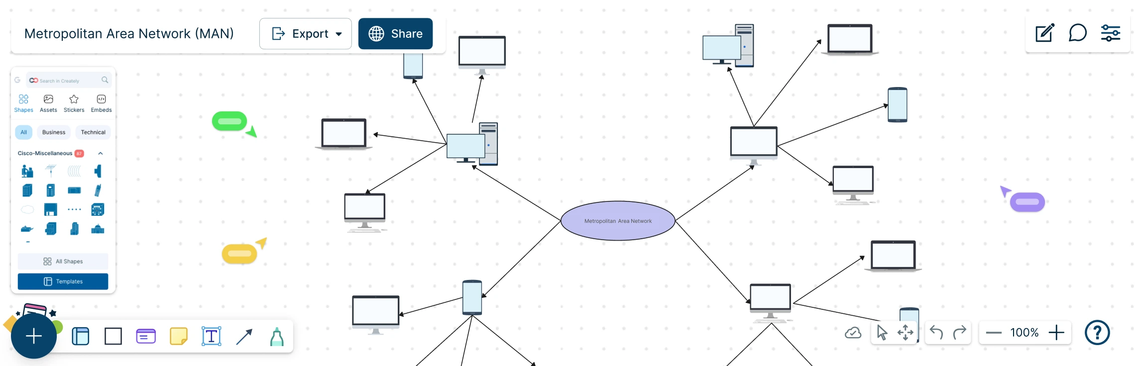
A Metropolitan Area Network (MAN) sits at the heart of modern, city-scale connectivity, linking offices, campuses, and critical services into one seamless network. But as networks grow beyond a single building, understanding how everything connects can quickly become complex. This guide explores what a MAN network diagram is, how it compares to LAN and WAN setups, when it makes sense to use one, and how to design it step by step. With practical examples and free templates, you can move from concept to clarity and confidently map networks that scale across an entire city.
A star topology makes networks easy to see, manage, and troubleshoot by connecting all devices to a central hub or switch. The key is clarity and simplicity — a well‑designed diagram instantly shows how devices interact and highlights potential issues. In this guide, you’ll learn how to create a clear, professional network star topology diagram that communicates your network at a glance.
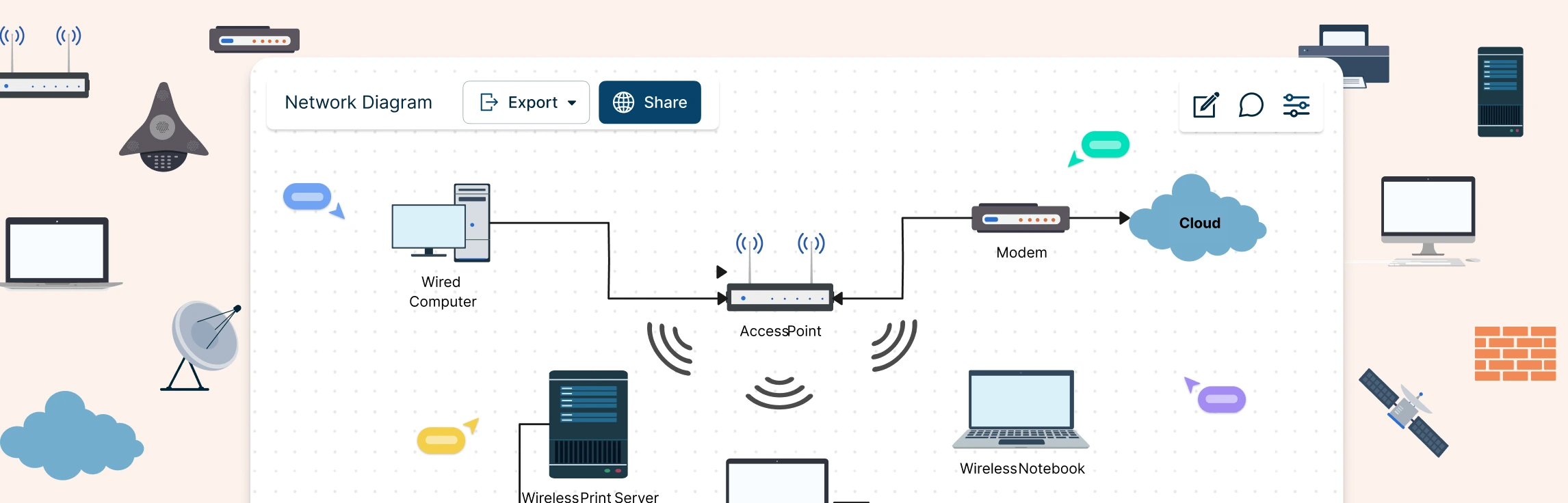
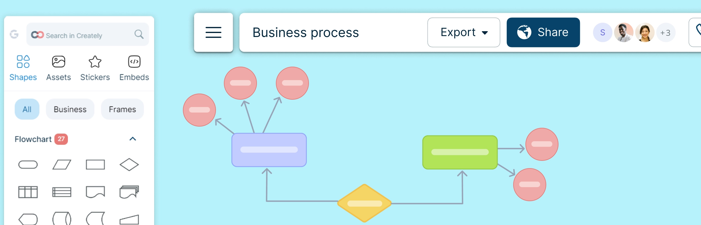
A network diagram is a visual representation of system components—such as devices, servers, and applications—and how they’re connected. It shows how data, traffic, or dependencies flow across a network, making complex systems easier to understand at a glance. In this guide, you’ll learn how to draw a network diagram step by step, from planning what to include to laying out components clearly and choosing the right symbols.
Bus topology is often one of the first network layouts people encounter because it’s simple, visual, and easy to follow. In this guide, you’ll learn how bus topology diagrams are structured, how data moves across the shared backbone, and what the layout looks like in real-world and learning scenarios. We’ll break down key bus topology diagram elements, highlight common design patterns, and point out the limitations you need to account for when working with this topology.
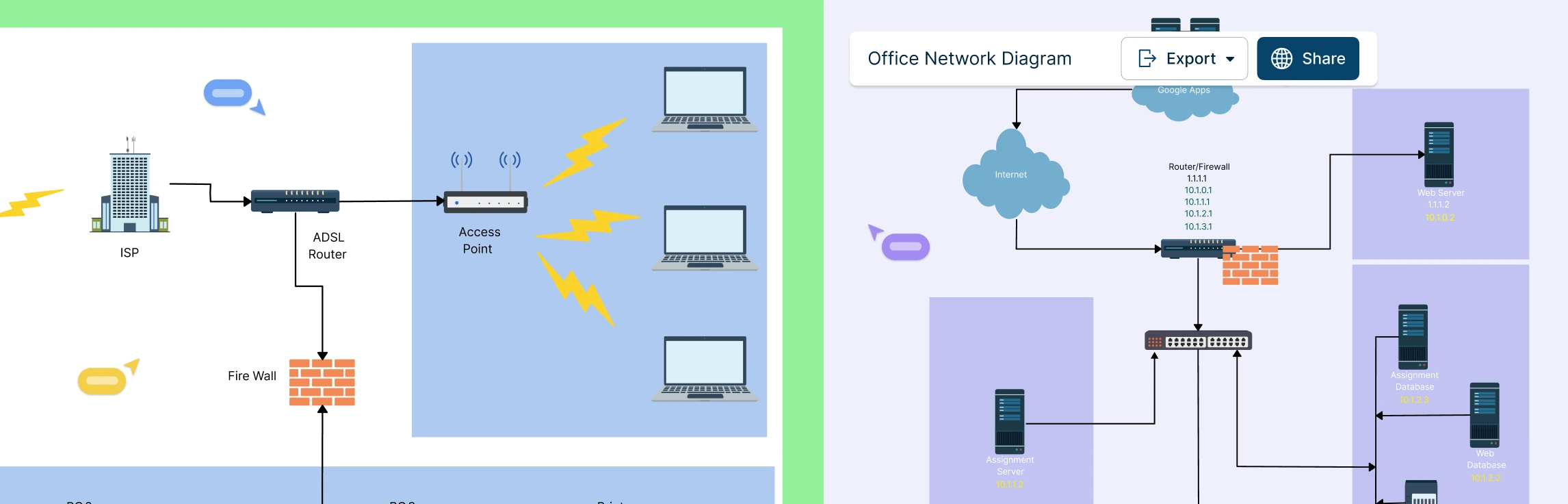
Designing a wide area network can quickly feel overwhelming when you’re trying to connect multiple locations, keep traffic secure, and avoid downtime at the same time. A clear WAN diagram cuts through that complexity by showing how everything fits together before problems appear. In this guide, you’ll learn how to create a wide area network diagram step by step, understand key components and WAN examples, follow proven best practices, and get started faster using free network diagram templates.
Modern networks can quickly become complex as devices multiply, connections overlap, and even a small change can impact the entire system. Whether you’re setting up a network, managing infrastructure, or trying to explain how everything fits together, having a clear visual makes all the difference.
Modern IT environments rarely stay simple for long. As systems grow, tools multiply, and teams scale, it becomes harder to see how everything fits together, or what might break when changes are made. This guide helps you cut through that complexity. You’ll learn what IT infrastructure maps are, how they bring clarity to connected systems, how to create your own step by step, and the best tool to do it.
Ever stared at a tangled web of network devices, cables, and subnets and thought, “How does any of this actually work?” Managing a network without a clear visual plan can be frustrating, time-consuming, and prone to costly errors. That’s why a logical network diagram is a game-changer. In this guide, we’ll cover what a logical network diagram is, how it differs from a physical network diagram, why it’s useful, and how to create one, including ready-to-use templates and best practices to streamline your workflow.
If you’ve ever tried to understand a network setup by staring at a jumble of cables, spreadsheets, or half-erased whiteboard sketches, you know the frustration. Devices are connected, something breaks, and suddenly no one knows what connects to what—or why. That’s exactly where a local area network diagram makes all the difference.
Managing a network that spans multiple departments, locations, or devices can feel like juggling puzzle pieces in the dark. That’s where a hybrid topology diagram comes in. By visually mapping how different network topologies connect and work together, you can turn chaos into clarity. This guide will walk you through what hybrid topology diagrams are, explore the types and examples, highlight advantages and disadvantages, provide a step-by-step creation process, and share best practices to make your diagrams clear, scalable, and actionable.
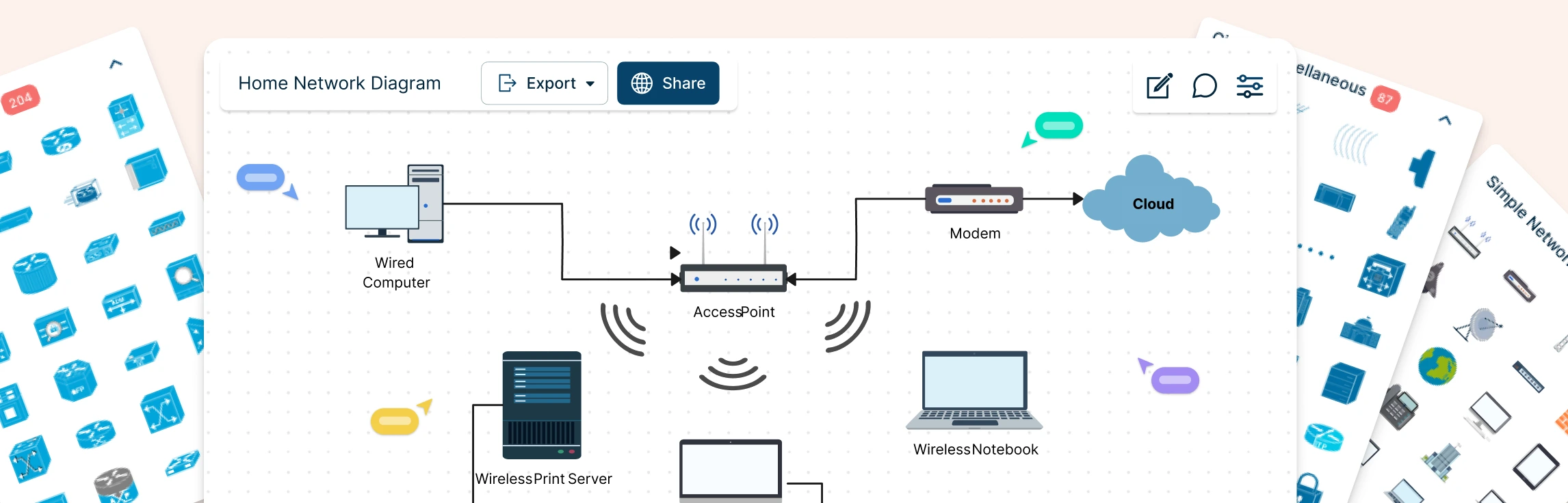
Planning a home network often starts with guesswork—what’s connected, what’s slowing things down, and where everything actually sits. A home network diagram removes that uncertainty by giving you a clear, visual view of how your devices connect and communicate. In this guide, you’ll learn how to create a home network setup diagram step by step, understand common layouts, follow practical best practices, and use free templates to map your setup.
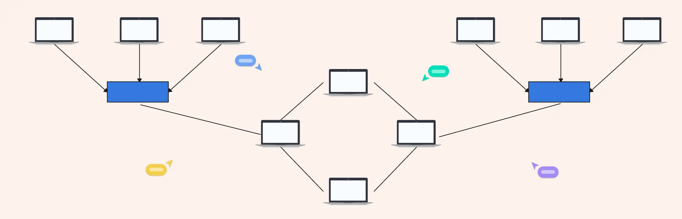
Designing a network can quickly feel complex when you’re trying to balance performance, cost, and scalability at the same time. Understanding network topology simplifies that process by showing you how different network structures work and why they matter. In this guide, you’ll explore the 7 types of network topology, see where each one fits in real-world scenarios, and learn how to choose the right option with confidence.
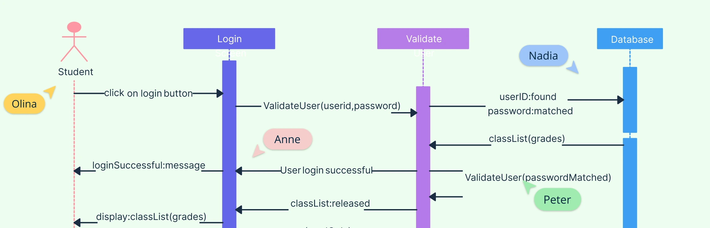
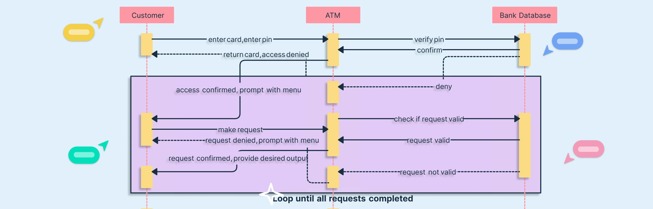
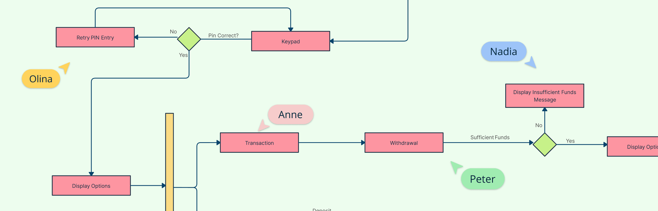
Repetitive processes are a core part of most software systems, from multiple login attempts to repeated data validations. Sequence diagram loops make these interactions easy to understand and communicate. By visually representing repeated actions, developers and stakeholders can quickly grasp system behavior, avoid errors, and streamline workflow design. Whether you’re designing an ATM, an online exam platform, or an e-commerce system, understanding how to model loops in sequence diagrams is a game-changer.
Class diagrams are a fundamental part of UML notation, used to model the static structure of a system, including classes, interfaces, relationships, inheritance, and object interactions. Whether you’re a beginner or an experienced developer, having a UML Class Diagram Cheat Sheet ensures your diagrams are clear, consistent, and easy to understand.
In today’s fast-paced digital systems, tasks rarely happen one at a time. Whether it’s an online booking system checking seat availability while processing payments, or an app updating data while sending notifications, concurrency is everywhere. Yet, many UML designers struggle to clearly represent these simultaneous operations. That’s where sequence diagram parallel tasks come in. By using the parallel combined fragment, you can model concurrent processes visually, making your system design more accurate, efficient, and easy to understand.
When working on complex systems, sequence diagrams can quickly turn into a tangled web of interactions, especially when multiple components or subsystems need to communicate. If you’ve ever found yourself squinting at overlapping message lines or losing track of how data moves between diagrams, you’re not alone. That’s where sequence diagram gates come in. These clever UML elements simplify message passing between diagrams, helping you keep your models clean, modular, and easy to understand. In this guide, we’ll break down what sequence diagram gates are, how they work, and how you can use them to create clearer, more efficient UML diagrams.
As your system designs grow more complex, your sequence diagrams can quickly become cluttered with repeated interactions and overlapping lifelines. If you’ve ever found yourself redrawing the same sequences across multiple diagrams or struggling to keep everything consistent, you’re not alone. That’s where the interaction occurrence in UML 2 comes in, a powerful tool that helps you simplify, reuse, and organize complex interactions effortlessly. In this guide, we’ll explore what an interaction occurrence is, how it works, and why it’s essential for creating scalable, easy-to-maintain UML models.
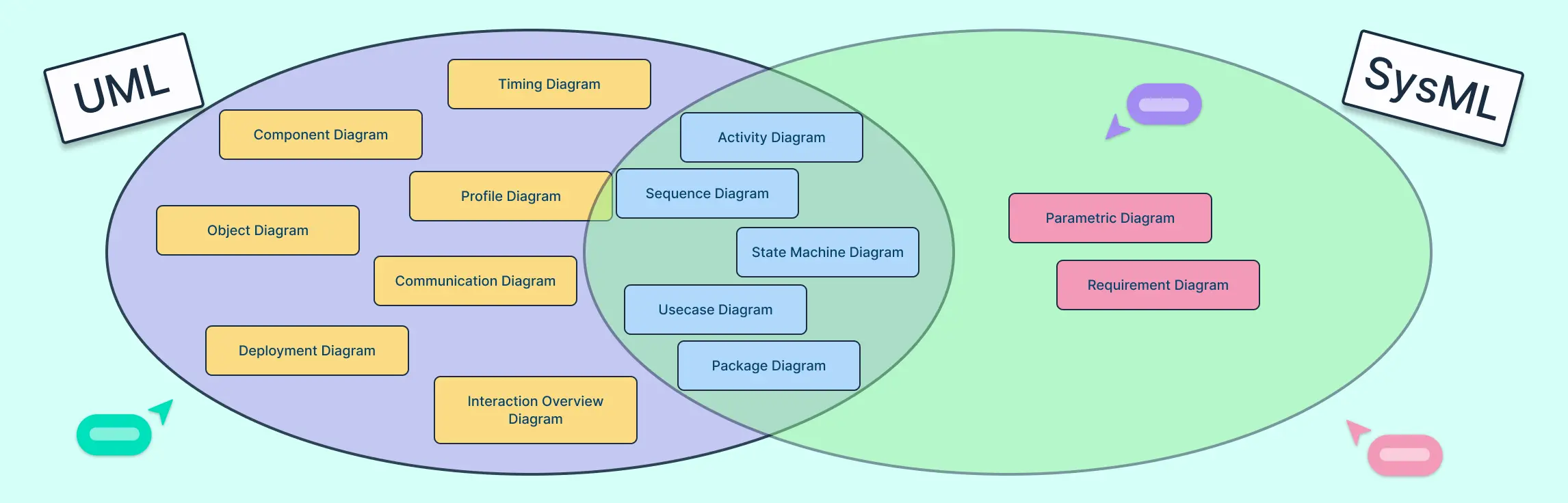
Modeling complex systems or software is easier when you use the right language, which is why UML and SysML are so useful. This guide looks at why each is used—UML for software design, SysML for systems engineering—and compares their diagram types, use cases, and real-world applications to help you choose the best approach for your project.
If you’ve ever confused an ERD with a class diagram, you’re not alone. ERDs show how data is structured in a database, while class diagrams show how that data behaves in software. Use ERDs for database design and class diagrams for object-oriented planning. This guide breaks down their differences, notations, mapping patterns, conversion steps, real-world examples, a migration checklist, and templates to build your own models quickly.
Understanding how a system behaves requires looking at both its process flow and its state changes, and that’s where Activity and State Diagrams come in. This guide explores the Difference Between Activity Diagram and State Diagram in UML, explaining how each visualizes system behavior from a different perspective. You’ll learn how each diagram works with real-world examples, and how to choose the right one for your modeling needs.
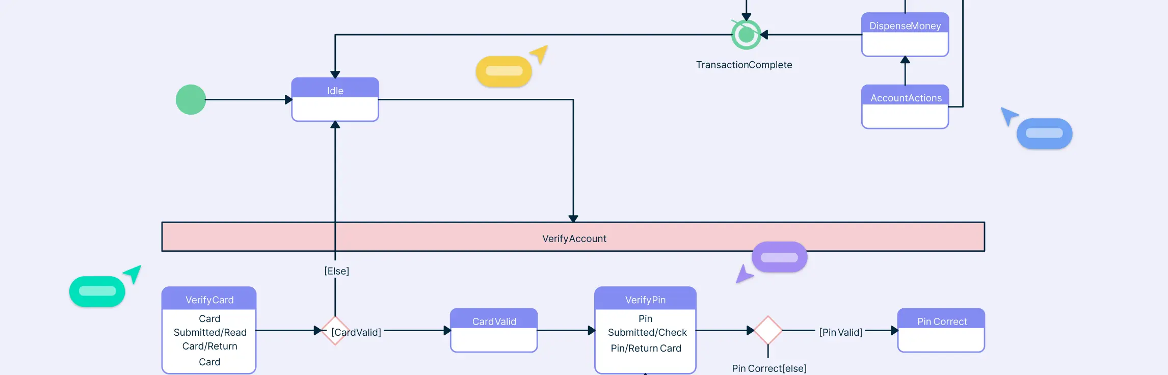
Understanding how a system behaves under different conditions is key to designing reliable software, and that’s where state diagrams come in. This guide will walk you through what a UML state diagram is, why it’s important in modeling system behavior, and how to create one effectively. You’ll learn about its core components, see examples of real-world applications, and explore best practices to capture the dynamic flow of your system.
Understanding how different parts of a system interact is key to effective software design, and UML Collaboration Diagrams provide a clear way to visualize those interactions. This guide explains what collaboration diagrams are, their key components, and notations. You’ll also learn how to create one step by step, and discover best practices to make your diagrams clear and useful.
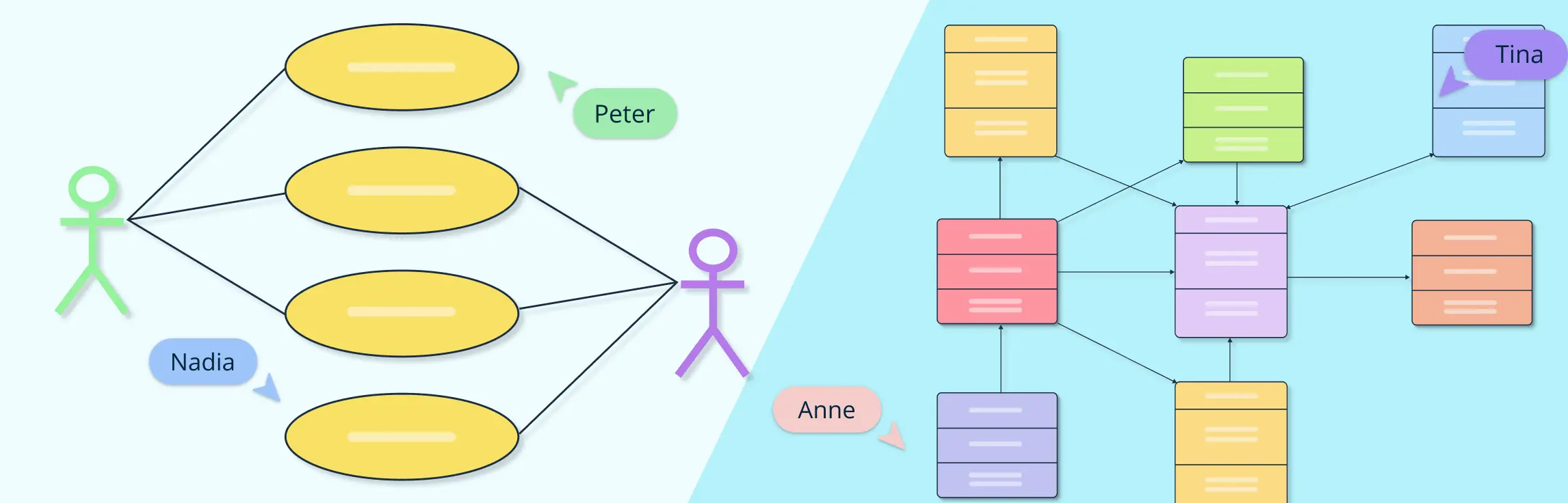
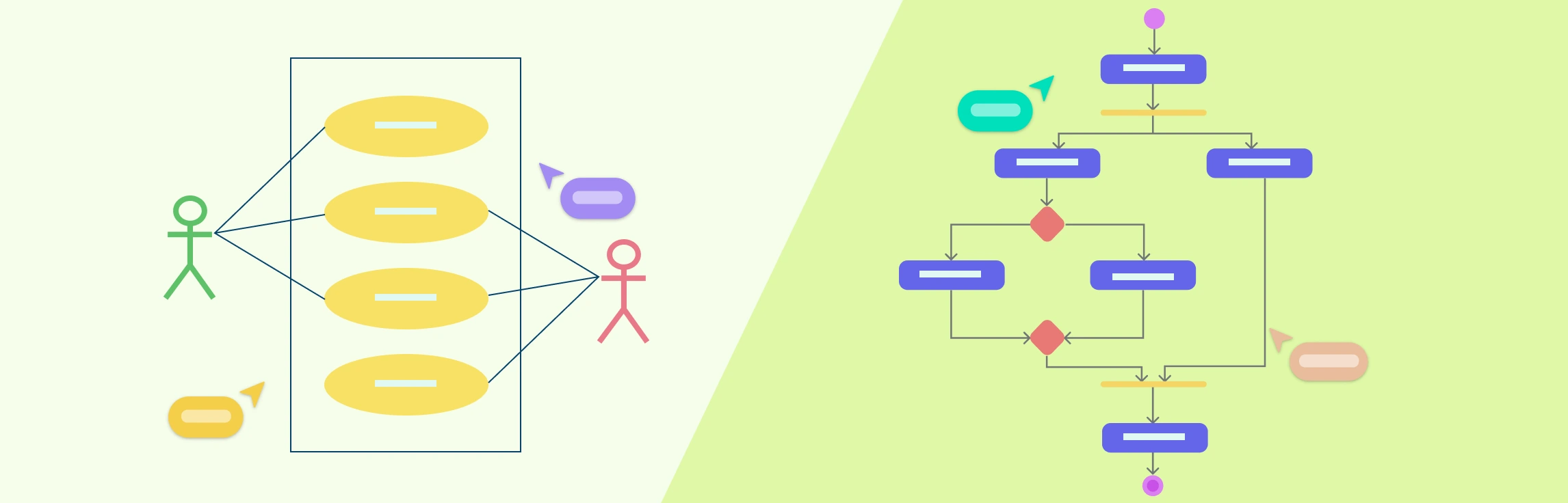
What Are Actors in Use Case Diagrams? Actors in a use case diagram represent the roles that interact with a system. They can be individuals, external systems, or organizations that exchange information or perform actions with the system being modeled. Their main purpose is to define who uses the system and what they expect it to do, helping clearly establish boundaries between the system and its environment.
Understanding the difference between UML vs. ERD is essential for anyone involved in software or database design. While both are visual modeling tools, they serve distinct purposes. In this guide, we’ll explore what UML and ER diagrams are, their key differences, use cases, and comparison through examples to help you decide which diagram to use for your next project.
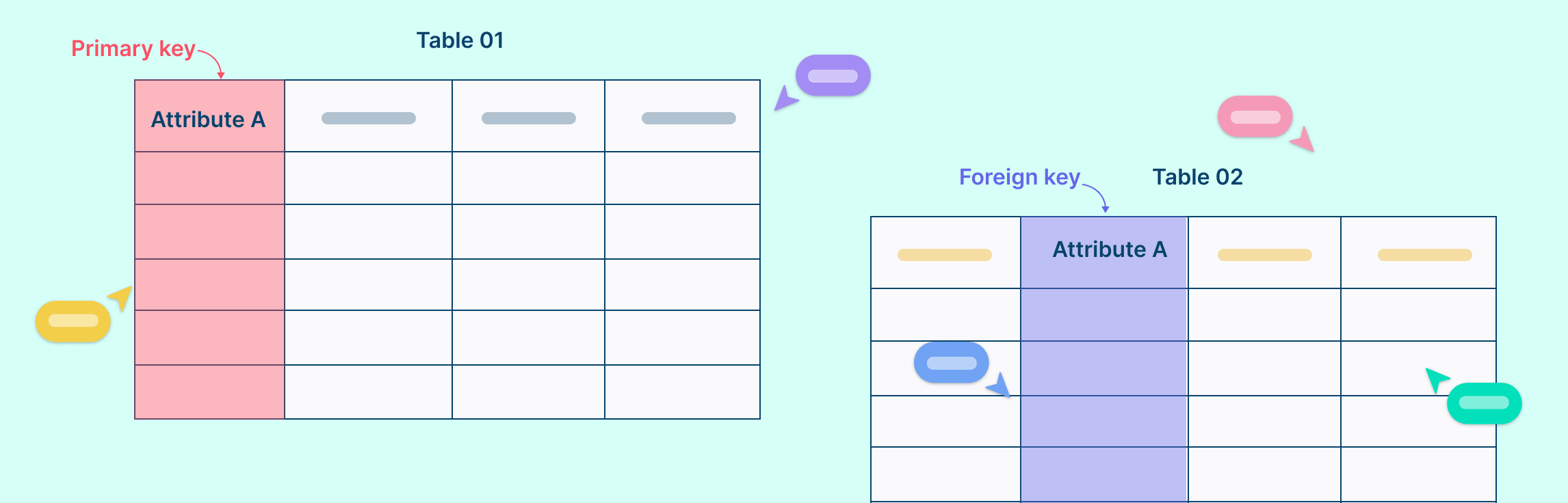
In relational databases, primary keys and foreign keys play crucial roles in maintaining data integrity and establishing relationships between tables. Understanding the fundamental differences between these keys is essential for designing well-organized databases. In this guide, we’ll compare primary key vs. foreign key, suggest tips for using both and help you understand how together, they can transform a good database into a great one.
Understanding how different parts of a system interact is essential for modeling complex behaviors in software design. In this guide, we’ll cover what an Interaction Overview Diagram is, its key notations, and a step-by-step process on how to draw one. You’ll also explore the benefits of using these diagrams and learn when to use them effectively in system modeling.
Ever started designing a system only to realize your team is mixing up user flows with system structures? You’re not alone. UML diagrams are essential tools in software design and UML modeling, helping teams visualize how systems behave and how their components interact. Among the most commonly used types, use case diagrams and class diagrams are often confused, yet they serve entirely different purposes. While one focuses on system behavior and user interactions, the other captures the internal structure and relationships between classes. In this guide on use case diagram vs class diagram, we’ll break down their key differences, explore real-world use case diagram examples and class diagram examples, and share ready-to-use templates to help you create both effortlessly.
When designing a new system, tracking every interaction between components can be a nightmare. That’s why sequence diagrams are essential for illustrating how objects or components interact over time, making complex systems easier to understand for developers, analysts, and stakeholders alike. But with so many tools available, from intuitive drag-and-drop editors to text-based generators, choosing the right one can be overwhelming. In this guide, we break down the top sequence diagram tools, comparing their features, collaboration capabilities, templates, and export options, so you can pick the perfect tool for your workflow.
State diagrams are essential tools for visualizing how systems behave and transition between different states, making complex processes easier to understand. In this guide, we’ll explore state diagram examples to simplify complex system modeling and demonstrate how objects or components interact within a system. To make your diagram creation even easier, we’ve included ready-to-use templates that you can customize for your specific projects.
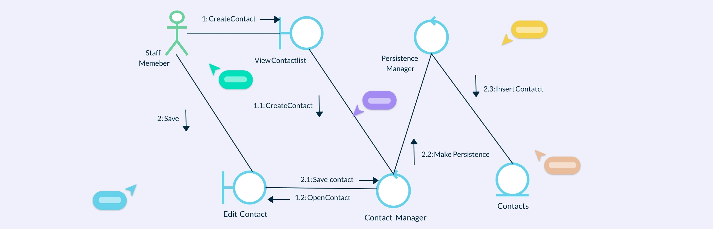
Interaction Diagram Definition A UML Interaction Diagram is a type of behavioral diagram used to visualize how objects in a system interact through the exchange of messages. It focuses on the dynamic behavior of a system by showing what happens, when it happens, and which components communicate during a specific process or use case. Interaction diagrams capture the “conversation” between objects, helping designers and developers understand how parts of a system collaborate to achieve a goal.
A System Sequence Diagram (SSD) is a high-level UML sequence diagram that shows how external actors interact with the system as a single black box for a specific use case. It captures the time-ordered sequence of input events (messages) from actors to the system and the system’s observable responses, without revealing any internal objects, classes, or control flow. Let’s look at when to use UML system sequence diagrams, notations, a comparison with sequence diagrams and benefits.
Understanding the difference between use case diagram and activity diagram is essential for anyone involved in system analysis, software design, or process modeling. While both are part of the Unified Modeling Language (UML) suite, they serve distinct purposes and visualize different aspects of a system. This guide breaks down their purposes, notations, and practical applications, helping you understand when to use each diagram, and how they complement one another.
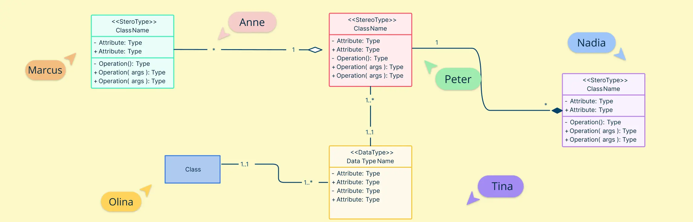
What Are Class Diagram Symbols? UML Class Diagram symbols are the standardized notations used to represent the structure and relationships of classes in object-oriented systems. These symbols visually communicate how classes, attributes, methods, and relationships interact within a software design. They serve as a universal language for developers, analysts, and designers, helping teams model systems clearly without ambiguity.
Understanding the internal workings of a system is crucial for software designers, architects, and developers. A UML composite structure diagram offers a detailed view of how components, parts, ports, and roles interact within a system, making it easier to design modular, maintainable, and scalable solutions. Whether you’re modeling software architecture, system workflows, or component-based designs, these diagrams help bridge the gap between static class definitions and dynamic interactions, providing clarity and improving collaboration across teams.
A UML Profile Diagram is a powerful tool for customizing standard UML models to fit specific domains, from IT management and enterprise software to mobile applications and service-oriented architectures. By using UML profiles, teams can define domain-specific stereotypes, tagged values, and constraints, all while keeping their models compatible with standard UML tools. In this guide, we’ll break down the key elements of a UML profile diagram, show you how to create one step-by-step, and explore ready-to-use templates to accelerate your modeling workflow.
In software and system design, understanding how different parts of a system interact is crucial, and that’s where component diagrams come in. A component in UML represents a modular part of a system, showing its interfaces, dependencies, and relationships with other components. This guide will walk you through practical component diagram examples and provide ready-to-use templates, helping you visualize complex systems clearly and implement UML components quickly and efficiently.
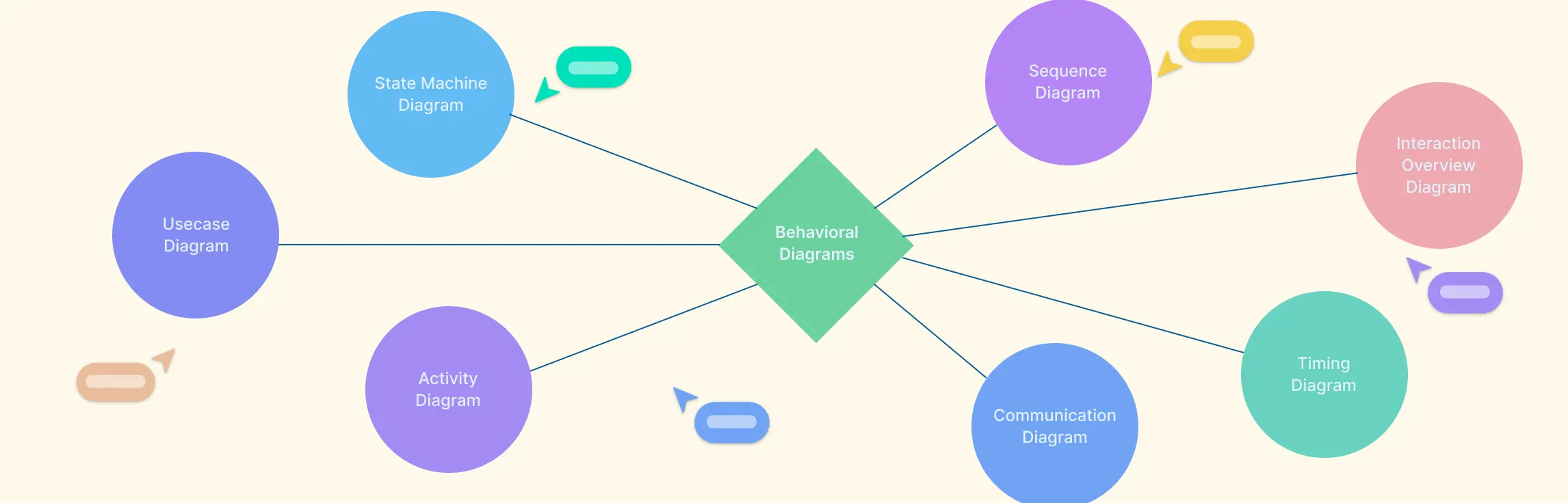
Understanding how a system behaves is just as important as knowing its structure, and that’s where behavioral diagrams in UML come in. These diagrams provide a visual representation of system interactions, workflows, and object behavior over time, helping teams design more efficient software, communicate clearly, and ensure requirements are accurately captured. In this guide, we’ll explore what behavioral diagrams are, why they matter, and break down the seven main types along with examples to help you apply them effectively.
UML Diagram Definition A UML Diagram is a visual representation of a system created using the Unified Modeling Language (UML) to illustrate how different parts of a software system interact, function, or are structured. It helps developers, designers, and stakeholders understand and communicate system design clearly before or during implementation. UML diagrams are generally divided into two main types, structural and behavioral. In complex organizations, 43% of people in highly matrixed environments report complexity hurts decision quality and speed, which is why clear system modeling matters early (Marmolejo et al., 2021).
Understanding how different parts of a system interact is essential for effective software design, and that’s where UML Communication Diagrams come in. In this guide, we’ll explore what a Communication Diagram is, its purpose, key elements, and how to create one effectively.
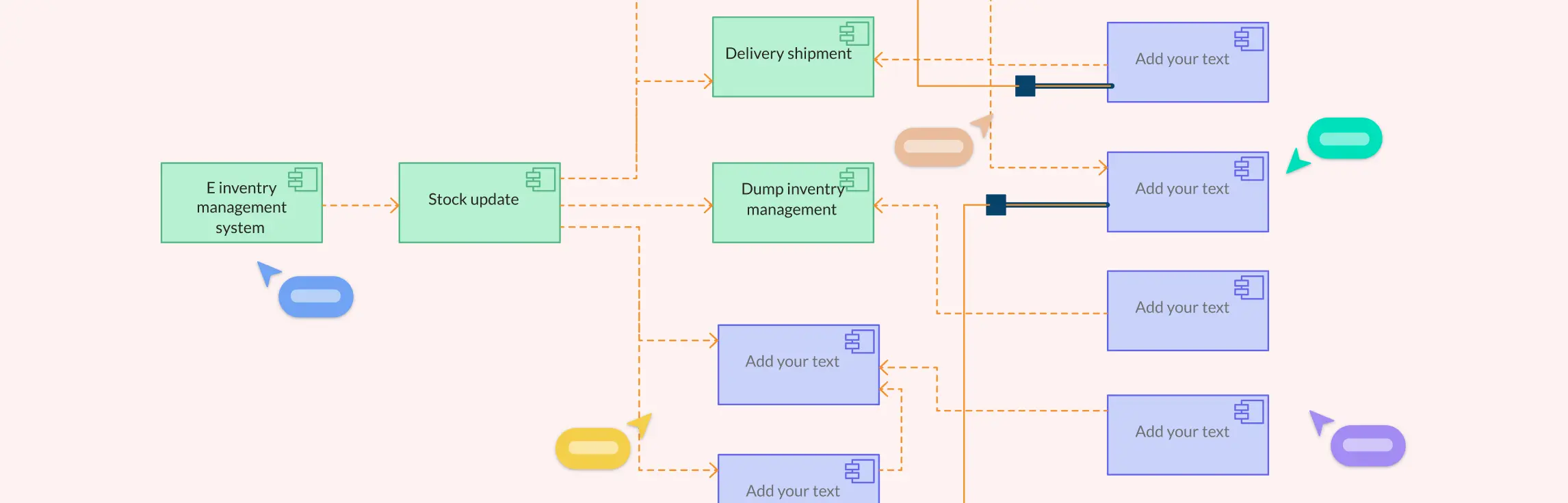
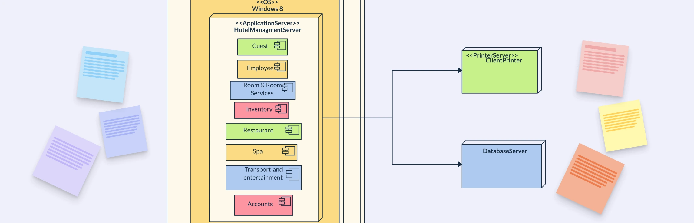
What is a Deployment Diagram A UML Deployment Diagram is a structural diagram that shows how software components are deployed across hardware or network environments. It maps hardware nodes (servers, devices) to software artifacts (applications, databases) to visualize where each part runs and how they interact. In short, it illustrates a system’s runtime architecture, helping teams understand and document how software operates within its infrastructure.
A deployment diagram is a UML diagram that shows how software components are deployed across hardware nodes, servers, devices, or cloud environments. It bridges the gap between design and implementation by visualizing where each part runs and how elements communicate. Used across industries from web and mobile apps to IoT, cloud, and enterprise systems, it helps teams plan, document, and optimize architecture for scalability, reliability, and efficiency.
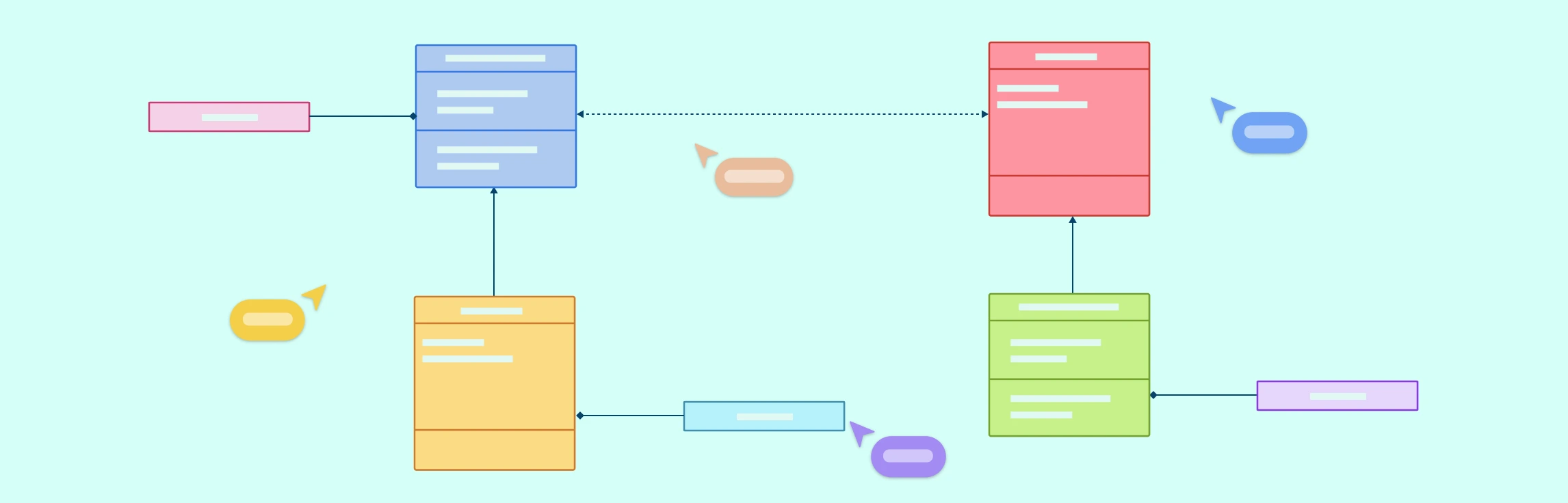
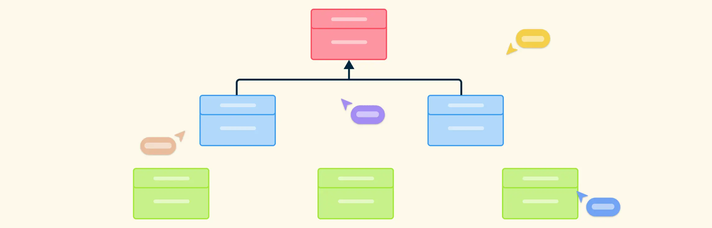
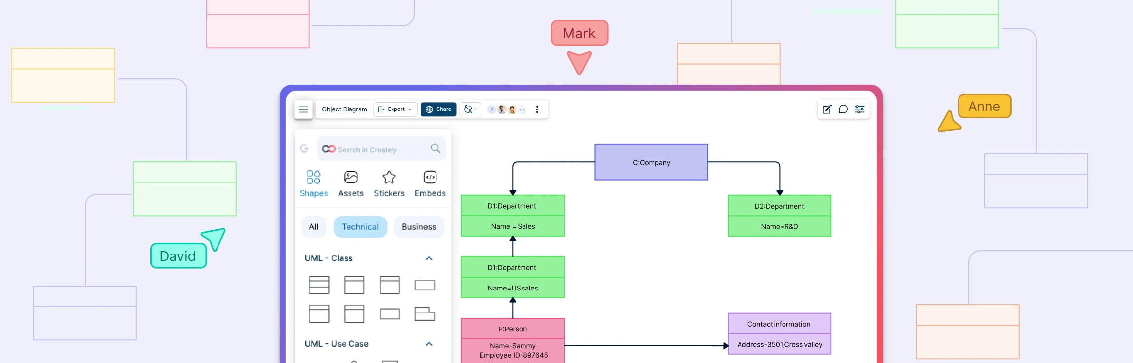
Object Diagram Definition A UML Object Diagram is a structural diagram that shows a snapshot of objects, their attributes, and relationships at a specific point in time. It represents how instances of classes interact in a real situation, reflecting the system’s state during execution. While class diagrams define the blueprint of a system, object diagrams display the actual data and connections between objects, making them useful for understanding, validating, and illustrating how a system behaves at runtime.
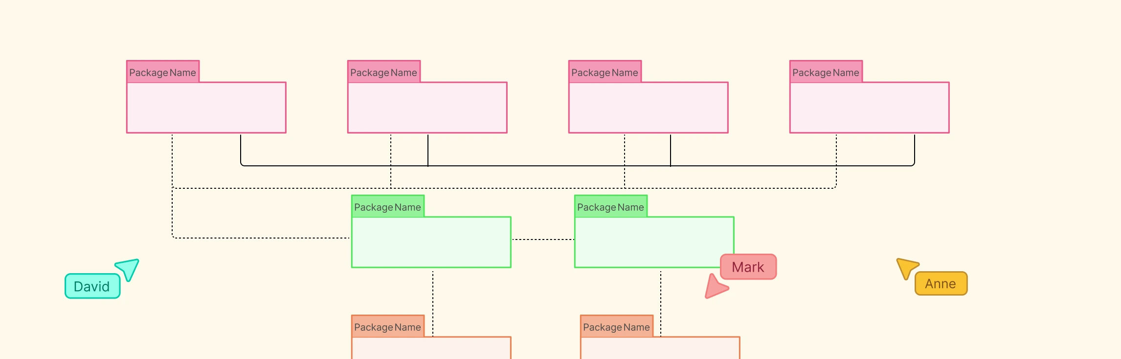
Package Diagram Definition A package diagram in UML (Unified Modeling Language) is a structural diagram that groups related elements such as classes or components into logical units called packages. It shows how these packages are organized and depend on each other, offering a clear view of a system’s structure. By grouping related parts, package diagrams simplify complex designs, promote modularity, and ensure a clean separation of responsibilities within large software systems.
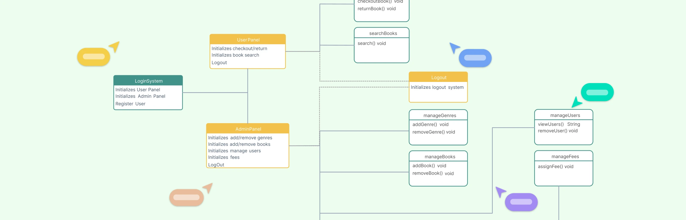
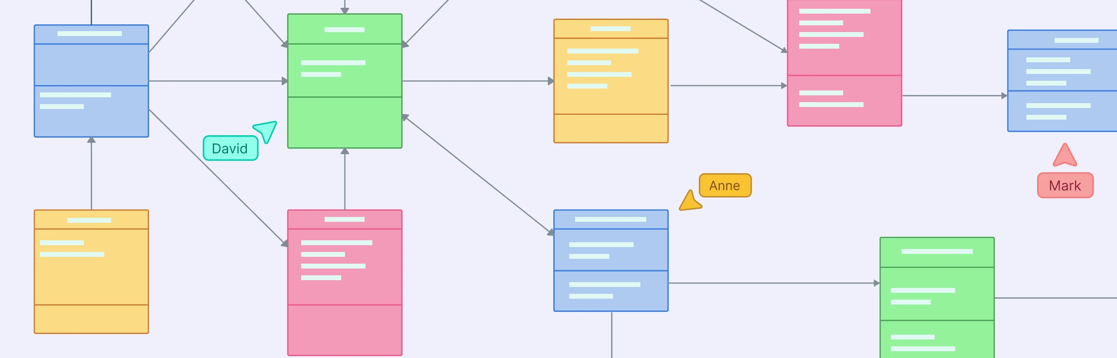
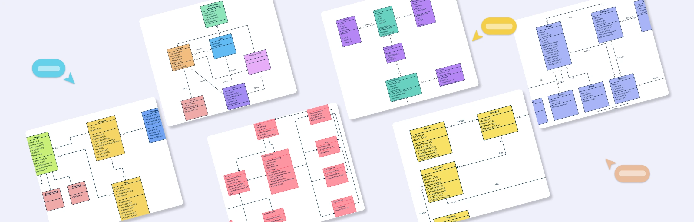
Class Diagram Definition A class diagram is a type of UML (Unified Modeling Language) diagram that visually represents the structure of a system by showing its classes, attributes, methods, and relationships. It serves as a blueprint for how different parts of an object-oriented system interact and organize data. Class diagrams are fundamental in system design because they bridge the gap between real-world concepts and code implementation. This helps developers, analysts, and stakeholders understand how the system’s components are connected and how they collaborate to perform various functions.
UML Class Diagrams are one of the most essential tools in software engineering, helping developers visualize the structure and relationships within object-oriented systems. They provide a clear overview of classes, attributes, methods, and how different entities interact, making them indispensable for designing, documenting, and maintaining complex applications.
In the world of software design, clear visual modeling can make the difference between a well-structured system and a confusing tangle of code. Among the essential UML tools, object diagrams vs. class diagrams stand out as critical instruments for understanding both the blueprint and the real-time instances of a system. This guide will help you explore the key differences between class and object diagrams, illustrate practical examples of each, and provide ready-to-use templates so you can start modeling your software architecture with clarity and efficiency.
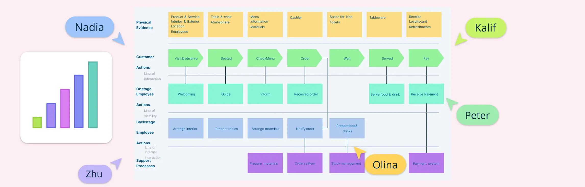
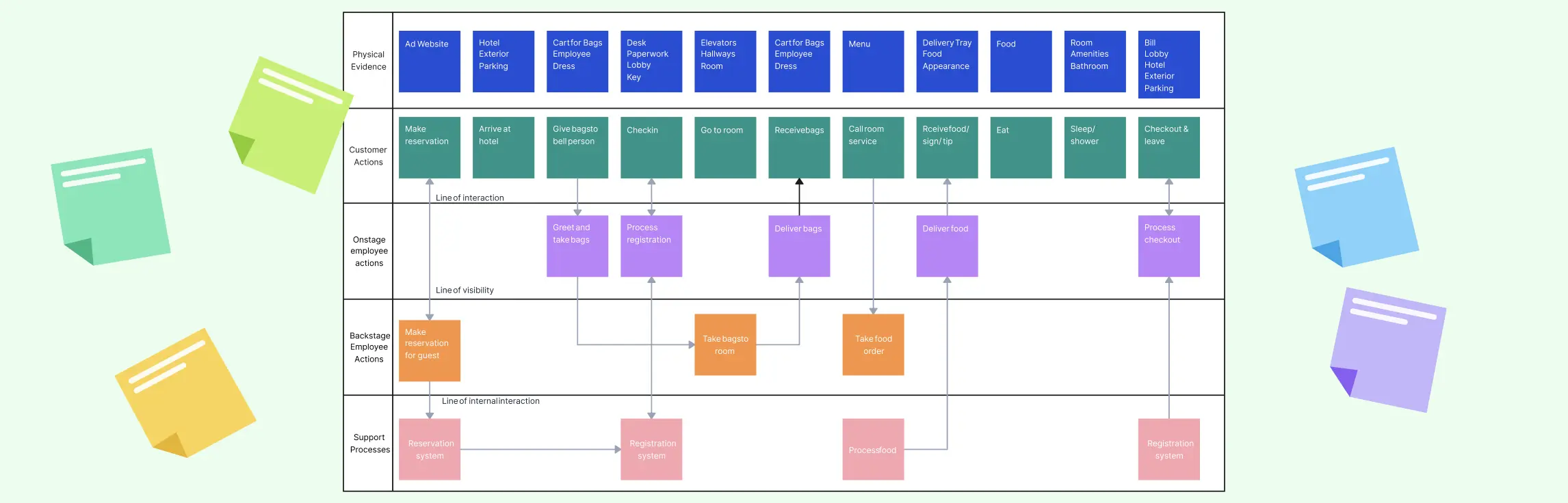
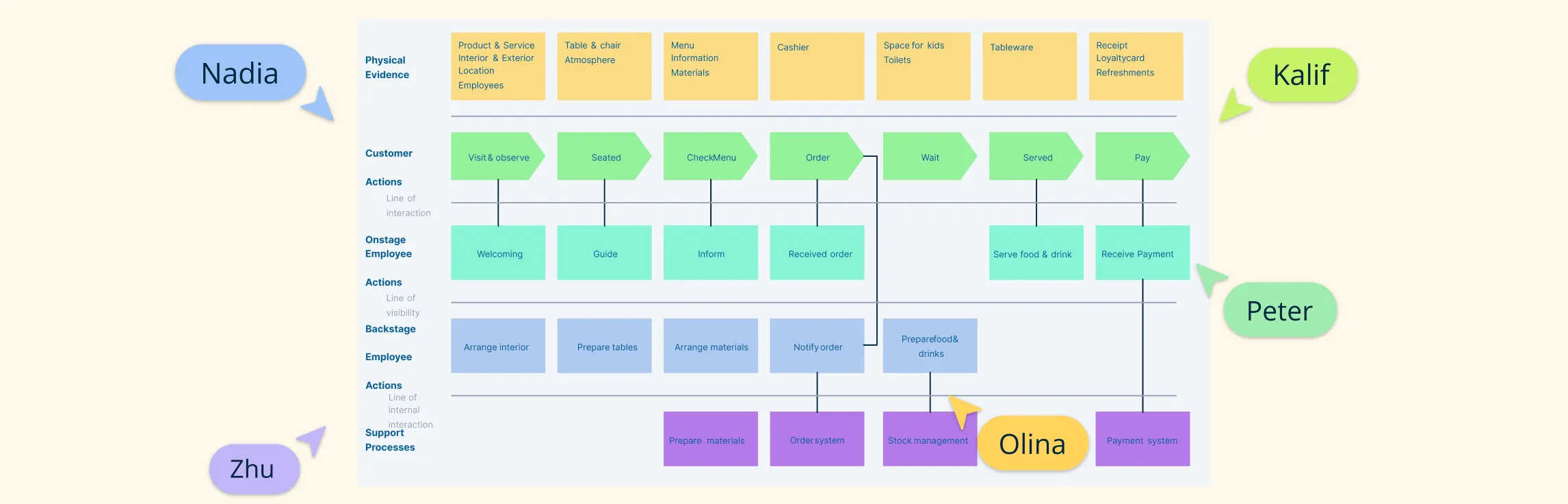
A service blueprint is a visual map that shows how a service works—from what the customer experiences to what happens behind the scenes. It helps teams see the full picture, align better, and improve how services are delivered.
Visual tools like process maps and service blueprints help make sense of how businesses run and how services are delivered. They simplify complex workflows and highlight what’s working—and what’s not. While both are useful, service blueprint vs process map serve different goals. Knowing when to use each one can make your work more effective. In this guide, we’ll explain what process maps vs service blueprints are, how they differ, where they overlap, and when to use them—plus some real examples to help you get started.
The service blueprint methodology is a structured way to understand and improve how a service works—both for customers and the teams behind the scenes. Unlike a one-time diagram, it’s a repeatable process that helps businesses design better experiences, fix gaps, and align everyone involved in delivering a service.
Service blueprint software helps teams map both the customer-facing and behind-the-scenes parts of a service. It’s a key tool for improving experiences and operations. In this guide, we’ve rounded up the best service blueprint software available today — covering both free and paid options. Whether you’re looking for deep collaboration features, flexible templates, or just a simple way to visualize service processes, this list has you covered.
In this guide, we’ll show you how to create a service blueprint step by step. Whether improving support, onboarding, or checkout, a blueprint helps you see the full picture—including behind-the-scenes processes. If you’re new to service blueprints, check out our what is a service blueprint guide first.
What Are Service Blueprints A service blueprint is a visual tool that shows how a service is delivered—from what the customer experiences to the behind-the-scenes processes that support it. It breaks down each step of the service, including what the customer does, what employees do (both seen and unseen), and the internal systems involved.
Service blueprints are powerful tools that help you visualize how your service works—from what the customer sees to the behind-the-scenes steps that make it happen. Whether you’re in hospitality, banking, healthcare, or education, a clear blueprint can reveal gaps, improve workflows, and create a better customer experience.
Creating an empathy map is an essential step in understanding your audience deeply and designing experiences that truly resonate with their needs. By visualizing a user’s thoughts, emotions, attitudes, behaviors, and pain points, you gain valuable insights that help shape products, services, and strategies effectively.
When designing a relational database, understanding how entities connect is just as important as defining the entities themselves. That’s where the foreign key in ER diagrams comes in. It serves as the critical link that binds different tables together, helping you create a structured, meaningful database model.
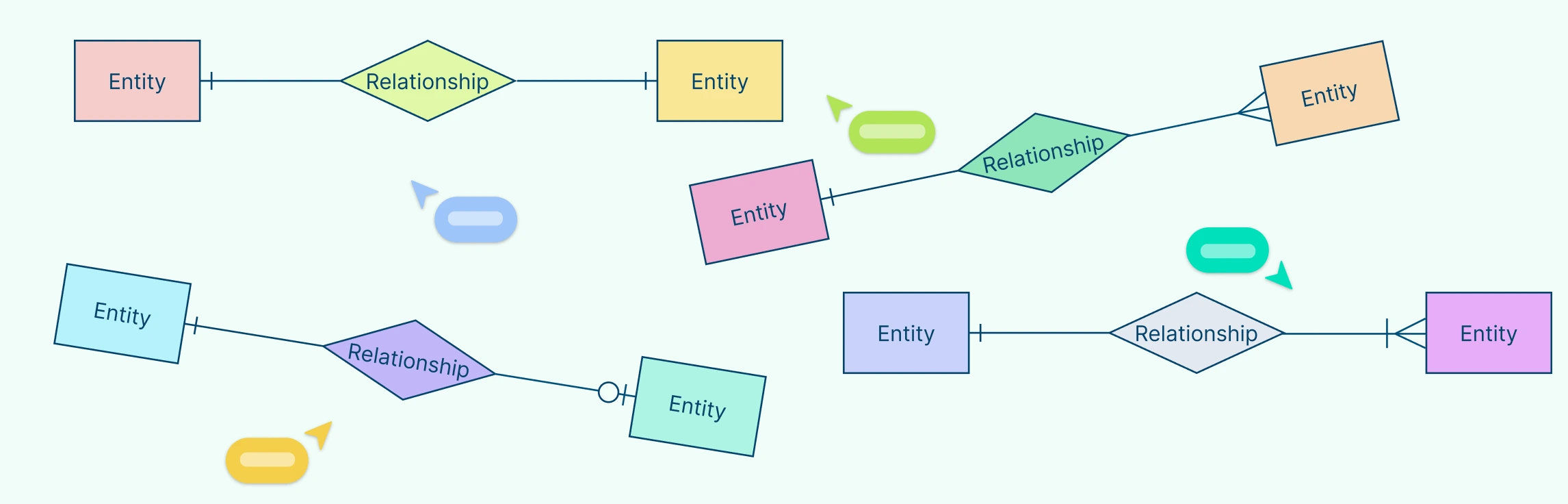
Understanding how entities relate to each other is at the heart of data modeling. That’s where cardinality symbols come in. These visual indicators define how many instances of one entity can or must be associated with instances of another, forming the backbone of accurate, meaningful ER diagrams.
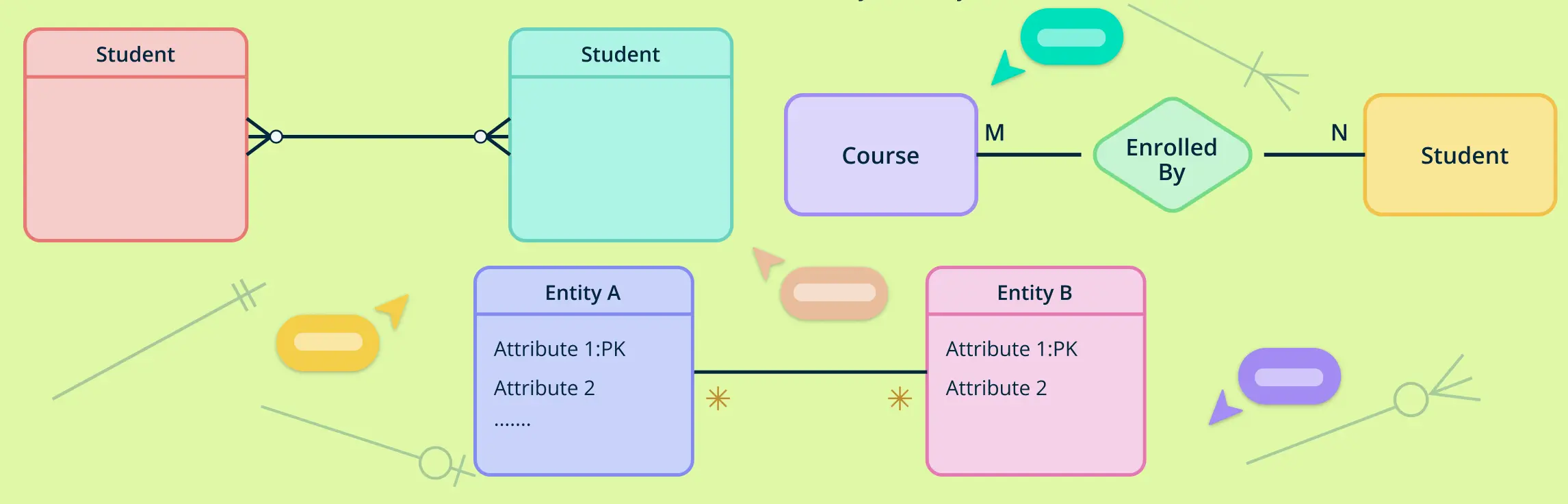
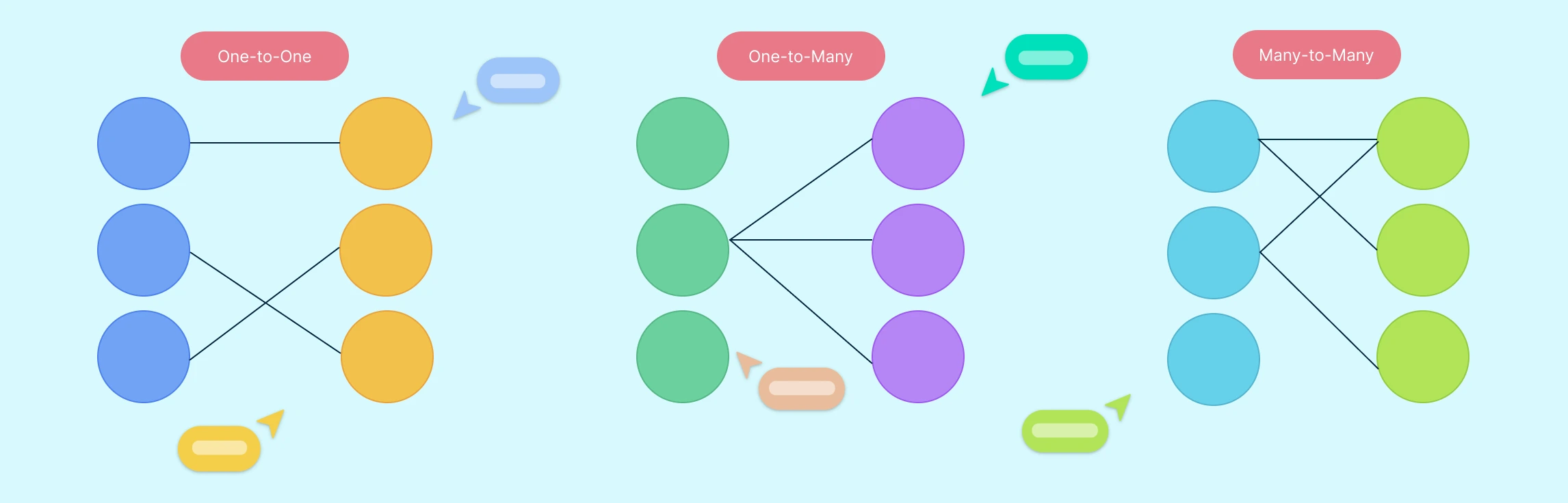
In database design, understanding how different entities relate to each other is essential for creating efficient and accurate data models. One of the most straightforward yet powerful types of relationships is the one-to-one relationship. This occurs when each record in one table is linked to exactly one record in another table—and vice versa.
Designing a well-structured database starts with understanding how to represent data and its relationships clearly. One of the most influential tools for this is Chen notation, a visual language used in Entity-Relationship diagrams.
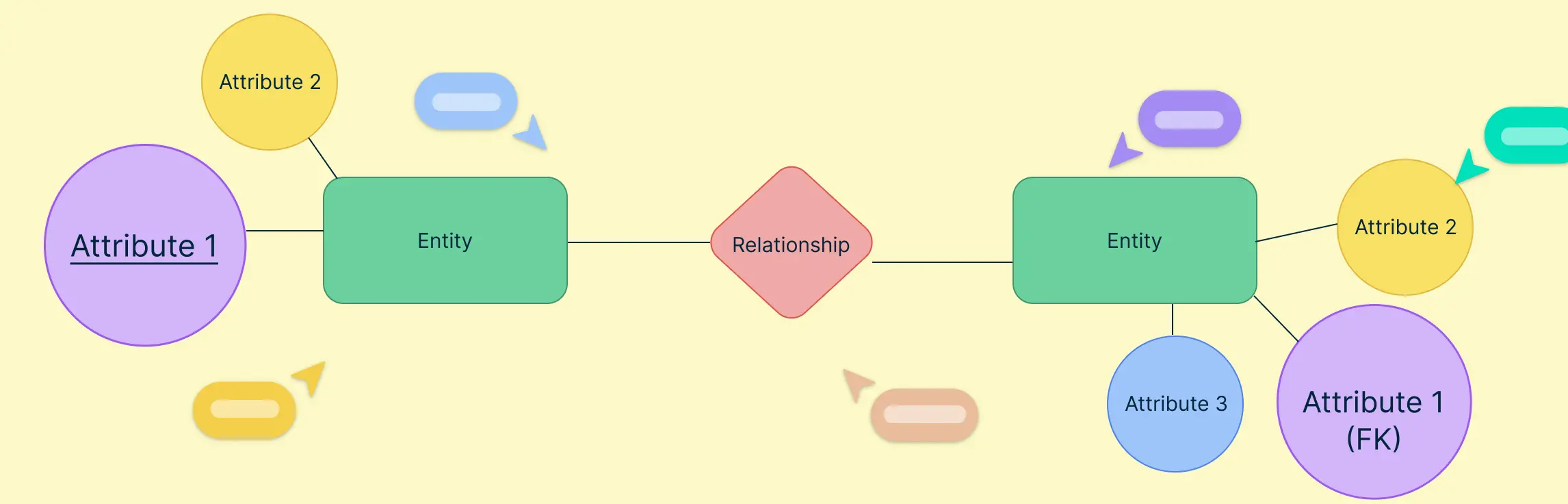
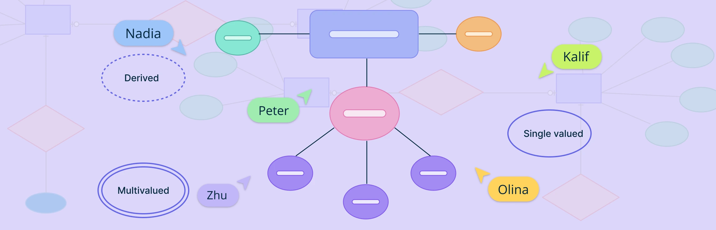
Attributes in ERD play a crucial role in defining and distinguishing entities within a database. From simple attributes that store atomic values to composite attributes that break down into smaller components, these elements help structure data meaningfully. Understanding attributes is essential for maintaining data integrity, optimizing queries, and ensuring effective relationships between entities. This guide explores the different types of attributes in ERD, their importance, and best practices for utilizing them in database modeling.
In database design, not all entities can stand on their own. Some rely on other entities to make sense or to be uniquely identified. These are called weak entities. They are an important part of ER diagrams, especially when modeling real-world situations where certain data cannot exist without being linked to other data.
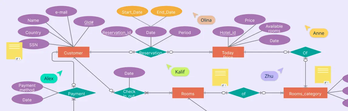
An ER diagram for a hotel management system is a simple way to show how all the parts of a hotel work together in a database. Whether you’re building hotel software or just trying to understand how hotel data is stored and managed, an ER diagram helps map out everything clearly—from guests and rooms to bookings and staff.
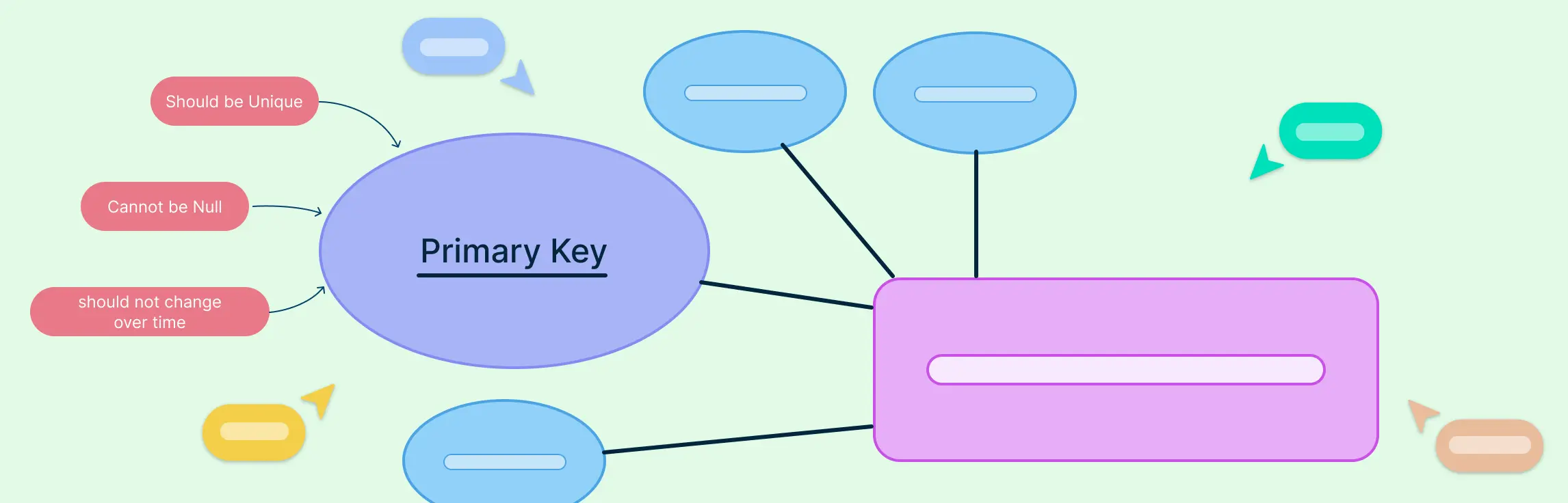
In any well-structured database, the primary key in ERD (Entity Relationship Diagram) plays a vital role in ensuring data accuracy and integrity. Whether you’re a database designer, developer, or student, understanding how primary keys work and how to represent them in ER diagrams is crucial for building efficient relational models.
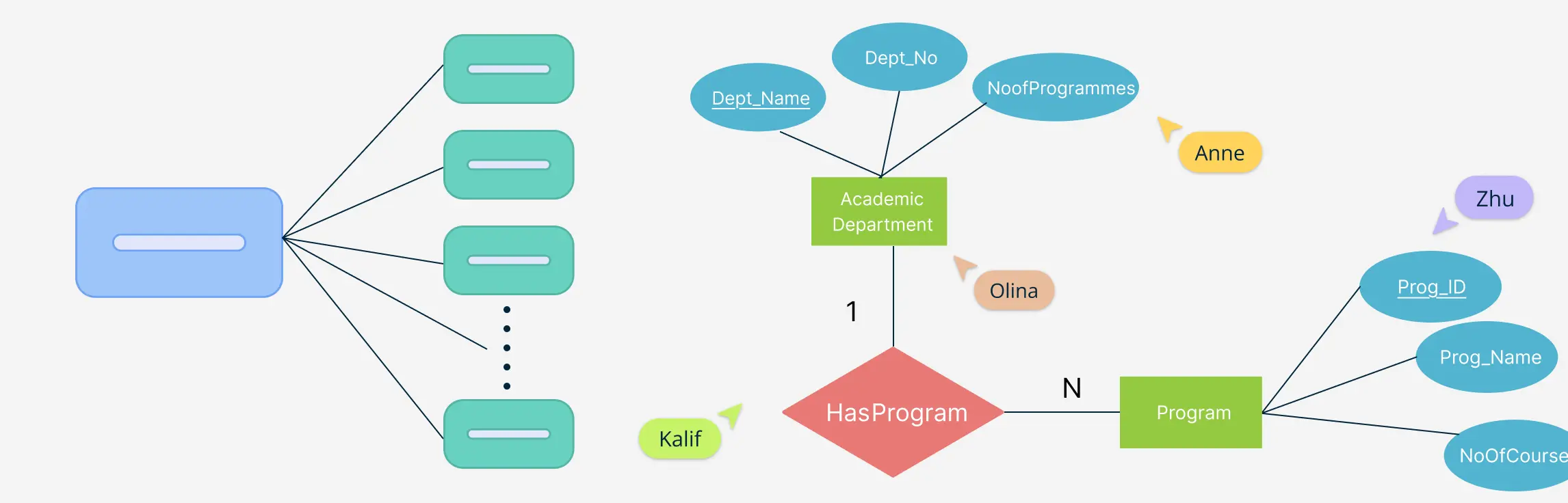
When designing a database, the relationships between entities are just as important as the entities themselves. Among these, one-to-many relationships are the most commonly used and foundational in building scalable, logical, and normalized data models. This guide explains what one-to-many relationships in ER diagrams are, how to represent them using different notations, how to identify them correctly during data modeling, and why they matter in real-world database design. This will help you understand how ERD relationships shape a database system’s overall structure and efficiency.
Crow’s Foot notation is a powerful and widely used method for visually representing relationships in database modeling. Its distinctive symbols such as dashes, circles, and the ‘crow’s foot’ shape help define the connections between entities, making database structures easier to interpret.
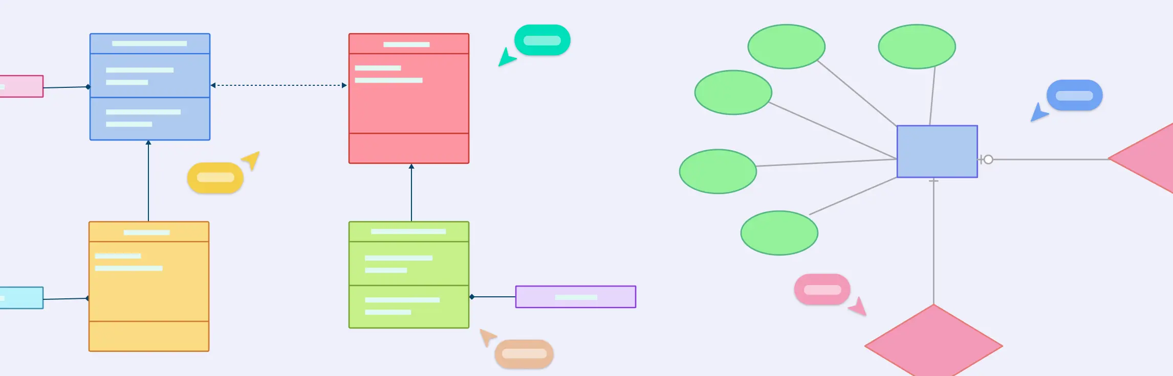
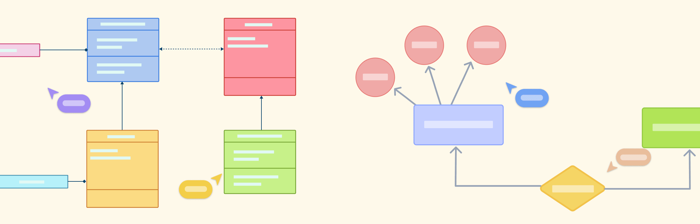
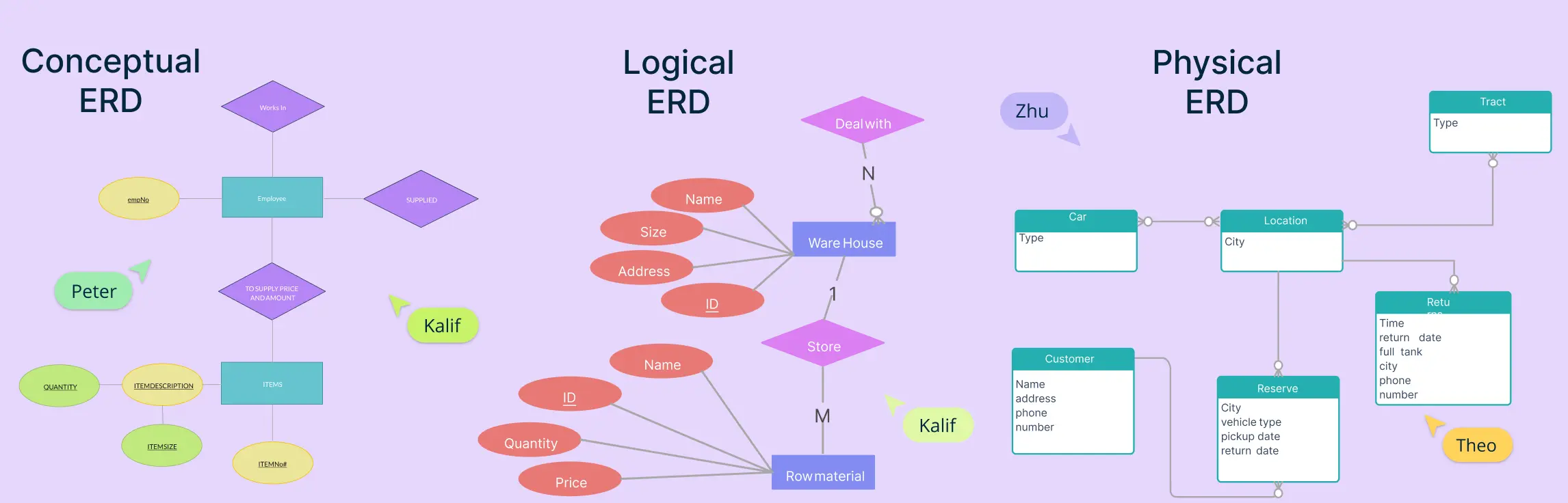
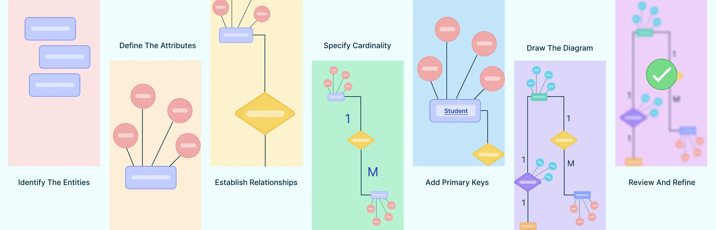
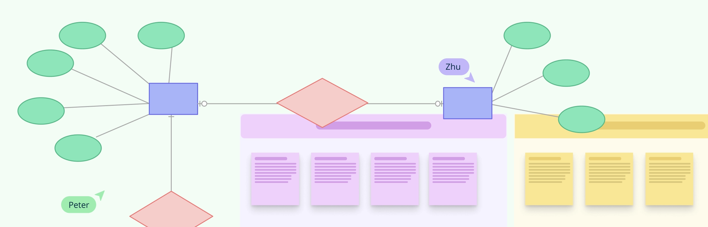
Entity-Relationship Diagrams (ERDs) are the foundation of modern database design, offering a visual representation of how data is structured, connected, and maintained. As businesses and organizations rely increasingly on efficient data management, understanding ERD relationships is essential for designing scalable, well-organized databases.
When designing a database, one of the most important steps is understanding how information connects and flows. That’s where Entity-Relationship Diagrams (ERDs) come in. ERDs help us map out the key parts of a system—like people, products, or events—and how they relate to one another.
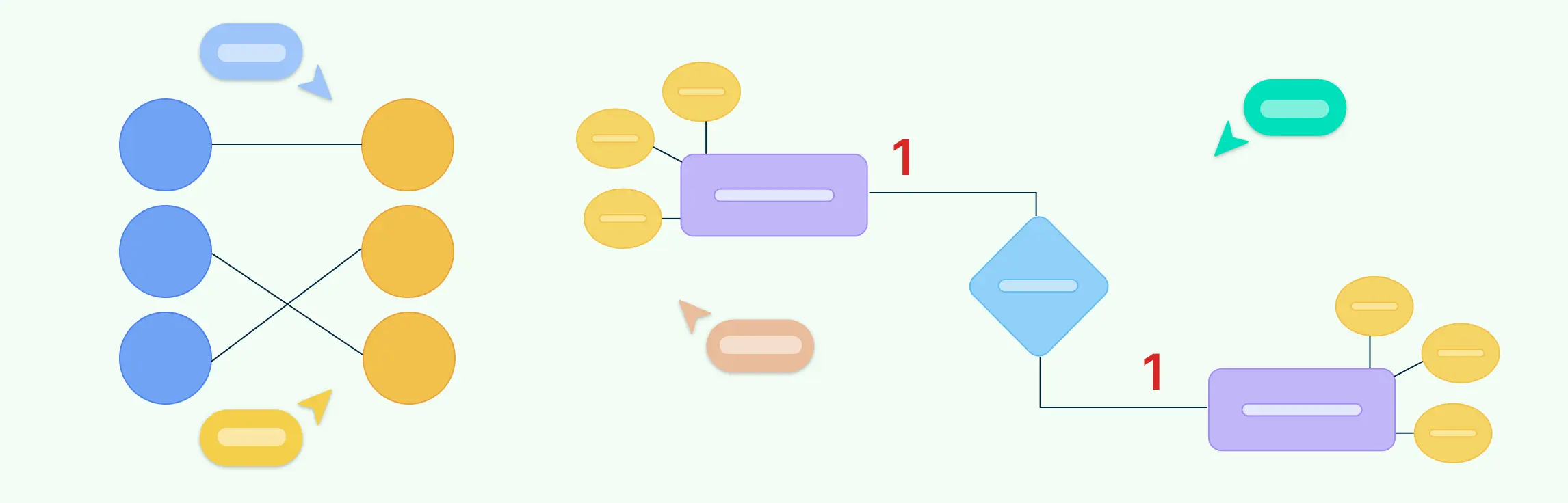
An entity relationship diagram is a visual representation of the structure of a database. It illustrates how entities (such as people, objects, or concepts) relate to one another within a system. Entity relationship diagrams are essential for designing databases, ensuring data is organized efficiently, and facilitating clear communication among stakeholders.
Many-to-many relationships are a fundamental concept in Entity-Relationship (ER) modeling. They represent scenarios where multiple instances of one entity can be associated with multiple instances of another. In this guide, you’ll learn how to illustrate many-to-many relationships in ER diagrams using best practices.
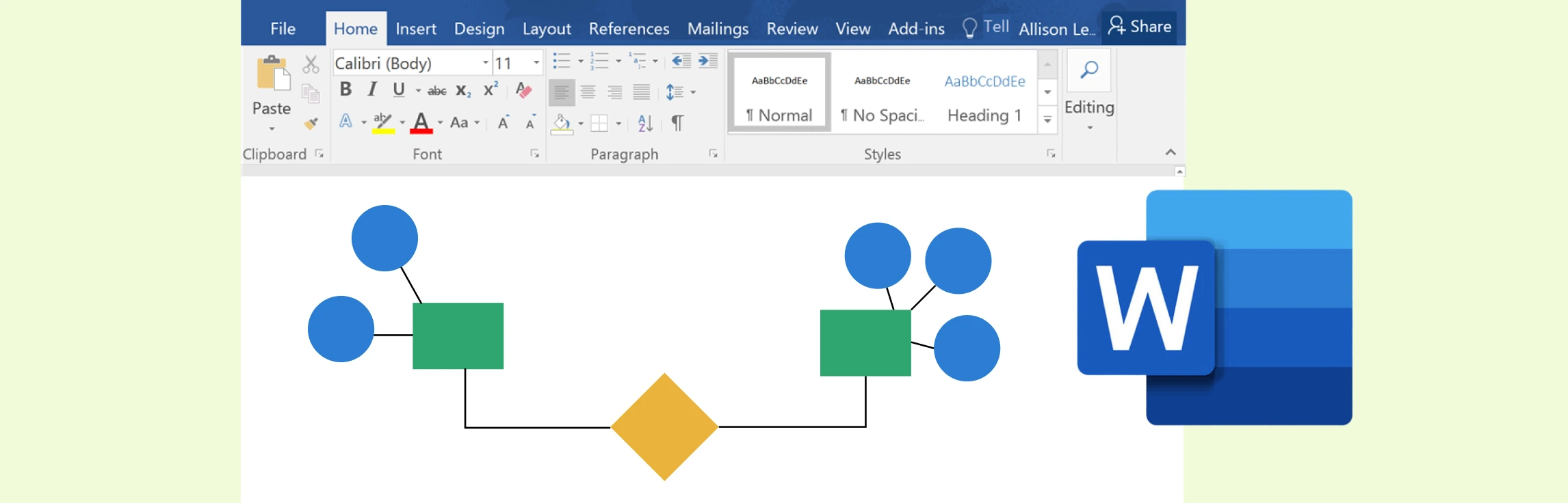
While Microsoft Word offers a practical way to create ER diagrams using its shapes and SmartArt features, it often falls short in functionality and efficiency compared to specialized tools. Creately, on the other hand, excels as a dedicated diagramming platform with intuitive tools, customizable templates, and collaboration features designed for professional-grade ER diagrams.
Entity Relationship (ER) diagrams are the cornerstone of effective database design, acting as a visual language that bridges the gap between abstract concepts and structured data models. At the heart of these diagrams lie ER diagram symbols and notation styles, which transform complex relationships into easily understandable representations. Whether you’re a novice stepping into the world of data modeling or an experienced database architect aiming to refine your craft, understanding these ER diagram symbols is crucial for building clear, efficient, and scalable data structures.
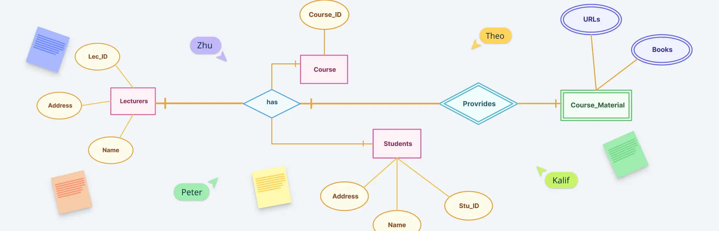
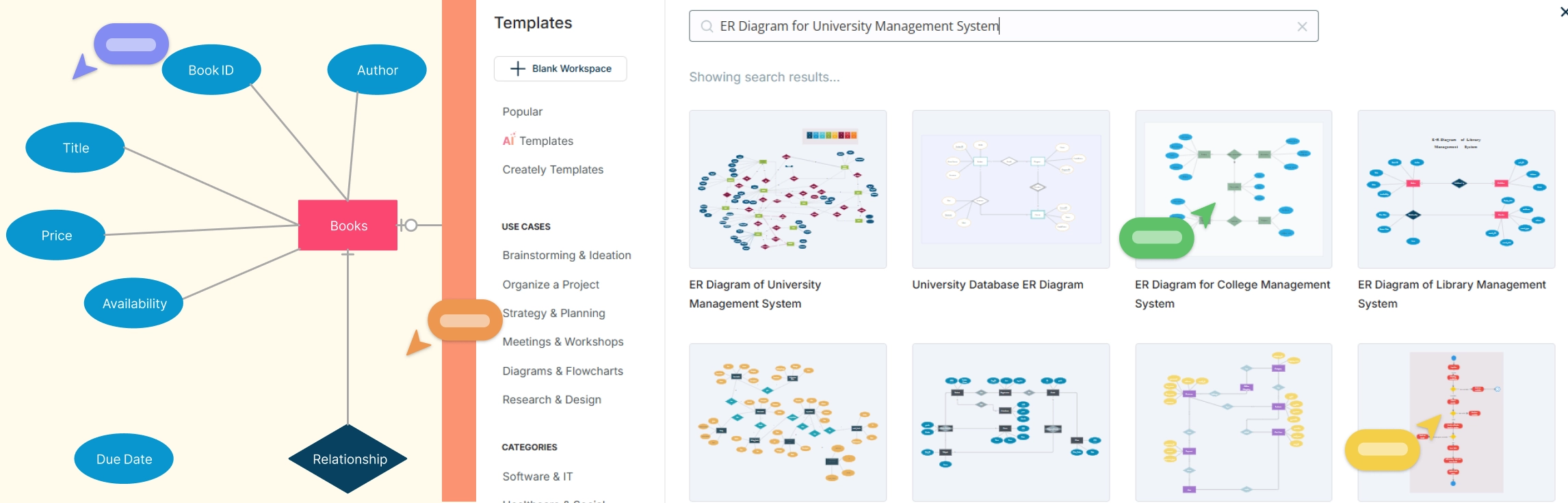
Designing a well-structured Entity-Relationship (ER) Diagram is crucial for building an efficient Library Management System (LMS). This guide provides a comprehensive overview of an ER diagram for library management system, covering various scenarios like book reservations, user roles, membership plans, and fine calculations. Whether you’re a developer, database designer, or library administrator, this guide will help you understand key components, relationships, and best practices to create a clear and optimized data structure for your library system. Plus, explore free templates to streamline your diagram creation process effortlessly!
An Entity-Relationship (ER) diagram for a banking system helps to visualize the relationships between various entities such as customers, accounts, transactions, and employees. Creating an ER diagram for a banking system is crucial for understanding how data is structured and how different entities interact. Below are six scenarios where ER diagrams can be used effectively in a banking system.
An Entity-Relationship (ER) diagram is a visual representation of the structure of a database. It helps define the relationships between different entities in a system. For an Employee Management System (EMS), an ER diagram helps to model the system’s data requirements, focusing on entities like employees, departments, roles, and payroll.
In a hospital management system, keeping track of various operations like patient care, staff management, and medical records is crucial. One of the best ways to design and visualize the structure of these systems is through Entity-Relationship (ER) diagrams. ER diagrams help to map out relationships between different components, making it easier for developers, managers, and teams to understand how data flows within the system. In this guide, we’ll explore 10 ER diagrams for hospital management systems, complete with free templates that you can use to get started with your own projects.
Efficient data management is essential for any university to streamline operations like student registration, course enrollment, faculty management, and more. This guide explores the top 10 ER diagrams designed for various university management functions, providing ready-to-use templates to help visualize and optimize database structures. Whether you’re an administrator, IT professional, or faculty member, these ER diagrams will help create a structured and scalable university system.
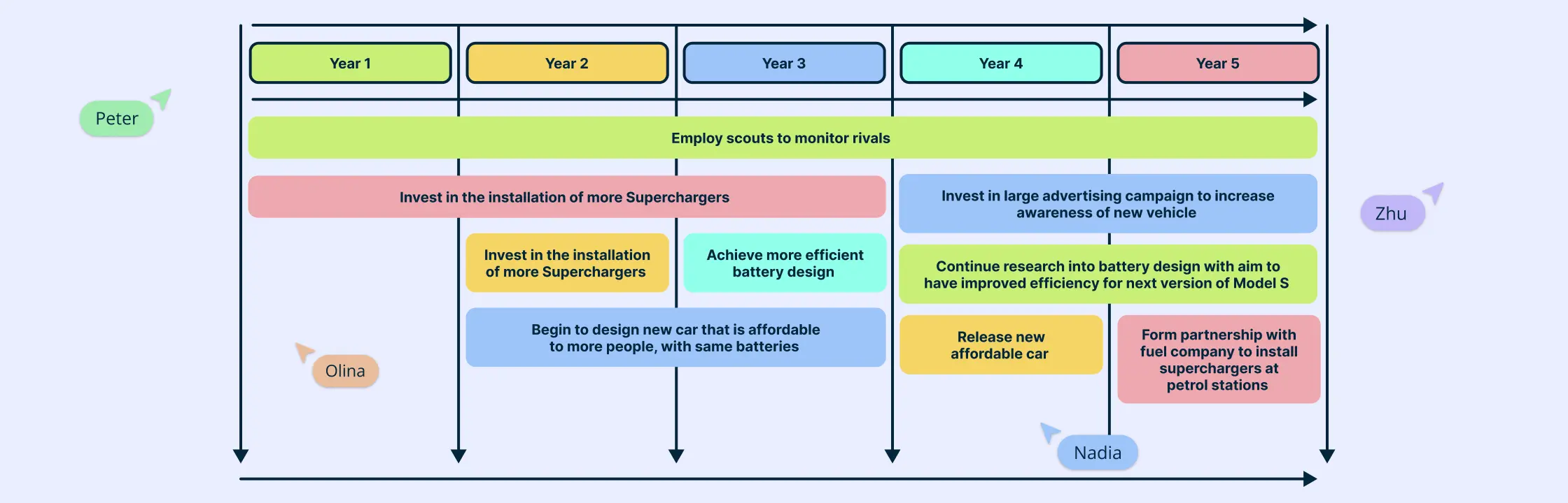
A technology roadmap serves as a powerful strategic tool, guiding organizations through the complex landscape of technological evolution. It offers a clear path, helping teams align their technology investments with broader business objectives. But creating an effective roadmap isn’t just about plotting out future initiatives—it’s about ensuring that every step you take is purposeful and aligned with your company’s vision. Whether you’re aiming to innovate, streamline operations, or improve customer experience, a well-crafted technology roadmap is your blueprint for achieving these goals.
Kubernetes has rapidly become a cornerstone in modern DevOps, enabling seamless automation of deployment, scaling, and management of containerized applications. Understanding its architecture is crucial for optimizing these processes. A Kubernetes architecture diagram serves as a visual representation of the intricate components and their interactions within the Kubernetes ecosystem. These diagrams are indispensable tools for DevOps engineers, cloud architects, and IT professionals looking to design, implement, and manage Kubernetes clusters effectively.
Data architecture diagrams play a pivotal role in data management. They help structure complex data systems efficiently, thereby facilitating informed decision-making.
Understanding how systems work is essential to making informed decisions, solving problems effectively, and finding ways to innovate. Using a visual tool like block diagrams helps us organize thoughts and gives us a broader view of complicated systems.
A context diagram stands as a cornerstone in system analysis, offering a bird’s-eye view of a system’s landscape. It’s a high-level representation that encapsulates the system’s scope, illustrating how it interacts with external entities—users, systems, and data flows. Unlike other system representation tools that delve into granular details, the context diagram keeps it simple; it’s the 30,000-foot overview that provides clarity without overwhelming stakeholders with complexity. This guide will take you through everything you need to know about a context diagram and how you can create one.
Use Case Diagram Tutorial Use case diagrams help teams visualize how people and external systems interact with a product without diving into implementation details. This guide explains what a UML use case diagram is, when to use one, which elements matter most, and how to build a diagram that clarifies scope, requirements, and stakeholder expectations.
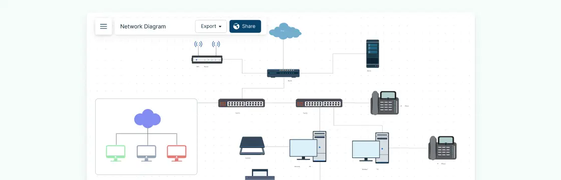
Creating network diagrams doesn’t have to be complicated. With the right network diagram examples, templates, and shapes, designing clear and effective network layouts becomes quick and easy. Whether you’re a network designer, administrator, or just looking to visualize a network, these examples will help you get started fast.
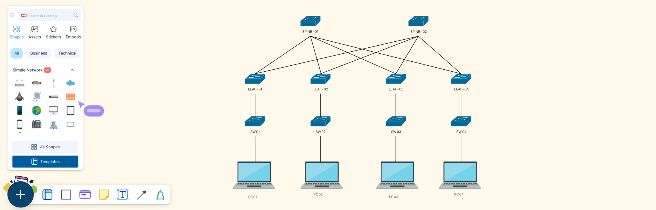
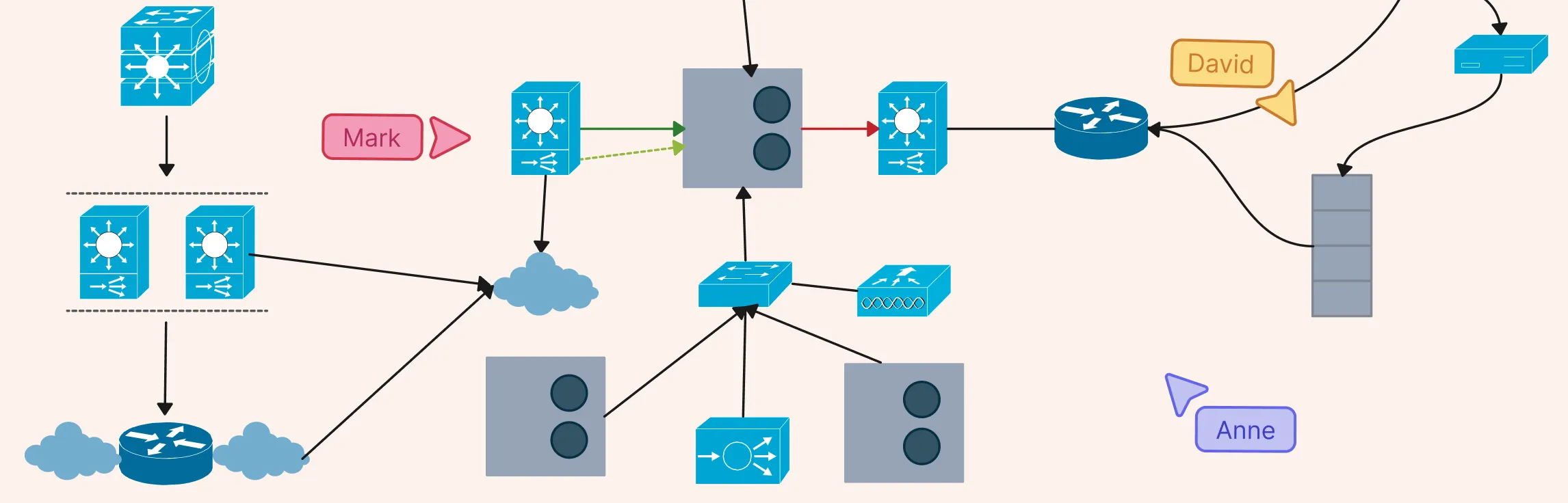
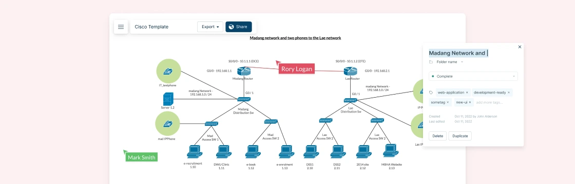
Cisco network topology diagrams play a critical role in how modern networks are designed, managed, and explained. For network engineers and IT teams working with Cisco environments, a clear visual layout of devices and connections makes it easier to plan architectures, communicate designs, and troubleshoot issues faster. In this guide, you’ll learn how to approach Cisco network topology diagrams with confidence and create visuals that are practical, accurate, and easy to understand.
What Is a Service Blueprint? Service blueprints help teams visualize how a service is delivered across customer touchpoints, employees, and supporting systems. This guide explains what a service blueprint is, which components matter most, when to create one, how to read it, and how to build one step by step with practical templates.
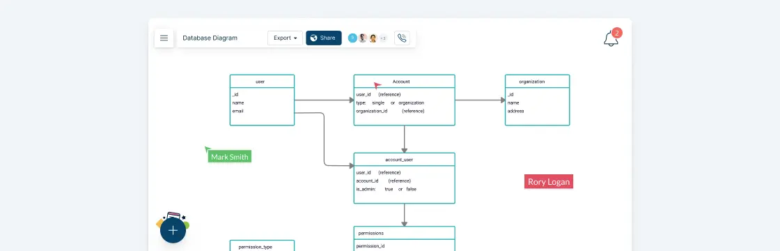
A database diagram is the very foundation of a database design and development effort. It represents the basic structure of a database; how information is stored, categorized and managed within it. A typical database diagram consists of entities, attributes, and relationships.
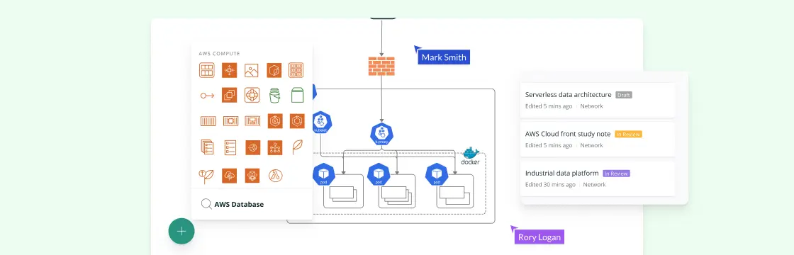
AWS architecture diagrams give teams a shared view of cloud environments for planning, documentation, network reviews, and stakeholder communication. This guide includes practical AWS architecture examples and use cases you can adapt for your own cloud architecture.
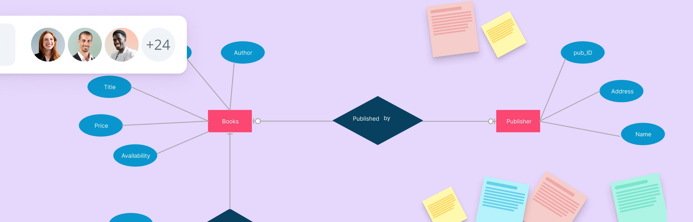
So you want to learn Entity Relationship diagrams? This ER diagram tutorial will cover what is an ER diagram, its usage, history, components of ER diagram, and how to use Creately to draw them. We’ve also added some templates for you to get started quickly.
Designing complex software systems can be daunting without a clear blueprint. UML Structural Diagrams provide a visual roadmap, helping developers, architects, and teams understand system architecture, components, and their relationships at a glance. In this guide, we’ll explore what structural diagrams are, why they matter, the main types, and real-world examples to make your modeling easier and more effective.