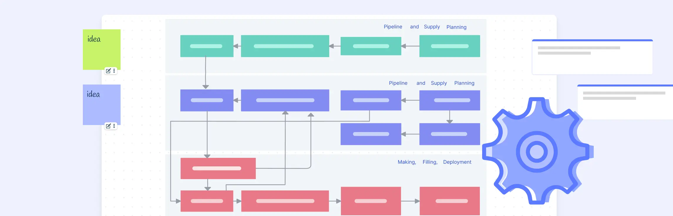
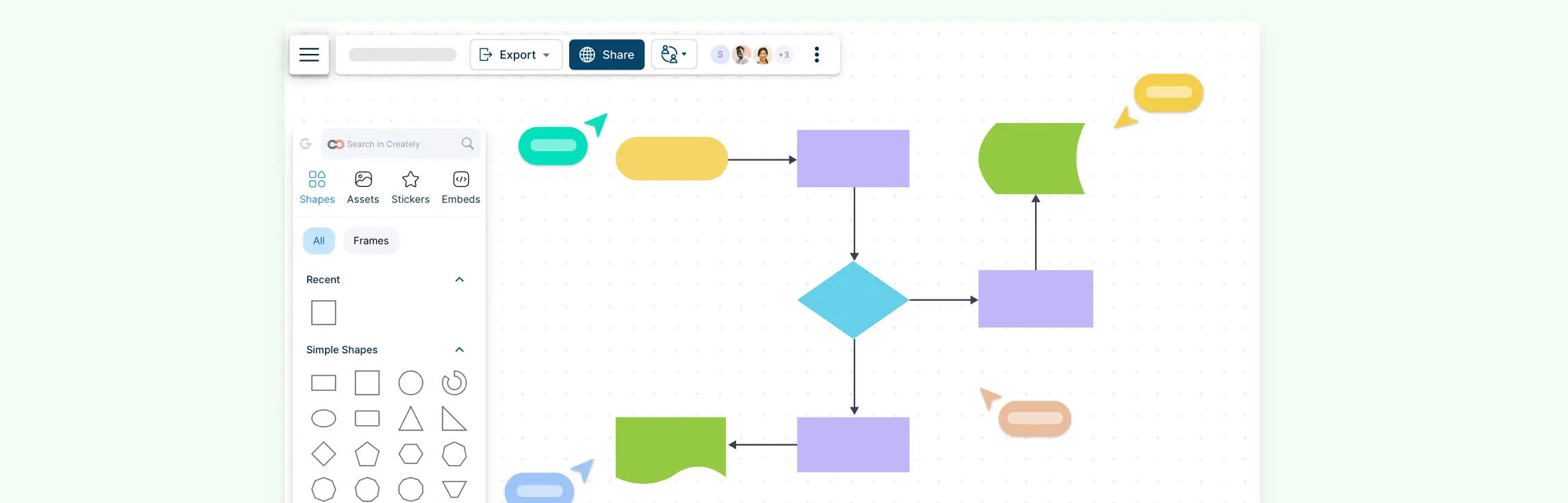
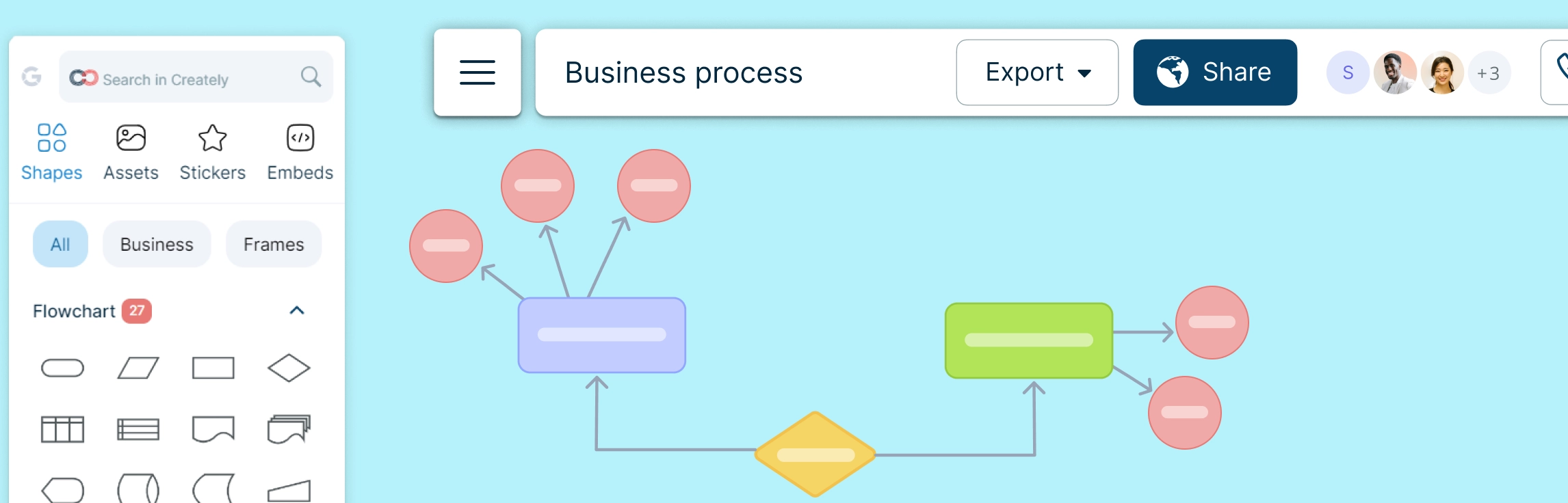
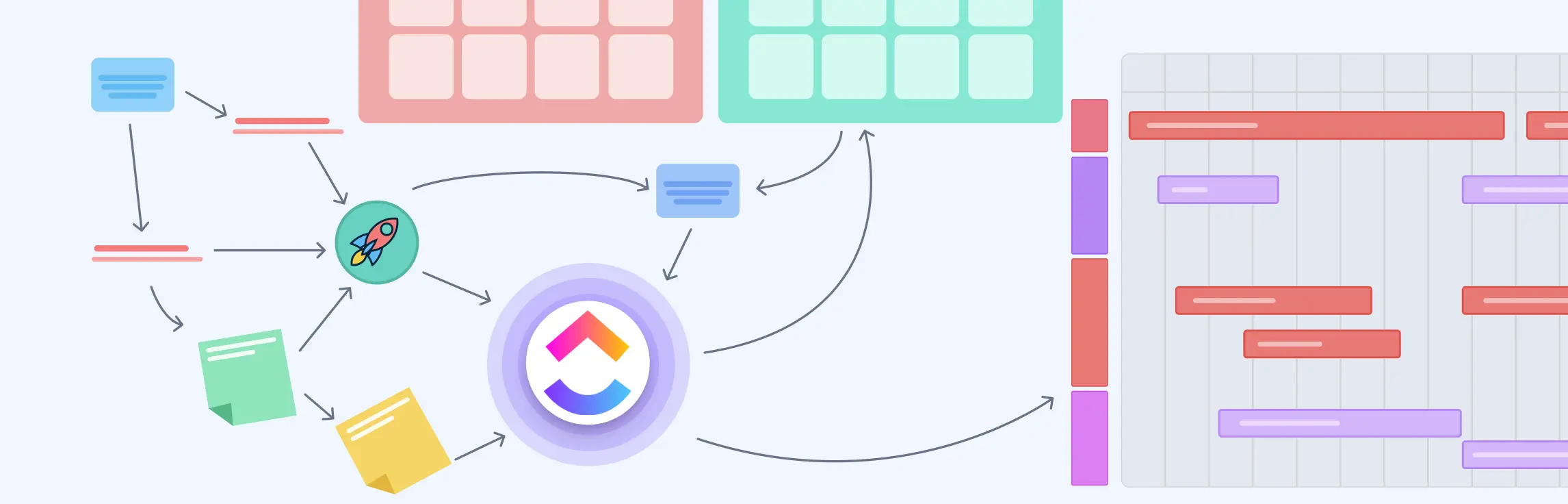
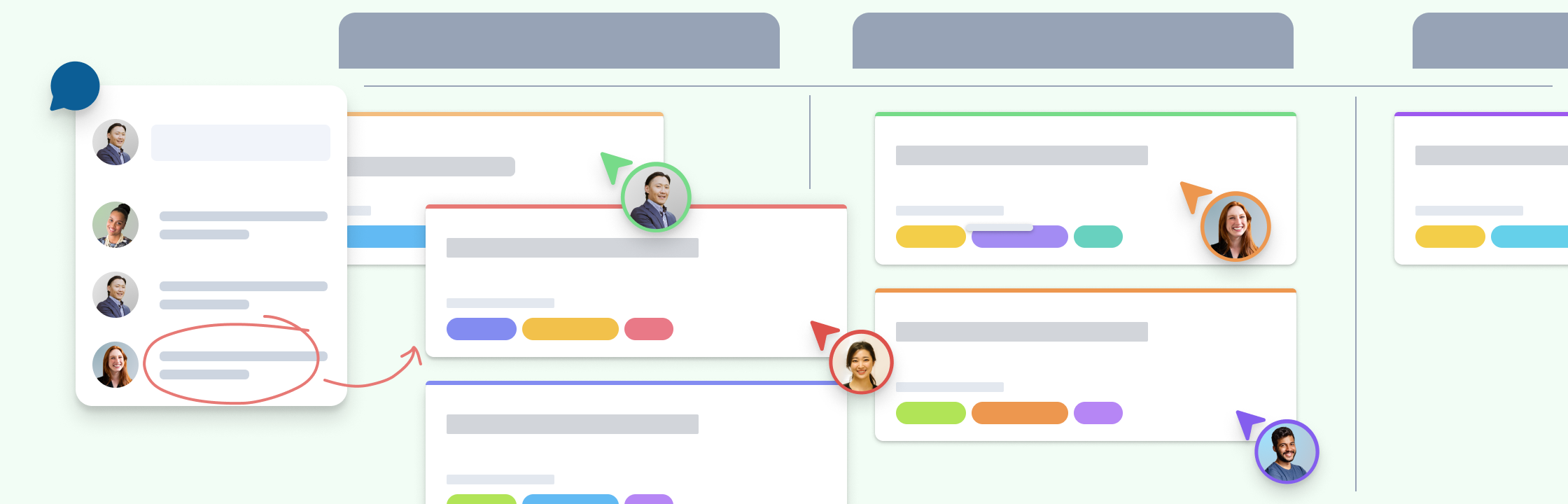
Easily visualize your processes and workflows with smart automation.
Create visual organizational structures with images and detailed profiles.
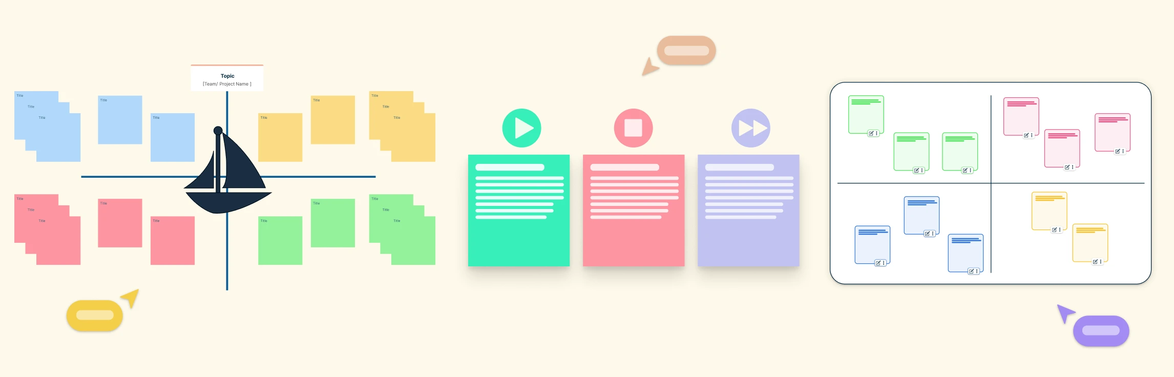
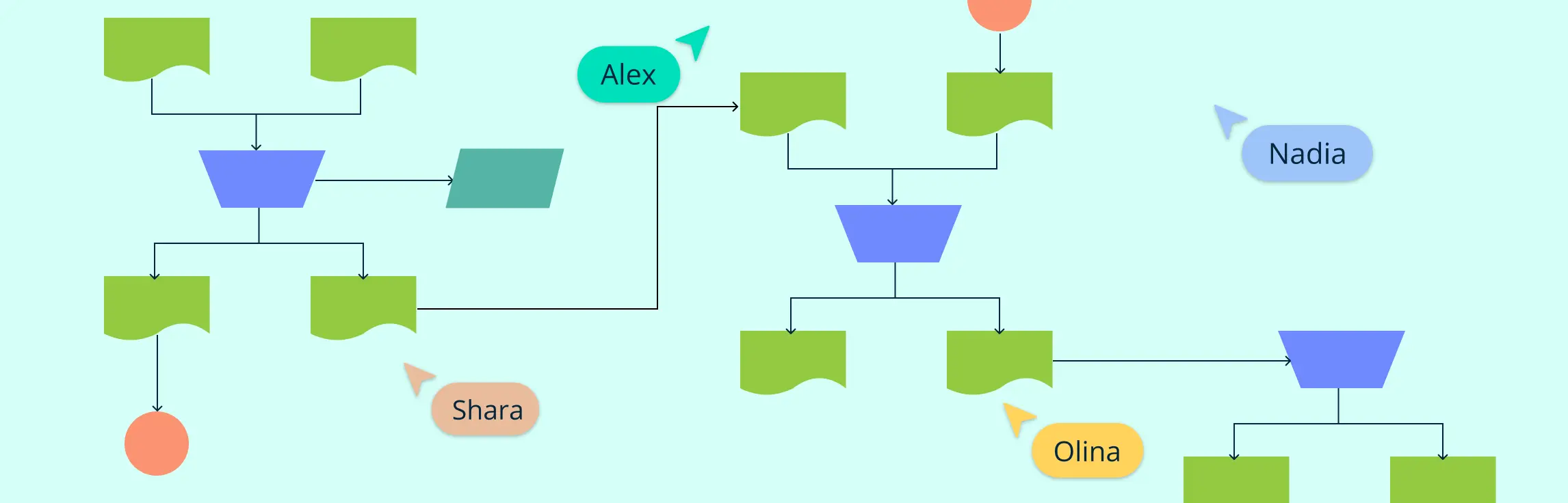
Visualize concepts and their relationships on an infinite visual canvas.
Map family history and understand the relationships with detailed genograms.
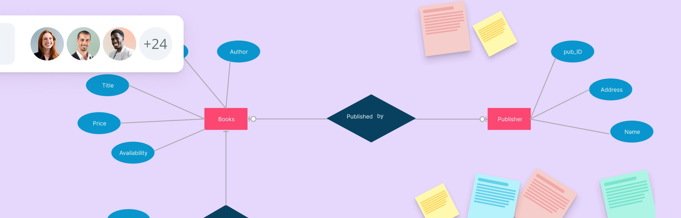
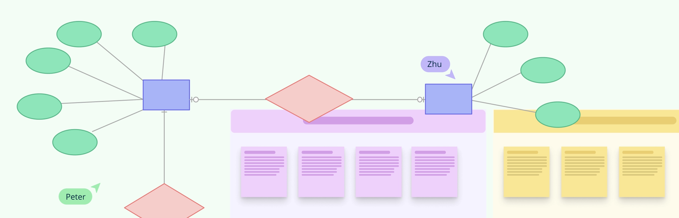
Visualize relationships between entities using Crows Foot or Chen notation.
Visualize your network infrastructure. Support AWS, CISCO, Azure and more.
Visualize and expand your ideas using our powerful mind mapping tool.
Easily create family trees with our professionally designed templates.
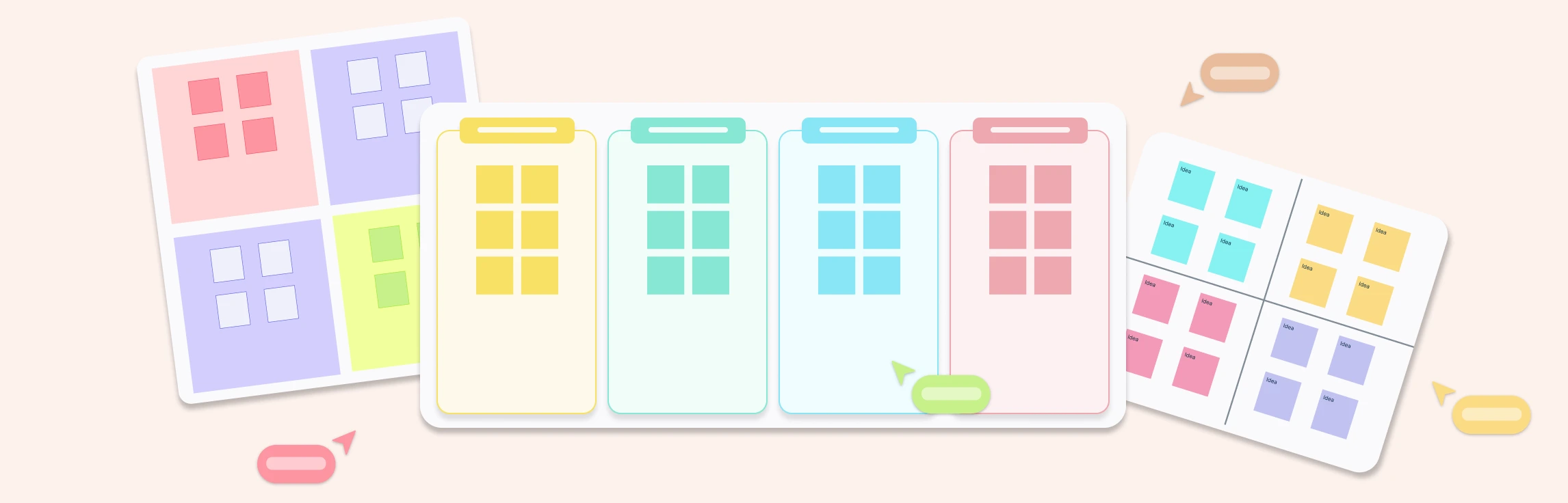
Infinite canvas to add diagrams, images, sticky notes and more.
Run collaborative meetings, workshops or brainstorming sessions.
Collaborative diagramming for educators and students at discounted rates.
Generate customizable diagrams with a simple prompting tool.
Log In
Sign Up Free
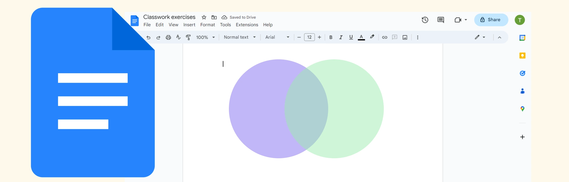
If you want to know how to do a Venn diagram in Google Docs, then this guide is for you. Discover what Venn diagrams are, how to create one in Google Docs, and understand the limitations of Google Docs for making them. We also dive into a better alternative, and compare the two methods.
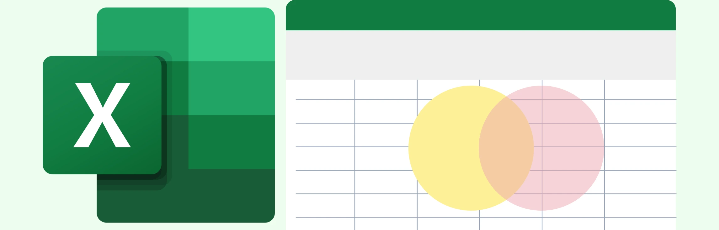
If you’re wondering how to create a Venn diagram in Excel, then you’ve come to the right place. We explore what Venn diagrams are, how to make a Venn diagram in Excel, and understand the challenges of using Excel for this. This guide also covers an easier to use and better alternative which comes with plenty of ready-made templates for making Venn diagrams.
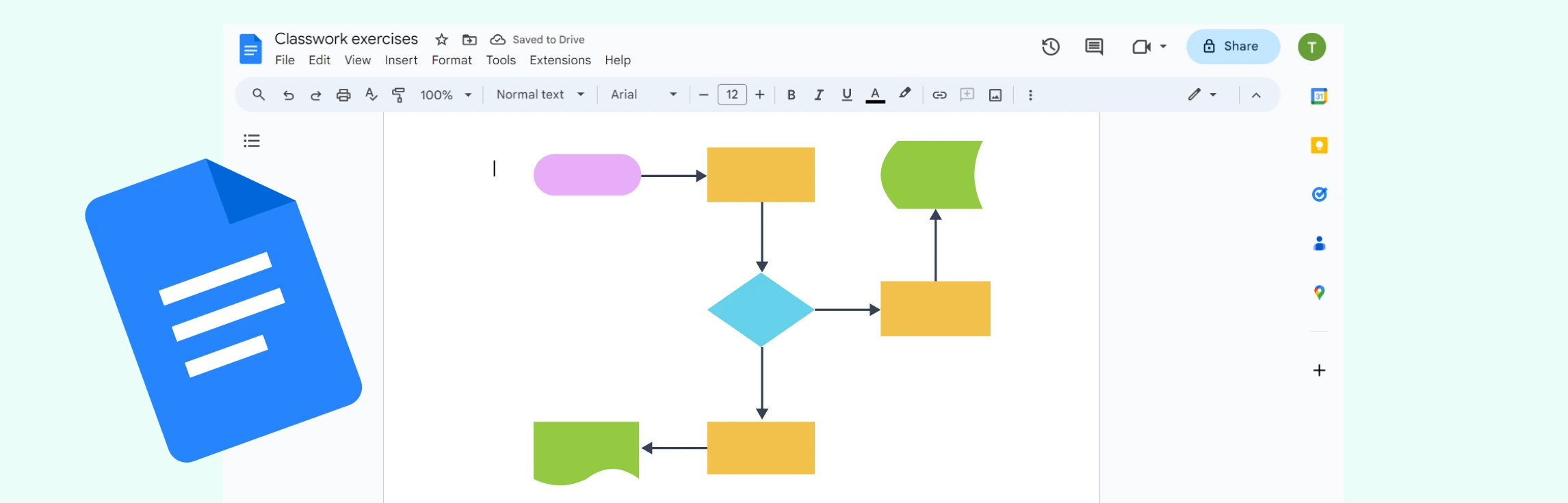
If you’ve been wondering “how do I make a flowchart in Google Docs”, then this is the guide for you. This tutorial covers how to build a flowchart in Google Docs in just six simple steps, go through the limitations, explore a better alternative, and compare its features to Google Docs.
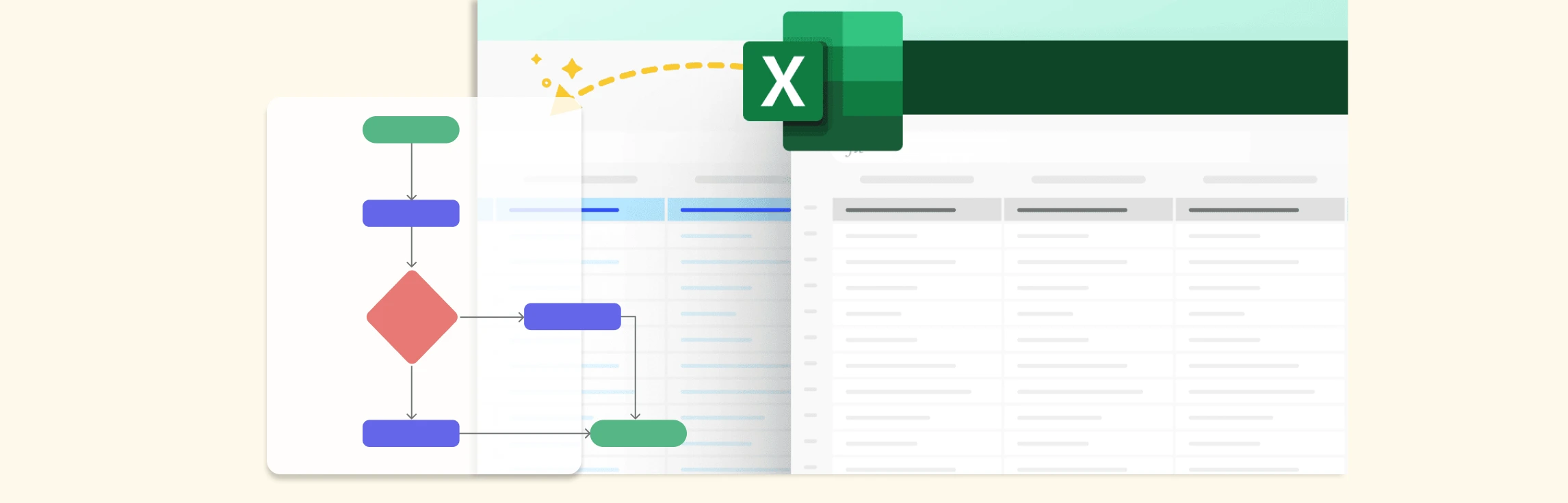
If you want to learn how to make a flowchart in Excel, then this guide is for you. Learn how to build a flowchart in Excel, make it interactive, explore its limitations, and discover a better alternative and free templates to get started today.
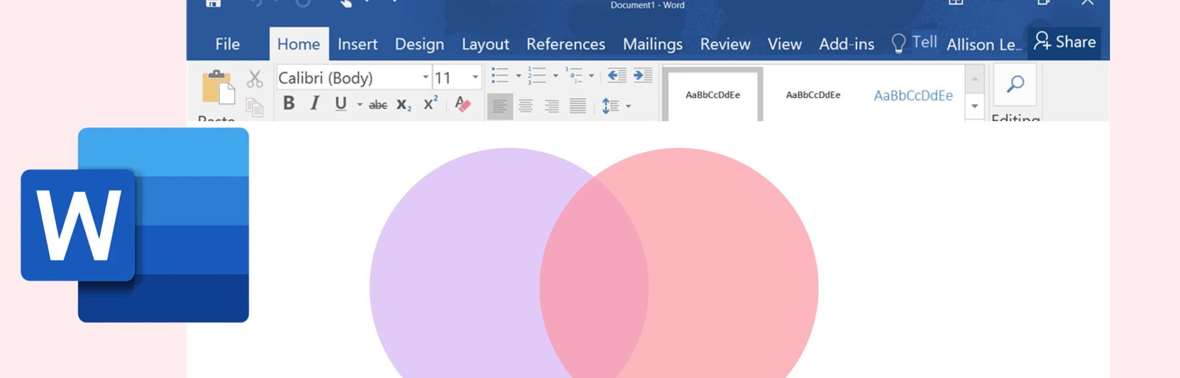
If you’ve been wondering how to draw a Venn diagram in Word, then this guide is for you. Keep reading to discover what a Venn diagram is, step-by-step instructions on how to add a Venn diagram in Word, and understand its limitations. This also covers a better alternative and a comparison between the two methods.
Using the right retrospective template can make a significant difference in how teams communicate their thoughts, analyze challenges, and celebrate wins. Whether you’re working in an Agile environment or simply looking to boost team dynamics, these templates provide the clarity and direction needed for meaningful discussions. Let’s see how they can cater to different team needs.
Retrospectives are vital for team cohesion, continuous improvement, and productivity, especially in remote and hybrid setups. Yet, without variety, they can become dull and lose their impact. To keep them engaging and effective, we’ve put together a set of creative ideas, fun retrospective templates, and practical tips designed to make your meetings both enjoyable and results-driven.
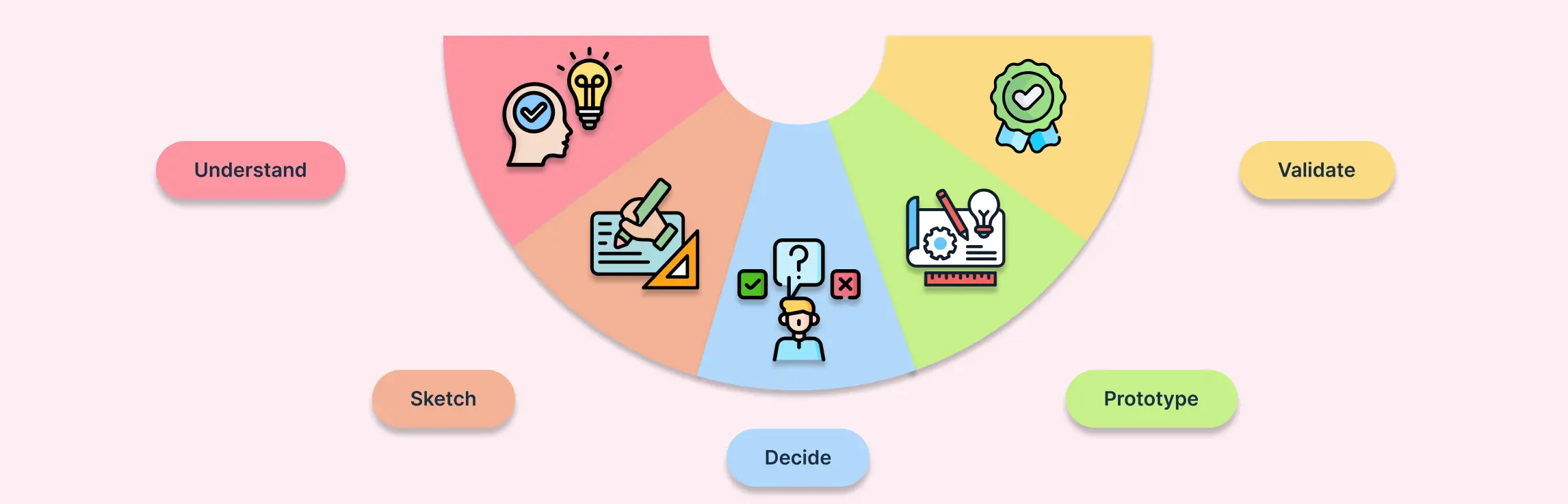
A design sprint is a structured, time-bound process that helps teams solve complex problems and test ideas quickly. Breaking the sprint into clear phases ensures that every step—from understanding the problem to validating solutions—is purposeful and focused. In this guide, we’ll dive deep into each design sprint phase, explaining the key activities, recommended tools and templates, and practical tips to make each phase effective.
Retrospectives are even more crucial for remote teams, as working apart often hides workflow issues, communication gaps, or morale dips until they become major blockers. By holding regular retrospectives, teams create a space to speak openly, surface challenges early, and align on improvements, ensuring smoother collaboration and timely project delivery. This guide covers how to run effective remote retrospectives, along with best practices, etiquette tips, and free editable templates you can start using right away.
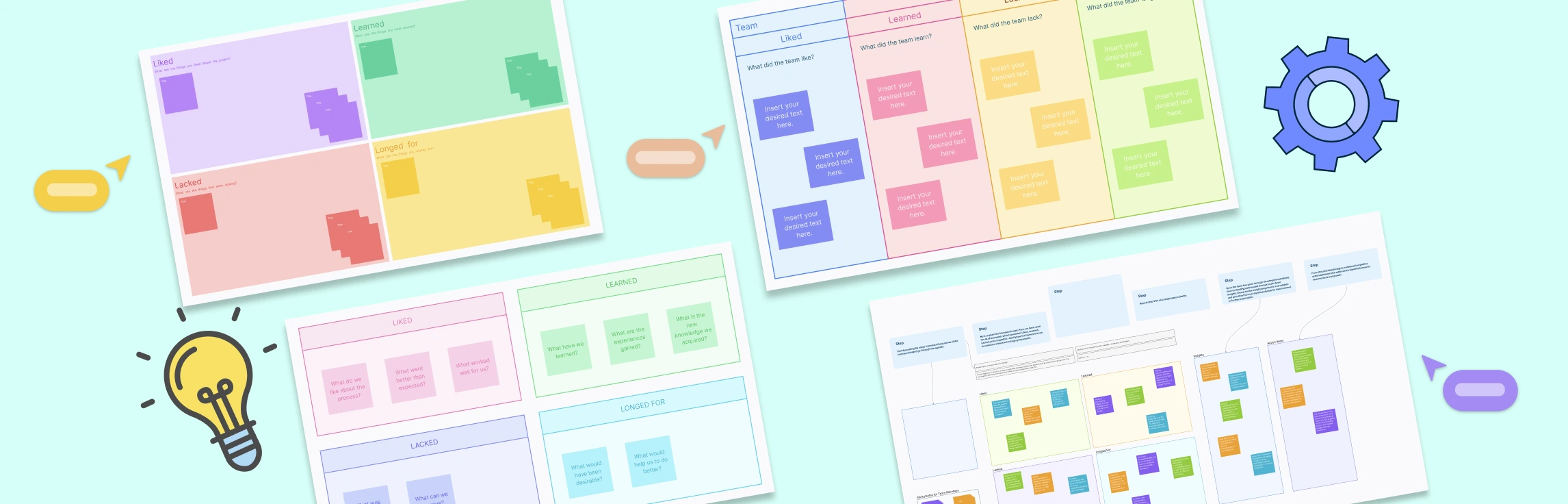
The 4Ls retrospective strikes a balance between celebrating progress and uncovering opportunities, making it ideal for teams that value both reflection and continuous improvement. This guide explores how the method works, why it’s effective, and includes free templates to help you run your own 4Ls session.
What is a Quick Retrospective? A quick retrospective is a short, time-boxed meeting (15–30 minutes) held at the end of a sprint or milestone to capture wins, challenges, and improvement ideas. Unlike a full retrospective, it focuses on a few targeted questions to keep momentum and clarity. Teams often use methods like dot voting, short brainstorming, or mood checks, with input shared on a simple board in real time or asynchronously. The goal is a clear list of action items that can be acted on immediately, making it ideal for fast-moving teams or when time is limited.
What is a 4Ls Retrospective? A 4Ls Retrospective is a simple yet powerful reflection technique used by agile teams to look back on a sprint, project, or workflow and identify what they Liked, Learned, Lacked, and Longed For. By breaking feedback into these four categories, teams can celebrate wins, capture valuable lessons, highlight missing resources, and share aspirations for improvement. The structured yet open format makes it easy to spark meaningful discussions, uncover insights that might otherwise be missed, and turn reflections into actionable steps for continuous growth.
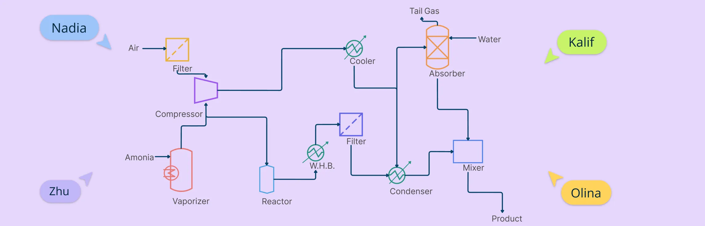
If you work in chemical, mechanical, or process engineering, chances are you’ve come across a process flow diagram (PFD). These aren’t your everyday business flowcharts—they’re high-level technical blueprints that show how materials and energy move through a system. In this guide, we’re going beyond the theory. You’ll learn how to create a process flow diagram, step by step.
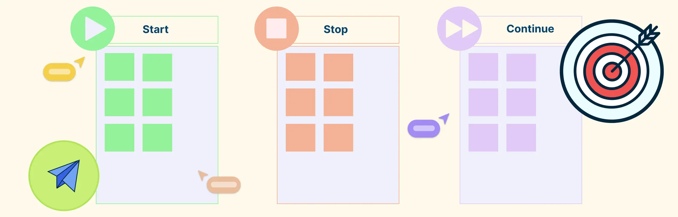
Start Stop Continue feedback breaks feedback into three simple parts: what to stop doing, what to start doing, and what to keep doing. It makes giving and receiving feedback clearer, more actionable, and less overwhelming.
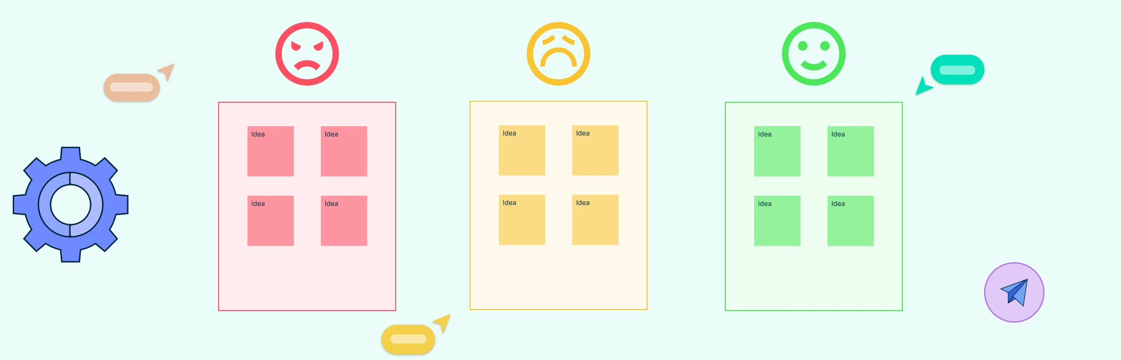
What is a Mad Sad Glad Retrospective The Mad Sad Glad retrospective is a model that guides participants to categorize sprint experiences into three buckets—things that made them mad, sad, or glad. Originated as a simple emotional check-in for agile teams, this structure helps surface morale issues and emotional undercurrents early on. While effective for highlighting general feelings, the retrospective mad sad glad technique may limit deeper analysis when overused.
This guide shows you how to run structured, collaborative, and action-oriented Start Stop Continue retrospectives using Creately. We’ll walk through how Creately’s visual workspace, real-time collaboration, and AI-powered features help you plan, run, and follow up on retrospectives with less hassle and more impact in 3 simple steps.
What is a Mad Sad Glad Retrospective The Mad Sad Glad retrospective is an agile practice designed to help teams articulate their emotions during the reflection process. This method categorizes feelings into three distinct areas: Mad, Sad, and Glad. By focusing on these emotions, teams can gain valuable insights that contribute to both emotional well-being and continuous process improvement.
A Start Stop Continue retrospective is an easy and effective way for teams to reflect on how things are going and find ways to improve. It helps everyone speak up in a structured and positive way.
The Start Stop Continue exercise is a straightforward way for teams to reflect and improve. It uses a simple three-column format—Start, Stop, and Continue—to help people share ideas on what to begin doing, what to stop, and what’s already working well. Originally popularized in agile teams, it’s now used widely in retrospectives, performance reviews, and team check-ins.
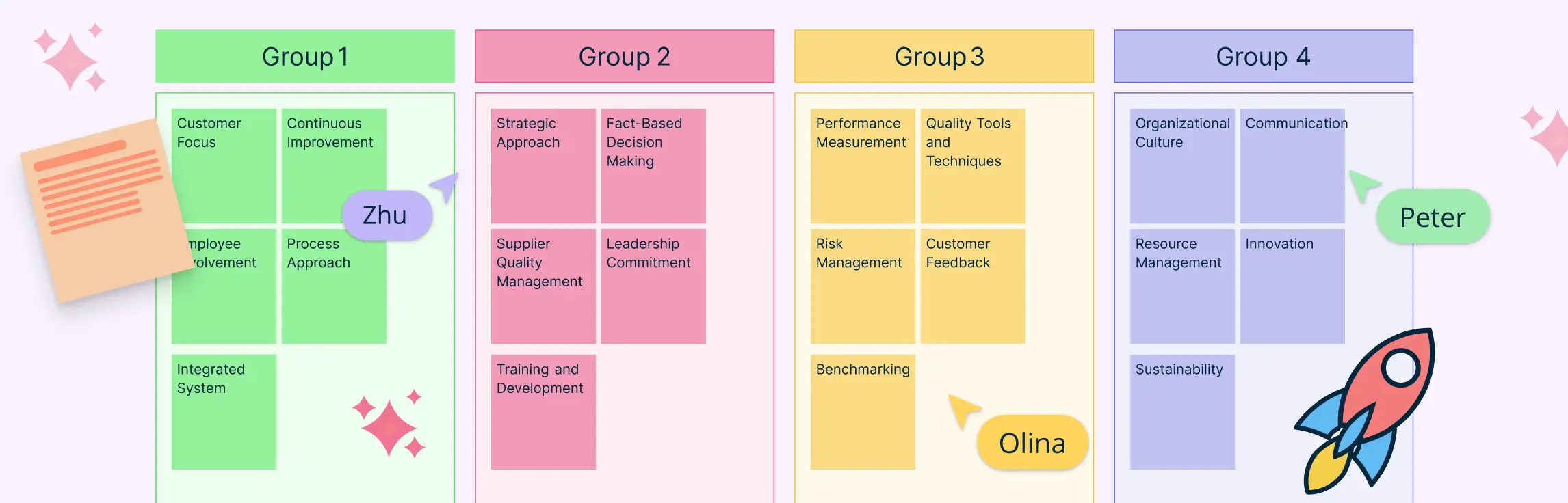
In project management, especially within the PMP® methodology, organizing stakeholder input, requirements, and risks is critical for effective planning. An affinity diagram in PMP helps project managers visually cluster large volumes of qualitative data, revealing natural relationships and guiding strategic decisions.
Affinity mapping in UX brings structure to qualitative research, transforming raw observations into cohesive themes. It fuels actionable insights by clustering related observations, ideas, or pain points. This guide walks through core concepts, workflows, and tools, from basic affinity diagram UX to best practices.
What Is Affinity Mapping? Affinity mapping—also known as affinity diagramming—is a powerful technique for synthesizing large volumes of qualitative data into actionable insights. Used in UX research, design thinking, agile retrospectives, and customer feedback analysis, this method transforms sticky notes and scattered ideas into structured themes that fuel innovation.
Start Stop Continue is a simple feedback method used in reviews, retrospectives, and team meetings to drive improvement. It helps identify what to start doing, what to stop because it’s unhelpful, and what to continue because it’s working well. It encourages balanced, action-focused feedback without blame.
A design sprint is a fast, focused way for teams to solve problems and test ideas in just a few days. Instead of spending months guessing or debating, a design sprint helps you build a prototype and get real user feedback quickly. It’s a popular method used by startups and big companies alike to reduce risk, save time, and make better decisions.
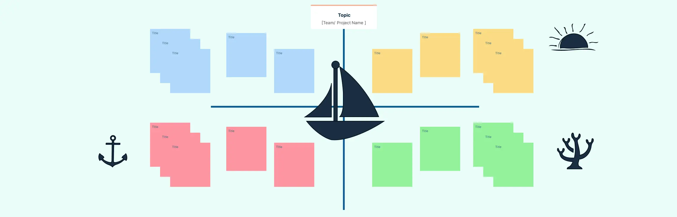
What Is a Sailboat Retrospective? A sailboat retrospective is a creative and visual project management tool that helps Agile teams reflect on their progress, challenges, and goals using the metaphor of a sailboat journey. By exploring elements like wind, anchors, rocks, and the island, teams can surface what’s helping, what’s hindering, and what risks lie ahead. This format encourages open, honest dialogue and collaborative problem-solving in a relaxed, non-judgmental setting.
Meetings are an integral part of our work lives. They serve as key platforms for discussions, decision-making, and collaboration. However, we’ve all experienced meetings that seem to go nowhere, waste time, and leave everyone feeling frustrated. To overcome unproductive meetings, having clear and well-structured meeting templates helps.
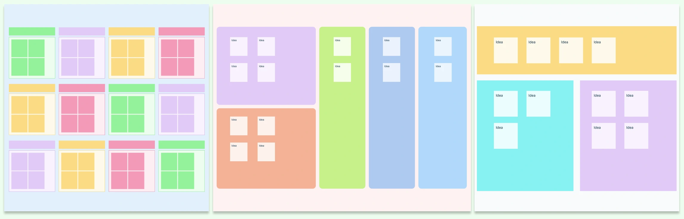
When teams are flooded with ideas, data, or feedback, it’s easy to lose clarity. That’s where Affinity Diagram Examples come in handy. These visual tools help you organize information into logical groups, making it easier to identify patterns, prioritize tasks, and drive decisions.
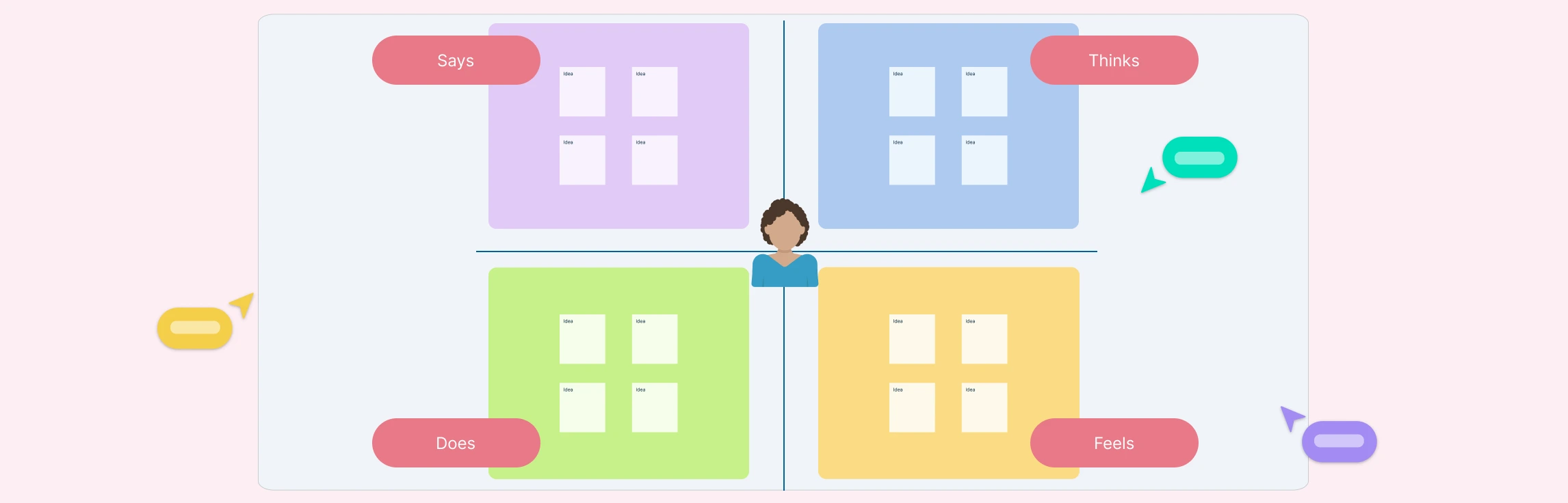
Creating an empathy map is an essential step in understanding your audience deeply and designing experiences that truly resonate with their needs. By visualizing a user’s thoughts, emotions, attitudes, behaviors, and pain points, you gain valuable insights that help shape products, services, and strategies effectively.
When designing a relational database, understanding how entities connect is just as important as defining the entities themselves. That’s where the foreign key in ER diagrams comes in. It serves as the critical link that binds different tables together, helping you create a structured, meaningful database model.
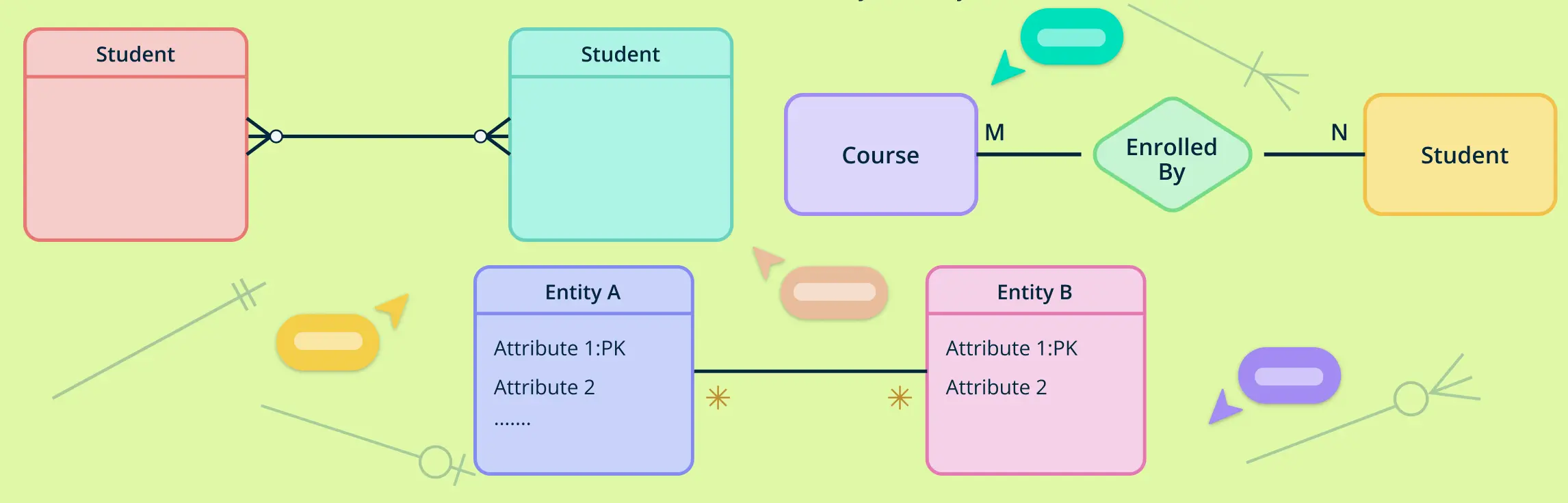
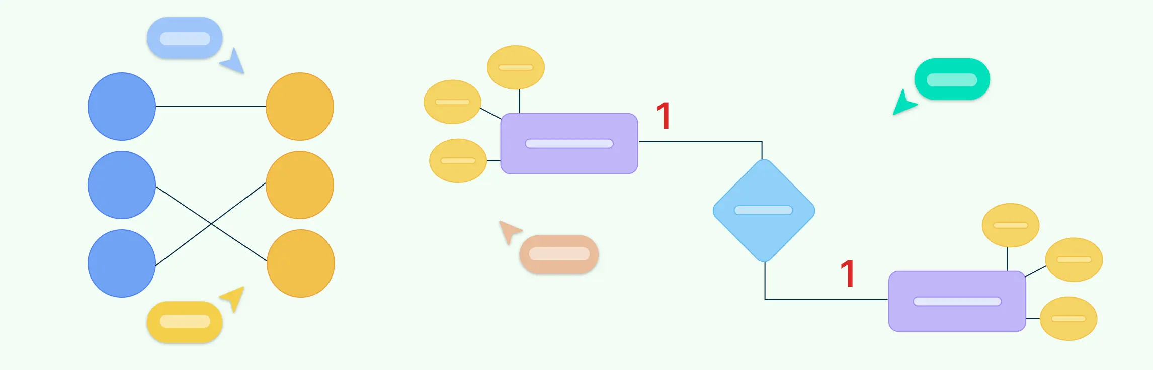
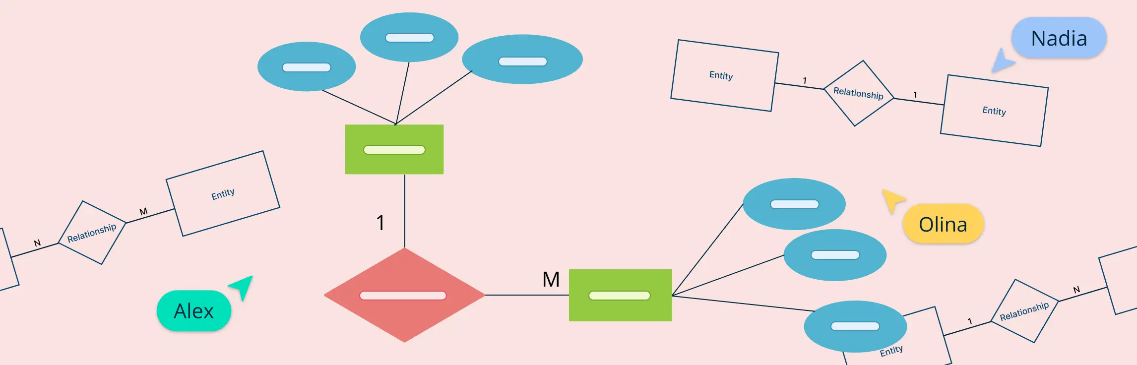
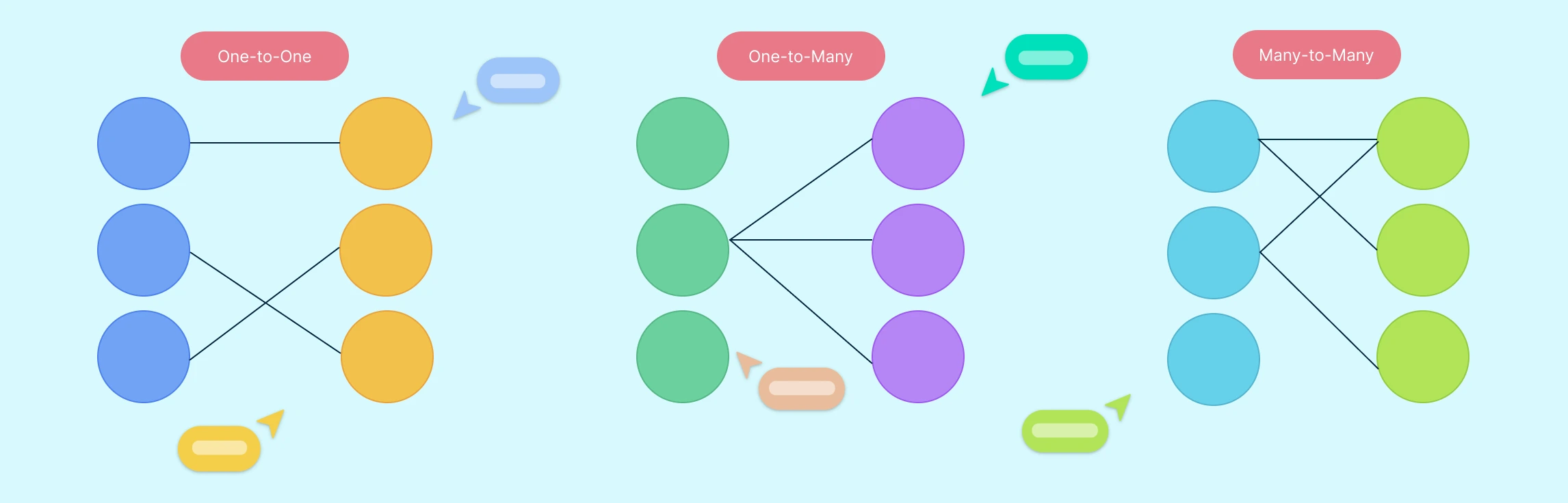
Understanding how entities relate to each other is at the heart of data modeling. That’s where cardinality symbols come in. These visual indicators define how many instances of one entity can or must be associated with instances of another, forming the backbone of accurate, meaningful ER diagrams.
In database design, understanding how different entities relate to each other is essential for creating efficient and accurate data models. One of the most straightforward yet powerful types of relationships is the one-to-one relationship. This occurs when each record in one table is linked to exactly one record in another table—and vice versa.
Designing a well-structured database starts with understanding how to represent data and its relationships clearly. One of the most influential tools for this is Chen notation, a visual language used in Entity-Relationship diagrams.
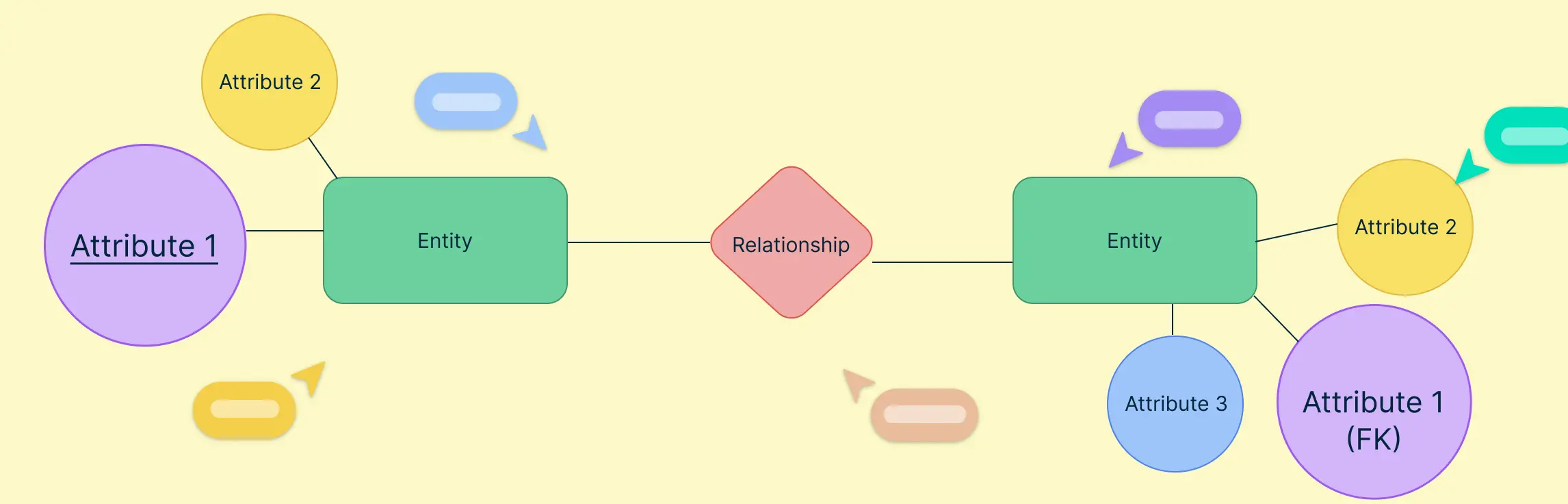
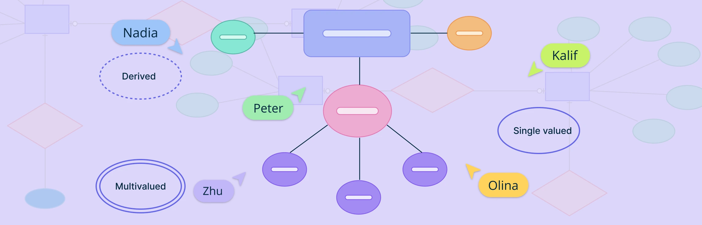
Attributes in ERD play a crucial role in defining and distinguishing entities within a database. From simple attributes that store atomic values to composite attributes that break down into smaller components, these elements help structure data meaningfully. Understanding attributes is essential for maintaining data integrity, optimizing queries, and ensuring effective relationships between entities. This guide explores the different types of attributes in ERD, their importance, and best practices for utilizing them in database modeling.
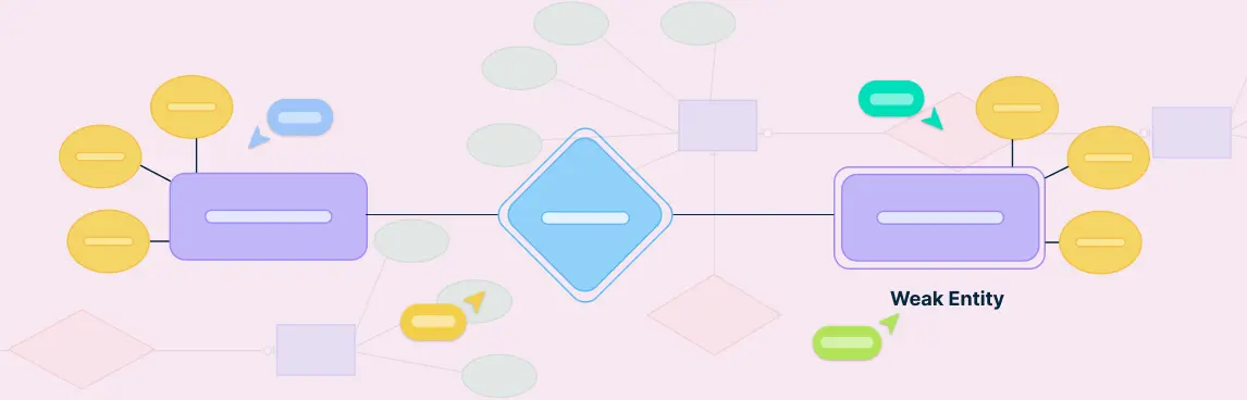
In database design, not all entities can stand on their own. Some rely on other entities to make sense or to be uniquely identified. These are called weak entities. They are an important part of ER diagrams, especially when modeling real-world situations where certain data cannot exist without being linked to other data.
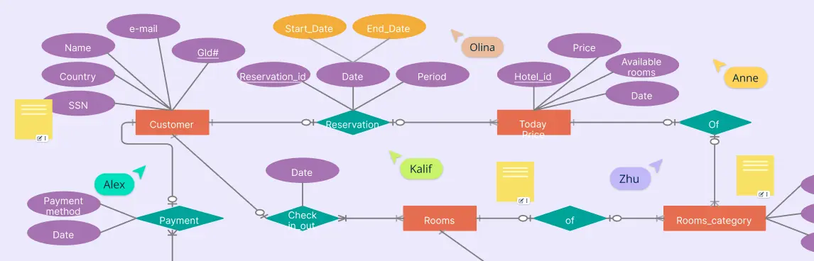
An ER diagram for a hotel management system is a simple way to show how all the parts of a hotel work together in a database. Whether you’re building hotel software or just trying to understand how hotel data is stored and managed, an ER diagram helps map out everything clearly—from guests and rooms to bookings and staff.
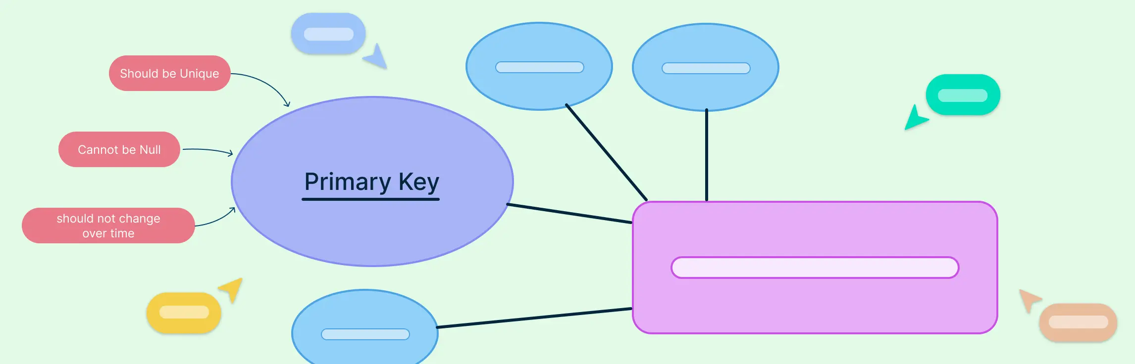
In any well-structured database, the primary key in ERD (Entity Relationship Diagram) plays a vital role in ensuring data accuracy and integrity. Whether you’re a database designer, developer, or student, understanding how primary keys work and how to represent them in ER diagrams is crucial for building efficient relational models.
When designing a database, the relationships between entities are just as important as the entities themselves. Among these, one-to-many relationships are the most commonly used and foundational in building scalable, logical, and normalized data models. This guide explains what one-to-many relationships in ER diagrams are, how to represent them using different notations, how to identify them correctly during data modeling, and why they matter in real-world database design. This will help you understand how ERD relationships shape a database system’s overall structure and efficiency.
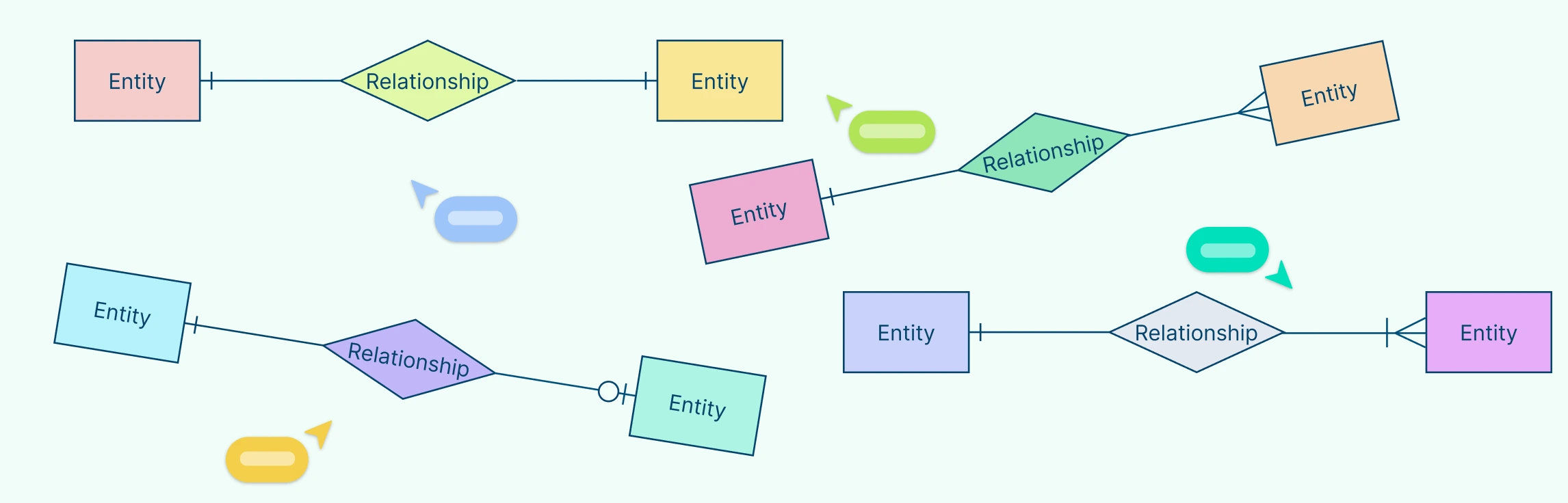
Crow’s Foot notation is a powerful and widely used method for visually representing relationships in database modeling. Its distinctive symbols such as dashes, circles, and the ‘crow’s foot’ shape help define the connections between entities, making database structures easier to interpret.
Entity-Relationship Diagrams (ERDs) are the foundation of modern database design, offering a visual representation of how data is structured, connected, and maintained. As businesses and organizations rely increasingly on efficient data management, understanding ERD relationships is essential for designing scalable, well-organized databases.
When designing a database, one of the most important steps is understanding how information connects and flows. That’s where Entity-Relationship Diagrams (ERDs) come in. ERDs help us map out the key parts of a system—like people, products, or events—and how they relate to one another.
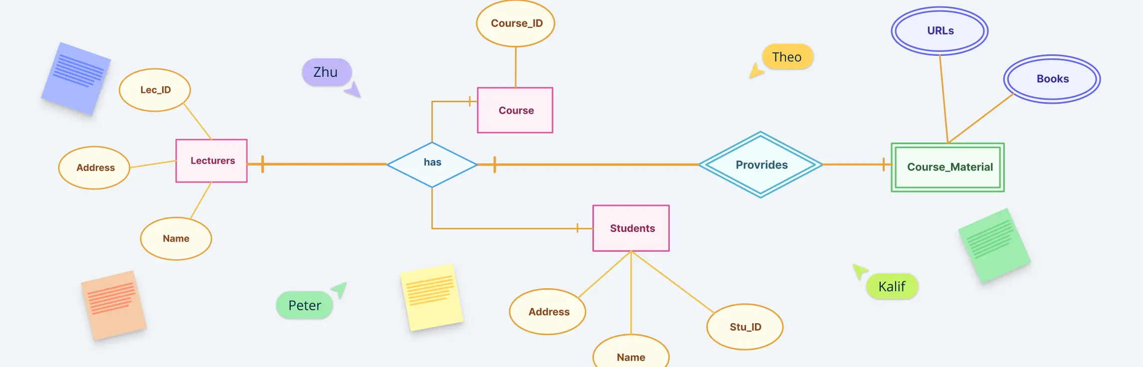
An entity relationship diagram is a visual representation of the structure of a database. It illustrates how entities (such as people, objects, or concepts) relate to one another within a system. Entity relationship diagrams are essential for designing databases, ensuring data is organized efficiently, and facilitating clear communication among stakeholders.
Many-to-many relationships are a fundamental concept in Entity-Relationship (ER) modeling. They represent scenarios where multiple instances of one entity can be associated with multiple instances of another. In this guide, you’ll learn how to illustrate many-to-many relationships in ER diagrams using best practices.
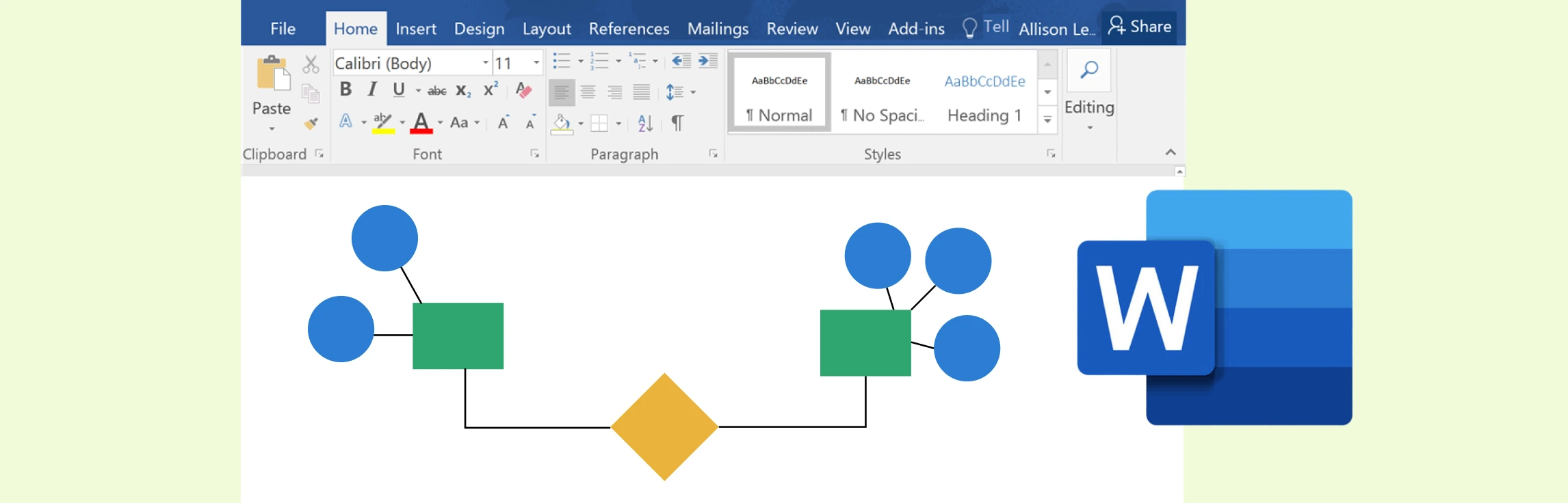
While Microsoft Word offers a practical way to create ER diagrams using its shapes and SmartArt features, it often falls short in functionality and efficiency compared to specialized tools. Creately, on the other hand, excels as a dedicated diagramming platform with intuitive tools, customizable templates, and collaboration features designed for professional-grade ER diagrams.
Entity Relationship (ER) diagrams are the cornerstone of effective database design, acting as a visual language that bridges the gap between abstract concepts and structured data models. At the heart of these diagrams lie ER diagram symbols and notation styles, which transform complex relationships into easily understandable representations. Whether you’re a novice stepping into the world of data modeling or an experienced database architect aiming to refine your craft, understanding these ER diagram symbols is crucial for building clear, efficient, and scalable data structures.
A screen flow diagram is a visual tool that shows how users move through an app, website, or software. It maps out the different screens, the paths between them, and the decisions users make along the way. By laying out this journey step by step, teams can design smoother, more intuitive digital experiences.
A process flow diagram (PFD) visually maps out the steps in a process from start to finish using standard symbols. It helps teams understand, analyze, and improve workflows across fields like engineering, business, and software. This guide explains what a PFD is, its main components, key symbols, and why it’s useful.
PFD symbols represent the key equipment, lines, and instruments in a process, helping you visualize how materials flow through a system. Knowing these symbols makes reading and creating PFDs easier.
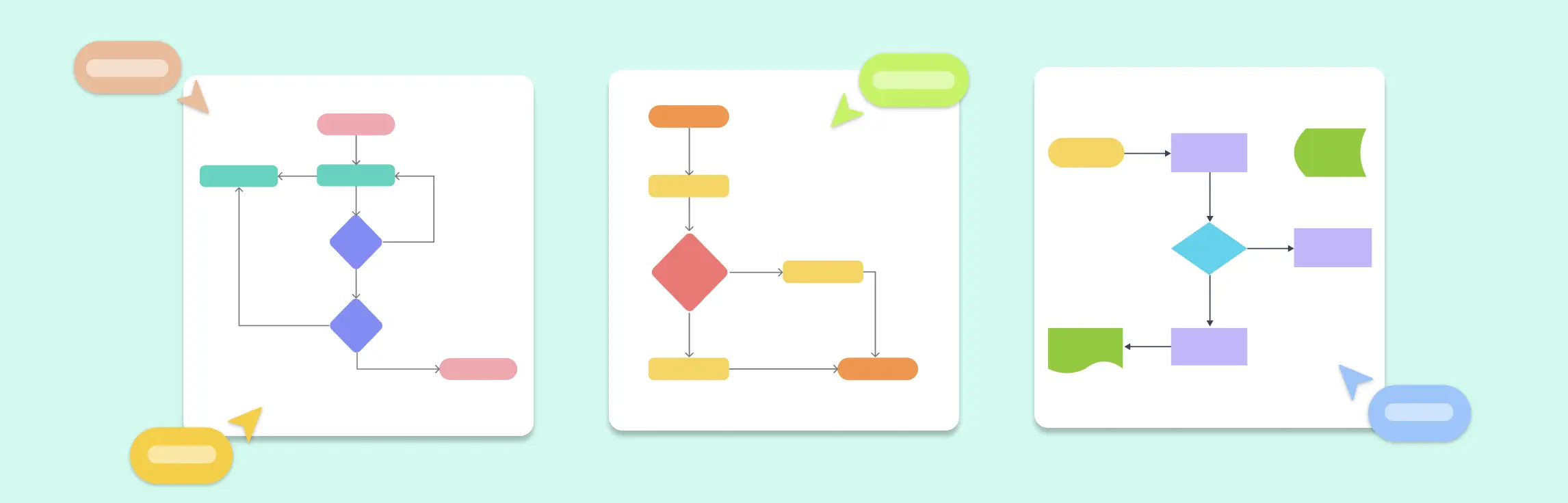
Flowcharts are one of the simplest yet most powerful tools for visualizing processes, making them easier to understand and optimize. In this guide on flowcharting basics, we’ll walk you through the essential symbols, best practices, and ready-to-use templates to help you create clear and effective flowcharts.
An action plan for career growth provides a structured roadmap to help individuals set, track, and achieve their professional goals. Whether you’re advancing in your current role, switching industries, or developing new skills, a well-defined plan ensures steady progress. Here are 10 examples of career action plans to help you succeed:
An Affirmative Action Plan (AAP) is a structured strategy that helps organizations promote diversity, equity, and inclusion by ensuring fair hiring, promotion, and workplace policies. These plans are essential for businesses committed to eliminating discrimination and fostering equal opportunities for all employees. Below is a list of 10 key affirmative action plan templates to guide organizations in creating a more inclusive workforce.
A Business Action Plan is a structured framework that helps organizations outline their goals, define strategies, and execute tasks efficiently. Whether launching a startup, expanding into new markets, or improving financial management, a well-designed action plan ensures clarity, accountability, and measurable progress. In this guide, we will share 10 Business Action Plan Templates to help businesses achieve their objectives effectively.
Every day, businesses and organizations handle countless documents—contracts, invoices, reports, and more. Keeping track of how these documents move from one step to another can get complicated. That’s where a document flowchart comes in.
A cross-functional flowchart is a simple but powerful tool that helps businesses and teams visualize their processes more clearly. Unlike a regular flowchart, it doesn’t just show the steps of a process—it also highlights who is responsible for each step. This makes it especially useful for teams that work across different departments, ensuring everyone understands their role in the bigger picture.
When mapping out processes, whether for business, software development, or everyday workflows, visual diagrams make things clearer. Two commonly used tools for this are flowcharts and activity diagrams. At first glance, they may seem similar—both show steps in a process—but they serve different purposes and are used in different fields.
Flowcharts are powerful tools for visualizing processes and making complex information easier to understand. Whether you’re mapping out a business process, designing software, or planning a project, flowcharts help you break down tasks step by step. However, to create clear and effective flowcharts, it’s important to follow certain flowchart rules.
Flowcharts are a great way for students to organize thoughts, simplify complex tasks, and improve problem-solving skills. In this guide, we’ll explore flowchart examples for students that cover various academic and personal scenarios, from solving math problems to planning study routines.
A decision flowchart is a simple yet powerful tool that visually maps out choices and outcomes, making decision-making easier. Whether for work, projects, or daily life, a decision-making flowchart helps clarify options and improve efficiency.
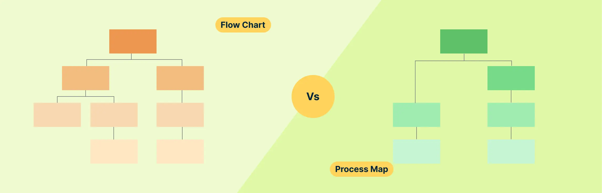
Understanding processes is key to making tasks more efficient and effective, whether you’re managing a project, improving workflows, or solving problems. Two useful tools for visualizing and analyzing processes are flowcharts and process maps. Though they may look similar, each one serves a distinct purpose and works better in different scenarios.
Flowcharts are powerful tools that help visualize processes, systems, and workflows. Whether you’re mapping out a business operation, designing a computer program, or organizing daily tasks, flowcharts make complex ideas easier to understand.
Management action plans can address various business needs, such as project execution, risk management, performance improvement, and strategic planning. Below are ten examples of management action plan templates that organizations can use to enhance efficiency and productivity. Here are 10 Examples of Management Action Plan with templates.
Employee action plans can be used for professional development, performance improvement, or addressing behavioral concerns. They provide employees with a clear understanding of their objectives while offering managers a structured method to monitor and support progress. Here are 10 examples of employee action plans with editable templates.
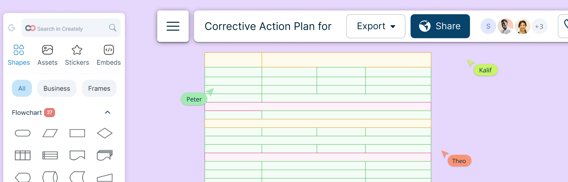
A successful CAP should include clear objectives, measurable expectations, a timeline for improvement, and support mechanisms for the employee. Corrective action plans are essential for maintaining workplace standards, ensuring compliance with company policies, and fostering a culture of continuous improvement. Here is a 10 Examples of Corrective Action Plans for Employees
An Emergency Action Plan (EAP) for schools is a critical safety strategy that outlines procedures for effectively responding to crises and ensuring the well-being of everyone on campus. Schools need clear and actionable emergency protocols that align with local laws and safety regulations. Emergency action plan should be updated regularly and communicated to all stakeholders, including students, teachers, parents, and emergency responders.
Designing a well-structured Entity-Relationship (ER) Diagram is crucial for building an efficient Library Management System (LMS). This guide provides a comprehensive overview of an ER diagram for library management system, covering various scenarios like book reservations, user roles, membership plans, and fine calculations. Whether you’re a developer, database designer, or library administrator, this guide will help you understand key components, relationships, and best practices to create a clear and optimized data structure for your library system. Plus, explore free templates to streamline your diagram creation process effortlessly!
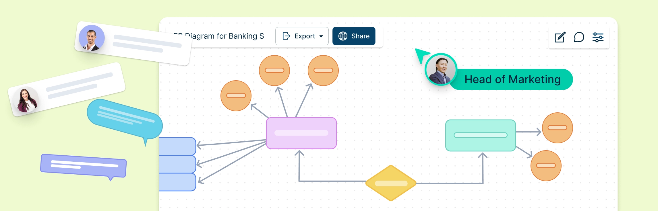
An Entity-Relationship (ER) diagram for a banking system helps to visualize the relationships between various entities such as customers, accounts, transactions, and employees. Creating an ER diagram for a banking system is crucial for understanding how data is structured and how different entities interact. Below are six scenarios where ER diagrams can be used effectively in a banking system.
An Entity-Relationship (ER) diagram is a visual representation of the structure of a database. It helps define the relationships between different entities in a system. For an Employee Management System (EMS), an ER diagram helps to model the system’s data requirements, focusing on entities like employees, departments, roles, and payroll.
In a hospital management system, keeping track of various operations like patient care, staff management, and medical records is crucial. One of the best ways to design and visualize the structure of these systems is through Entity-Relationship (ER) diagrams. ER diagrams help to map out relationships between different components, making it easier for developers, managers, and teams to understand how data flows within the system. In this guide, we’ll explore 10 ER diagrams for hospital management systems, complete with free templates that you can use to get started with your own projects.
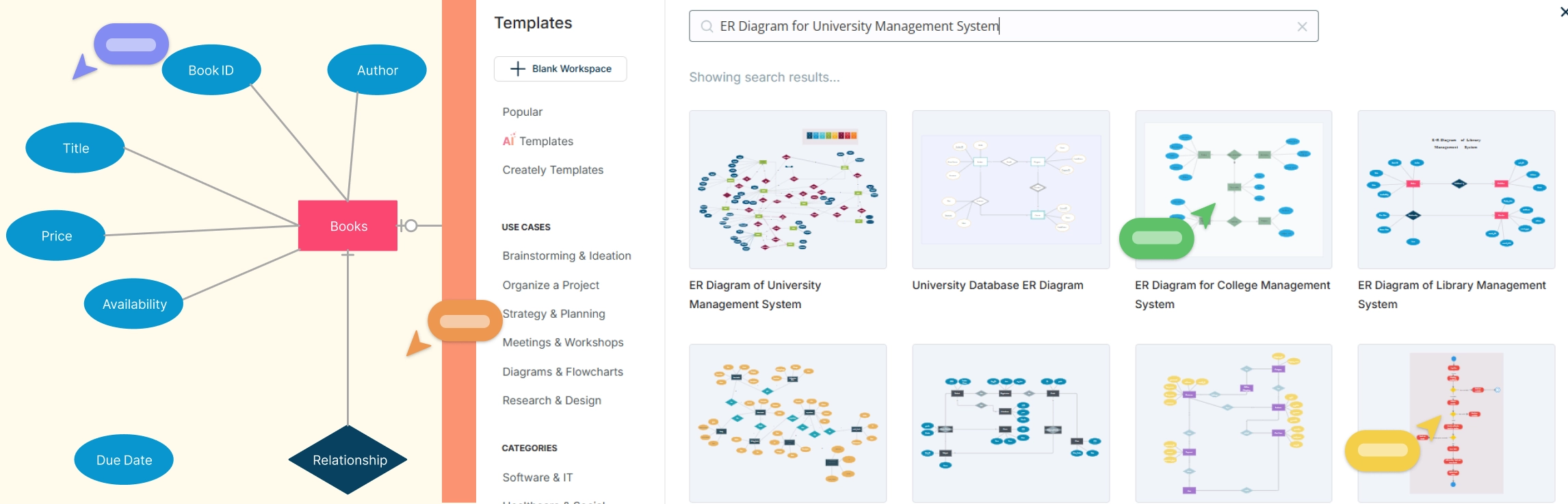
Efficient data management is essential for any university to streamline operations like student registration, course enrollment, faculty management, and more. This guide explores the top 10 ER diagrams designed for various university management functions, providing ready-to-use templates to help visualize and optimize database structures. Whether you’re an administrator, IT professional, or faculty member, these ER diagrams will help create a structured and scalable university system.
Imagine a fire breaks out in your office or a severe storm forces an evacuation. Would your team know what to do? That’s where an emergency action plan (EAP) comes in. It’s a step-by-step guide that helps businesses and organizations prepare for unexpected emergencies, ensuring everyone stays safe and knows their role when disaster strikes.
Ever feel overwhelmed by all the things you need to get done, with no clear path forward? That’s where an action plan comes in. What is an action plan? It is your roadmap to success. It breaks down your goals into simple, manageable steps so you know exactly what to do and when to do it.
In today’s fast-paced work environment, effective collaborative team meetings play a crucial role in boosting both productivity and engagement. As team structures become more dynamic and work processes more complex, creating a collaborative team meeting culture is indispensable. These meetings serve as a platform where ideas are not only exchanged but enhanced, leading to innovative solutions and strategic advancements.
The importance of visual communication cannot be overstated. It’s a powerful tool that helps people understand and share ideas more clearly. With so much information to process, using visuals like charts, images, and videos makes complex concepts easier to grasp. Whether you’re working in a team or presenting to others, the importance of visual communication lies in its ability to improve collaboration, decision-making, and problem-solving. In this guide, we’ll explore why visual communication is important and how it can help you work smarter, not harder.
Knowing how to use visual communication is essential for making your message clear, engaging, and memorable. Whether it’s a presentation, a report, or a marketing campaign, visuals help simplify complex ideas and make them easier to understand.
Visual communication is the use of images, graphics, and other visual elements to share information and ideas. In today’s world, we rely on visuals more than ever to get our messages across quickly and clearly. Whether it’s a logo, a chart, or a social media post, visuals help us communicate in a way that words alone often can’t.
Types of visual communication are all around us—on billboards, in social media posts, and in the videos we watch every day. Visuals are one of the most powerful ways to share ideas, tell stories, and make information easy to understand.
Teamwork thrives on effective communication. Whether in the office, remote, or hybrid, collaborative communication helps teams share ideas, solve problems, and achieve goals together.
Effective communication is the foundation of any successful workplace. Whether you’re working in a team, managing a group, or collaborating with clients, how you communicate can make or break your productivity and team dynamics. Poor workplace communication can lead to misunderstandings, missed opportunities, and conflict, while strong workplace communication fosters collaboration, innovation, and a positive work environment.
What is Dotmocracy? Dotmocracy is a collaborative decision-making method that helps teams collect and recognize levels of agreement or disagreement among participants in an unbiased and inclusive manner. Using Dotmocracy, participants can document ideas and mark their level of agreement with dots, fostering transparency and trust.
Whimsical is a popular lightweight diagramming tool known for its clean interface and focus on creating simple flowcharts, wireframes, and mind maps. However, it might not satisfy every team’s requirements, particularly those needing advanced diagramming features, robust collaboration capabilities, or enterprise-level integrations. If you’re considering moving away from Whimsical or searching for alternatives that offer more comprehensive features for growing teams, this guide will help you make an informed decision.
Looking to collaborate visually with your team but wondering if Microsoft Whiteboard is the best fit? While Microsoft’s digital canvas solution offers basic whiteboarding features and seamless integration with Teams, today’s market is brimming with powerful alternatives that might better suit your needs. Whether you’re seeking advanced diagramming capabilities, more sophisticated collaboration tools, or platform-agnostic solutions, there are numerous options worth exploring.
When it comes to managing workflows and fostering collaboration, ClickUp has earned a reputation as a versatile tool. However, not every team’s needs are the same. Whether you’re looking for a more intuitive diagramming platform, a specialized tool for brainstorming, or a simpler solution for visual collaboration, there are plenty of alternatives to consider.
Mural has established itself as a go-to platform for teams looking to collaborate visually through whiteboards, brainstorming sessions, and design thinking workshops. Its intuitive interface and real-time collaboration features make it a favorite for creative and agile teams. However, like any tool, Mural has its limitations—whether it’s the lack of certain advanced features, challenges with scalability for larger organizations, or pricing concerns.
What is Visual Collaboration? Visual collaboration is an innovative approach that employs visual tools to boost communication, enhance comprehension, and strengthen teamwork within modern work environments. Visual collaboration clarifies complex ideas through visual representations, improving communication and decision-making. It minimizes misinterpretation, reduces the need for frequent meetings, and enables asynchronous collaboration, helping teams stay aligned and make faster, informed decisions.
Lucidchart is a well-known diagramming tool, but it’s not always the best fit for everyone. Maybe you’re looking for more collaborative features, a simpler interface, or better value for your money. The good news is that there are plenty of Lucidchart alternatives out there that can meet—and even exceed—what Lucidchart offers.
FigJam is a popular collaborative whiteboarding tool recognized for its user-friendly interface and focus on team brainstorming and idea sharing. However, it might not meet every user’s needs, especially those seeking proper diagramming features, broader integrations, or more competitive pricing. If you’re considering switching from FigJam or looking for FigJam alternatives that better align with your workflow and team requirements, this guide is here to help. Let’s dive into the top FigJam alternatives and see how they compare!
Microsoft Visio has long been the de facto product in diagramming tools. Its deep integration with the Microsoft ecosystem makes it popular among businesses, but its high cost and steep learning curve often drive users to seek Visio alternatives. Whether you’re looking for a more cost-effective solution, better collaboration features, or a simpler interface, there are many excellent Microsoft Visio alternatives available to meet a variety of needs.
Draw.io (now branded as diagrams.net) is one of the most widely used free diagramming tools available. Its simplicity, integration with Google Drive, and accessibility make it an excellent choice for users looking to create flowcharts, mind maps, and other visual diagrams. However, as team requirements grow and projects become more complex, Draw.io may not always be the perfect fit.
SmartDraw is a widely used diagramming tool known for its ease of use and powerful diagramming capabilities. However, it may not be the perfect fit for every user, especially those looking for more specialized features, flexible pricing, or specific integration options. If you’re considering switching from SmartDraw or looking for alternatives that provide a more tailored experience, this list will help guide your decision.
Looking to switch from Miro to something more tailored to your needs? While Miro is a popular choice for online whiteboarding and team collaboration, it has its share of limitations that might prompt you to explore other options. Whether it’s pricing, feature restrictions, or simply finding a tool that fits better with your workflow, you’ve got some great Miro alternatives to consider.
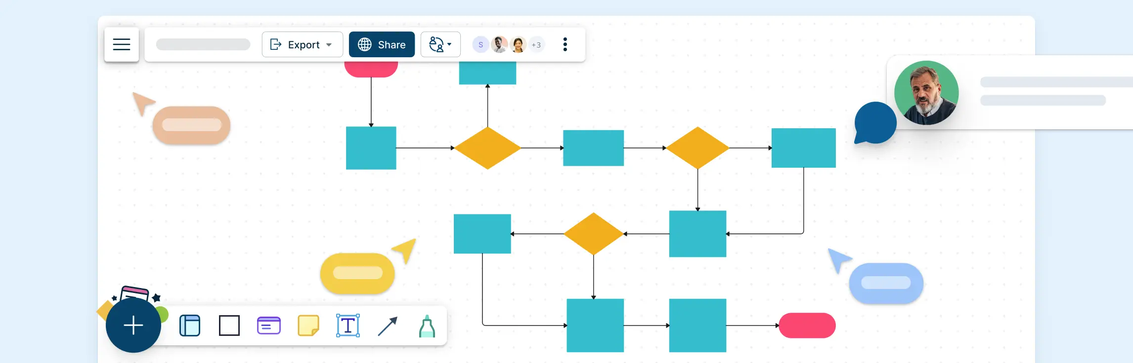
Flowcharts are the go-to tool for process mapping. Whether you are working on a new workflow or solving a problem, flowchart symbols make it easy to visualize steps, decision points, and paths. However, to create a flowchart that clearly communicates your process, you need to know the right flowchart symbols and their usage. This guide will walk you through everything you need to know about flowchart symbols, their meanings, best practices, and common mistakes. Understanding flowchart symbols ensures that your diagrams are effective, structured, and universally understood.
Today, challenges are complex and deadlines are tight, having a shared brain to tackle these problems are of paramount importance. When people come together, bringing their unique skills and perspectives to the table, they can achieve far more than they could on their own. Collaboration isn’t just about getting the job done faster—it’s about unlocking innovative solutions, sparking creativity, and building a sense of shared purpose that drives everyone toward success.
What is an After Action Review? An After Action Review (AAR) is a tool designed to help teams assess their performance after completing a task, event, activity, or project. The primary purpose of an AAR is to facilitate a candid and constructive discussion among team members to uncover what was successfully executed, identify areas for improvement, and generate actionable insights for future endeavors. Unlike traditional performance evaluations, AARs focus on collective learning, fostering a culture of continuous improvement and adaptive learning within organizations. It is also a tool that can be used as a catalyst for cultural change.
In 2024, turning dreams into reality has never been easier, thanks to the rise of digital vision board apps. Whether you’re aiming for career success, personal development, health improvements, or any other goal, vision board apps can help you visualize your aspirations and stay motivated. Here are the best vision board apps to help you realize your dreams this year.
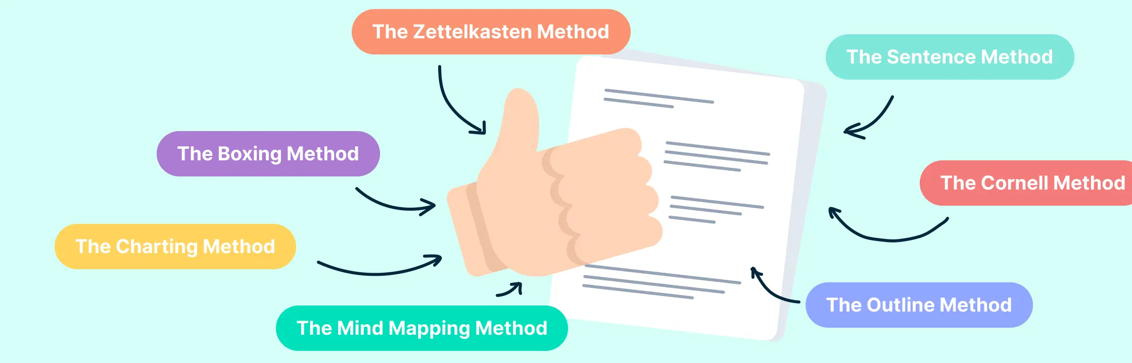
Taking notes can be tedious. You sit through a long meeting or webinar, writing down all the important stuff, but then when you look back at your notes, you realize there are things missing or they don’t make sense. But it doesn’t have to be that way! If you use a good note-taking method and have a way to easily find your notes later, it can be much less stressful.
The mapping method, often referred to as concept mapping, is a dynamic and visual approach to organizing and understanding information. Its origins trace back to the educational theories that emphasize understanding relationships between concepts rather than just memorizing facts.
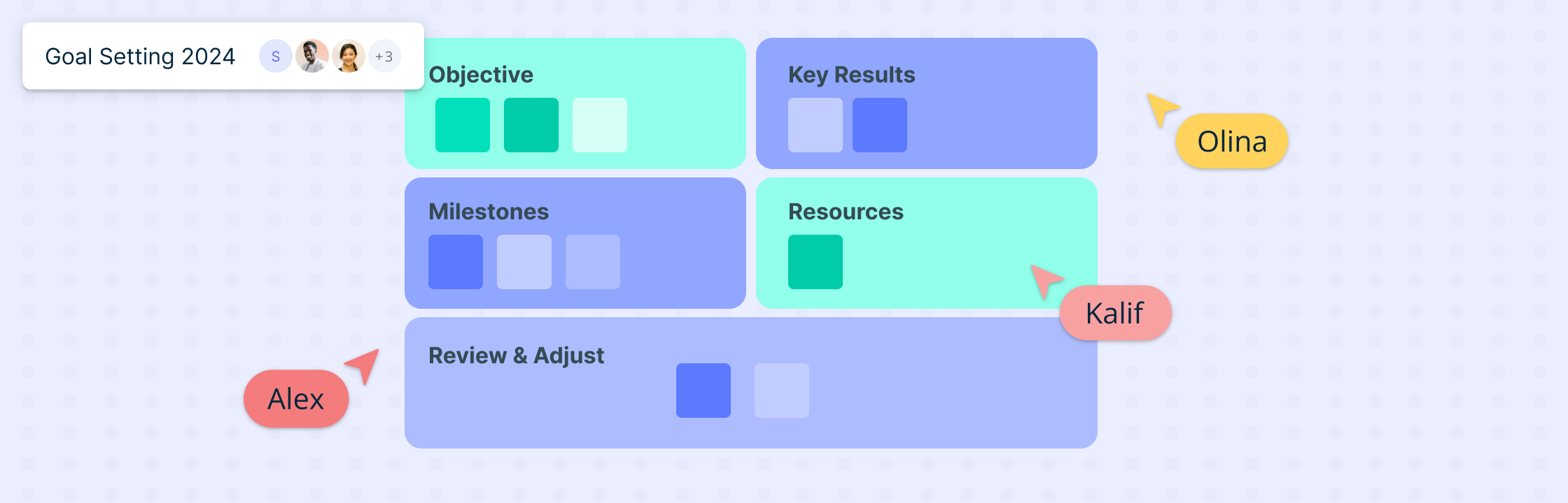
What are OKRs? Objective and Key Results (OKRs) are a transformative goal-setting methodology that has become integral to strategic planning in modern businesses, especially in the SaaS sector. At its core, OKRs consist of an Objective, which defines a clear direction or goal, and Key Results, which are measurable outcomes that track the achievement of that goal. This framework not only provides alignment around measurable goals but also ensures that every team member is working towards the same strategic objectives.
As AI gets more deeply integrated into every aspect of business, one of the most unique and exciting opportunities is to use AI as your strategic thinking coach. AI is revolutionizing the way we access and process information and is helping us enhance human intelligence, through learning, decision-making, and problem-solving. Its relevance to strategic planning lies in its ability to process vast amounts of data, uncover patterns, and provide actionable insights that can drive a company’s strategic direction.
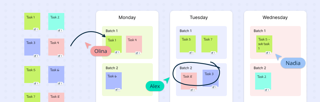
Ever find yourself knee-deep in a task, only to be derailed by a barrage of notifications, leaving a trail of half-finished endeavors? If you’ve ever felt like you’re constantly juggling tasks without making meaningful progress, you’re not alone – most of us have been there, more times than we’d care to admit. Juggling a bunch of tasks can hurt our productivity, not improve it. In this guide we will explore how we can structure the long lists of tasks we need to tend to using task batching- a strategic approach to work that can significantly streamline your workflow.
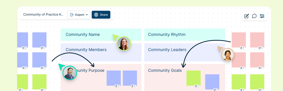
In the modern workplace, effective collaboration is what makes the difference. And while the benefits of having a dynamic team that’s great at collaboration are apparent- there’s no magic switch to instantly transform a group of individuals into a seamlessly collaborative team. Creating the right environment involves a strategic approach that gently guides employees toward a culture of shared knowledge and mutual support. One such powerful tactic is the establishment of communities of practice. These dynamic forums serve as incubators for collaboration, breaking down silos, and nurturing a culture where the exchange of ideas is not just encouraged but celebrated. In this blog, we delve into the transformative impact of communities of practice on workplace dynamics and what you can do to set up these spaces.
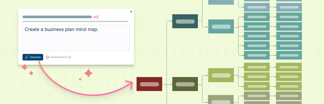
If you have ever tried to write one, you know just how challenging crafting a business plan can be. There’s a lot of foresight, strategic thinking, and meticulous attention to detail involved. You have to understand what people want, figure out how to fund it, and explain your big ideas clearly. Entrepreneurs have to do all this while dealing with the everyday chaos of running a business.
Most organizations have clearly defined teams and reporting structures. In most cases, there is constant interaction with team members and people who they directly report to. What is less common is employees getting face time with their bosses-boss. This practice known as skip-level meetings is an emerging trend that allows higher-level managers to connect directly with employees at lower levels. The purpose is usually for a senior-level manager to gain insight into what is taking place at the organization from the perspective of an employee. The meeting can also be an opportunity for an employee to ask important questions and gain useful insights
Have you ever finished a project and felt like it could have gone better? Maybe you missed some deadlines, went over budget, or encountered some unexpected issues. Or maybe you just want to celebrate your achievements and learn from your mistakes.
The New Year brings with it a chance to reflect on our success and failures while giving us the opportunity to plan ahead. Setting and achieving meaningful goals is not just a resolution but a roadmap to success. In this article, we delve into the art of crafting professional goals for the year 2024. Discover actionable insights on defining your aspirations, creating a roadmap for achievement, and navigating potential challenges.
Are you looking for ways to boost the morale, productivity and collaboration of your virtual or hybrid team? If so, you’re not alone. Many organizations are facing the challenges of managing teams that are dispersed across different locations, time zones and work environments. But don’t worry, there are plenty of team building activities that can help you bridge the gap and create a strong and cohesive team culture.
Process documentation is an integral workflow for any organization. Visualizing complex processes and workflows can be challenging, but with the right tools, it becomes a straightforward and efficient task. Creately, a powerful visualization platform, empowers individuals and teams to create clear and concise flowcharts and process maps, enhancing communication, streamlining processes, and boosting productivity. See Using a Visual Collaboration Tool for Visual Documentation for more information.
A context diagram stands as a cornerstone in system analysis, offering a bird’s-eye view of a system’s landscape. It’s a high-level representation that encapsulates the system’s scope, illustrating how it interacts with external entities—users, systems, and data flows. Unlike other system representation tools that delve into granular details, the context diagram keeps it simple; it’s the 30,000-foot overview that provides clarity without overwhelming stakeholders with complexity. This guide will take you through everything you need to know about a context diagram and how you can create one.
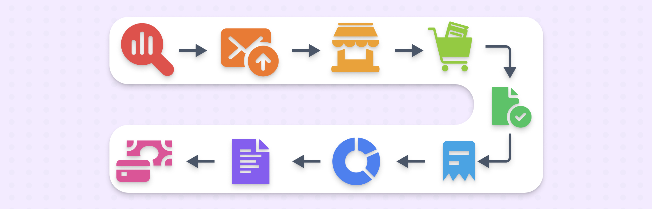
Procurement management can sometimes feel never-ending- it is easy to be overwhelmed by the constant invoices and purchase orders flooding your desk every day. You know you need to streamline the process, but with so many moving parts, where do you even start? This guide will walk you through the essentials from requisition all the way to payment - to help you gain control of your p2p operations and give you the insights you need to transform your procure-to-pay process into a strategic powerhouse.
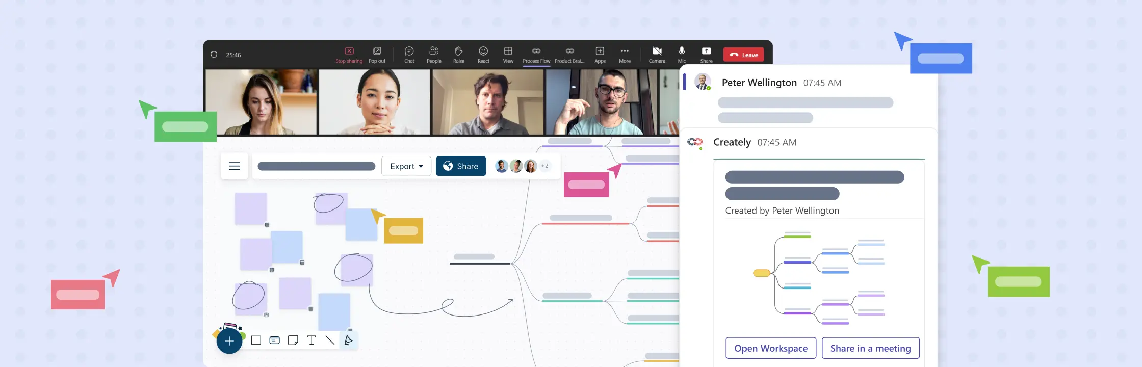
Running a successful brainstorming session on Microsoft Teams involves a combination of effective planning, utilizing Teams’ features & its plugins, and good collaboration. Here’s a step-by-step guide to help you maximize your Microsoft Teams brainstorming sessions using a visual collaboration platform like Creately.
In today’s fast-paced world, being productive and efficient is crucial as we juggle between personal and work commitments. Action items are the key to staying organized and keep things on track. They are specific, measurable, achievable, relevant, and time-bound tasks that help us get closer to our goals, whether it is finishing a work project or managing our daily lives.
Weekly meetings are great for keeping everyone updated, fostering collaboration, and making informed decisions. However, they can also be a source of frustration, time-wasting, and disengagement when not carried out effectively.
Meetings are essential when it comes to sharing ideas, making decisions, and fostering team synergy. However, meeting participation isn’t just about showing up; it’s about actively engaging, contributing meaningfully, and making sure that your time and expertise are effectively used.
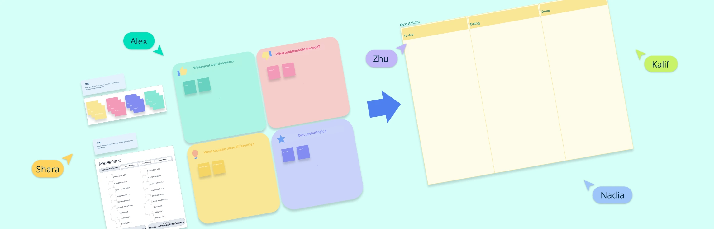
In today’s fast-paced enterprise environment, it’s too easy to get busy with the demands of daily tasks and projects, which can make you miss out on opportunities for growth and improvement. Retrospective meetings are essential for identifying what worked well (wins), what challenges were faced (blockers), and what can be improved in a project. Even though you can conduct retrospectives without using technology, using a visual collaboration platform can make them significantly more effective and efficient. Here’s how a visual collaboration platform like Creately can help teams run a retrospective meeting productively:
Retrospectives are an essential tool for teams striving to continuously improve and drive success. By reflecting on past performance and identifying areas of improvement, teams can enhance collaboration, communication, and productivity. When combined with the right platform, such as Creately, retrospectives become even more powerful. In this blog, we will explore five key benefits of retrospectives and highlight the Creately features that will help you host effective and engaging retrospective meetings.
Table of Contents: Retrospectives for marketing teams Retrospectives for customer service teams Retrospectives for creative agencies Retrospectives for UX teams Retrospectives for event teams Retrospectives gained popularity in agile circles, but that’s not where they should stay. Retros are often mistakenly associated with only product, and technical teams. However, this misconception overlooks the immense value that retrospectives bring to teams across all industries and departments. Regardless of whether you’re in sales, marketing, customer support, or any other domain, retrospectives have the potential to revolutionize your team’s effectiveness. In this article, we will debunk the myth that retrospectives are exclusive to certain teams and explore how this powerful practice can and should benefit everyone. You will also see how you can use Creatly’s retrospective software to run seamless retrospectives with your team.
Have you ever organized an event and wondered how to measure its success beyond immediate feedback? Event retrospectives offer a great solution to this. They help you uncover valuable insights by measuring key metrics. Event retrospectives enable data-driven analysis which can be used to improve future events, enhance attendee experiences, and optimize event planning strategies.
Agile UX Design is all about blending the best of Agile methodology and user-centered design to craft amazing user experiences. It’s a flexible and collaborative approach that puts users at the forefront. In this exciting and fast-moving field, retrospectives play a vital role by providing a dedicated space for teams to look back, assess their work, and find opportunities to improve.
Marketing retrospectives allows teams to analyze, learn from, and improve their marketing processes. Whether you’re an agile marketing team or follow a mixed methodology, regular retrospective meetings are a vital ingredient for success.
In team collaboration, retrospective meetings are a powerful tool for continuous improvement. They hold the key to addressing conflict and fostering trust within your team.
Retrospective meetings hold incredible untapped potential for your team’s growth and success. Discover how facilitators can transform retrospective meetings into insightful action plans.
Retrospectives are a powerful tool for teams to reflect, learn, and improve. They provide a dedicated space for collaboration, where everyone’s unique perspectives are valued. These meetings drive team success by fostering transparency, collaboration, and growth. Let’s look at why retrospectives are important, especially for teams.
Collaboration is key in today’s interconnected world. Cross-functional teams bring together diverse individuals to tackle challenges and spark innovation. But effective collaboration can be a challenge. That’s where retrospective meetings come in. Retrospective meetings are a valuable tool for fostering collaboration in cross-functional teams. They provide a space for teams to reflect, discuss what’s working, and improve. In this blog post, we’ll explore how retrospective meetings drive collaboration and success for cross-functional teams. Let’s get started!
Retrospective meetings are crucial for teams to reflect, learn, and plan for success in today’s fast-paced work environment. In this article, we’ll provide valuable insights and practical tips to help you have meaningful discussions and set actionable goals that drive results. Whether you’re a team leader, project manager, or team member, this guide equips you with the knowledge and tools to enhance team collaboration and achieve progress through retrospectives.
Retrospective meetings are key to team growth and improvement, but without honest feedback, they can fall flat. Sometimes team members may find it difficult to openly share their ideas. That’s why creating a safe and supportive space is vital. In this blog post, we’ll dive into practical strategies that’ll make your team feel comfortable sharing their thoughts. Get ready to unlock your team’s potential and watch them soar to new heights of success!.
Retrospective meetings offer valuable opportunities for teams to reflect, learn, and improve. However, to maximize their effectiveness, it’s crucial to avoid common mistakes. In this article, we’ll explore ten retrospective mistakes to avoid during retrospectives and provide tips for a positive and productive environment. Let’s dive in and make the most out of these meetings!
Retrospective questions are crafted to foster reflection and ignite engaging discussions in a retrospective meeting. They serve as a guide for teams to evaluate their processes, uncover potential areas for enhancement, and generate practical insights. By posing these retrospective questions, teams can delve into valuable learnings and drive tangible improvements.
Work breakdown structures (WBS) are frequently used by project teams to break the project into smaller, easily identifiable components. The WBS structures used in projects follow strict rules like 100% rule and the mutually exclusive rule, but in general, they can be used to break down almost any complex task. However, coming up with a WBS template from scratch can be a tedious task, which is why we have introduced work breakdown structure templates to speed up the process. All of the templates mentioned below can be reused by clicking the Use as Template button.
Failing to plan is planning to fail. That’s why a business plan is crucial to your business. If you want to make sure that the promising business idea in your head is feasible, you have to start with a business plan.
Drowning in sticky notes after a brainstorming session? Struggling to make sense of scattered ideas or conflicting feedback? That’s where an affinity diagram comes in. Also known as an affinity map or the K-J method, this simple yet powerful visual tool helps you group related ideas, uncover patterns, and bring structure to messy information. In this guide, you’ll learn what an affinity diagram is, how to create one from scratch, and when to use an affinity diagram to improve collaboration and decision-making. We’ll also walk you through real-world affinity diagram examples, share expert tips, and give you access to free templates so you can start organizing your thoughts more strategically.
So you want to learn flowcharts? This flowchart tutorial will guide you through everything you need to know. You’ll discover what a flowchart is, the different flowchart symbols, how to create flowcharts, and the best practices to follow. We’ve also included answers to common questions about flowcharts. Best of all, we’ll provide you with flowchart software to create them faster and better.
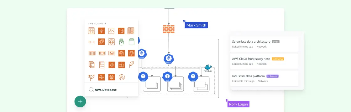
What is an AWS Architecture Diagram? An AWS (Amazon Web Services) architecture diagram is a visual representation that illustrates the design and structure of a system or application built on AWS cloud services. It uses symbols, icons, and lines to depict AWS services, components, data flow, interactions, and their relationships within a solution. These diagrams provide a clear and concise way to communicate how various AWS resources are configured and connected to achieve a specific goal or functionality.
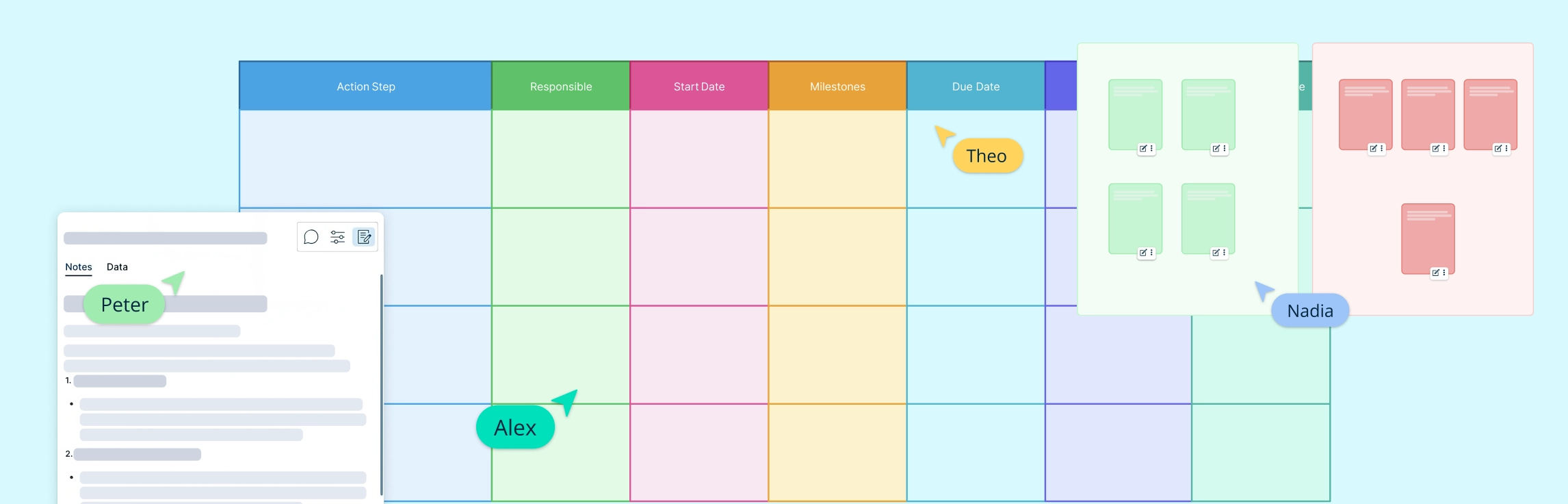
What Is an Action Plan? An action plan is a detailed outline that defines the actions needed to achieve a specific goal. It includes tasks, deadlines, assigned responsibilities, required resources, and milestones. Creating an action plan helps teams and individuals stay organized, focused, and accountable, whether in personal projects, business strategies, or academic endeavors.
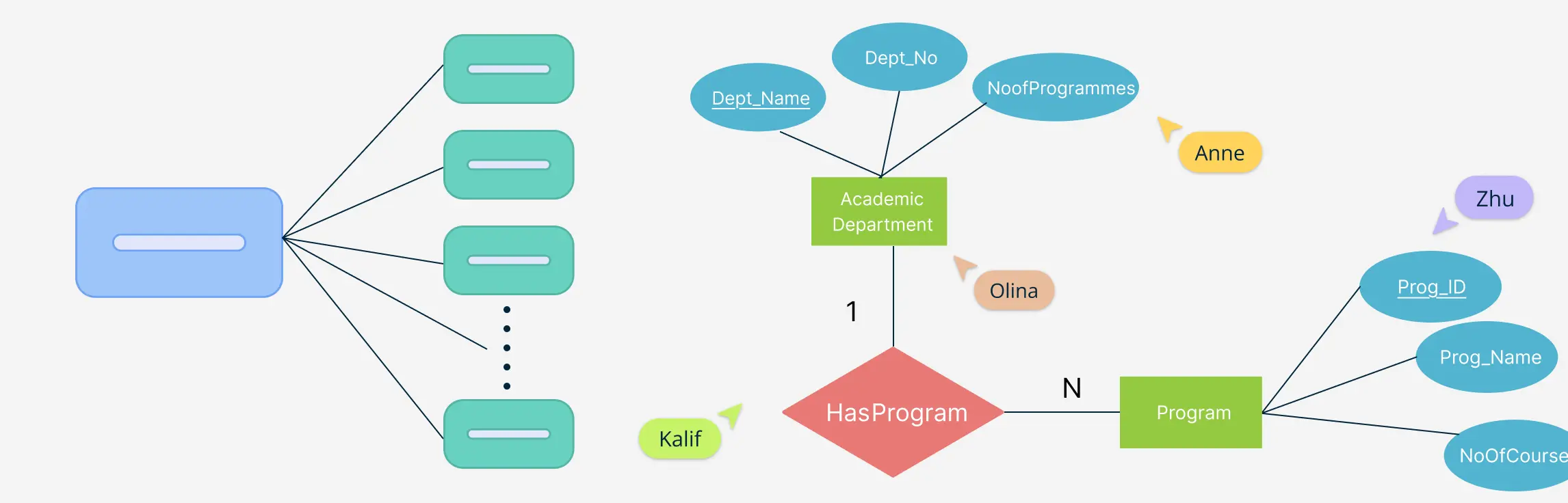
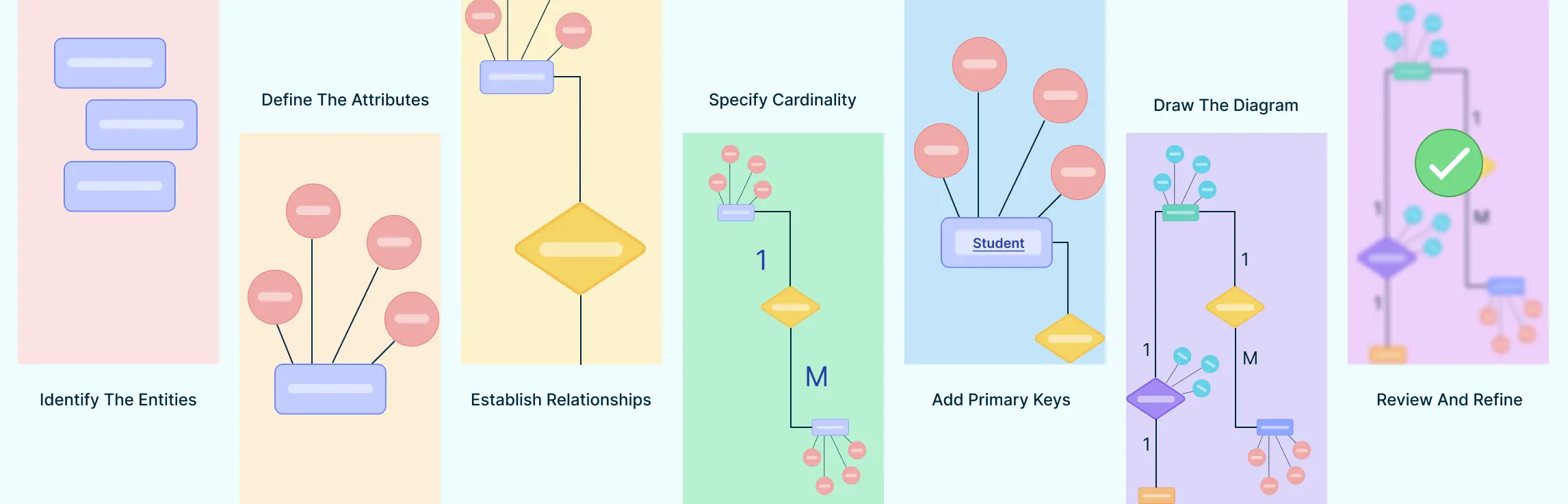
So you want to learn Entity Relationship diagrams? This ER diagram tutorial will cover what is an ER diagram, its usage, history, components of ER diagram, and how to use Creately to draw them. We’ve also added some templates for you to get started quickly.
Chapter 1: Looking Back to Move Forward ‘Actionable Learning’- that’s a word that gets thrown around a lot in Agile circle. The continuous improvement ethos is based on finding effective ways to test and improve every aspect of a team’s performance. But we all know that’s easier said than done. And what often gets forgotten is the discipline of learning how to learn.
User Flow Diagram Definition A user flow can refer to the overall navigation paths available in a product, the actual experience of moving through a process, or the specific steps a user takes to complete a task. Tools like flowcharts are effective for visualizing these user journeys within a website or app, helping to trace how users interact with various interface elements and features.
Visual communication is all around us—on social media, websites, billboards, and presentations. It uses images, graphics, and videos to make information easier to understand and more engaging. In today’s fast-paced world, visuals are a powerful way to grab attention and share ideas quickly.
Want to make costly marketing errors and waste time and resources? Start without a marketing plan. A marketing plan is not only an essential part of your business plan, but it is the roadmap that will provide your team focus and direction in all their marketing efforts.