Teams often waste time fixing symptoms, debating opinions, or chasing the loudest explanation instead of finding the real cause of a problem. A fishbone diagram solves that by giving everyone a clear visual way to break a problem into cause categories, explore contributing factors, and identify what needs to be investigated first.
In this guide, you’ll learn how to create a fishbone diagram step by step, choose the right category model, avoid common mistakes, and use Creately to brainstorm, validate causes, and turn the analysis into follow-up action.
What Is a Fishbone Diagram?
A fishbone diagram is a visual tool for finding the root cause of a problem. The problem goes at the head, major cause categories form the main bones, and sub-causes branch out underneath. Also called an Ishikawa diagram or cause-and-effect diagram, it helps teams move from vague opinions to a structured view of what is actually driving the issue. It is especially useful when a problem has multiple contributing factors.
For a deeper breakdown, read what a fishbone diagram is.
Choose the Right Fishbone Structure First
One reason fishbone sessions stall is that teams pick a generic layout even when the problem clearly belongs to a known pattern. Start by choosing the model that matches the work:
| Fishbone type | Best for | Typical categories |
|---|---|---|
| Simple fishbone | Early-stage exploration or mixed problems | Flexible categories such as People, Process, Tools, Policy |
| 4S fishbone | Service and operations issues | Surroundings, Suppliers, Systems, Skills |
| 6M fishbone | Manufacturing and quality analysis | Manpower, Method, Machine, Material, Measurement, Mother Nature |
| 8P fishbone | Marketing and customer experience issues | Product, Price, Place, Promotion, People, Process, Physical Evidence, Performance |
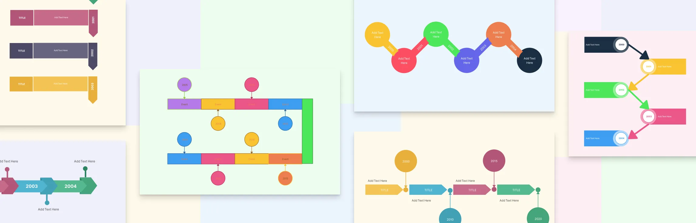
If you are not sure which one to use, start with a simple fishbone, then switch to a more structured model once the pattern is clearer. For a deeper breakdown, see our guide on types of fishbone diagrams.


How to Make a Fishbone Diagram
You can create a fishbone diagram with pen and paper, a whiteboard, or a tool like Creately’s fishbone diagram maker. The process stays the same: define the problem clearly, organize possible causes, test them with evidence, and identify what to act on.
Step 1: Define the effect you want to investigate
Write the problem at the head of the fishbone. Keep it specific, measurable where possible, and focused on one issue. Good examples include “Customer onboarding takes 12 days” or “Packaging defects increased by 18% this quarter.”
This step sounds simple, but it is where many teams get sloppy. If the problem statement is vague, every branch under it becomes vague too. Bring in the people closest to the work early and start with whatever evidence you already have, such as defect logs, complaints, missed SLAs, or audit notes, so the discussion stays grounded.
Step 2: Add the main spine and category branches
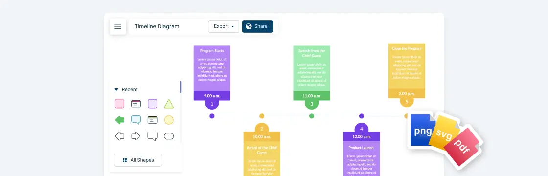
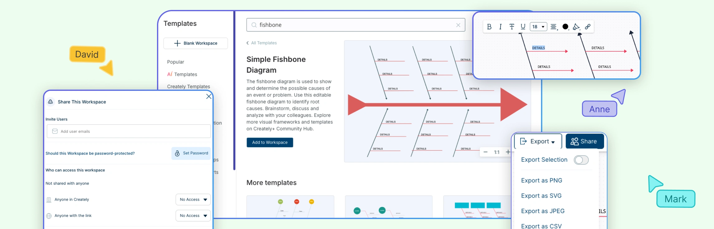
Draw the central line from left to right and add your main branches. If you are using a template, most of this structure is already there, which saves time and keeps the session from becoming a formatting exercise.
Creately’s template library is useful here because you can start with a blank, simple, 4S, 6M, or 8P fishbone instead of rebuilding the diagram shape manually. That matters when your team is trying to analyze a live issue and does not want to spend the first 15 minutes fixing spacing, alignment, and branch placement on the canvas.
Step 3: Brainstorm possible causes under each branch
Now fill the branches with possible causes. Ask the team what could realistically be contributing to the problem under each category. Keep causes short and specific. “Machine downtime during shift handover” is better than “equipment issues.”
Step 4: Break big causes into sub-causes
Once the first layer is filled, go one level deeper. If a branch says “training gap,” ask what exactly is missing. Is onboarding incomplete, documentation outdated, or coaching inconsistent between teams? Sub-causes are where the diagram becomes useful. Without them, the fishbone stays too broad to guide action.
Step 5: Use evidence to test each branch
Do not stop at brainstorming. Review the likely causes against actual data, logs, observations, or stakeholder feedback. A fishbone diagram is not supposed to be a list of opinions. It should help you narrow down which causes deserve deeper investigation.
Add notes, attach supporting files, and keep contextual comments next to the relevant branch. That reduces the usual back-and-forth of checking spreadsheets, screenshots, and chat history in separate tools just to validate one suspected cause.
Step 6: Use 5 Whys on the strongest branches
When one or two branches look especially likely, take them deeper with the 5 Whys method. The fishbone helps you map the landscape. The 5 Whys helps you drill into the branches most likely to contain the real root cause.
This combination is more effective than using either method alone. The fishbone prevents you from jumping too early to one explanation. The 5 Whys prevents you from staying too shallow once the strongest explanation starts to emerge.
Step 7: Mark the root causes worth acting on
By this point, you should be able to distinguish between possible causes and probable root causes. Highlight the branches supported by evidence, not just by volume of discussion. If needed, use color coding in the diagram to separate confirmed causes, assumptions that still need checking, and ideas that can be parked.
Step 8: Turn the analysis into follow-up work
A fishbone diagram should end with action, not with a screenshot in a slide deck. Assign the next investigation, the corrective action, and the owner for each confirmed root cause. If a cause still needs testing, record what evidence is needed and who is responsible for gathering it.
Common Mistakes When Creating a Fishbone Diagram and How to Avoid Them
Once you understand how to draw a fishbone diagram step by step, the next challenge is avoiding the common mistakes that can make your analysis unclear or incomplete.
- Starting too broad: Problem statements like “quality is poor” or “customers are unhappy” make every branch vague. Start with one clear effect, such as a specific delay, defect, or drop in performance.
- Listing symptoms instead of causes: A symptom tells you what is happening, not why. If a branch says “late delivery” or “high error rate,” keep digging until you reach something the team can investigate or fix.
- Letting opinions lead the diagram: The loudest explanation is not always the right one. Use logs, complaints, audit notes, observations, or performance data to test the strongest branches before treating them as root causes.
- Using the wrong category model: A generic structure can hide the issue if the problem clearly belongs to manufacturing, service delivery, marketing, or another specific context. Use a model like 4S, 6M, or 8P when it fits.
- Stopping at a finished diagram: A fishbone is only useful if it leads to action. Before closing the session, decide what still needs validation, what should happen next, and who owns each follow-up item.
A Practical Example of the Fishbone Workflow
How to generate a fishbone diagram becomes clearer when you follow a practical example from problem statement to root cause. Imagine a team investigating problems in a customer reservation system after repeated booking failures and long wait times. Here’s how the fishbone diagram can be set up for this reservation problem:
- Effect statement: “Customers cannot complete reservations without delays or errors.”
- Diagram type: A simple fishbone, because the issue spans staff workflow, reservation records, booking steps, and service delivery.
- Main branches: People, Material (records), Method, and Service.
- People: Incomplete staff training, data entry mistakes, slow handoffs between teams.
- Material (records): Outdated reservation records, duplicate customer entries, missing booking details.
- Method: Manual approval steps, duplicate confirmation checks, unclear escalation paths.
- Service: Delayed confirmations, payment handoff failures, availability not updating in time.
- Evidence checked: Support tickets, booking logs, error reports, and customer complaints.
- 5 Whys result: The team drills into “availability not updating in time” and finds that reservation records are not syncing correctly between the booking form and the internal scheduling system.
This is what a fishbone diagram is meant to do: turn a broad complaint like “the reservation system is broken” into specific causes the team can verify, prioritize, and act on.
The template below shows how those branches and sub-causes can be organized visually for a customer reservation system.

How Creately Helps Teams Create Better Fishbone Diagrams
Teams rarely struggle with the fishbone concept itself. They struggle with the work around it: getting people into the same session, capturing ideas quickly, keeping evidence attached to the right branch, and translating the output into action. That is where Creately is more useful than a basic drawing tool.
| Pain point during root cause analysis | Creately feature | Why it matters |
|---|---|---|
| Teams waste time building the layout from scratch | Ready-made fishbone templates and shape libraries | You can start analysis immediately instead of formatting branches and labels |
| People have ideas but cannot contribute at the same speed | Real-time collaboration, comments, reactions, and sticky notes | Faster brainstorming with fewer missed inputs during live sessions |
| Complex issues outgrow the initial diagram | Infinite canvas | You can keep expanding branches, evidence, and related notes without starting over |
| Evidence gets scattered across files and chats | Notes, attachments, linked context, and branch-level comments | Causes stay connected to the proof behind them |
| Root cause reviews change over time | Version history | Teams can compare revisions and recover earlier branches if needed |
| Analysis stops after the workshop | Shape data and linked Kanban boards | Owners, dates, and follow-up work stay tied to the diagnosis |
| Stakeholders were not in the workshop | Share links, exports, and presentation mode | You can present the logic clearly without rebuilding the story in slides |
For teams working across departments, this is the real advantage. Creately is not only helping you draw a fishbone diagram. It is helping you keep diagnosis, discussion, and follow-up in one visual workspace.