Overwhelmed by messy brainstorm notes or conflicting feedback? That’s where an affinity diagram comes in. In this guide, you’ll learn what is an affinity diagram, and the steps to create one from scratch to improve collaboration and decision-making. We’ll also walk you through real-world examples, and free templates so you can start organizing your thoughts more strategically.
What Is an Affinity Diagram?
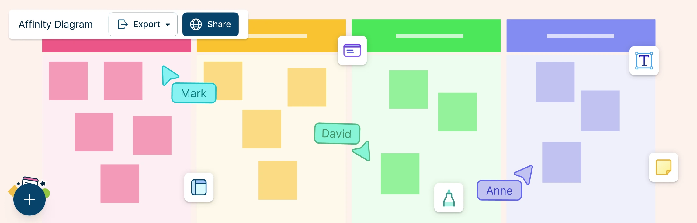
An affinity diagram is a visual tool that helps you organize information such as unstructured ideas, feedback, or research insights into related themes (affinity groups) based on natural relationships. It’s also known as the KJ method, affinity map, or affinity chart. Developed by Japanese anthropologist Jiro Kawakita in the 1960s to synthesize qualitative data, it is now widely used in areas like project management, UX, and quality improvement to simplify complex information, encourage collaborative sense-making, reveal patterns and root causes, and support clearer prioritization, decision-making, and stakeholder alignment.
How to Create an Affinity Diagram in 6 Steps
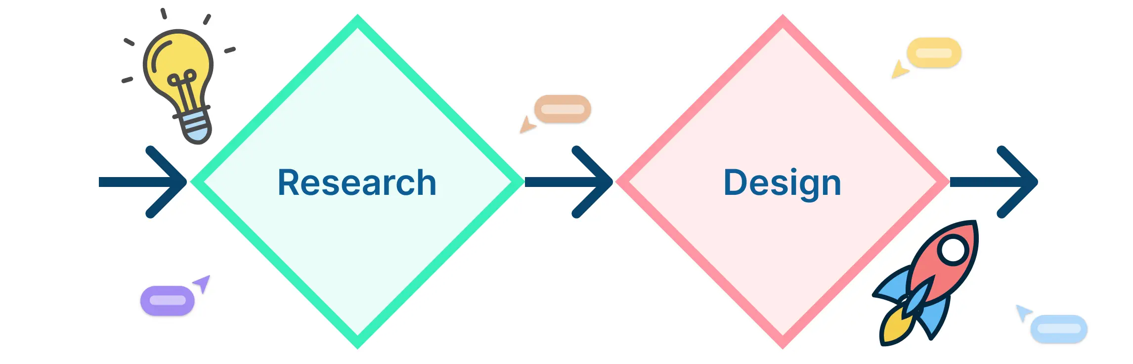
Knowing how to make an affinity diagram can help teams break down complex information, uncover patterns, and drive more focused discussions. Whether you’re brainstorming solutions, organizing research findings, or gathering user feedback, the steps below will guide you through the affinity diagram process.
Step 1: Collect Ideas or Data
Begin by gathering all the raw information you want to organize. This could come from a brainstorming session, survey responses, meeting notes, research findings, or customer feedback. Write each idea or data point on a separate sticky note, index card, or digital note if using an Affinity Diagram Maker.
Step 2: Share and Display the Information
Once you’ve collected the data, display all the individual items in a shared space—on a wall, whiteboard, or digital canvas. Avoid pre-sorting at this stage. The goal is to let the ideas “speak” for themselves without any assumptions.
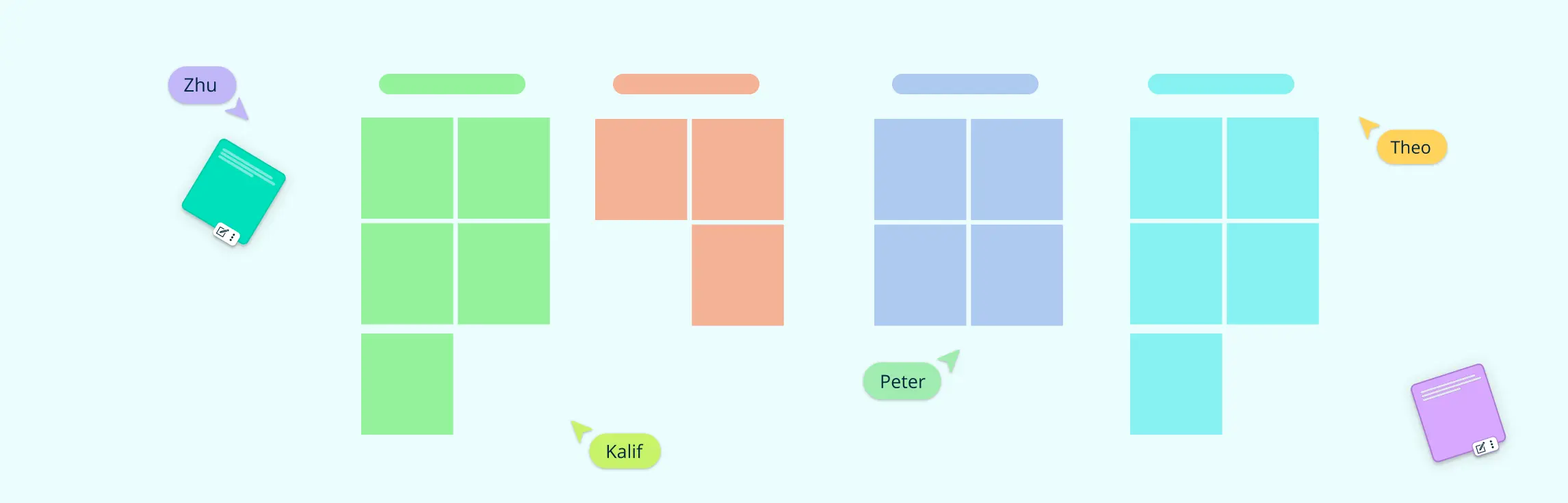
Step 3: Group Similar Items Together
Now, it’s time to identify connections. Begin clustering items that seem related or fall under a similar theme. These groupings form the core of your affinity diagram. Don’t rush—take the time to review and rearrange as needed. This process often sparks new insights and team discussions.
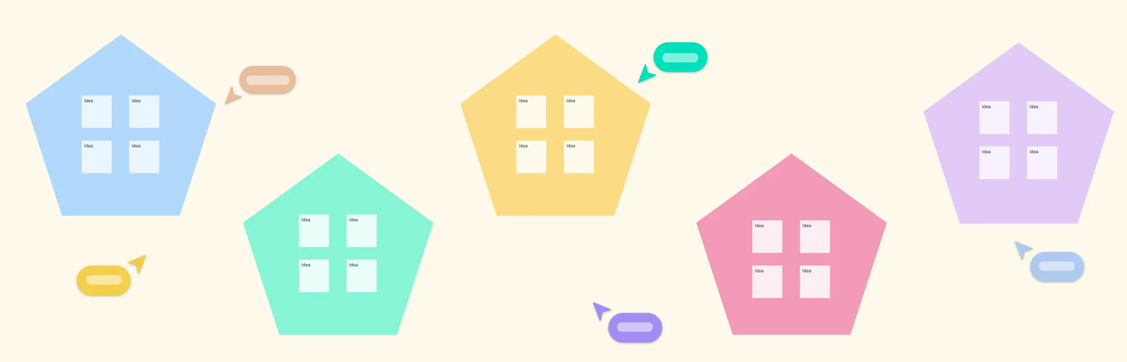
Step 4: Create Category Headings
After grouping the items, assign a heading to each cluster. These headings should represent the overarching theme or common thread that links the items in the group. You can think of these as affinity sets or categories that make the diagram easier to interpret.
Step 5: Review and Refine
Take a step back and review the entire affinity diagram. Are there any misplaced items? Do some groups need to be merged or split? Make adjustments to ensure the final diagram accurately reflects the relationships and themes present in the data.
Step 6: Analyze the Results
Once your diagram is finalized, use it to extract insights, identify trends, or guide decision-making. The visual layout helps teams quickly understand key issues, prioritize actions, and align on next steps.
Real World Affinity Diagram Examples
Understanding when to use an affinity diagram becomes easier with practical examples. Below are some real-world affinity diagram examples that illustrate how they can be applied in different contexts.
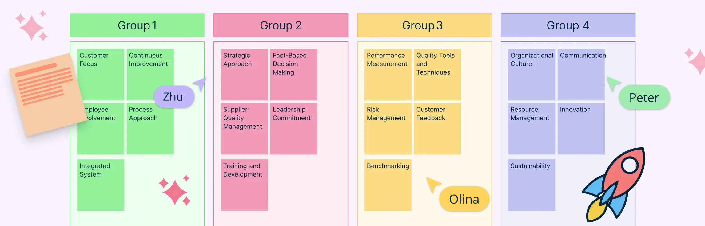
Example: Total Quality Management
In Total Quality Management (TQM), affinity diagrams are often used to analyze problems and improve processes. This example shows how affinity diagrams can be used as a quality management tool to identify challenges in management and planning. This specific affinity diagram example explores reasons for substandard customer service. The collected data can be grouped under themes like:
- Inadequate employee training
- Poor communication between departments
- Lack of standardized procedures


Example: User Research
UX and product development teams frequently use affinity diagrams to analyze qualitative data from user interviews to understand the customer journey. This affinity diagram example groups insights and findings collected from user interviews. It can group customer feedback information on shopping on an e-commerce retailer for clothing under themes like:
- Benefits of online shopping
- Frustrations with product filters and search
- Concerns about sizing and returns
- Expectations for delivery times

Read our affinity diagram examples guide for more on how affinity analysis can be used across various industries and applications.
Advantages of Affinity Diagrams
Using an affinity diagram offers several powerful benefits that make it an essential tool for teams and individuals tackling complex information or problem-solving tasks. Here are some key advantages of affinity diagrams:
1. Simplifies Complex Data
Affinity diagrams transform large, unstructured sets of ideas or data into organized, manageable groups. This simplification helps teams quickly identify patterns and connections that might otherwise go unnoticed.
2. Enhances Collaboration and Inclusivity
By encouraging participation from people with diverse perspectives and backgrounds, affinity diagrams foster teamwork and ensure that all voices are heard. This inclusive approach often leads to more innovative solutions.
3. Encourages Creative Problem Solving
Grouping ideas visually helps uncover new relationships and insights, inspiring creative thinking and generating effective solutions to difficult problems.
4. Improves Clarity and Focus
Affinity diagrams help teams prioritize issues or ideas by highlighting major themes. This focus supports better decision-making and planning.
5. Facilitates Clear Communication
The visual nature of affinity diagrams makes it easier to present complex findings and insights to stakeholders, helping align teams and gain buy-in for next steps.
Free Affinity Diagram Templates to Try


How to Use AI to Create an Affinity Diagram
To create an affinity diagram with AI, start by adding your raw input (brainstorm notes, survey responses, interview insights, or research findings) into Creately’s AI Affinity Diagram Template. This will automatically cluster related items into themes based on semantic similarity. Review the suggested groups, rename or merge categories as needed, and refine the layout with drag-and-drop to produce a clear, shareable affinity map. With this AI-powered template, you can start mapping ideas quickly with intelligent assistance.
FAQs on Affinity Diagrams
When should I use an affinity diagram?
How is an affinity diagram different from a mind map?
Do affinity diagrams need predefined categories?
How to use an affinity diagram to organize UX research?
What are the best practices for creating affinity diagrams?
What are useful tips for Creating Affinity Diagrams?
Resources
Lucero, A. (2015). Using Affinity Diagrams to Evaluate Interactive Prototypes. Human-Computer Interaction – INTERACT 2015, 9297, pp.231–248. doi:https://doi.org/10.1007/978-3-319-22668-2_19.
Widjaja, W. and Takahashi, M. (2016). Distributed interface for group affinity-diagram brainstorming. Concurrent Engineering, 24(4), pp.344–358. doi:https://doi.org/10.1177/1063293x16657860.