Pictograph Maker
Convert Data into Stunning Visuals with Pictogram Maker
Effectively visualize and represent any type of data using Pictogram maker app. Discover useful insights for better decision making using colourful pictogram.
Extensive Pictograph shape and icon library to create pictographs
Ready-made templates for pictographs
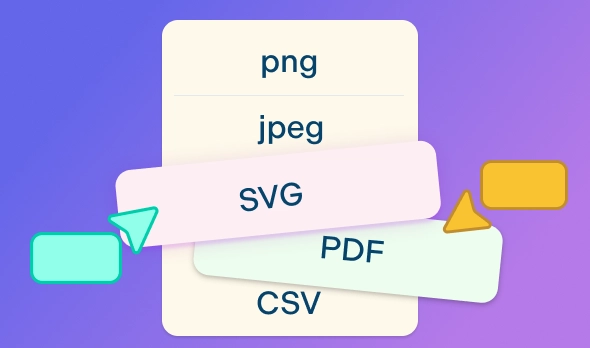
Export pictograms in SVG, PNG, JPEG to share or publish


 Diagramming Visual Collaboration Org Chart


Highlight Data Patterns and Trends

Quickly visualize and represent complex data with simple-to-use drag-and-drop tools with Pictograph maker free.
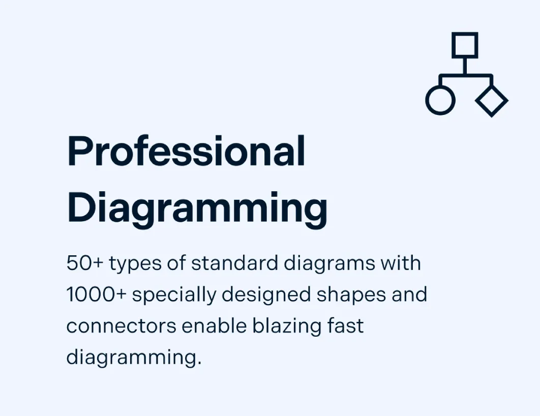
Extensive pictogram shape library for over 50 types of charts and diagrams.
Customize pictographs using configurable color themes and advanced text formatting.
Import images and icons or use the built-in Google-image search to browse for graphics.

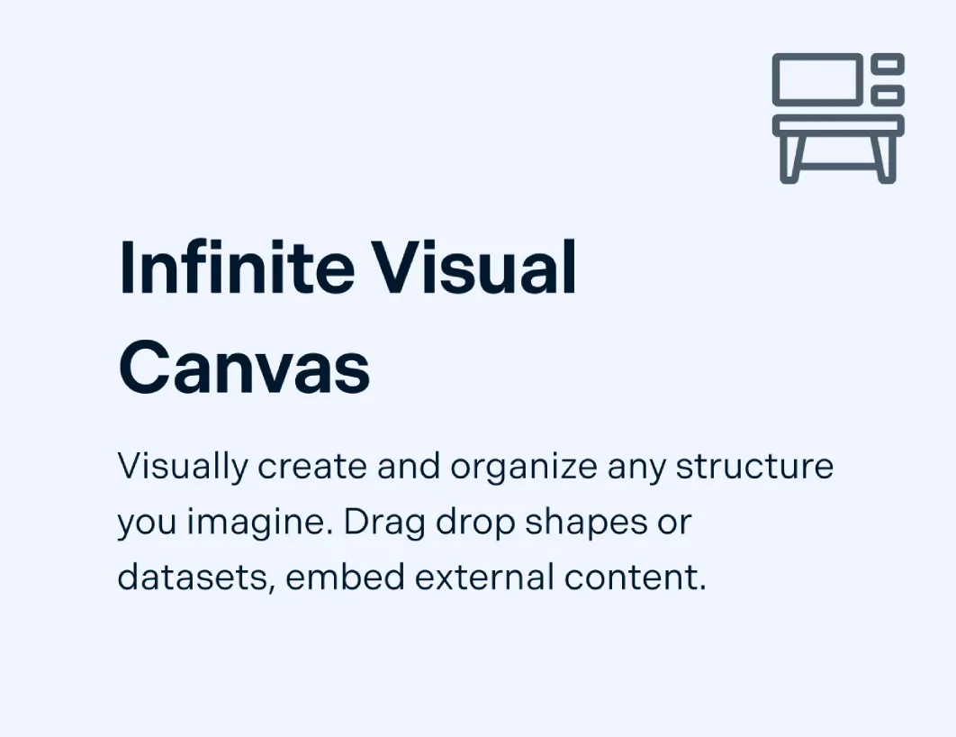
Arrange Data to Analyze Visually
Create workspaces to arrange data and visualize data in tables, grids, timelines, tree charts, and more using the Pictograph maker app.
Export additional data from CSVs, Excel files or Spreadsheets to keep all data in a single location.
Organize and create presentations, dashboards, and reports using built-in tools with our easy pictograph creator.
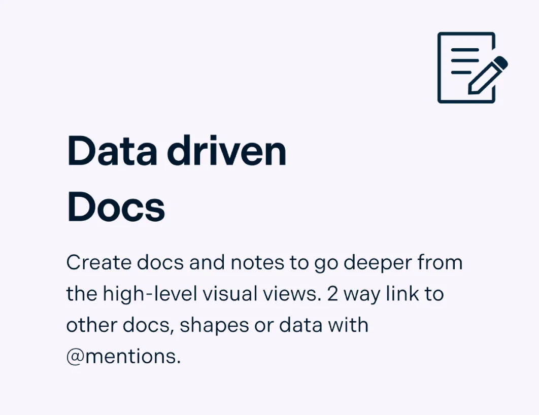
Add docs, attachments, links, and more through the notes panel to capture details right inside the pictogram chart.
Collaborate Seamlessly with Peers

Collaborate on a shared canvas; real-time cursors for any number of participants using our Pictogram generator.
Comment with context and have discussions and follow-ups on the same canvas.
Keep track of changes to your pictograph chart with full version history.
Export and share your pictographs as PNGs, JPEGs, SVGs, or PDFs for printing and publishing or embed them in any site or intranet with a secure link.
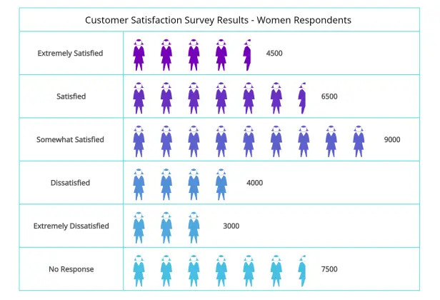
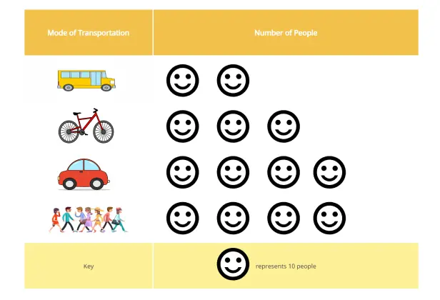
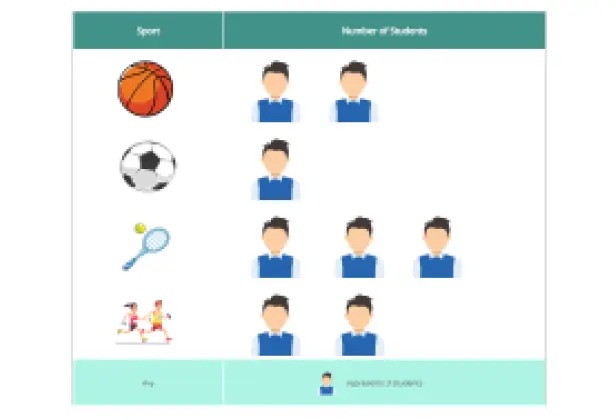
What Is a Pictograph?

Pictographs, also known as pictograms, are pictorial representations of data using images, icons, or symbols. A pictograph can represent the frequency of data using symbols or images that are relevant to the data. It is one of the simplest ways to represent data.
Though pictographs can be used to visualize various data types, they are mostly used to represent qualitative or categorical data. It is also used to show the frequency of different events in terms of the distribution of different objects in a set. As pictographs use pictures or symbols to represent the various categories or values, it is much easier to understand while being visually appealing.
How Can Teams Collaborate Using Pictographs?
- Represent team goals:
Use pictographs to represent your team goals such as the number of sales you need to achieve or milestones completed in a project.
- Present team data:
Use pictographs to present data such as survey results, customer feedback and number of sales, in a way that is easy to visualize and understand.
- Collaborate to design:
Collaborate on the creation and design of pictographs using the Creately canvas. Get everyone in the same workspace to brainstorm and discuss. Work together to select the best design, images or symbols to come up with an easy to understand and visually appealing online pictograph.
- Use in presentations:
Teams can use pictographs in presentations to illustrate information for better understanding and visual appeal.
Create a PictographCreate Pictographs Online with Editable Templates
How to Create a Pictograph Using Creately
Launch Creately and set up your workspace
Open Creately and start a new workspace. Choose a pictograph template or a blank canvas, and invite your team or students to collaborate in real time.
Collect and organize data in Creately
Gather the information you want to visualize. Use Creately’s table feature to neatly list categories and values.
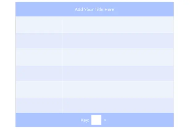
Select symbols from the shape library and assign values
Pick a symbol or picture to represent your data from the built-in shape librari or using Google image search. Define a key (e.g., one symbol = five units) and use sticky notes or the whiteboard to brainstorm and refine ideas.
Design your pictograph
Arrange your categories in a table and add symbols according to their frequency. Use Creately’s drag-and-drop tools to adjust layouts, sizes, and even fractions if needed.
Review, finalize and share
Collaborate with teammates using in-line comments and multi-cursor editing. Once done, download your pictograph as PNG, JPEG, SVG, or PDF, or share it directly via a secure link.
FAQs About the Pictograph Software
What are Creately’s pictograph maker pricing plans?
- Free Plan — $0/month for basic pictograph creation and collaboration
- Starter & Team Plans — $8/month or $5/month billed annually
- Business Plan — $149/month or $89/month billed annually
Annual billing helps you save more while unlocking advanced collaboration, workspace management, and enhanced pictograph features. You can compare all available plans and features on the Creately Pricing Page.
How can you create pictographs faster?
Are there templates for different pictograph use cases?
Can teams collaborate on pictographs?
Can I add notes, data, and files?
Can I share, present, or export pictographs?