An organization chart is a graphical representation of relationships between an organization’s departments, functions, and people. It can also indicate the flow of data, responsibility, and reporting from bottom-up or top-down. Its usage across the globe is a testament to its effectiveness. Below are some rules for drawing organizational charts and org chart best practices to make your org chart more meaningful and useful.
Importance of Selecting the Right Org Chart to Visualize Your Organizational Structure
Selecting the right type of organizational chart is crucial because it can impact how effectively the organizational structure is communicated, understood, and used within the organization.
Clarity
The right organizational chart helps to provide clarity about the hierarchy, roles, and responsibilities of employees in the organization. It helps employees understand how they fit into the larger structure and who they report to.
Communication
The right organizational chart facilitates communication within the organization. It provides a clear and concise way of communicating about the structure and roles of different departments, teams, and individuals.
Decision-making
It helps in making informed decisions by providing a clear overview of the organizational structure. This can help leaders identify potential gaps or inefficiencies in the structure, which can be addressed to improve overall performance.
Resource allocation
An accurate organizational chart can also help in allocating resources effectively. By understanding the different departments and their roles, leaders can make more informed decisions about where to allocate resources, such as budgets and personnel.
Change management
They are also important for managing change within an organization. As the organization evolves and grows, the chart may need to be updated to reflect changes in the structure, roles, or responsibilities. A clear and accurate organizational chart can help to ensure that all employees are aware of these changes and can adapt accordingly.
Divide and Conquer
Unless you’re a small company with few employees, organizational charts are definitely going to be complex, with possibly many inter-relationship among departments or functions.
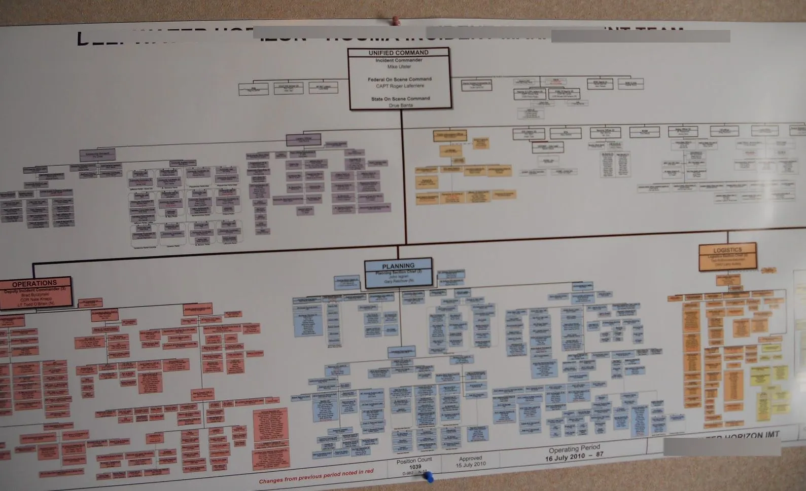
For example, a multinational company may have their subsidiaries in different countries/markets that will have a variety of organization structures (depending on market situation and work functions) and the company will have a huge and complex organizational structure.

When your organization chart becomes too large and complex like the one above, it can be split into smaller charts. You can split it by department, project, site, region, etc.
Whatever it is that makes sense to others in your organization. This makes it easier for the viewer to understand the responsibilities or the expectations of each department.
Breaking down the org chart into small charts makes it becomes much easier to monitor the progress or workload of employees. So that it can be easier to spread work among workers with less load. It also makes it very easier to do a comparative analysis of a situation so that resource allocation can be streamlined to meet the demands of different situations.
Org Chart Software
There are many org chart software available both online and offline that facilitate the creation of various types of organization charts.
When large organizations have multiple organization charts covering their sub-units it is likely to be difficult to study them together at a glance.
With a chart covering several pages it can also be confusing working out the connections between each entity shown in the chart. With Creately as your organization chart diagramming tool, you can avoid this issue using the diagram linking feature. This allows viewers of the chart to see the connections between charts, navigate between the different charts and possibly like to individual employee profiles.
For example, take a look at the below org chart. It shows the top hierarchy of the company. Now click on the highlighted box (the blue right-hand CEO box) and it will take you down to another org chart that further breaks down that department. You can quickly move back to the original chart by clicking the arrow buttons in the bottom toolbar. Go ahead and try it yourself.
Make Sensible Groupings
When organization charts are being broken down into sub-charts, sensible grouping and linking is a must since the connection of each chart and the flow should be easily understandable to the viewer.
Sensible grouping is done based on how individuals, jobs, functions or activities are differentiated and aggregated. The information flow also requires optimizing within each group but at the same time clearly differentiating it from the other groups.
Structural Linking
Structural linking of the groups should be performed with an integration mechanism (eg: liaison roles, cross-unit groups, integrator roles or projects and dotted lines) to assist with coordinating and sharing of information across groups which will enable the organizations leadership to provide guidance and direction throughout the organization.
5 Types of Organization Structures
1. Functional Organizational Structure
The most common structure organized according to functions or departments. For example finance, marketing, sales etc. Suitable for small or single programmatic organizations that do not need to manage across a large geographic area.
Benefits of this model are;
• Develops depth of skills in a particular function or department (most jobs are functional in nature)
• Promotes functional innovation, scale and lower costs
• Is simple to do and easy for each department to understand their core responsibilities, and to hold them accountable
2. Geographic Organizational Structure
This structure is organized around major geographies. Suited to companies which are large with multiple programs that often differ across geographies where local differences are critical for success (e.g. regulation, fundraising, economics).
Benefits of this model are;
• Makes available the resources needed to succeed within a geography
• Allows greater customization of programs or services by region
• Enables clear focus with accountability for results by geography
• Enables focus on geographic funding sources
3. Program Organizational Structure
This structure is organized around major projects. Suited for multi-service organizations and foundations, that has programs which are very different from one another (e.g. different customers, economics, etc.) and where the resources and skills needed to succeed by a program are very different as well. However, the factors for each program are similar across geographies.
Benefits of this model are;
• Promotes a depth of understanding within a particular program area and can promote program innovation
• Makes available the resources needed to succeed within a program
• Enables clear focus with accountability for program results
• Enables focus on funding sources which are often program oriented
4. Customer/Market Organizational Structure
This structure is organized around customers/clients served by the organization. It is suitable for companies who have very different customers who have different service requirements (resulting in different programs provided).
Benefits of this model are;
• Provides focus to be put on the customer, therefore, enabling development of programs tailored to a population’s needs and ability to get “results”
• Enables clear focus with accountability for results by customer group
• Enables clear focus on most important customers and/or markets
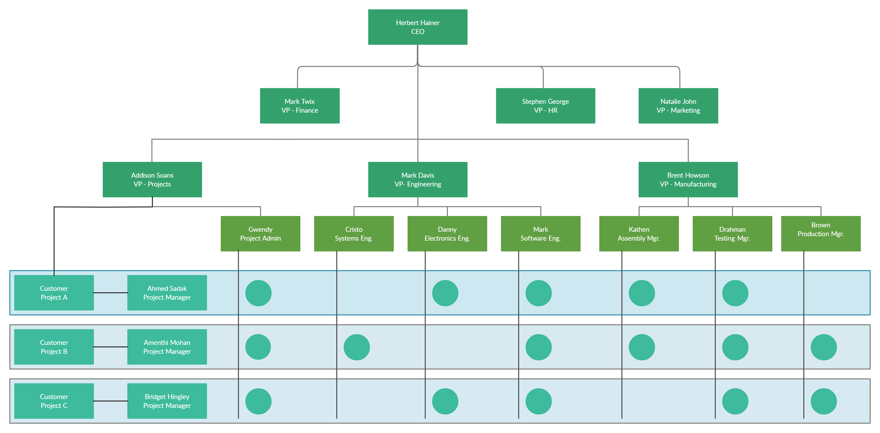
5. Matrix Organizational Structure
This is a structure organized to manage multiple dimensions, e.g. program and geography. Due to the difficulty of managing, this model is NOT recommended to be used.
Benefits of this model are;
• Enables the organization to (at least theoretically) manage multiple organizational dimensions simultaneously

Some of these types can be found in our org chart examples.
Clear Reporting Path / Hierarchy
When drawing an organization chart that indicates the organizational hierarchy, clear reporting paths must be highlighted so that the viewer/employee gets a clear understanding of the reporting structure he/she should follow. One method to use would be using a color coding or visual queues to indicate the reporting path. When it comes to Matrix organization charts where the reporting relationships are set up as a grid, or matrix, rather than in the traditional hierarchy, indicating clear reporting path is critical for the success of the organization’s operation.
What Are Your Organizational Chart Best Practices?
Hope you found this article on organizational structure best practices useful and that it helped you to make much more effective org charts.


