An Excel org chart is a visual representation of an organization’s structure created using Microsoft Excel. It outlines the relationships between different roles, departments, and individuals within a company. In this guide, we’ll show you how to make an org chart in Excel and explore the benefits of using Creately, a tool designed to overcome the challenges Excel presents.
How to Create an Org Chart in Excel
How to make an org chart in Excel? It begins with organizing your data effectively. This means gathering essential information, such as employee names, job titles, and reporting relationships and structuring it in a clear, organized format.
Structuring Your Data
Start by creating a table in Excel with columns for employee names, job titles, and direct supervisors. This layout forms the backbone of your org chart. For example, you might include:
- Employee Name: The individual’s full name.
- Job Title: Their role within the organization.
- Direct Report: The name or ID of their immediate supervisor.
Creating an Org Chart in Excel Manually
The simplest way to make an org chart in Excel is by manually using shapes and connectors. Here’s how to make an org chart in Excel manually.
- Prepare Your Data: Open a blank Excel worksheet. Create a table with columns for employee names, job titles, and direct supervisors.
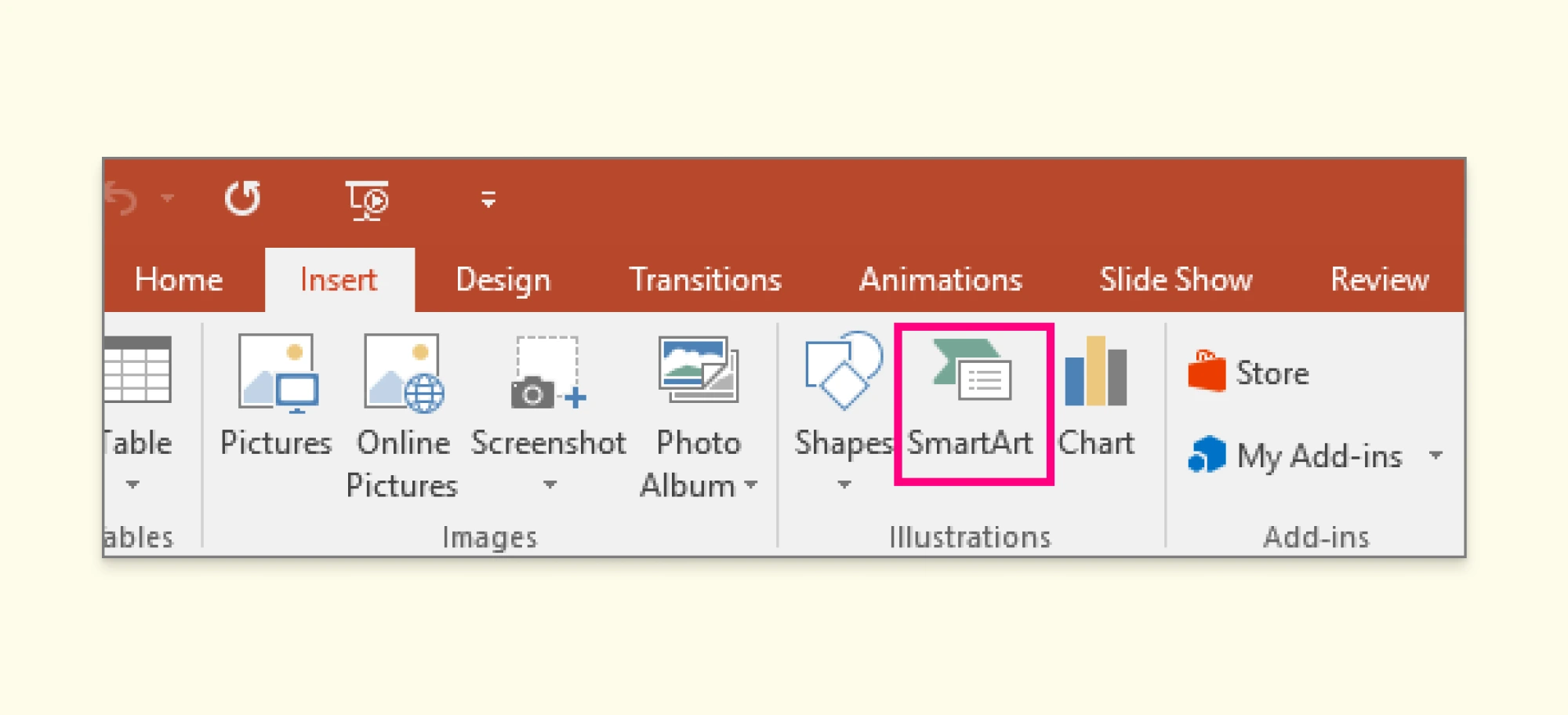
- Insert Shapes for Employees: Go to the Insert tab and select Shapes from the Illustrations group. Choose a rectangle or text box to represent an employee. Add the employee’s name and title inside the shape.
- Arrange Shapes: Place the shapes in a hierarchical layout, with higher-level roles at the top and subordinate roles below.
- Connect Shapes with Lines or Arrows: Use the Insert > Shapes menu to add lines or arrows. Connect shapes to illustrate reporting relationships between employees.
- Style and Customize: Adjust the size, color, and font of shapes to improve readability. Align shapes evenly to create a professional appearance.
Automating with Excel’s Hierarchy SmartArt
For a faster and more visually polished approach, you can use Excel’s hierarchy SmartArt tool. This feature provides predefined templates to make an org chart in Excel which you can update with your data.
Here’s how to make an org chart with Excel using SmartArt.
- Insert a SmartArt Graphic: Go to the Insert tab and click on SmartArt in the Illustrations group.

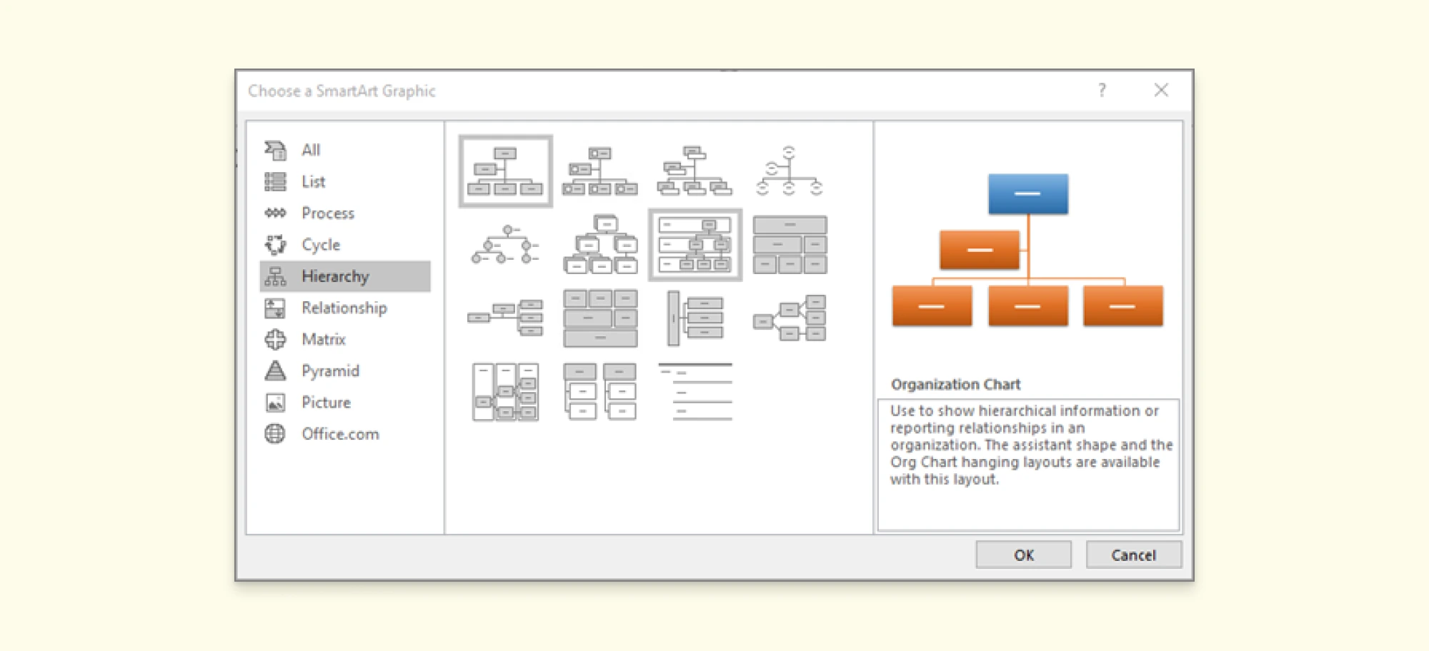
- Select Hierarchy from the available categories. Choose a hierarchy template, such as “Organizational Chart.”

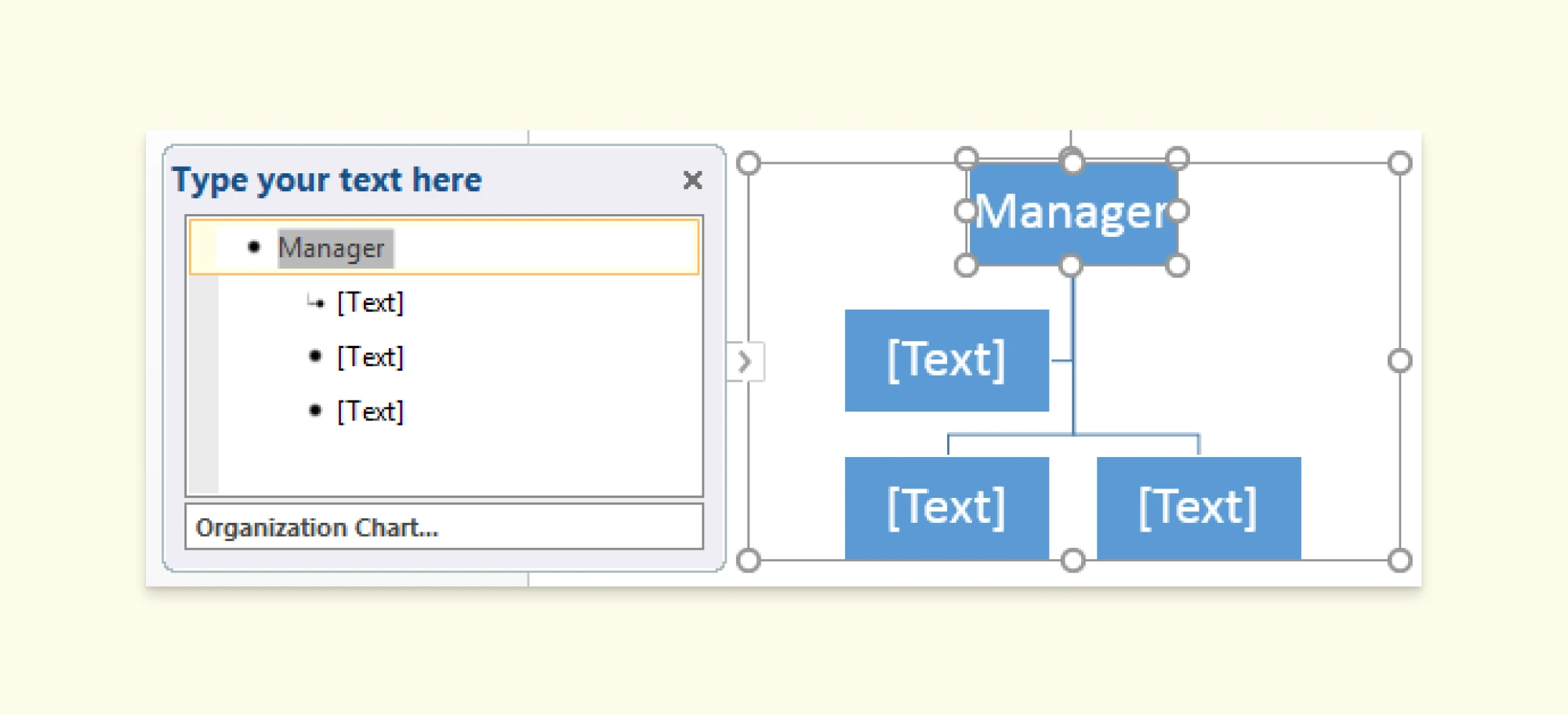
- Enter Employee Information: A text pane will appear next to the SmartArt graphic. Type employee names and titles in the corresponding hierarchy boxes.

Add or Remove Boxes: To add a new employee, press Enter in the text pane and type their information. To remove a box, select it and press Delete.
Customize the Chart: Use the SmartArt Design tab to change colors, styles, and layouts. Resize or reposition the chart if needed.
Save and Share: Once your org chart is complete, save the Excel file. You can copy and paste the chart into PowerPoint or Word for presentations.
How to Make an Org Chart on Creately Using an Excel Datasheet
Creating an org chart on Creately using data from an Excel spreadsheet is an intuitive and efficient process. With Creately’s Excel integration and advanced automation features, you can generate a dynamic org chart that stays up-to-date with your data.
Step 1: Open a New Workspace
Start by logging into your Creately account and creating a new workspace. This workspace will serve as the canvas for your org chart.
Step 2: Add the Employee Card Shape
From the Shapes Library, add the Employee Card to your canvas. This shape is specifically designed to display employee details like name, job title, and reporting relationships.
Step 3: Set Up Your Database
After adding the Employee Card, a pop-up will prompt you to Set Up Database. Follow these steps:
- Choose Human Resource Management as the database type.
- Name your database (e.g., “Org Chart Database”).
- Click Create Database to proceed.
Step 4: Import Data from Excel
Once your database is set up, navigate to the Data tab on the left sidebar:
- Select your newly created database.
- Click the drop-down menu and choose Import Data.
- Select your data source in the M365 Excel format. But it requires an M365 Business tier. You can import directly from .csv format or a Google Sheet.
- Upload your file or paste the link to your data source, then click Import.
Step 5: Map Your Data Fields
In the import pop-up, map your Excel columns to the appropriate Creately fields:
- Database: Select the database you just created.
- Data Type: Choose Employee.
- Row Identifier Field: Use a unique identifier such as Employee ID. Ensure all columns (e.g., Name, Title, Supervisor) are correctly matched.
- Check the box for Ignore Data Import Errors and click Import.
Step 6: Filter and Refine Data
To display the relevant data, use the Filter option:
- Click the Filter icon next to your database in the left sidebar.
- Set the following parameters:
- Object Type: Employee
- Condition: Employee ID not equal to a specific value (leave blank if unnecessary).
- Sort the data in descending order and click Filter.
Step 7: Generate the Org Chart
After filtering, drag the Filtered Results directly onto the canvas. Creately will automatically generate the org chart based on the data relationships in your Excel file. Each employee will be displayed in an Employee Card, with hierarchical connections reflecting your organization’s structure.
Step 8: Customize Your Org Chart
Use Creately’s customization options to enhance your chart:
- Adjust colors, fonts, and layouts to match your company’s branding.
- Add additional metadata like department or location to each card.
- Use filtering tools to focus on specific teams or roles.
Step 9: Enable Two-Way Sync for Continuous Updates
With Creately’s two-way sync feature, any updates made to your Excel sheet will automatically reflect in your org chart. Similarly, changes made in Creately can sync back to your Excel file. This ensures your org chart remains accurate and saves you time on manual updates.
Step 10: Collaborate in Real Time
Share the workspace with your team for real-time collaboration. Creately allows multiple users to edit, comment, and review the org chart simultaneously, ensuring alignment across departments.
How to Add a Creately Org Chart to an Excel Sheet
Integrating your Creately org chart into an Excel spreadsheet is simple and seamless, thanks to the Creately M365 Excel add-in. Once you’ve built your org chart in Creately, you can easily insert it into an Excel sheet and keep everything organized in one place.
- Open Excel and Access the Add-ins Store: In Excel, navigate to the Insert tab. Click on Office Add-ins to open the Add-ins store.
- Search for Creately Add-in: In the Add-ins store search bar, type “Creately” and hit enter. Once you see the Creately add-in, click on “Add” to install it.
- Access Creately from the Add-ins Tab: After the add-in is installed, go to the Add-ins tab in your Excel ribbon. Click on Creately to open the Creately interface within Excel.
- Insert Your Org Chart: You can either insert an org chart you’ve already created in Creately or start building a new one directly within the Creately window. If you’ve already created an org chart, simply select it from your saved diagrams and click Insert. Your org chart will then be added directly to your Excel sheet.
Why Creately Is the Best Excel Alternative for Creating Org Charts
Although you can make an org chart in Excel, its limitations make it a less-than-ideal choice for growing businesses. With Creately’s Org chart software you can create dynamic org charts that update automatically saving time and effort.
1. Automatic Updates with Data Linking
One of the key features of Creately is data linking, which allows your org chart to be automatically updated whenever the underlying data changes. With Creately, you can easily import your data from sources like M365 Excel, Google Sheets, or CSV files. If someone changes departments or a new employee is added, Creately will update your org chart automatically.
2. Two-Way Data Sync
Creately goes beyond one-way data syncing with its two-way sync feature. This means that any updates made in Creately can be synced back into your Excel file or any other data source you’re using. So, if your team is working in Creately and makes changes to the org chart, those changes can be reflected in your Excel file in just a few clicks.
3. Real-Time Collaboration for Teams
Unlike Excel, which is primarily a single-user tool, Creately allows multiple team members to collaborate on the same org chart simultaneously.
4. Significant Time Savings
Creately’s automation and syncing features are designed to save you hours of manual work. Updating an org chart in Excel often involves re-entering data, repositioning elements, and reformatting layouts—all of which take time.
5. Visual Clarity and Customization
Creately offers a wide range of customization options to make your org charts not just functional, but visually appealing. From customizable shapes and colors to dynamic layouts, you can design charts that are easy to read and tailored to your organization’s needs.
Ready to Use Org Chart Free Templates
Simplify the process of creating professional org charts with Creately’s extensive library of templates. These templates will help you build visually appealing and accurate charts in minutes.
Org Chart for HR Department
Basic Org Chart Template
Sales Influencer Org Chart
Org Chart for an NGO
Functional Organization Chart
FAQs on How to Make an Org Chart in Excel
How to make an org chart in Excel with multiple departments?
How to make an org chart in Excel without using SmartArt?
How to make an org chart in Excel that automatically updates?
How to make an org chart in Excel for large teams?
How to make an org chart in Excel with photos?
Resources: Puett, E. (2024). An Analysis of Organization Charts. [online] TRACE: Tennessee Research and Creative Exchange. Available at:www.trace.tennessee.edu/utk_gradthes/1115/ [Accessed 28 Nov. 2024].
Zhang, J., Yu, P.S. and Lv, Y. (2015). Organizational Chart Inference. Proceedings of the 21th ACM SIGKDD International Conference on Knowledge Discovery and Data Mining - KDD ’15. doi:www.doi.org/10.1145/2783258.2783266.


