Supply and Demand Graph Maker
Visualize Supply and Demand Data for Better Understanding
Use Creately to quickly turn supply and demand concepts into clean, easy-to-read graphs for assignments, lessons, presentations, reports, or market analysis.
- Start faster with editable templates & ready-made graph layouts
- Explain price, quantity, equilibrium, & shifts with curves, labels, & annotations
- Export graphs for lessons, assignments, reports, or meetings


 Diagramming Visual Collaboration Org Chart


How to Create a Supply and Demand Graph in Creately?
Start With a Template
Choose an editable supply and demand graph template so you do not have to draw the axes, curves, and layout from scratch.
Add Price and Quantity
Label the vertical axis as price and the horizontal axis as quantity, then adjust the scale or spacing to match what you are explaining.
Draw the Supply and Demand Curves
Add the demand curve, supply curve, and equilibrium point, then customize the lines and labels so the graph is easy to read.
Show Market Changes
Use annotations, notes, and extra curves to explain shifts, shortages, surpluses, price changes, or changes in equilibrium.
Share or Export Your Graph
Collaborate with others for feedback, present the graph, or export it for assignments, lessons, reports, or presentations.
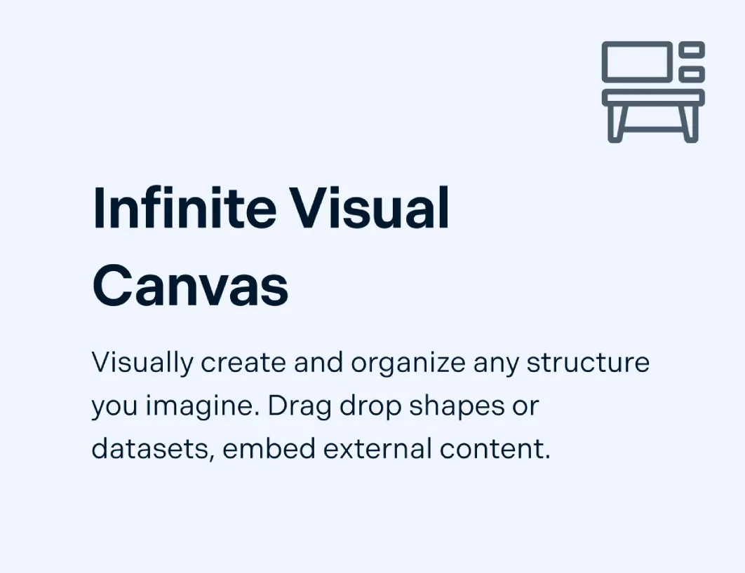
Build a Supply and Demand Graph Faster

Starting from a blank canvas can slow you down when you just need a clear graph for an assignment, lesson, report, or discussion. Use ready-made templates, editable curves, axes, and labels to create a clean graph without spending time fixing rough layouts.
Use editable templates to start with a ready-made supply and demand graph layout.
Drag and adjust curves, axes, labels, and grid elements to build the graph faster.
Customize colors, text, spacing, and styles to make the final graph easier to read.

Make Market Changes Easier to Understand
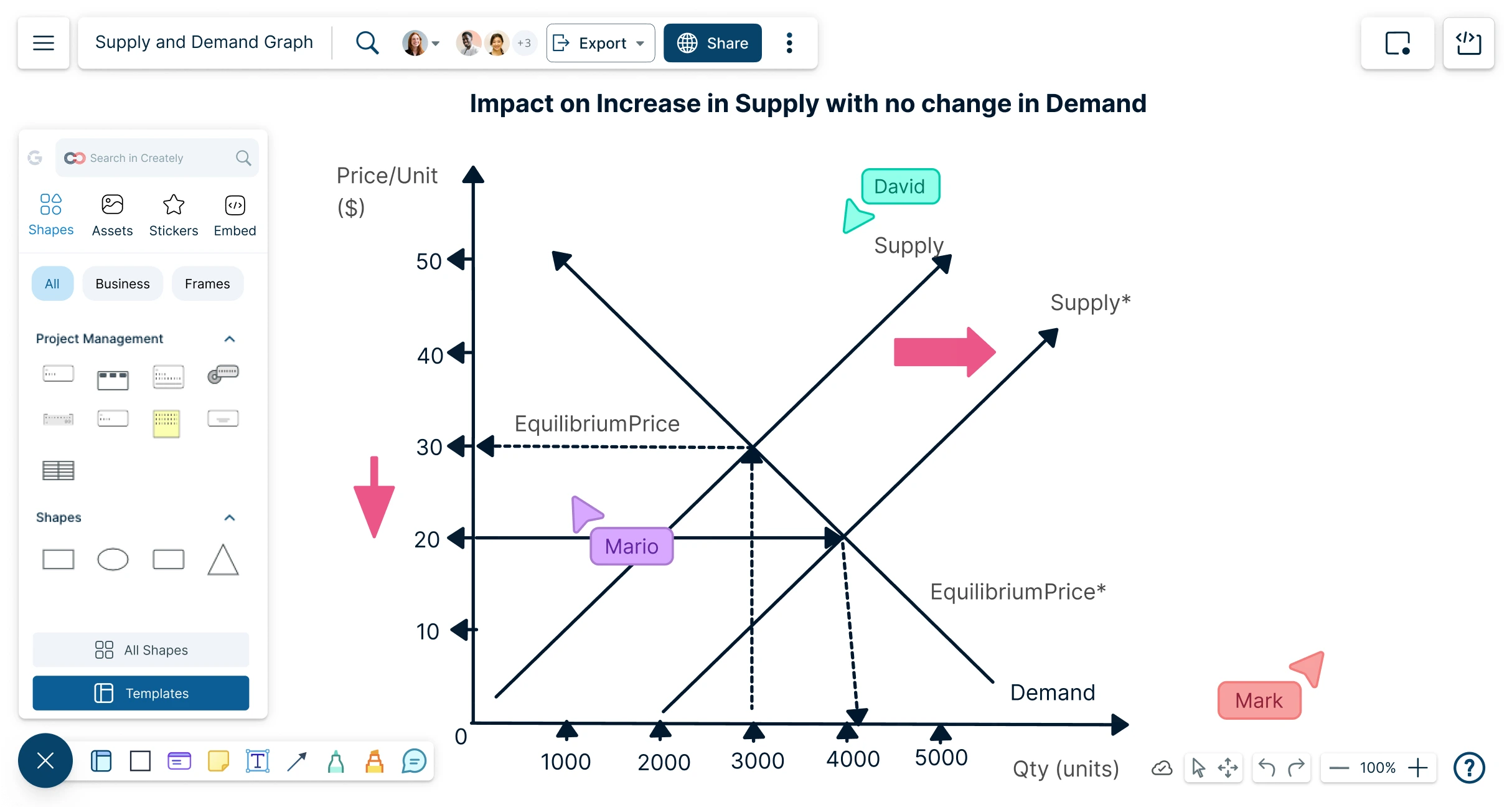
A supply and demand graph needs to show more than two curves. It should help people understand what changed, why it changed, and how price, quantity, and equilibrium are affected. Add visual context so the graph is easier to read and explain.
Use text labels and callouts to identify price, quantity, supply, demand, and equilibrium.
Add extra curves and annotations to show demand shifts, supply shifts, shortages, and surpluses.
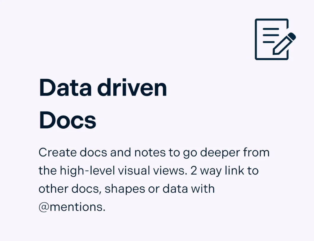
Attach notes, links, or supporting data to explain assumptions, causes, and examples without cluttering the graph.
Get Feedback Without Sending Multiple Versions Around

Graphs often need review from teachers, classmates, teammates, or stakeholders before they are final. Work on the same graph together, leave comments in context, and make updates without losing track of feedback.
Use real-time collaboration and live cursors to review graphs together.
Add comments and @mentions directly on curves, labels, or sections that need feedback.
Manage access permissions so others can view, comment, or edit as needed.
Use frames and presentation mode to walk through graph changes step by step.
What Can You Create With Creately’s Supply and Demand Graph Maker?
- Basic Supply and Demand Graphs:
Create simple graphs that show the relationship between price, quantity, supply, demand, and equilibrium.
- Demand Shift Graphs:
Show how demand changes when factors such as income, preferences, population, substitutes, or expectations change.
- Supply Shift Graphs:
Explain how production costs, technology, taxes, subsidies, regulations, or resource availability affect supply.
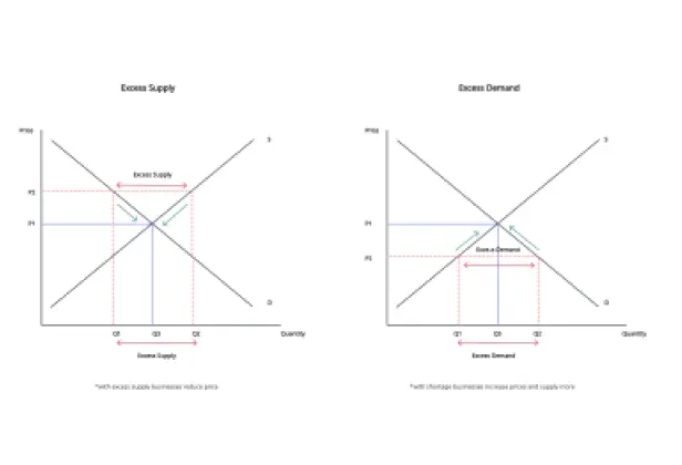
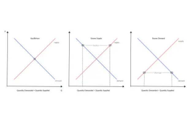
- Shortage and Surplus Graphs:
Visualize excess demand or excess supply and explain how markets move toward equilibrium.
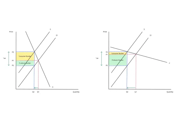
- Price Ceiling and Price Floor Graphs:
Create graphs that explain government price controls, minimum prices, maximum prices, and their effects on markets.
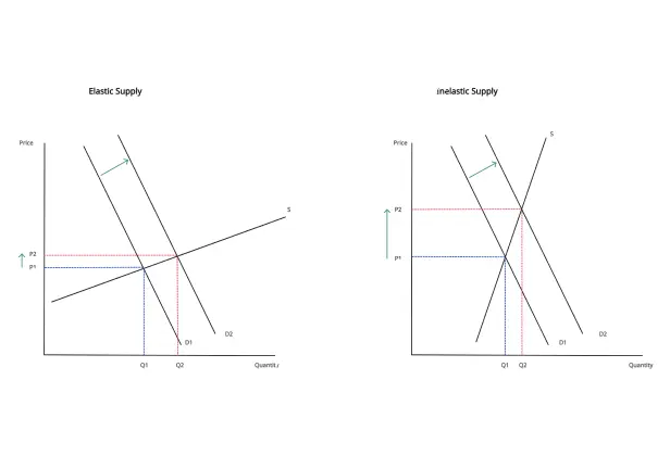
- Elasticity Graphs:
Compare elastic and inelastic supply or demand using different curve shapes and annotations.
- Market Scenario Diagrams:
Show before-and-after market changes for classroom examples, case studies, reports, or business discussions.
- Presentation-Ready Economics Visuals:
Create clean graphs for assignments, lectures, workshops, business reports, and slide decks.
Quickly Create Supply and Demand Graphs with Premade Templates
FAQs About the Supply and Demand Graph
What are Creately’s supply and demand graph maker pricing plans?
- Free Plan — $0/month for basic supply and demand graph creation and collaboration
- Starter & Team Plans — $8/month or $5/month billed annually
- Business Plan — $149/month or $89/month billed annually
Annual billing helps you save more while unlocking advanced collaboration, workspace management, and enhanced supply and demand graph features. You can compare all available plans and features on the Creately Pricing Page.
How can you create supply and demand graphs faster?
Are there templates for different supply and demand graph use cases?
Can teams collaborate on supply and demand graphs?
Can I add notes, data, and files?
Can I share, present, or export supply and demand graphs?
What is a supply and demand graph?