Knowing how to use visual communication is essential for making your message clear, engaging, and memorable. Whether it’s a presentation, a report, or a marketing campaign, visuals help simplify complex ideas and make them easier to understand.
This guide will walk you through the visual communication process and the key visual communication strategies to help you effectively share information and connect with your audience. You’ll learn how to create visuals that not only capture attention but also leave a lasting impact. Whether you’re working on a business project, an educational task, or a creative idea, this guide will help you master how to use visual communication to its fullest potential.
How to Use Visual Communication Effectively in Your Work
It’s important to approach the visual communication process with a clear plan. This involves understanding your goals, knowing your audience, and choosing the right tools to create visuals that truly connect. Let’s break down the key steps on how to use visual communication to help you make the most of it.
Step 1. Identify the purpose
Before creating a visual, ask yourself: What do I want to achieve with this? Having a clear purpose will guide every decision you make, from the type of visual you choose to how you design it. The purpose of your visual might fall into one of three main categories:
- Inform: You might want to share information or present data in a way that’s easy to understand.
- Persuade: Your goal could be to convince someone to take action or change their opinion.
- Educate: Perhaps you’re breaking down a complex concept to help others learn.
Why purpose matters
When you define your purpose, you create a foundation for your visual. A well-defined purpose ensures your message is focused and prevents unnecessary elements from cluttering your design. Without it, your visual may confuse or overwhelm your audience.
Examples of purpose in action
- Inform: A weather forecast map uses simple icons (e.g., sun, rain clouds) to quickly inform viewers about expected conditions.
- Persuade: A nonprofit might create a donation flyer with emotional images and bold statistics to encourage contributions.
- Educate: A teacher might use a flowchart to explain a science experiment step by step.


Align purpose with audience
Think about who will see your visual and what they need from it. If you’re informing, make it straightforward and clear. If you’re persuading, evoke emotion and use compelling visuals. For education, focus on simplicity and clarity to help your audience grasp new concepts easily.
By identifying your purpose early, you set the stage for creating visuals that are not just attractive but also impactful. It’s a simple yet critical first step in understanding how to use visual communication effectively.
Step 2. Know your audience
To use visual communication effectively, it’s crucial to understand who will see your visuals. Your audience shapes every decision you make, from the design style and colors to the language and tone. When your visuals resonate with your audience, they’re more likely to understand, engage, and act on your message.
Why knowing your audience matters
Different groups of people have unique preferences, needs, and levels of familiarity with your topic. For example:
- Professionals in the tech industry may prefer sleek, minimalist visuals with clear data points.
- Children, on the other hand, respond better to colorful, playful designs with simple explanations.
Tailoring your visuals to your audience ensures they’re not just looking at your content but also connecting with it.
Steps to understand your audience
- Define your audience: Who are they? Think about their age, profession, interests, and knowledge of the topic.
- Example: A visual for college students about budgeting might include vibrant graphics and relatable examples, like managing student loan payments.

- Consider their needs: What are they hoping to learn, understand, or achieve from your visual?
- Example: A healthcare flyer for senior citizens might use large, easy-to-read fonts and simple icons to explain preventive care tips.
- Match their communication style: How does your audience prefer to consume information?
- Example: Busy professionals might appreciate a concise infographic summarizing key points rather than a lengthy text document.

Audience drives design
When you know your audience, you can design visuals that speak directly to them. Think about what grabs their attention, what they care about, and how they consume information. This is a key part of any successful visual communication strategy.
By keeping your audience at the center of your planning process, you ensure your visuals are not just appealing but also meaningful and impactful.
Step 3. Choose the right form of visual communication
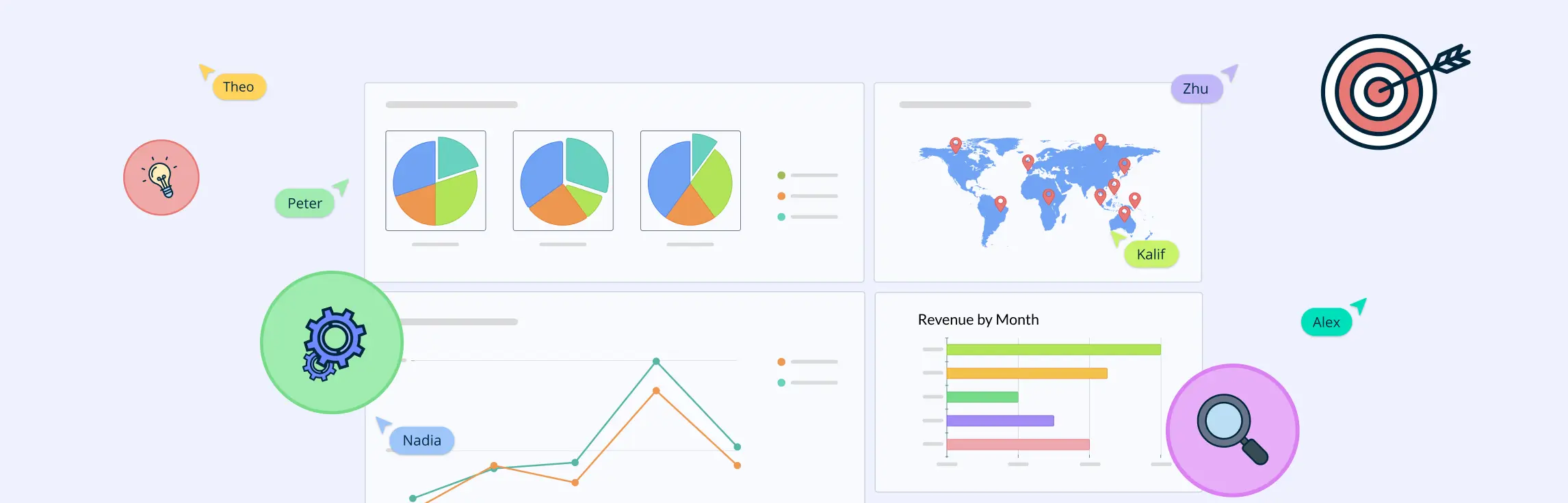
Selecting the right types of visual communication is crucial to ensuring your message resonates with your audience. Each type of visual has its strengths and works best in different contexts. By choosing the right form, you can make your communication clearer, more engaging, and impactful.
Common forms of visual communication
Infographics: Infographics are ideal for condensing complex information into an easily digestible format. They combine text, visuals, and data to tell a story or explain a concept in a simple, visually appealing way.
Use case: A company might use an infographic to visualize their company profile, breaking down each point with icons, brief text, and charts.

Charts and graphs: Charts and graphs are great for visualizing numerical data. They help highlight patterns, comparisons, or trends, making data more accessible and easier to interpret.
Use case: A report might include a doughnut chart showing the year-over-year growth of a business, allowing viewers to quickly grasp the increase in sales.

Diagrams: Diagrams are perfect for explaining relationships, structures, or processes. They help organize information visually, making it easier for people to understand how things fit together or follow a sequence.
Use case: A flowchart could outline the steps involved in a hiring process, helping applicants understand what to expect.

Images and photographs: Images and photographs evoke emotions and add a personal touch to your message. They can be used to tell stories, capture moments, or create connections with the audience.
Use case: A nonprofit might use powerful photos of their work in the community to convey the impact of their mission.
Videos and animations: Videos and animations are dynamic forms of visual communication that add motion and sound, making them highly engaging. They are especially effective for explaining complex concepts, showing how things work, or telling stories.
Use case: A business might create an animated video to explain a new product feature, using visuals to show how it works in real-time.
Presentations: Presentations are versatile tools that combine multiple types of visuals—like images, text, charts, and videos—into a cohesive narrative. They are perfect for step-by-step communication, especially when presenting information to a group.
Use case: A teacher might use a presentation to explain a science lesson, combining visuals, charts, and diagrams to enhance the lesson.

Interactive visuals: Interactive visuals engage the audience by allowing them to explore the content themselves. These might include clickable diagrams, interactive maps, or customizable charts that let viewers dive deeper into the information.
Use case: A museum might use an interactive map that allows visitors to click on different exhibits to learn more details.
The form you choose plays a key role in how effectively you communicate your message. By carefully selecting the right type of visual, you can ensure that your audience not only understands but also engages with your content in a meaningful way.
Step 4. Plan your layout
Planning your layout is key to ensuring your visuals communicate clearly and effectively. A well-organized layout guides your audience through the content naturally, helping them absorb information without confusion. It’s not just about looks—structure matters in making your message easy to understand.
Why layout matters
A cluttered or poorly organized layout can overwhelm your audience. A clean layout helps them focus on the most important points, making the information easier to digest. Whether it’s an infographic, chart, or presentation, your layout directly impacts how well your audience grasps your message.
Key elements of a good layout
Hierarchy: Use hierarchy to emphasize the most important information. Make key points larger or bolder to draw attention first.
Example: In an infographic, the main message or product features should stand out.
Whitespace (negative space): Whitespace makes your design feel balanced and less cluttered, helping each element stand out.
Example: Leave space between text and images to avoid overwhelming your audience.
Alignment: Proper alignment ensures your elements are arranged neatly, making it easier for viewers to follow.
Example: In presentations, aligning text and images keeps everything organized and clear.
Contrast: Use contrast to highlight important elements and make them stand out.
Example: Use contrasting colors in a chart to differentiate data points.
Balance: Ensure your layout feels even and visually pleasing by balancing elements across your design.
Example: Balance large images with text or icons to keep the design from feeling too heavy on one side.
Flow and readability: Arrange elements in a way that naturally guides the viewer’s eye from one point to the next.
Example: Use arrows in a flowchart to guide the viewer through each step.
Step 5. Integrate visuals effectively
Integrating visuals with your text or other types of communication makes your message clearer and more engaging. The goal is to use visuals in a way that enhances your content and helps your audience understand it better.
Why integration matters
When visuals are used correctly, they make your message stronger. If used poorly, they can confuse the audience. The key is to blend visuals and text so they complement each other and improve understanding.
How to integrate visuals effectively
Reinforce your message: Visuals should support and clarify what you’re saying, not just repeat it.
Example: Use a chart to explain a complex idea in your text.
Balance visuals and text: Don’t overload with too much of either. Use visuals to highlight key points, and let text provide details.
Example: A presentation with images and minimal text allows the speaker to elaborate.
Place visuals strategically: Position visuals where they help guide the viewer’s understanding.
Example: In an infographic, place the main visual elements at the center to attract attention first.
Make visuals accessible: Ensure your visuals are easy for everyone to understand, including those with visual impairments.
Example: Use labels or patterns in charts for colorblind accessibility.
Break up text with visuals: Use visuals to make long sections of text easier to digest.
Example: Add graphs or icons to highlight key points in a report.
Maintain consistency: Keep the style of visuals consistent with the tone of the content.
Example: Use professional charts for formal content, and playful icons for casual content.
Effective integration of visuals can make your content more engaging and easier to understand. By ensuring they support your message, balance well with text, and are placed thoughtfully, you’ll create more impactful and accessible communication.
Effective Visual Communication Strategies
Effective visual communication strategies help you convey information clearly and engagingly. By using visuals strategically, you can make your messages more impactful, memorable, and easy to understand. Here are some key visual communication strategies to improve your messaging:
1. Keep it simple
Simplicity is at the heart of effective visual communication. Overloading your audience with too much information can cause confusion and make your message less memorable. Focus on one main idea per visual, and remove unnecessary elements. This allows your audience to quickly understand the point you’re trying to make without distraction.
Example: Use a single chart to show one key piece of data, rather than cluttering the visual with too many figures.
2. Use color thoughtfully
Color isn’t just for decoration—it plays a critical role in how your audience perceives and understands your message. The right color choices can evoke emotions, create emphasis, and enhance readability. However, it’s essential to use color wisely to avoid overwhelming or confusing viewers.
Example: Red can highlight urgent information, while blue can create a calm, trustworthy tone.
3. Tell a story with visuals
Humans are wired to respond to stories, and visuals can be powerful storytelling tools. Using visuals to guide your audience through a logical flow of information can make the content more engaging and easier to understand. This approach helps break down complex ideas into manageable, digestible chunks.
Example: A step-by-step infographic can walk viewers through a process, with each section leading logically to the next.

4. Make it relevant
Every visual should support and reinforce the message you’re trying to communicate. Irrelevant images, random icons, or stock photos that don’t tie into the content can confuse your audience and make the communication feel less cohesive. By choosing visuals that directly relate to your message, you create stronger connections and enhance the clarity of the information.
Example: Use an image of a product when explaining its features, not a generic stock photo.
5. Use consistency
Consistency in your visual elements (like colors, fonts, and graphic styles) helps establish a unified look and makes your content feel organized and professional. Consistency also helps viewers quickly recognize patterns and structure, leading to better understanding and retention of the information.
Example: Use the same color palette and font throughout a presentation to keep things unified.
6. Choose the right visual type
Different types of visuals serve different purposes. Choosing the right format based on the type of information and the message you want to convey can make a big difference in how well your audience understands and engages with your content. Whether it’s a chart, video, infographic, or photo, each visual type has its strengths and should be used accordingly.
Example: Use a doughnut chart to show proportions or a video to demonstrate a process.

7. Make it easy to understand
Clarity is crucial in visual communication. If your visuals are too complicated or hard to interpret, they defeat the purpose of using them in the first place. To ensure your audience understands the message quickly, make your visuals clean, easy to follow, and straightforward.
Example: Use simple icons and labels to make an infographic easy to follow.
How to Use Visual Communication: Best Practices
To communicate effectively through visuals, it’s important to follow certain best practices. These practices help ensure that your visuals are clear, engaging, and easy to understand. Here are some key guidelines for using visual communication in the most effective way:
1. Clarity is key
The main goal of visual communication is to make your message easier to understand. If your visual is too complicated or cluttered, it can confuse your audience. Keep your visuals clean and simple, focusing on the main idea.
2. Use visuals that align with your message
Ensure that the visuals you choose directly support the message you’re trying to convey. Irrelevant images or random icons can distract from your main point.
3. Balance text and visuals
Too much text can overwhelm your audience, while visuals without context can leave them guessing. Strive for a balance between text and visuals, where each complements the other. Use visuals to highlight key points and make the content more engaging, but rely on text for more detailed explanations.
4. Use contrast effectively
Contrast helps important elements stand out and makes your visuals easier to read. Use contrasting colors, sizes, or shapes to draw attention to key pieces of information. However, be careful not to overdo it—too much contrast can be overwhelming.
5. Limit the number of colors
Using too many colors in your visuals can be distracting. Stick to a few complementary colors that align with your brand or message. This makes your visuals more cohesive and visually appealing.
6. Consider accessibility
Not everyone sees colors the same way, so it’s essential to design with accessibility in mind. Use high-contrast colors and clear fonts to ensure your visuals are legible to all viewers, including those with visual impairments.
Tips for Engaging Visual Communication
Creating engaging visuals is essential for grabbing your audience’s attention and helping them understand your message clearly. Here are some tips to make your visuals more effective and engaging:
1. Use tools and templates to save time
Creating visuals from scratch can be time-consuming, especially if you’re not a designer. Use ready-made tools and templates to speed up the process. Many online visual collaboration tools like Creately offer a wide variety of templates for infographics, presentations, social media posts, and more. This not only saves time but also ensures your visuals look professional and polished.
2. Include interactive elements where possible
Interactive visuals are a great way to engage your audience and keep them interested. Adding interactive elements like clickable links, hover effects, or even simple animations can turn static visuals into more dynamic and engaging experiences.
3. Leverage AI tools for visual creation
AI-powered tools are becoming increasingly popular for creating visuals. These tools can help you design more quickly and efficiently, as they often come with features like automatic layouts, design suggestions, and image generation. AI can also assist with tasks like resizing visuals, choosing color schemes, and improving image quality.
4. Add annotations or callouts to highlight key points
When you want to emphasize a specific part of your visual, annotations or callouts are helpful. These can be arrows, text boxes, or other indicators that draw attention to important points. This makes it easier for your audience to focus on what matters most in your visual.
Common Mistakes to Avoid When Using Visual Communication
Visual communication is a powerful tool, but it’s easy to make mistakes that can hurt its effectiveness. Here are some common pitfalls to watch out for when creating visuals, and how to avoid them:
1. Failing to align visuals with brand identity
Your visuals should reflect your brand’s personality and values. Failing to align them with your overall brand identity can confuse your audience or make your message feel inconsistent. Make sure the colors, fonts, and overall design match your brand’s look and tone.
2. Not simplifying complex ideas enough
It’s easy to assume that your audience will understand complex ideas presented visually, but the reality is, not everyone will. Always aim to simplify concepts and avoid clutter. Break down complex ideas into digestible parts using simple visuals that are easy to follow.
3. Ignoring the power of whitespace
Whitespace, or the empty space around elements, is an essential design principle that is often overlooked. It allows the viewer to focus on the content and prevents the visual from feeling cramped or overwhelming. Without enough whitespace, your visuals can feel cluttered and chaotic.
4. Using too many colors or fonts
It might be tempting to use various colors and fonts to make your visual stand out, but this can make it look disorganized and chaotic. Stick to a cohesive color palette and limit the number of fonts you use to maintain harmony and clarity in your visuals.
5. Overlooking cultural differences
Visual communication can be interpreted differently across cultures, so it’s important to consider your audience’s background when creating visuals. Colors, symbols, and images may carry different meanings in different cultural contexts, and what works for one group may not resonate with another.
6. Not testing your visuals
Just because you think a visual looks great doesn’t mean it’s the most effective for your audience. Always test your visuals to see how they perform. You can ask for feedback, run small focus groups, or simply track engagement metrics to understand how well your visuals are being received.
7. Overcomplicating animations and transitions
Animations and transitions can enhance your visuals, but overusing them can be distracting. When used excessively or without purpose, they can take attention away from the key message and make the visual feel gimmicky.
Helpful Resources
Explore the best visual communication examples, and learn how they simplify ideas, connect emotionally, and make messages stick.
Learn what is visual communication is, the key elements that make up a strong visual message, and the principles that ensure those visuals are effective.
Understand the different types of visual communication that can help you express ideas more effectively.
Discover the importance of visual communication and how it plays a crucial role in achieving success.
How to Use Visual Communication with Creately
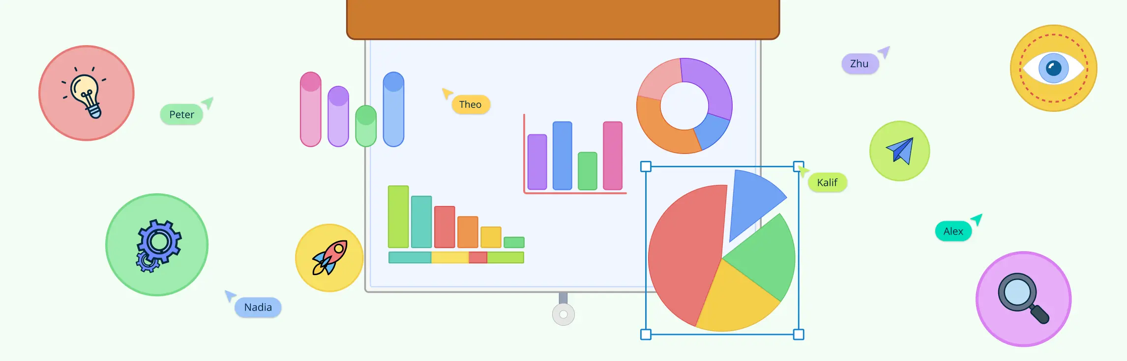
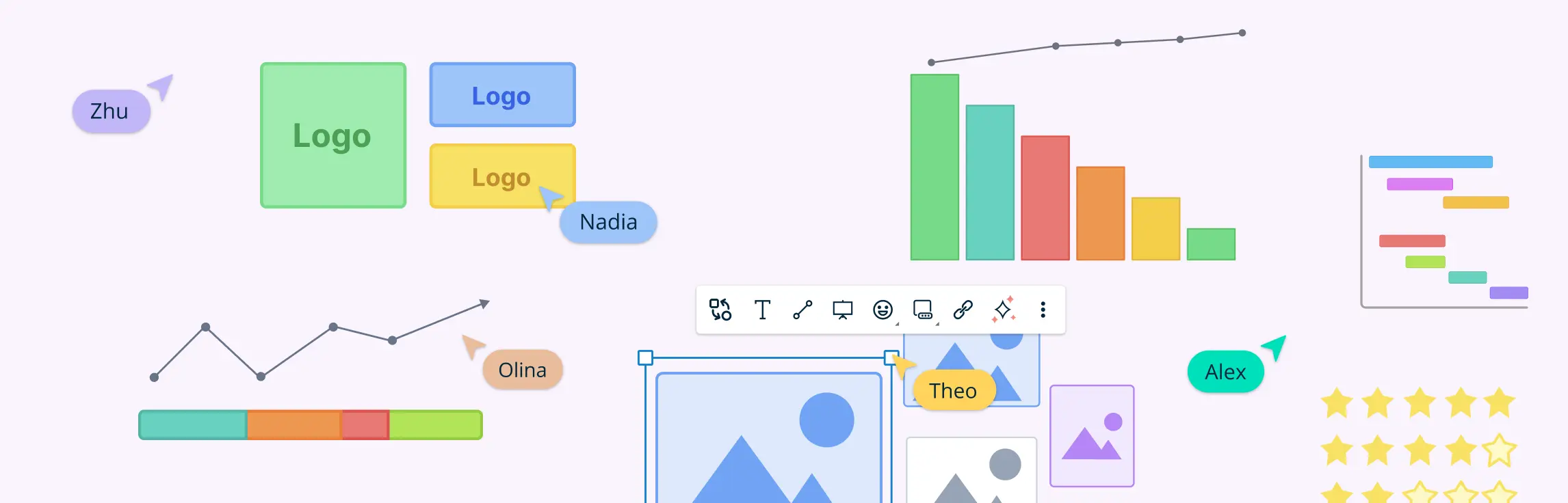
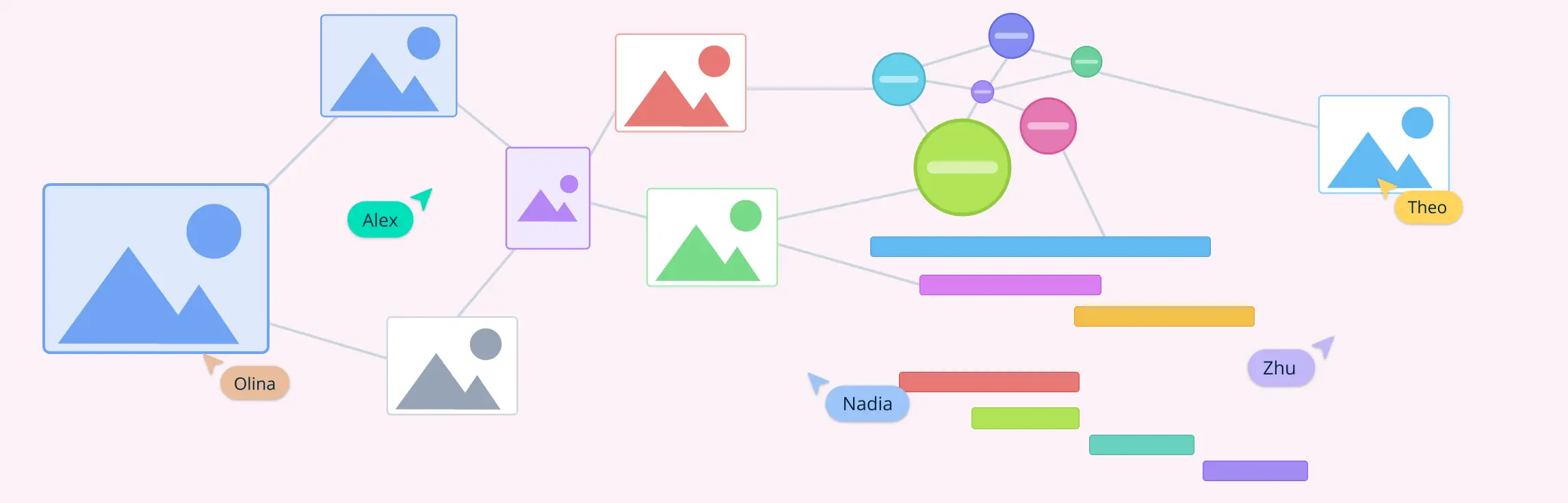
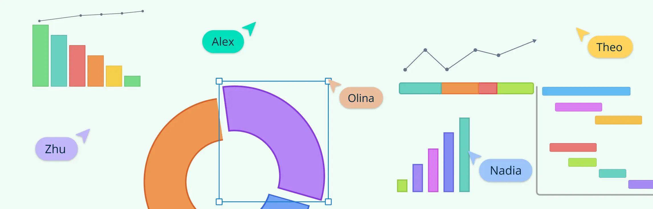
Creately is designed to make visual communication simple and effective for everyone, whether you’re creating a project plan, presenting data, or brainstorming ideas.
1. Wide range of templates
Creately offers a variety of templates that make it easy to start creating visuals, even if you’re new to design. From flowcharts and mind maps to infographics and presentations, there’s a template for almost every need. Templates provide a structure to build on, saving time and ensuring a professional look.
2. User-friendly interface
Creately’s drag-and-drop interface makes it simple to design visuals without any technical skills. You can easily add shapes, icons, text, and images, then arrange them as needed. The intuitive design ensures you can focus on your ideas rather than struggling with the tools.
3. Real-time collaboration
Visual communication often involves teamwork, and Creately makes collaboration seamless. With real-time updates, you and your team can work on the same document simultaneously. You can add comments, make changes, and see updates instantly, ensuring everyone stays on the same page.
4. Customizable visuals
Creately allows you to customize every aspect of your visuals to match your unique needs. You can change colors, fonts, and layouts, ensuring your visuals align with your brand or project goals.
5. Integration with other tools
Creately integrates with tools like Google Workspace, Microsoft Teams, and Slack, making it easy to share visuals and incorporate them into your workflows. This streamlines communication and ensures your visuals are accessible wherever your team works.
6. Presentation mode
Creately’s presentation mode lets you showcase your visuals without needing to transfer them to another platform. You can guide your audience through the visual step by step, helping them better understand your message.
7. Enhanced clarity with annotations
Annotations, comments, and notes can be added directly to your visuals in Creately. This feature helps clarify complex ideas or provide additional context without cluttering the main design.
8. Flexibility for different types of visual communication
Whether you need to create a chart, diagram, storyboard, or presentation, Creately provides the flexibility to support all types of visual communication. This versatility ensures you can use the tool for various purposes, from business meetings to educational sessions.
Conclusion: How to Use Visual Communication
Understanding how to use visual communication effectively is key to sharing ideas, simplifying complex information, and engaging your audience. By identifying your purpose, tailoring your visuals to your audience, choosing the right forms, planning layouts carefully, and using the best strategies of visual communication, you can create visuals that are clear, impactful, and memorable.
When done right, visual communication strategies can enhance understanding, strengthen your message, and leave a lasting impression. Whether you’re informing, persuading, or educating, mastering how to use visual communication will ensure your message stands out and connects meaningfully with your audience.
References
Lintang Ruhil Hidayah (2023). The Importance of Using Visual in Delivering Information. VCD (Journal of Visual Communication Design), 8(1), pp.52-61. doi:https://doi.org/10.37715/vcd.v8i1.2720.
Ijaz, N. (2018). (PDF) Art of Visual Communication, Evolution and its Impact. [online] ResearchGate. Available at: https://www.researchgate.net/publication/330828287_Art_of_Visual_Communication_Evolution_and_its_Impact.
Thelander, Ã…. (2018). Visual Communication. The International Encyclopedia of Strategic Communication, pp.1-13. doi:https://doi.org/10.1002/9781119010722.iesc0198.