Research Data Analysis Maker
Streamline Your Research Data Analysis
A connected and collaborative visual workspace to organize, summarize, and categorize qualitative and quantitative research data effectively to derive key insights.
- Multiple templates and frameworks for research data analysis
- Real-time collaboration to work seamlessly together with colleagues
- Bring data from external sources to visualize them as meaningful shapes
- In-built presentation tools to quickly present your research findings
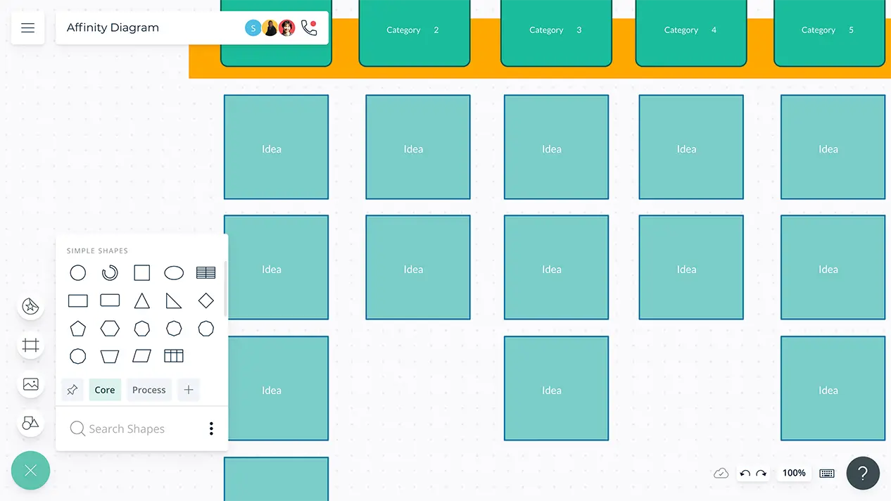
- Multiple templates and frameworks for research data analysis
- Real-time collaboration to work seamlessly together with colleagues
- Bring data from external sources to visualize them as meaningful shapes
- In-built presentation tools to quickly present your research findings

Easy Tools for Data Visualization

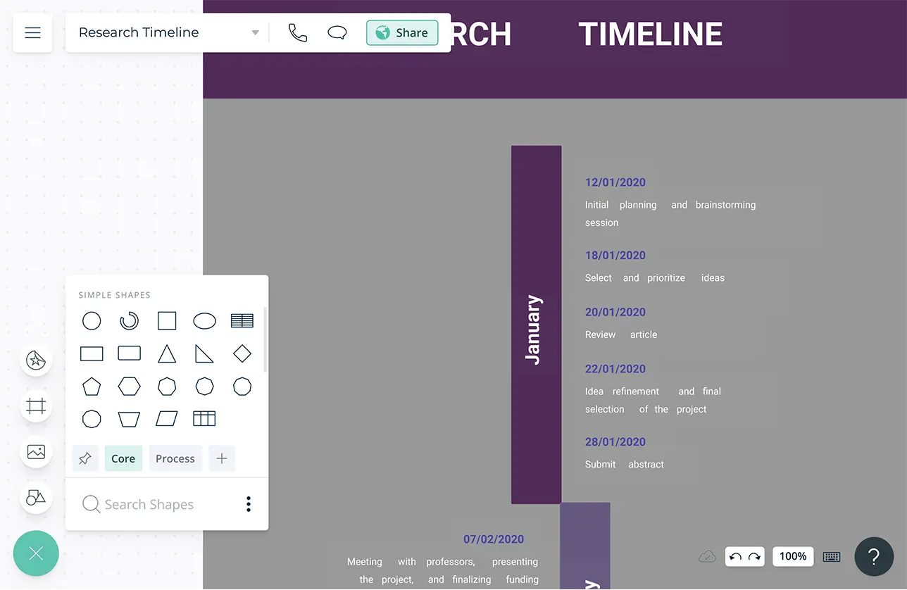
Multiple ready-made templates and frameworks to visualize quantitative and qualitative research data effortlessly.
Configurable color themes and advanced text formatting to quickly highlight data patterns and trends for easier analysis.
Over 50 types of diagrams with specialized shape and icon libraries to visualize any type of data.
Simple to use drag and drop tools to quickly create any type of chart and easily visualize complex statistical data.
Find Insights Faster
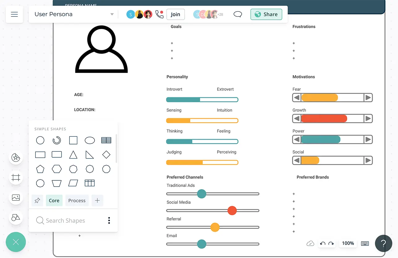
Powerful and versatile table with precision control and advanced customizability to create worksheets to arrange data in columns or rows to identify patterns.
Bring data as CSV or Excel files or spreadsheets from any source to visualize them in tables, grids, timelines, tree charts, and more.
Built-in tools to quickly organize your research findings and create interactive presentations, dashboards, and reports right on the canvas.
Infinite canvas to create an easily accessible central repository for all your research findings, analysis, and insights.
Universal text search to easily navigate through and locate relevant information in complex data visualizations.

Collaborate with Anyone, Anywhere

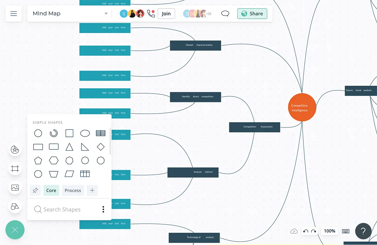
Real-time cursors for any number of participants. Collaborate with colleagues and fellow researchers on a shared canvas.
Video conferencing baked into the platform to feel like you are in the same room.
Use @mention comments to assign people to relevant tasks and responsibilities and to have discussions and follow-ups within the same canvas.
Full version history to keep track of key points during each iteration of your data entry. Branch out from an earlier version if needed at any time.
Augment Your Research Data
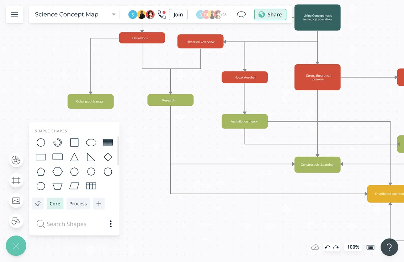
Create custom databases for any kind of statistical data and information from survey data to documents and spreadsheets.
Add detailed docs, attachments, links and more via the notes feature on each findings to capture details and the big picture.
Export your visuals as PNGs, JPEGs, SVGs, or PDFs for printing and publishing or embed them in any site or intranet with a secure link.
Generate multiple views of the same research data with model objects; easily convert your worksheet data into a bar chart into an infographic.

What Is Research Data Analysis?
A Research Data Analysis Maker is a digital tool that helps users organize, analyze, and visualize research data efficiently.
How to Analyze Research Data?
- Set measurable, realistic and attainable goals prior to starting your research process. Base the questions you ask during the research on these goals.
- Understand the type of data you want to gather to find answers to the questions you set earlier. Then decide on the criteria you should use to measure that data.
- Now that you know what you want to gather and how you are going to measure it, start collecting the data in a systematic way. You can use research methods such as surveys, focus groups, interviews etc. to gather data.
- Once you have gathered the data from your research, check it for accuracy. You can create a database in Creately to store your data.
- Next step is data scrubbing, where you will be removing wrong, duplicate or incomplete data. Also check for the authority of data sources and measure the quality of data.
- Based on the type of data you have, select a data analysis method. For example, if it includes numbers you can use pie charts or bar charts, or if your data is on your customer’s view on competitor products, you can use perceptual maps to visualize it.
- Select a relevant template from Creately to start visualizing your data. Or enable the relevant shape library to quickly create the chart or diagram you want to represent your data with.
- Invite your teammates to collaborate on the visuals via Creately real-time collaboration features.
- Once the data has been analyzed, it’s time to interpret it. See how the analyzed data can help you answer the questions you wanted answers to.