Comparison Chart Maker
Simplify Your Decision Making with Comparison Charts
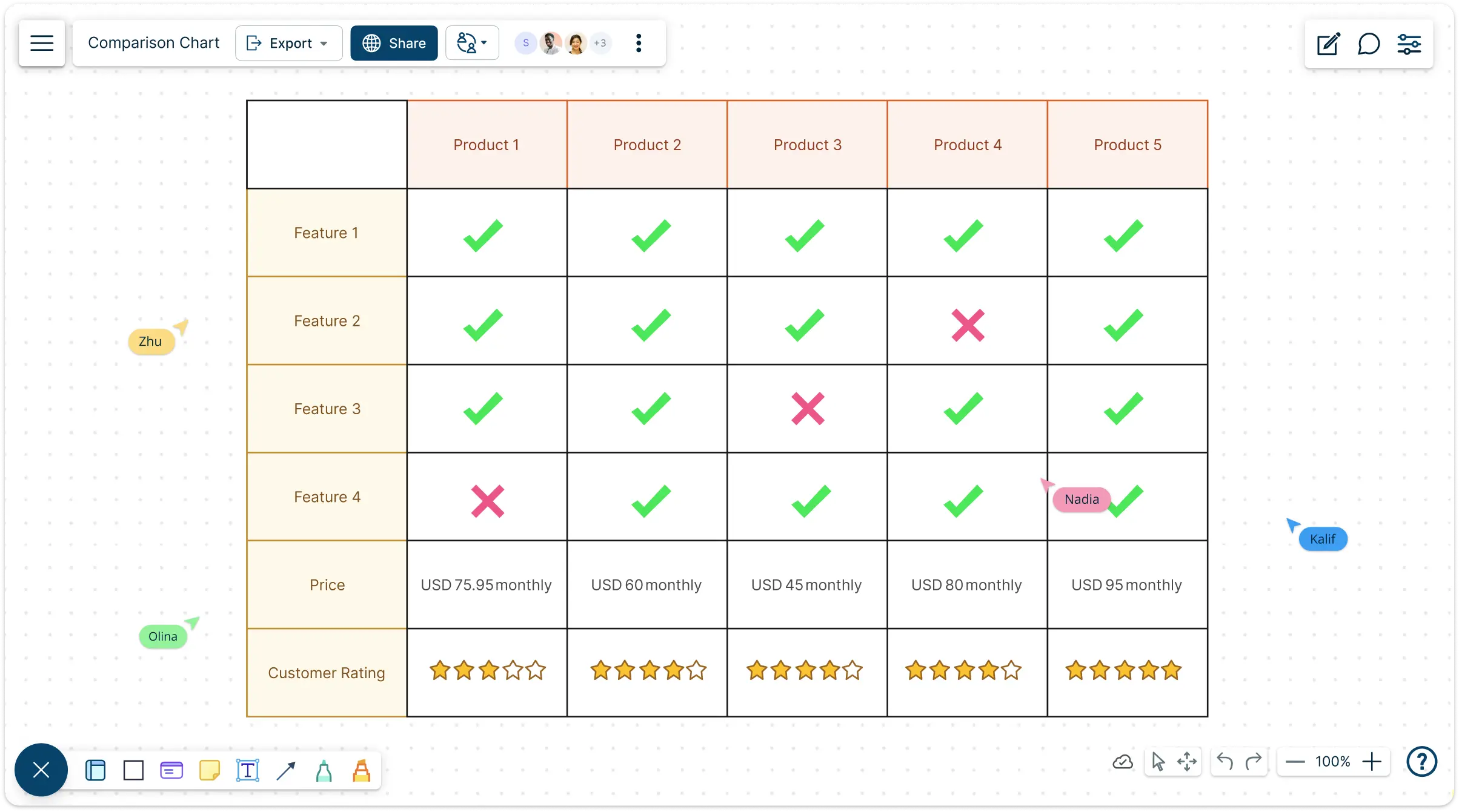
Create professional, data-driven comparisons with Creately's intuitive online comparison chart maker to analyze, organize, and align your team in real-time.
- Build comparison tables instantly with smart, ready-made templates
- Collaborate in real-time on an infinite canvas for seamless team alignment
- Centralized workspace with information, notes and attachments
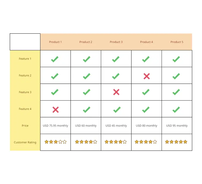
Free Comparison Chart Templates to Jumpstart Your Analysis
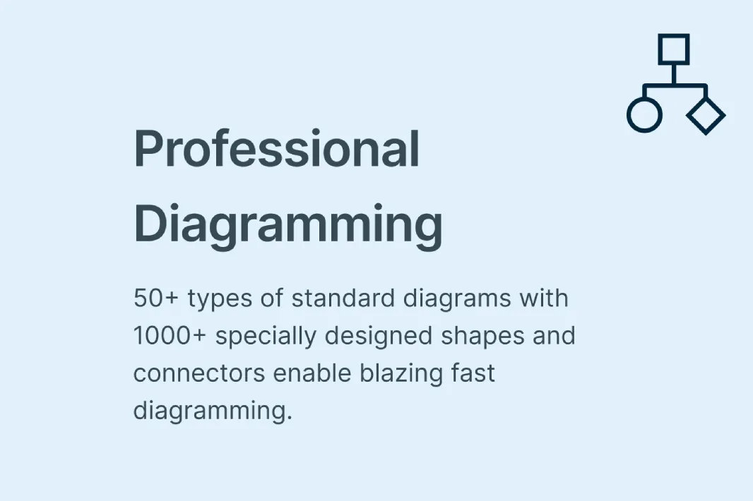
Brainstorm and Visualize with Intuitive Comparison Chart Tools

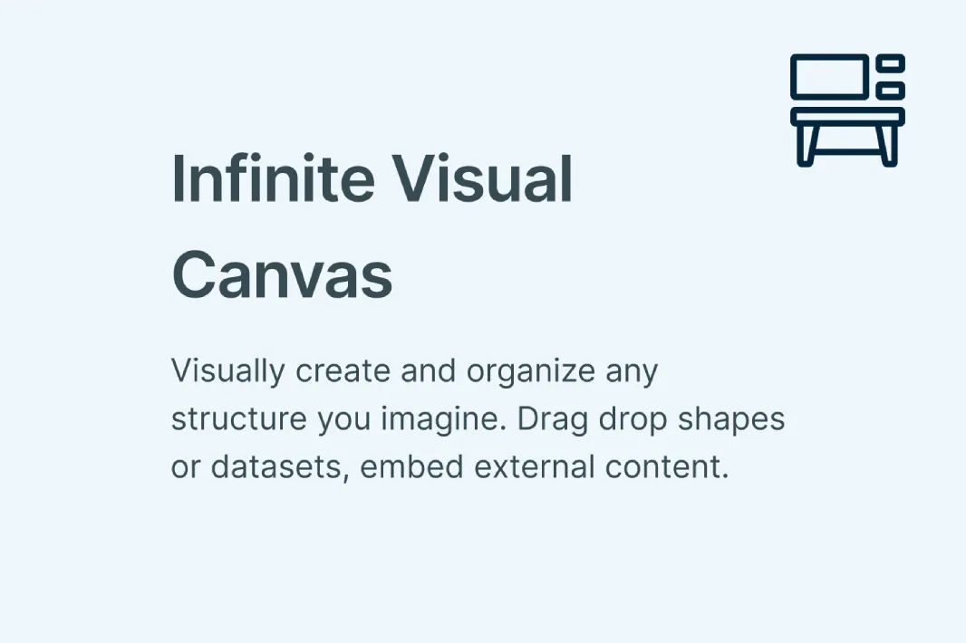
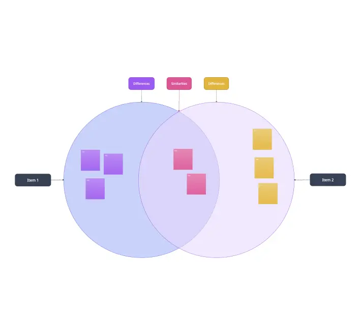
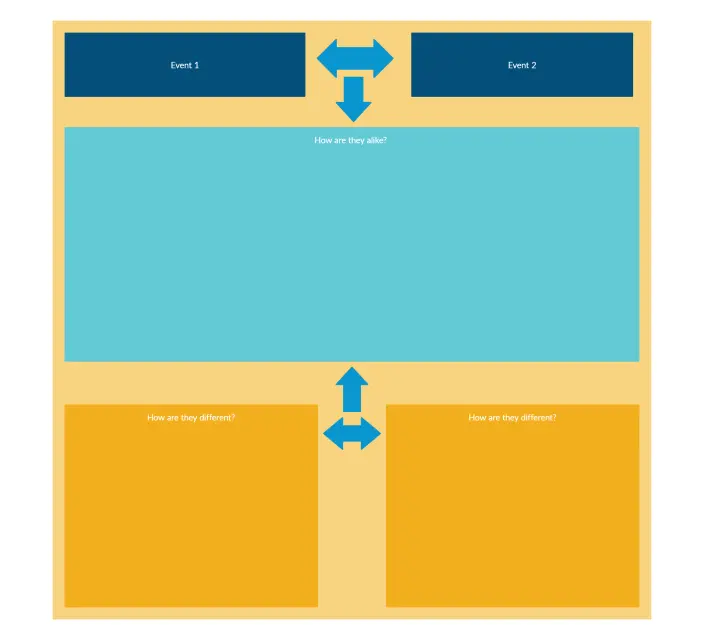
Start your comparison chart by brainstorming with sticky notes and mind maps. Creately’s intuitive diagramming tools and infinite canvas let you visualize concepts and organize ideas before creating your online comparison chart.
Use ready-made templates, drag-and-drop shapes, and color-coded layouts to turn raw ideas into a professional comparison chart. Whether it’s a simple comparison table or a detailed competitor comparison chart, your visualizations are clear, engaging, and presentation-ready.

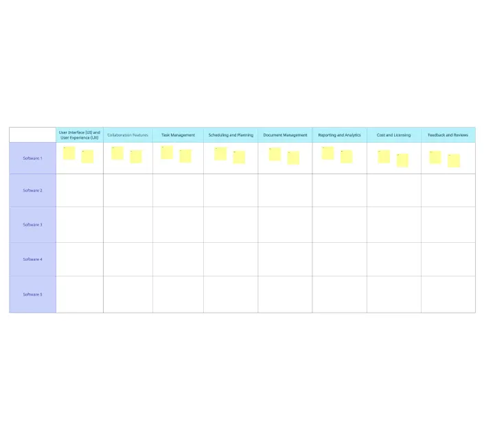
Turn Insights into Action with Centralized Comparative Charts
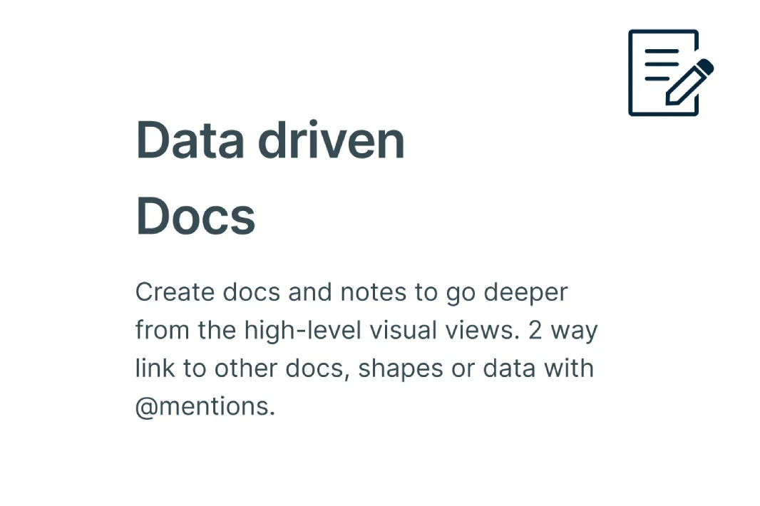
Consolidate all your information in one workspace for actionable insights. The integrated notes panel, version history, and comment threads allow you to analyze your data and gather input from your team.
Add attachments, annotations, or extra details to any shape in your comparative chart, ensuring nothing is overlooked. With Creately, your digital online comparison charts aren’t just visual; they’re strategic tools for planning, competitor analysis, and informed decision-making.
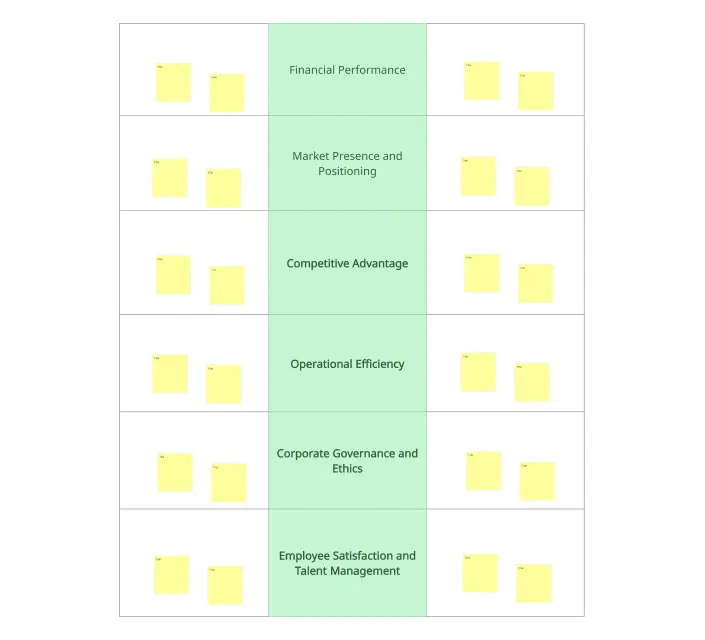
Organize and Enhance Your Comparisons with Ease

Elevate your online comparison chart by embedding live links, research docs, and multimedia directly onto the canvas. Use smart formatting tools like color-coding and custom tags to categorize features and details, ensuring your list is easy to scan at a glance.
Whether it’s a quick overview or building a deep dive, Creately keeps your data structured, accessible, and ready for high-level decision-making. This makes your comparative charts both informative and visually compelling.

Secure Collaboration with Your Team in Real-Time
Work together seamlessly on any online comparison chart with @mentions, multiple cursors, and contextual comments. Secure sharing with access controls ensures sensitive data is protected while allowing everyone on your team to contribute. From brainstorming ideas to finalizing a comparison chart, Creately makes collaboration smooth, fast, and productive. It’s not just about working together; it’s about reaching consensus faster and moving projects forward with confidence.
What Is an Online Comparison Chart?

How to Make a Comparison Chart with Creately
Launch Creately and Open Your Workspace:
Sign in to Creately and open a new or existing workspace. Your infinite canvas gives you the flexibility to start a blank comparison chart or build from a ready-made template.
Choose a Template or Start from Scratch:
Select a comparison chart template or a comparative chart layout that fits your needs. From competitor comparison charts to simple comparison tables online, templates help you structure your data quickly.
Add and Customize Your Data:
Drag-and-drop shapes, sticky notes, and text boxes to add items, features, or metrics. Use color codes, formatting, and icons to highlight key comparisons and make your comparison table or list visually appealing.
Annotate and Collaborate:
Use the notes panel to add context, attach files, or leave detailed explanations for any item in your chart. Collaborate with your team in real time using @mentions, comments, and multiple cursors to refine your comparison chart generator project.
Review, Update, and Share:
Double-check your comparative chart for accuracy and clarity. Update any information as needed, and share your online comparison chart securely with stakeholders or your team. Export, embed, or present directly from Creately for seamless use.
Discover More Free Comparison Chart Examples
FAQs On Comparison Charts
Why choose this over other tools?
Are templates and flexible customization available?
Can teams collaborate in real time?
Can I organize data, notes, and supporting context?
Can I share, present, or export work?