In today’s fast-paced world, understanding the complexity of systems—whether in business, project management, or other—can make all the difference in decision-making. That’s where Causal Loop Diagrams (CLDs) come into play. These diagrams are powerful tools for illustrating how variables within a system interrelate through feedback loops, offering a holistic view of the intricate web of cause-and-effect relationships. This guide will walk you through everything you need to know about CLDs: how to create them, real-world applications, things to consider, and their benefits.
What Is a Causal Loop Diagram?
A Causal Loop Diagram, also known as a systems thinking diagram, is a tool used to illustrate cause-and-effect relationships within a system. Each variable is represented by a node, and the cause-and-effect relationships between them are depicted using directional arrows known as edges. These arrows illustrate how a change in one variable impacts others, giving viewers a comprehensive picture of the system’s behavior over time. In simpler terms, it helps to see how different parts of a system interact to create behaviors—whether positive or negative.
For instance, consider a simple economic model where consumer spending and income levels are interconnected. An increase in income leads to higher consumer spending, which in turn can lead to increased income due to higher economic activity—a reinforcing loop symbolized by positive feedback. Conversely, if consumer spending decreases due to job losses, income levels may drop further—a balancing loop highlighted by negative feedback.


Key Components of a Causal Loop Diagram
A CLD is composed of a few essential elements that make it effective for mapping out cause-and-effect relationships:
Nodes (Variables)
Nodes, often referred to as variables, are the building blocks of a CLD. Each node represents an important factor within the system you’re analyzing. These could be anything from measurable quantities like “production costs” to more abstract concepts such as “employee morale” or “customer satisfaction.”
Each variable is a crucial part of the system’s structure, and its value or state influences other variables within the diagram. For example, in a business scenario, “customer satisfaction” might be influenced by variables such as “product quality,” “pricing,” and “service speed.” Every variable in a CLD can either have a positive or negative effect on other variables, and understanding these interdependencies is essential for strategic decision-making.
In more complex diagrams, nodes can also represent entire subsystems. These subsystems might include a range of interconnected variables themselves, providing a high-level overview of how different areas of the system affect one another.
Arrows (Edges)
The arrows in a CLD, also known as edges, are just as crucial as the nodes themselves. These arrows visually communicate the relationships between variables and indicate whether the relationship is positive or negative. Each arrow is accompanied by either a plus (+) or minus (-) sign to explain the direction and nature of the effect.
Positive Arrows (+)
A positive arrow means that as the first variable increases, the second variable will increase as well. For instance, an increase in “marketing efforts” might lead to an increase in “brand awareness.” It’s a direct relationship where both variables move in the same direction.
Negative Arrows (-)
A negative arrow represents an inverse relationship, where an increase in one variable results in a decrease in another. For example, as “employee workload” increases, “employee morale” might decrease. Understanding negative relationships is key to identifying the balancing mechanisms in the system.
Arrows are not only about identifying the presence of a relationship but also its strength. Sometimes a small change in one variable can create a significant ripple effect in another, demonstrating the sensitivity of the system to certain factors.
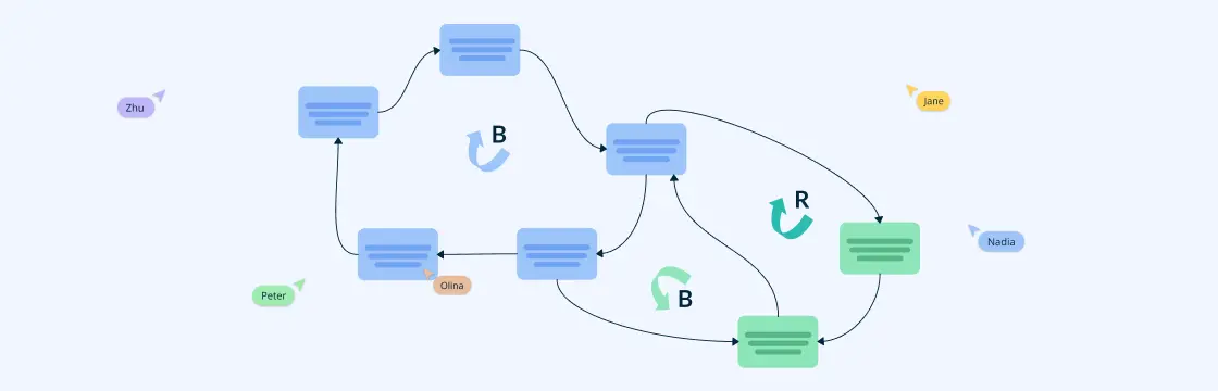
Feedback Loops
Feedback loops offer insight into how systems behave over time. They represent cyclical cause-and-effect processes, where a change in one variable leads to a series of changes in other variables, eventually circling back to influence the original variable. These loops visualize system dynamics and can either amplify or dampen changes within the system.
Reinforcing Loops (R )
These loops act as accelerators within the system, amplifying the effects of changes. Also known as positive feedback loops, reinforcing loops are responsible for processes that grow or decline exponentially. For example, in a sales system, a reinforcing loop might involve “increased sales” leading to “higher brand visibility,” which then drives “even more sales.” Reinforcing loops are self-perpetuating and can lead to explosive growth or runaway decline if left unchecked.
However, it’s important to note that reinforcing loops can either benefit or harm a system depending on the context. While they might drive growth in some cases, in other situations, they could exacerbate negative outcomes, such as rising costs or deteriorating quality.
Balancing Loops (B)
In contrast, balancing loops work to stabilize the system, counteracting changes and bringing the system toward equilibrium. These loops act as negative feedback mechanisms that resist runaway changes and prevent the system from spinning out of control. For instance, “inventory levels” might act as a balancing loop with “production rate”—as inventory rises, production might decrease to prevent overstock, keeping the system in balance.
Balancing loops are essential for maintaining long-term stability and avoiding destructive behaviors in systems, such as overproduction, financial bubbles, or environmental degradation. They often involve a delay, meaning the effects of changes take time to be felt, which can complicate efforts to manage the system effectively.
How to Create a Causal Loop Diagram
Step 1: Define the System and Key Variables
Before jumping into diagramming, clearly define the system you want to study. This might be a business process, a project, or even a natural ecosystem. Next, identify the key variables—these are the factors that drive the system’s behavior.
Let’s say you’re working on improving customer satisfaction in your company. Your variables might include “customer service quality,” “product delivery time,” “pricing,” and “customer reviews.”
Step 2: Map Relationships Between Variables
Once you have your variables, the next step is to map out how they affect each other. For instance, you could draw an arrow from “customer service quality” to “customer satisfaction” with a positive (+) sign, indicating that better service increases satisfaction. On the other hand, a variable like “long delivery times” might have a negative (-) impact on satisfaction.
Step 3: Identify Feedback Loops
Look at the relationships between variables to identify feedback loops. In your business scenario, a reinforcing loop might look like this:
- More satisfied customers → More positive reviews → More new customers → Increased sales → More resources to improve service → More satisfied customers.
A balancing loop might be:
- Increased demand → Longer delivery times → Lower customer satisfaction → Fewer repeat customers → Lower demand.
Step 4: Test and Validate Your Diagram
Once your CLD is complete, review it to make sure it reflects real-world dynamics. It’s a good idea to get feedback from team members who understand different parts of the system to ensure no important variables or relationships are missing.

Points to Consider When Creating a Causal Loop Diagram
While Causal Loop Diagrams are incredibly useful, there are a few things to keep in mind to ensure you’re using them effectively:
1. Keep It Simple
It’s easy to get carried away with too many variables, but simplicity is key. Start with the most important factors and expand the diagram gradually if needed.
2. Factor in Time Delays
Many systems involve time delays. For instance, if a company invests in improving customer service, it might take months to see a noticeable improvement in customer satisfaction. Be sure to account for such delays when building your CLD.
3. Collaborate with Stakeholders
The more perspectives you have when creating a CLD, the better. Involve team members from different departments or areas of expertise to ensure you’re capturing the entire system accurately.
4. Use Visual Aids
Incorporate color-coding, distinct shapes, or icons to visually distinguish different types of variables, loops, and relationships. This enhances clarity and helps users quickly interpret complex system dynamics at a glance.
5. Leverage Software Tools
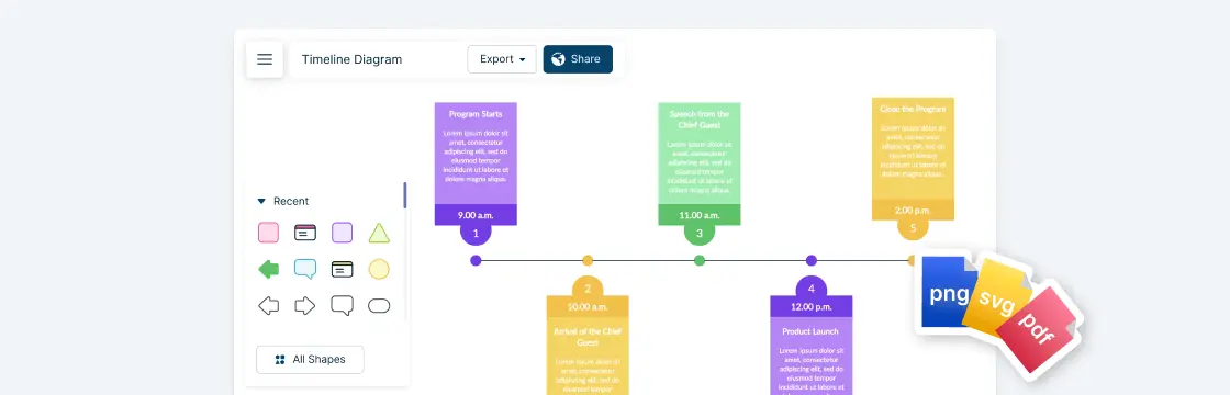
Utilize diagramming platforms like Creately to streamline the creation of Causal Loop Diagrams. These tools offer intuitive drag-and-drop features, templates, and customization options, making it easier to design detailed, visually appealing diagrams.
Benefits of Using Causal Loop Diagrams
Now that you know how to create and apply a CLD, let’s talk about why you should bother. Here are a few major benefits:
1. Improved Decision-Making
By mapping out how different variables interact, CLDs give you a clearer understanding of the system’s behavior. This helps in making informed decisions that take long-term consequences into account.
2. De-Personalizing Problems
One of the great things about CLDs is that they shift the focus away from blaming people and towards understanding system behaviors. Instead of pointing fingers, you can point at the feedback loops that are reinforcing the problem.
3. Strategic Planning
CLDs allow for better long-term planning by helping you visualize potential future scenarios. You can anticipate how changes to one part of the system will ripple through others, making it easier to plan proactively.
4. Visual Clarity
In complex systems, the relationships between variables can be hard to grasp. A CLD provides a clear visual representation, making it easier to spot patterns and potential issues.
Applications of Causal Loop Diagrams
Causal loop diagrams (CLDs) find widespread applications across various industries including business, education, and healthcare. By visualizing complex systems, CLDs facilitate a deeper understanding and more effective strategic planning.
Here are some of the applications of causal loop diagrams:
1. Business Strategy and Decision-Making
Businesses often rely on causal loop diagrams to map out how different factors like marketing, production, and customer feedback influence overall performance. This approach helps them predict potential bottlenecks and optimize their strategy for growth.
Leveraging strategy maps alongside causal loop diagrams offers a comprehensive approach to analyze and enhance organizational performance, ensuring data-driven decisions and sustained growth.
- Example: A company trying to improve customer retention could use a CLD to map out how factors like product quality, service, and pricing interact. By identifying reinforcing loops (like improving service leading to better reviews and more repeat customers), they can make targeted improvements.

2. Project Management
Project managers use CLDs to understand the relationships between timelines, resources, and project outcomes. This can help foresee delays, resource bottlenecks, and budget overruns before they happen.
- Example: In a software development project, a CLD might reveal how delays in testing impact the overall delivery schedule, which in turn affects customer satisfaction and project scope.

3. Environmental Sustainability
In environmental studies, CLDs help policymakers visualize how various factors like pollution, resource consumption, and population growth interact. Understanding these feedback loops can lead to more effective long-term sustainability policies.
- Example: A CLD could show how deforestation impacts local climate, which in turn affects agriculture, leading to food shortages and further deforestation.

4. Organizational Behavior
CLDs help to visualize the complex dynamics of team performance, training, and managerial support. It can indicate where the bottlenecks in the workforce can occur and give insights to identify solutions.
- Example: A CLD can show the effect of enhanced training on employee performance and how it can, in turn, improve the overall organizational output.
Using Creately for Effective Causal Loop Diagrams
Creately offers a comprehensive solution for creating effective causal loop diagrams (CLDs). With its intuitive interface and powerful features, Creately simplifies the process of mapping complex system dynamics, making it accessible for teams looking to enhance their strategic decision-making.
Creately supports collaborative planning and visualization, enabling teams to work together in real time. This ensures that all perspectives are captured and integrated into the final diagram, resulting in a more accurate representation of the system.
Some of the standout features of Creately that support effective CLD creation include:
- Collaborative Whiteboarding: Engage multiple team members in real-time brainstorming sessions to foster collaborative problem-solving and idea generation.
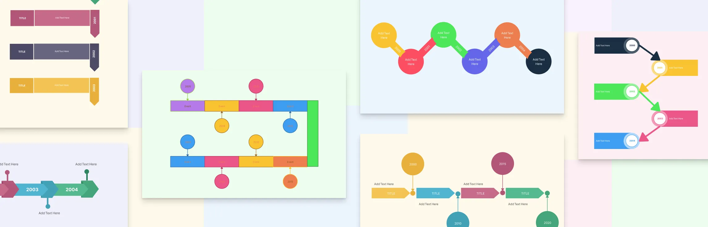
- Pre-built Templates: Take advantage of ready-made CLD templates designed to accelerate the diagramming process and ensure methodological accuracy.
- Customization Options: Easily adjust variables, relationships, and loop indicators with customizable shapes, colors, and labels, ensuring your CLD is clear and informative.
- Data Visualization: Integrate data-driven elements to enhance the diagram’s informational value, providing greater insights into system behavior.
Conclusion: The Power of Causal Loop Diagrams in Unraveling Complexity
In summary, mastering causal loop diagrams is essential for visualizing and analyzing dynamic system behaviors. These diagrams provide a comprehensive view of how variables interact and influence one another, making them invaluable tools for understanding complex systems.
From defining key components such as variables, links, and loop polarity to understanding the significance of reinforcing and balancing loops, every aspect plays a crucial role in developing effective CLDs. Ensuring the accuracy and clarity of your diagrams is paramount, and adhering to best practices can prevent common mistakes, leading to more reliable insights.
Industries ranging from business to healthcare can leverage CLDs to enhance strategic planning, improve communication, and support data-driven decision-making. By applying these tools, organizations can uncover feedback structures, identify leverage points for intervention, and create more robust plans for future scenarios.
Platforms like Creately make the process of creating causal loop diagrams seamless and efficient. With features tailored to collaborative planning, data visualization, and real-time collaboration, Creately ensures that teams can produce insightful and precise diagrams. Whether you are analyzing financial growth models or organizational behavior, leveraging Creately’s capabilities will significantly enhance your CLD creation process.