As we all know, clarity is the main goal of any wireframe or UI mockup. What we seek to elucidate via this post is that when structuring a wireframe you need to ensure that you
- focus on the client requirements
- ensure that the design is clear and uncomplicated
- and you concentrate on annotating the design.
Simple points but certainly potent points to ponder.
If you have experienced rejection at the hands of your clients, one too many times, you must remember that it may not actually be a fault of your design. Rather it could be all to do with the way you present your design to your client. While most designers are adept enough to get 1 and 2 sorted, then usually forget to do 3. And this is where it all goes horribly wrong.
Looking at a design from a client’s perspective, he/she would need to understand it before taking a decision on it. This is what annotating does. Consider this task as a step-by-step guide to the functionality of explaining what a wireframe design is all about. So at this stage, a client would be able to understand the whole concept and then, after much reflection, pass judgement on it.
Find below 4 best practices when it comes to annotating wireframes.
1. Short, simple and sweet
Think about it. How many clients do you know have oodles of time for meetings? You get the point. When annotating, make sure that you are clear and succinct in what you state. Be convincing, state the usefulness of whatever you annotate and keep it really short.
2. Annotate for the sake of usefulness
Your wireframe design is meant to solve a problem. Your client is only concerned about how useful your wireframe design is, so make sure that you annotate with “usefulness” being the main priority.
3. Order, please!
So your client has little or no time to spend meandering around a document figuring out how the wireframe design he is looking at is going to help him out. If you got the first two best practices sorted out, then all you need to do is to ensure that you arrange everything in numerical order. From the client’s perspective, this will lead to a natural flow whereby all information can be easily assimilated.
4. Get some space
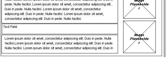
You already probably know how the natural progression is to read from left to right. So it’s natural to have your design on the left while your annotations are on the right. An example using all these 4 best practices are shown right below.
If you do find this post useful, please do make a comment below. We’d be more than happy to field in any questions that you may have. If you got any suggestions for topics that you would like us to cover, you are more than welcome to let us know.

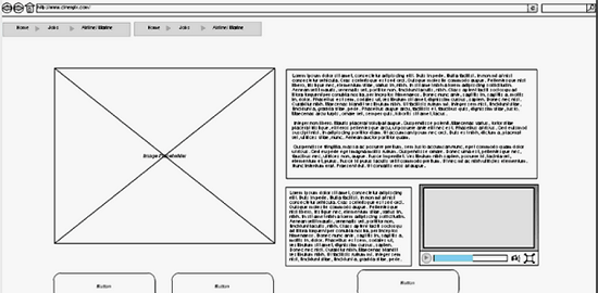


Good post. The example layout with the wireframe on the left and annotations on the right is the industry standard and a good practice to follow, too.
One word of warning: Do not assume that the client has read and understood all your annotations. No amount of annotation can replace a good walkthrough. In fact, perhaps we need to add a fifth item to this list: “More show, less tell.”