Most of you must have come across situations where you will have to illustrate an idea or a concept for a presentation. In fact if you’re reading this article you’re probably struggling with which diagram to use for your specific scenario. With so many diagram types out there it can be tough to figure out the right one, so below are some guidelines to make it easier for you.
When you are presented with a question or scenario-before thinking of which diagram to use-you need to figure out what sort of question/scenario are you trying to illustrate. Below are few question to ask yourself before thinking about the diagram type.
- Are you trying to map out a process ?
- Are you trying to identify a defect in a process ?
- Is it a math question involving things like sets and probability ?
- Are you trying to compare something or things?
- Are you trying to illustrate a relationship ?
- Are you trying to present data in a meaningful way ?
Finding the answers to these questions makes it easier to figure out which diagram to use for your specific scenario.
Which Diagram to Use to Map Processes
Processes come in different shapes and sizes. You might want to visualize a business process or simply want to illustrate a series of steps to be performed to complete an action. Fortunately there are plenty of diagrams to fit various scenarios.
- Flowchart – When it comes to displaying processes flowcharts are second to none. As you can see in the below image its simple enough to showcase the tea making process. At the same time they are used in software engineering and in many other professions to map processes.You can show most processes by just processes and decision blocks making it simple to use. However it has enough advance symbols to map down much complex processes. Try our flowchart software to immediately draw flowcharts or check the flowchart tutorial to learn more about them.

Process – Flowchart Example
- Business Process Modeling Notation – Although flowcharts are powerful, for complex business processes you need something more powerful. Business process modeling notation help you do that with a set of symbols that can give a much more detailed view of a business process.
Creately support business process modeling notation with a set of easy to use features. Also you can get started immediately by using our professionally designed BPMN templates. - UML – UML is a set of diagram types which provide an even more powerful way to map processes. Its commonly used by software engineers and business analysts to create a model of a particular business.
Different UML diagram types serve different purposes. For example class diagrams capture the different entities of the system and the relationship between them. A combination of all these diagrams provide a great way to get an overall idea of an system.

Want to Identify Defects ?
The first step to identify a defect/problem in a process is to map down the process. So in a sense any diagram that can map a process is a good candidate here. But there is a specific diagram type that’s a perfect fit for this scenario. Most refer to them as fishbone diagrams because of the look of the diagram but they are known as Ishikawa diagrams and also as cause and effect diagrams.

Fishbone diagram template that can be used in marketing ( click on the image to plan your marketing activities )
Its a very simple diagram which you can easily draw on a piece of paper. Or if you’re a digital native you can make use of our fishbone diagram templates.
Which Diagram to Use to Show Relationships
Another possible scenario you might encounter is to show the relationships between people using a diagram. Here also you can use different diagrams to fit that specific scenario.
- Family Tree – Want to track down your family history? Interested about your heritage? Then family tree diagrams are the perfect match for you. Although family tree diagrams were used for a long time they became extremely popular with the release of television series like Game of Thrones.
We have quite a few family tree examples in our diagramming community if you want to get started immediately. - Organizational Chart – As the name suggests org charts are used to show the relationship between employees in an organization. There are various organizational chart types but most follow the structure shown below.
The head of the organization resides at the top, the next level below that and so on and so forth. Creately have specialized features to draw org charts which will make creating org charts easy and intuitive.

Relationship: Org Chart Example
Which Diagram to Use to Solve Different Math Problems
Another area diagram are heavily used is in the classroom, especially in the maths class. And as shown in previous sections there are different diagram types for different problems. So below are some of the commonly used diagram types in the classroom with the specific scenario.
- Probability Tree diagrams – When you want to see the probability of different outcomes then one of the best ways to go about it is to create a probability tree diagrams. Of course this is only practical for simple examples where the outcomes are somewhat limited. Its a great way to learn probability as well.
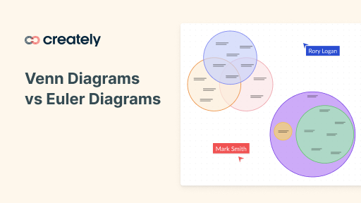
- Venn Diagrams – Venn diagrams are also one of those versatile diagrams that can be used for different purposes. In math it is mostly used to solve problems related to set theory. However throughout the Internet you will see it used to do comparisons, depict funny scenarios and a whole lot more.
Its simplicity is the main reason for its popularity. However one should not mistake Venn diagrams for Euler diagrams. Although very similar in how they look the representation can be vastly different for the same problem.

Comparison – Venn Diagram Example
Looking to Present Data in a Meaningful Way ?
Sometimes you simply want to make sense of the data you have or want to display them in a way so others can easily make decisions based on that data. There are various diagram types to cater to those as well.
- Pie charts – Pie charts are mostly used to show proportional data usually using the percentages next to or on the slice. If you have data on a table with different categories as rows or columns you can use a pie chart to see how the categories perform against each other.
However if there are many categories/slices then pie charts become less effective because its hard to see data. You can improve it by adding different colors to different slices but limitation exist. - Bar Charts / Column Charts – Bar charts are similar to pie charts because they also show the different between categories as proportions. However they are far more effective because its much more easier to see the difference compared to a pie chart.
Additionally in a bar chart bars can be clustered together to give even more meaningful data. For example performance of two products down the years can be show using a bar chart. - Bubble Charts – Pie charts and bar charts are two dimensional, meaning they can show how two data sets compare to each other. Bubble charts takes this a step further and lets you compare three sets of data.
There are many more chart types which can be used to represent data. Our infographics library supports most these chart types.

Charts available in our infographic libraray
I hope this article will help you to figure our which diagram to use in a specific scenario. I’ve covered only the main diagram types in this article, there are lots more other diagram types which you can use for different scenarios. Do some research or simply drop a comment if you’re struggling with them.